---
title: "View 100+ Years of Economic Superpowers’ Exports with .NET MAUI Stacked Area Chart"
published_at: "2024-09-19T12:46:09+00:00"
modified_at: "2025-03-20T12:34:59+00:00"
url: "https://www.syncfusion.com/blogs/post/view-exports-with-maui-stacked-area-chart"
excerpt: "Let's use the .NET MAUI Stacked Area Chart and its annotation feature to visualize a century of global exports by economic superpowers."
taxonomy_category:
- ".NET MAUI"
- "Chart"
- "Chart of the week"
- "Data Visualization"
- "Desktop"
- "Syncfusion"
- "UI"
taxonomy_post_tag:
- ".NET MAUI"
- "Chart"
- "Data Visualization"
- "desktop"
- "MAUI"
- "Mobile"
- "UI"
---
[Chart of the week](https://www.syncfusion.com/blogs/category/chart-of-the-week)
# View 100+ Years of Economic Superpowers’ Exports with .NET MAUI Stacked Area Chart
[Nitheeshkumar Thangaraj](https://www.syncfusion.com/blogs/author/nitheeshkumar-thangaraj)
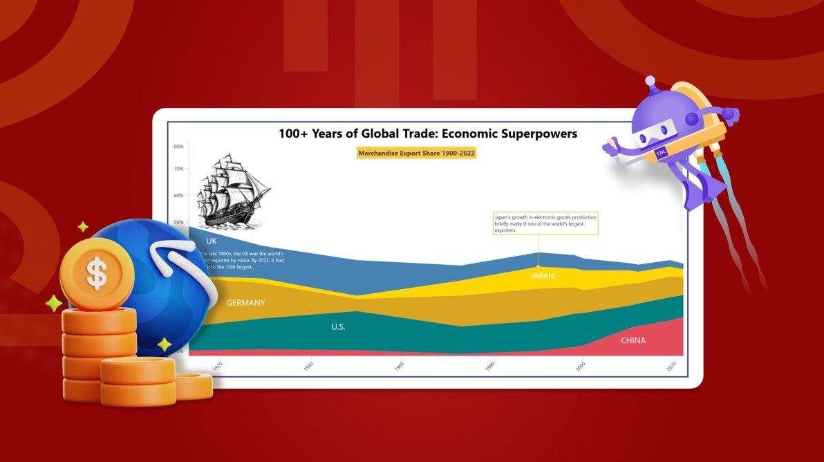
**TL;DR:** Let’s see how to use the .NET MAUI Stacked Area Chart to visualize 100+ years of exports by economic superpowers. The blog covers gathering data, configuring the chart, and adding annotations for enhanced clarity. You’ll learn to bind data and use text, shape, and view annotations to highlight key points.
Welcome to our **Chart of the Week** blog series!
Today, we’ll visualize the economic history of global superpowers over 100+ years using the Syncfusion .[NET MAUI Stacked Area Chart](https://help.syncfusion.com/maui/cartesian-charts/stackedarea)
and its annotation feature.
Throughout the centuries, nations have risen and fallen, and their economic influence has profoundly shaped the global stage. In this exploration, we’ll leverage data visualization to unravel the stories behind the numbers, revealing the economic forces that have shaped our modern world.
Join us on a captivating journey through economic history as we visualize a century of exports from the world’s leading economic powers.
## Why use annotations in Charts?
[Annotations](https://help.syncfusion.com/maui/cartesian-charts/annotation)
are essential for enhancing the visual appeal and informational depth of charts. They allow us to add additional elements, such as shapes, text, or even custom views, to highlight specific areas of interest and provide context to the data. Before we delve into annotations, we’ll first design the Stacked Area Chart to analyze the economic history of global superpowers over the past 100+ years.
Let’s get started!
## Step 1: Gathering data for 100 years of exports
Before creating the chart, we need to gather data on 100+ years of exports for top economic superpowers from this [Export Data source, page no 21](https://www.piie.com/sites/default/files/2023-11/wp23-11.pdf)
.
## Step 2: Preparing the data for the chart
Now, create the **ExportModel** class to hold export data for various countries with the ** Year** and ** Export** values.
```
public class ExportModel
{
public DateTime Year {get; set;}
public double UK {get; set;}
public double Germany {get; set;}
public double US {get; set;}
public double Japan {get; set;}
public double China {get; set;}
}
```
Next, generate the data collection with the help of the **ExportViewModel** class and ** ExportData** collection.
```
public class ExportViewModel
{
public ObservableCollection ExportData {get; set; }
public ExportViewModel ()
{
ExportData = new ObservableCollection ().
ExportData.Add(new ExportModel () {Year = new DateTime (1913, 01, 01), China = 2.0, US = 9.0, Germany = 18.0, Japan = 0.8, UK = 18.5});
ExportData.Add(new ExportModel () {Year = new DateTime (1929, 01, 01), China = 2.4, US = 11.5, Germany = 13.3, Japan = 1.7, UK = 12.2});
ExportData.Add(new ExportModel () {Year = new DateTime (1950, 01, 01), China = 2.1, US = 14.6, Germany = 4.5, Japan = 1.2, UK = 13.3});
ExportData.Add(new ExportModel () {Year = new DateTime (1973, 01, 01), China = 0.7, US = 10.3, Germany = 11.5, Japan = 5.6, UK = 5.6});
ExportData.Add(new ExportModel () {Year = new DateTime (1990, 01, 01), China = 1.8, US = 11.3, Germany = 12.0, Japan = 8.2, UK = 5.3});
ExportData.Add(new ExportModel () {Year = new DateTime (1998, 01, 01), China = 3.3, US = 12.4, Germany = 9.9, Japan = 7.0, UK = 5.0});
ExportData.Add(new ExportModel () {Year = new DateTime (2000, 01, 01), China = 3.9, US = 12.1, Germany = 8.5, Japan = 7.4, UK = 4.4});
ExportData.Add(new ExportModel () {Year = new DateTime (2010, 01, 01), China = 10.3, US = 8.4, Germany = 8.2, Japan = 5.0, UK = 2.7});
ExportData.Add(new ExportModel () {Year = new DateTime (2012, 01, 01), China = 11.1, US = 8.4, Germany = 7.6, Japan = 4.3, UK = 2.6});
ExportData.Add(new ExportModel () {Year = new DateTime (2019, 01, 01), China = 13.2, US = 8.6, Germany = 7.8, Japan = 3.7, UK = 2.4});
ExportData.Add(new ExportModel () {Year = new DateTime (2022, 01, 01), China = 14.4, US = 8.3, Germany = 6.6, Japan = 3.0, UK = 2.1 });
}
}
```
## Step 3: Configure the Syncfusion .NET MAUI Cartesian Charts
Let’s configure the Syncfusion**.NET MAUI Cartesian Charts** control according to the [documentation](https://help.syncfusion.com/maui/cartesian-charts/getting-started)
.
Refer to the following code example.
```
```
## Step 4: Binding data to the .NET MAUI Stacked Area Chart
To analyze exports for multiple countries, we’ll use multiple [Syncfusion StackedArea series](https://help.syncfusion.com/maui/cartesian-charts/stackedarea)
. Then, bind the **ItemsSource** property to the ****** ExportData****** collection,******** XBindingPath******** to******** Year,******** and******** YBindingPath******** for each country.
Refer to the following code example.
```
```
## Step 5: Adding annotations to the .NET MAUI Stacked Area Chart
We can add different types of annotations, such as **TextAnnotation, ViewAnnotation,** and ** ShapeAnnotation,** to enhance the clarity and visual appeal of charts.
### Adding text to the chart using TextAnnotation
The [TextAnnotation](https://help.syncfusion.com/maui/cartesian-charts/annotation#text-annotation)
allows you to add text labels or notes directly onto the chart. This feature is particularly useful for providing context, labeling data points, or explaining trends.
To differentiate exports, we’ll add additional information, such as country names, to the .NET MAUI Stacked Area Chart.
Refer to the following code example.
**XAML**
```
```
**C#**
```
#if WINDOWS || MACCATALYST
textAnnotation.Text = "In the late 1800s, the UK was the world's \nlargest exporter by value. By 2022, it had \nshrunk to the 15th largest.";
japanText.Text = "Japan's growth in electronic goods production \nbriefly made it one of the world's largest\nexporters.";
titleText.Text = "100+ Years of Global Trade: Economic Superpowers";
#else
titleText.Text = "100+ Years of Global Trade";
#endif
```
Refer to the following output image.
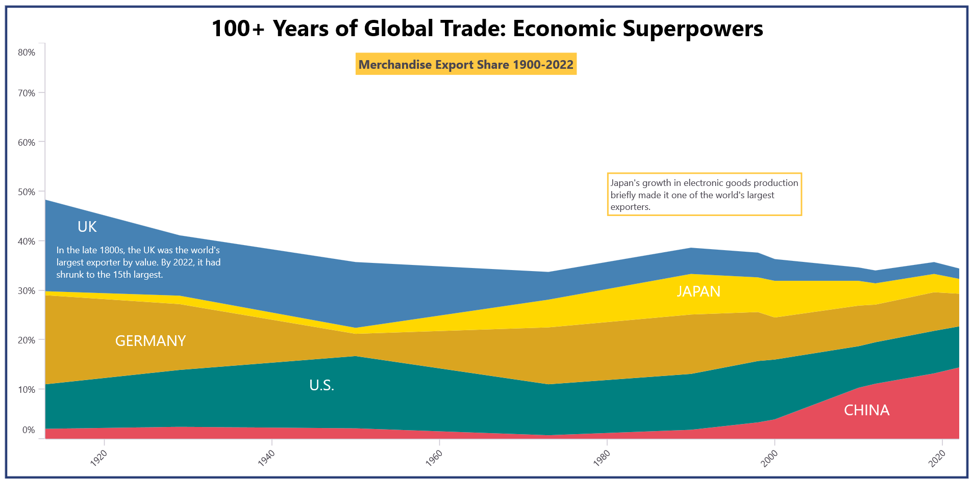
Adding text annotation in the .NET MAUI Stacked Area Chart
### Adding shapes to the chart using ShapeAnnotation
The [ShapeAnnotation](https://help.syncfusion.com/maui/cartesian-charts/annotation#shape-annotation)
allows us to add shapes such as rectangles, circles, and lines to your charts. These shapes can highlight specific data points, emphasize trends, or delineate areas of interest. This will enhance the overall aesthetics of your visualizations while making them more informative and engaging for viewers.
Refer to the following code example.
```
```
Refer to the following output image.
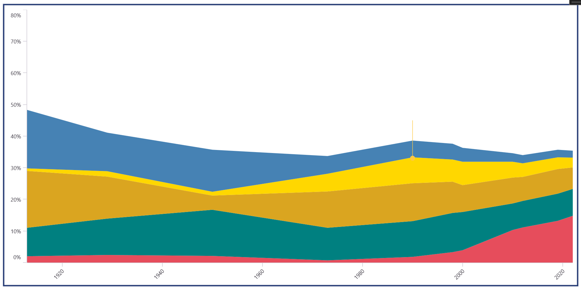
Adding shape annotation in the .NET MAUI Stacked Area Chart
### Adding views to the chart using ViewAnnotation
The [ViewAnnotation](https://help.syncfusion.com/maui/cartesian-charts/annotation#view-annotation)
enables the embedding of custom views directly onto the chart canvas. These views can include images, buttons, or other interactive elements, enhancing the chart’s interactivity and functionality. This will improve user engagement by offering customized visual enhancements tailored to specific data visualization needs.
Refer to the following code example.
```
```
Refer to the following output image.
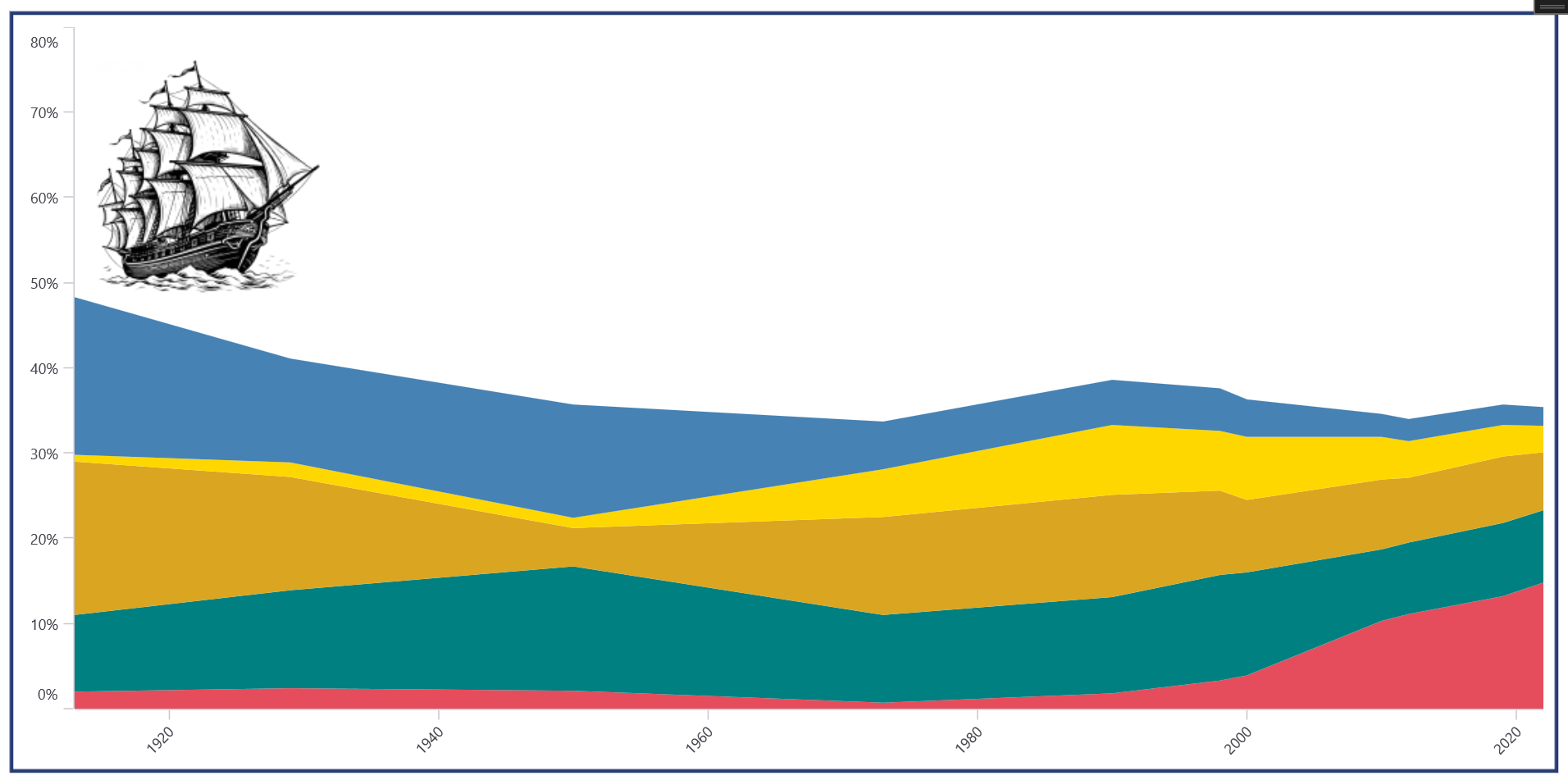
Adding view annotation in the .NET MAUI Stacked Area Chart
After executing the complete code examples, the output will look like the following image.
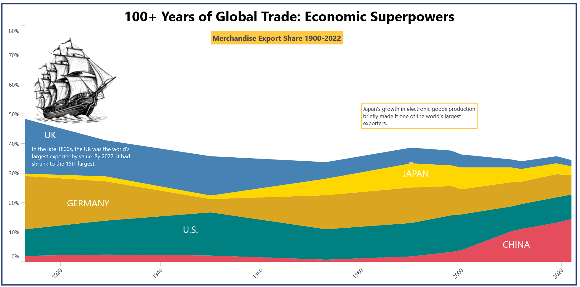
Visualizing 100+ years of export of economic superpowers using the .NET MAUI Stacked Area Chart
## GitHub reference
For more details, refer to the [visualization of 100+ years of export of economic superpowers with the .NET MAUI Stacked Area Chart GitHub demo](https://github.com/SyncfusionExamples/Visualizing-150-Years-of-Export-for-Economic-Superpower-with-Stacked-Area-Chart/tree/master)
.
## Conclusion
Thanks for reading! In this blog, we’ve seen how to visualize the 100+ years of export of economic superpowers using the Syncfusion [.NET MAUI Stacked Area Chart](https://help.syncfusion.com/maui/cartesian-charts/stackedarea)
. We encourage you to follow the steps outlined in this blog and share your feedback in the comments section below.
The existing customers can download the latest version of Essential Studio® from the [License and Downloads](https://www.syncfusion.com/account)
page. If you are new, try our 30-day [free trial](https://www.syncfusion.com/downloads)
to explore our incredible features.
If you require any assistance, please don’t hesitate to contact us via our [support forum](https://www.syncfusion.com/forums)
, [support portal](https://support.syncfusion.com/)
, or [feedback portal](https://www.syncfusion.com/feedback)
. We are always eager to help you!
## Related blogs
- [Syncfusion Essential Studio® 2024 Volume 3 Is Here!](https://www.syncfusion.com/blogs/post/syncfusion-essential-studio-2024-vol3)
- [Integrating AI-Powered Smart Paste in .NET MAUI DataForm for Easy Data Entry](https://www.syncfusion.com/blogs/post/ai-powered-smart-paste-maui-dataform)
- [AI-Powered Smart Searching in .NET MAUI Autocomplete](https://www.syncfusion.com/blogs/post/smart-ai-search-in-maui-autocomplete)
- [Create a .NET MAUI Drill-Down Chart to View U.S. Workforce Distribution by Industry](https://www.syncfusion.com/blogs/post/maui-drilldown-chart-to-view-workforce-data)