---
title: "How to Use Dual-Axis Charts for Effective Data Visualization?"
published_at: "2025-03-18T11:30:42+00:00"
modified_at: "2026-06-23T12:40:16+00:00"
url: "https://www.syncfusion.com/blogs/post/view-data-in-react-dual-axis-chart"
excerpt: "Learn when and how to use dual-axis charts with best practices, use cases, and implementation using React Charts component."
taxonomy_category:
- "Chart"
- "Data Visualization"
- "React"
- "Weekly Data Visualization"
taxonomy_post_tag:
- "Charts"
- "Data Visualization"
- "React"
- "UI Components"
- "Web Development"
---
[Weekly Data Visualization](https://www.syncfusion.com/blogs/category/weekly-data-visualization)
# How to Use Dual-Axis Charts for Effective Data Visualization?
[Easwaran Azhagesan](https://www.syncfusion.com/blogs/author/easwaran-azhagesan)
**TL;DR:** Dual-axis charts help compare two datasets with different value ranges on the same chart, making data relationships clearer. Learn when to use them and how to create one using our React Charts component, featuring Texas weather data for a practical example.
Welcome to the “**Weekly Data Visualization**” blog series!
Dual-axis charts are powerful visualization tools that allow you to compare two datasets with different value ranges on the same chart, providing deeper insights into data relationships.
In the world of data visualization, conveying complex relationships effectively is crucial. Dual-axis charts provide a powerful way to compare two data sets with a common category but different value ranges. In this blog, we’ll explore when and how to use dual-axis charts effectively, including practical use cases, best practices, and implementation using the Syncfusion [React Charts](https://www.syncfusion.com/react-components/react-charts)
.
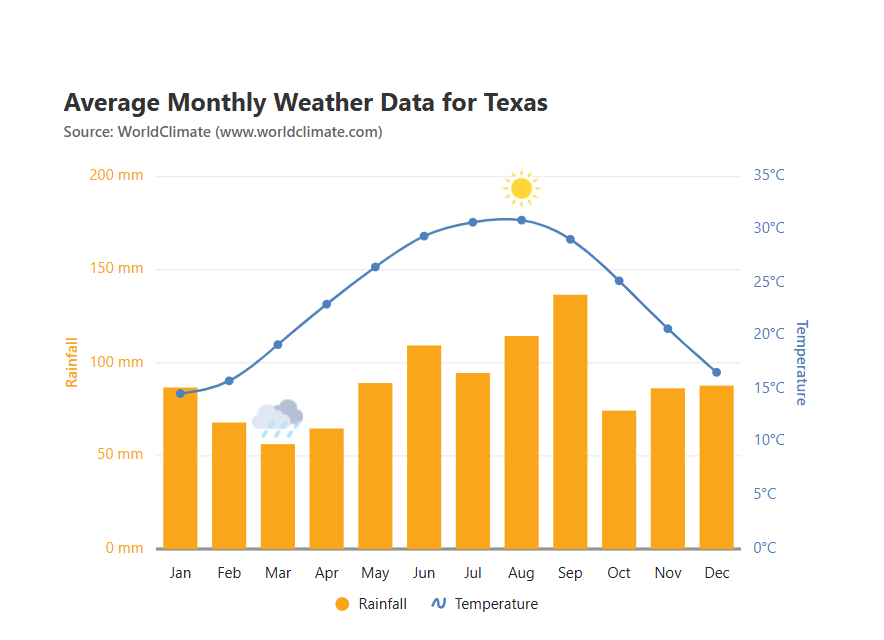
Here, we’ll create a dual-axis chart using Texas weather data, featuring rainfall and temperature.
## What is a dual-axis chart?
A dual-axis chart, also known as a two-axis chart or a combo chart, allows users to plot two different sets of data on the same chart using two vertical axes. Typically, one data series is displayed on the primary Y-axis, while the other is mapped to a secondary Y-axis, making analyzing correlations between different metrics easier.
## When to use a dual-axis chart?
Dual-axis charts are useful when:
1. **Comparing trends between two metrics:** When you need to visualize the relationship between two variables with different units or magnitudes.
2. **Showing correlation:** A dual-axis chart can reveal insights if one data set influences another, such as revenue and customer footfall.
3. **Analyzing performance over time:** Financial analysts use dual-axis charts to track stock performance versus market indices.
4. **Visualizing key performance indicators (KPIs):** Businesses can compare revenue and expenses parallelly to track profitability.
While dual-axis charts are powerful, they should be used cautiously to avoid misleading interpretations due to scale differences.
Simplify React Chart Development
Spend less time building data visualization features from scratch. Syncfusion React Charts includes ready-to-use support for multiple chart types, data binding, interactive tooltips, legends, zooming, selection, and responsive layouts.
[Start Building Today](https://www.syncfusion.com/react-components/react-charts)
## Creating a dual-axis chart using the React Charts component
Follow these steps to create a dual-axis chart using our React Charts:
### Step 1: Preparing the data
To begin with, we need to structure our data properly. Here, we’ll use the data from the [World Climate web page](http://www.worldclimate.com/)
for Texas’s average monthly rainfall (in mm) and temperature (in °C).
```
export let weatherData: Object[] = [
{ month: 'Jan', rainfall: 86.7, temperature: 14.6 },
{ month: 'Feb', rainfall: 67.9, temperature: 15.8 },
{ month: 'Mar', rainfall: 56.3, temperature: 19.2 },
{ month: 'Apr', rainfall: 64.7, temperature: 23.0 },
{ month: 'May', rainfall: 89.1, temperature: 26.5 },
{ month: 'Jun', rainfall: 109.3, temperature: 29.4 },
{ month: 'Jul', rainfall: 94.5, temperature: 30.7 },
{ month: 'Aug', rainfall: 114.4, temperature: 30.9 },
{ month: 'Sep', rainfall: 136.5, temperature: 29.1 },
{ month: 'Oct', rainfall: 74.3, temperature: 25.2 },
{ month: 'Nov', rainfall: 86.3, temperature: 20.7 },
{ month: 'Dec', rainfall: 87.7, temperature: 16.6 },
];
```
### Step 2: Configuring the primary X and Y-axes
Let’s configure the [React Charts](https://ej2.syncfusion.com/react/documentation/chart/getting-started)
component to create a stunning dual-axis chart. It provides multiple customization options, enabling us to fine-tune every aspect of the chart.
Here, the **primary X-axis** represents the common ** category (Months),** and the ** primary Y-axis** is assigned to one of the data series. Here, we configure the ** primary Y-axis** for ** rainfall**measurements.
```
import * as React from 'react';
import { useRef } from 'react';
import {
ChartComponent,
Legend,
SeriesCollectionDirective,
AxesDirective,
AxisDirective,
SeriesDirective,
Inject,
ColumnSeries,
Category,
Tooltip,
SplineSeries,
} from '@syncfusion/ej2-react-charts';
```
### Step 3: Adding the secondary Y-axis
To visualize temperature data, we introduce a secondary Y-axis using the **** component. This secondary Y-axis will be positioned on the right side of the chart.
When adding a **secondary axis** to a chart, it does not automatically associate with any data series. To link a series to the secondary axis, we should explicitly set the ** YAxisName** property in the series configuration. The value assigned to ** YAxisName** must match the ** name** property of the secondary axis to establish the connection.
Refer to the following code example.
```
```
### Step 4: Binding the data to the React dual-axis chart
Now, we’ll bind the rainfall and temperature data to separate chart series, associating them with their respective Y-axes.
#### Binding rainfall data (Column series – Primary Y-axis)
The**Primary Y-axis** is automatically assigned based on the ** xName** and ** yName**properties in the series.
```
```
Refer to the following image.
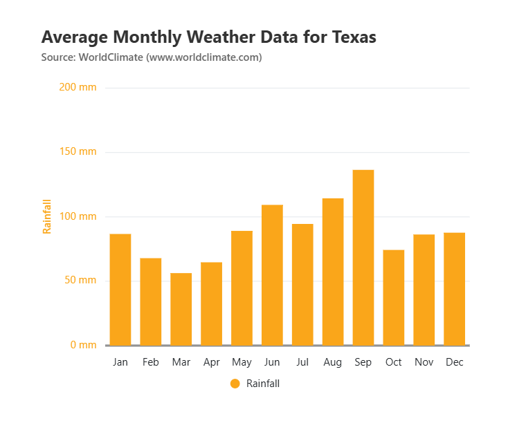
Binding rainfall data to primary Y-axis of React dual-axis chart
#### Binding temperature data (Spline series – Secondary Y-axis)
When we need a secondary axis, we must manually map it to a specific series using the **YAxisName** property.
Refer to the following code example.
```
```
Refer to the following image.
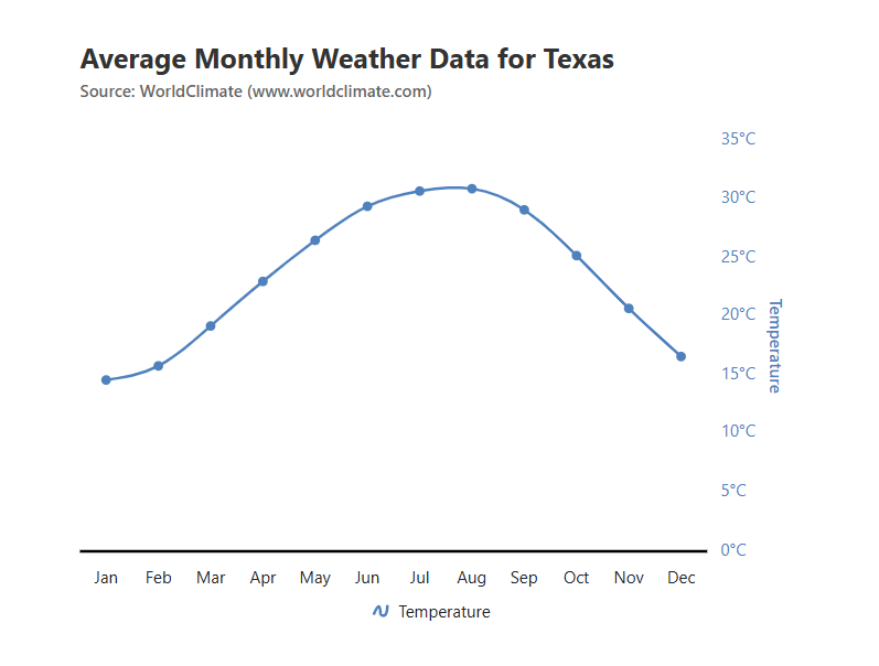
Binding temperature data to the secondary Y-axis of the React dual-axis chart
### Step 5: Enhancing the chart visualization
To improve the appearance of the dual-axis chart, we can:
- Customize the title and subtitle for better context.
- Use [markers](https://ej2.syncfusion.com/react/documentation/chart/data-markers#marker) for the line chart to highlight data points.
- Adjust the [axis](https://ej2.syncfusion.com/react/documentation/chart/axis-labels) styles and colors for better distinction.
Refer to the following code example to add a title and subtitle to the React dual-axis chart.
```
```
Refer to the following image.

Creating a dual-axis chart using the React Charts component
## Best practices for dual-axis charts
- **Use a secondary axis only when necessary**: Too many axes can confuse users.
- **Choose the right combination of chart types**: A line-column combination works well.
- **Keep the scales balanced**: Avoid misleading interpretations by normalizing axes.
- **Label axes clearly**: Indicate what each axis represents.
- **Avoid overloading the chart**: Display only relevant data to prevent clutter.
## Reference
For more details, refer to the [React dual-axis chart Stackblitz demo](https://stackblitz.com/edit/react-lpfamhhq-lckno9qi?file=index.js)
.
## Conclusion
Thanks for reading! Dual-axis charts are a valuable visualization tool when comparing two related datasets with different units or scales. By using Syncfusion [React Charts](https://www.syncfusion.com/react-components/react-charts)
, we can create an effective and engaging dual-axis chart to analyze trends and patterns efficiently.
The new version of Essential Studio® is available for current customers from the [License and Downloads page](https://www.syncfusion.com/account/downloads)
. If you are not a Syncfusion customer, try our 30-day [free trial](https://www.syncfusion.com/downloads)
to check out our newest features.
For questions, you can contact us through our [support forums](https://www.syncfusion.com/forums)
, [support portal](https://support.syncfusion.com/)
, or [feedback portal](https://www.syncfusion.com/feedback/)
. We are always happy to assist you. Happy coding!
## Related Blogs
[Easily Create UML Activity Diagrams with React Diagram Library](https://www.syncfusion.com/blogs/post/uml-activity-diagram-in-react-diagram)
[Create AI-Assisted Mind Maps Using OpenAI and React Diagram Library](https://www.syncfusion.com/blogs/post/ai-assisted-mind-map-in-react-diagram)
[From Scratch to Scale: Bootstrapping Your React App Without CRA](https://www.syncfusion.com/blogs/post/bootstrap-a-react-app-without-cra)
[Save and Load Reports Efficiently in React Pivot Table Using Redux](https://www.syncfusion.com/blogs/post/save-load-report-in-react-pivot-table)