---
title: "Top 10 React Component Libraries Every Developer Should Know"
published_at: "2022-03-04T11:00:04+00:00"
modified_at: "2026-01-16T07:52:59+00:00"
url: "https://www.syncfusion.com/blogs/post/top-react-component-libraries"
excerpt: "This article lists the top 10 React component libraries along with their key features you should use in your React apps."
taxonomy_category:
- "Development"
- "React"
- "UI"
- "Web"
taxonomy_post_tag:
- "development"
- "productivity"
- "React"
- "React Components"
- "Web"
---
# Top 10 React Component Libraries Every Developer Should Know
[Nipuni Arunodi](https://www.syncfusion.com/blogs/author/nipuni-arunodi)

**TL;DR:** Want to supercharge your React development with pre-built, customizable components? Explore 10 popular React component libraries that can save you time and effort, from Material UI’s vast collection to Chakra UI’s focus on accessibility. Dive in and discover the perfect library to boost your next React project!
Components are the building blocks in React. You can combine and structure them in a variety of ways to create the desired webpage. The React community has created many component libraries to assist developers in getting started faster.
In this article, I’ll go through 10 React component libraries every developer should know.
## 1. MUI
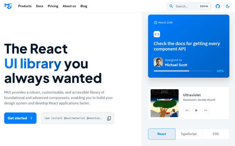
Image Source: [Material UI](https://mui.com/)
[MUI](https://mui.com/)
is one of the most famous React components. It is well known for making web development faster and easier.
The major goal of MUI is to provide developers with a large number of clean, simple, and highly adaptable components. It offers many ready-to-use features that can be plugged into any project.
### Features
- Develop design systems quickly and easily.
- Easily create and customize themes that can be used globally across your components.
- Well-organized and straightforward documentation.
### Installation
You can install MUI using NPM or Yarn as follows:
```
// with npm
npm install @material-ui/core// with yarn
yarn add @material-ui/core
```
### Usage
After installation, simply import the Material UI component you wish to use.
```
import React from 'react';
import ReactDOM from 'react-dom';
import Button from '@material-ui/core/Button';
function App() {
return ;
}
ReactDOM.render(, document.querySelector('#app'));
```
## 2. React Bootstrap : Bootstrap components built with React
Image Source: [React Bootstrap](https://react-bootstrap.github.io/)
[React Bootstrap](https://react-bootstrap.github.io/)
is a user interface framework based on the Bootstrap library. It’s arguably the quickest way to start building React and Bootstrap interfaces.
It’s the most popular front-end component library globally, with many starter kits, resources, and themes from which to choose.
### Features
- Simple to use.
- Composed of elements.
- Uses JSX syntax.
### Installation
You can easily install React Bootstrap using NPM as follows:
```
npm install react-bootstrap
```
### Usage
After installation, you can import React Bootstrap components:
```
import Button from 'react-bootstrap/Button';
```
## 3. Ant Design UI: An enterprise-class UI design language and React UI library
Image Source: [Ant Design](https://ant.design/)
[Ant Design](https://ant.design/)
is a set of enterprise-class web application user interfaces. It comes with over 50 customizable components that can be used to create attractive apps.
It is built with internal desktop applications in mind and is based on a number of concepts and unifying standards. It makes design and testing easily accessible to all project participants.
### Features
- Includes a set of high-quality React components right out of the box.
- Developed in TypeScript and uses predictable, static types.
- Internationalization allows the use of many languages.
- Adjust every aspect of the theme to your liking.
### Installation
Ant Design can be installed as follows:
```
//Using NPM
$ npm install antd
//Using yarn
yarn add antd
```
### Usage
After installation, you can import the Ant Design UI component:
```
import { DatePicker } from 'antd';
```
The following example shows how can use the date picker from Ant Design UI:
```
ReactDOM.render(, mountNode);
```
[Top 3 reasons to choose the Syncfusion React component suite:70+ UI componentsModular architectureOptimal user experienceExplore Now](https://www.syncfusion.com/react-components)
## 4. Semantic UI React: The official Semantic UI integration for React
Image Source: [Semantic UI](https://semantic-ui.com/)
[Semantic UI](https://semantic-ui.com/)
is a jQuery-based library that improves the usefulness of your pipeline.
It comes with many prebuilt components that help you understand and write Semantic-friendly code. If you’re building React apps and want to make sure your code is semantically sound, you should check this out.
### Features
- Easily create responsive layouts.
- Powerful tools for expressing collections and groups.
- Implement cover pages on blog pages.
- Drafts automatically save while writing.
### Installation
You can easily install Semantic UI using NPM as follows:
```
npm install semantic-ui-react semantic-ui-css
```
### Usage
Import the minified CSS file into your project once the installation is complete:
```
import React from "react";
import "./styles.css";
import "semantic-ui-css/semantic.min.css"; //css file
import { Button, Popup } from "semantic-ui-react";
export default function App() {
return (
Register} position="top center">
Tooltip for the register button
);
}
```
## 5. Blueprint UI: A React-based UI toolkit for the web
Image Source: [Blueprint UI](https://blueprintjs.com/)
[Blueprint UI](https://blueprintjs.com/)
is a web-based UI toolkit built on React. It’s designed to let developers create complicated, data-dense online interfaces for desktop apps that run on modern browsers like Internet Explorer 11.
### Features
- Offers all the features you need to engage stakeholders and confidently push a set of requirements through to completion.
- Organize and manage requirements efficiently and effectively.
- Produces a complete set of tests from the requirements automatically.
### Installation
You can easily install Blueprint UI using NPM or Yarn as follows:
```
//Using NPM
npm i @blueprintjs/core
//Using yarn
yarn add @blueprintjs/core
```
**Usage**
After installation, you can import Blueprint UI:
```
import { Button } from "@blueprintjs/core";
```
The following example shows how can use the Button from Blueprint UI:
```
```
## 6. Grommet: Streamline the way you develop apps
Image Source: [Grommet](https://v2.grommet.io/)
[Grommet](https://v2.grommet.io/)
is a React-based framework that provides accessibility, modularity, responsiveness, and themes. This component package makes it simple to construct mobile-first websites that are both responsive and accessible. One of the most appealing aspects of Grommet is how simple it is to incorporate it into existing projects or begin new ones with it.
### Features
- Quickly create layouts for small-screen phones or large-screen displays.
- Complies with W3C’s WCAG 2.1 standard and is accessible via keyboard and screen reader.
### Installation
You can easily install Grommet using NPM as follows:
```
npm install grommet grommet-icons styled-components --save
```
### Usage
After installation, you can import a Grommet component like this:
```
import React from 'react';
import { Grommet, Heading } from 'grommet'
function App() {
return (
<>
<>
);
}
export default App;
```
## 7. Chakra UI: Modular and accessible UI components for React applications
Image Source: [Chakra UI](https://chakra-ui.com/)
[Chakra UI](https://chakra-ui.com/)
is a component library that provides all the building blocks you’ll need to build React applications in a simple, modular, and accessible way. It can help you get started with creating simple components that address real-world user interface design problems.
### Features
- Includes many layout components such as box and stack that make it simple to style your components using properties.
- Constructed on top of a React UI Primitive for endless composability.
- Follows WAI-ARIA rules.
- Supports a dark mode.
### Installation
You can easily install Chakra UI using NPM or Yarn as follows:
```
//Using NPM
npm i @chakra-ui/react
//Using yarn
yarn add @chakra-ui/react
```
### Usage
After installation, you need to import Chakra:
```
import * as React from "react"
//import `ChakraProvider` component
import { ChakraProvider } from "@chakra-ui/react"
function App({ Component }) {
//Use at the root of your app
return (
)
}
```
## 8. Syncfusion React UI : The complete React UI components library
[Syncfusion React UI](https://www.syncfusion.com/react-ui-components)
offers over 65 high-performance, lightweight, modular, and responsive UI components in a single package. And this UI component library is the only suite you’ll ever need to construct a complete application.
### Features
- To facilitate selective referencing, all components are designed as modules.
- The components are touch-friendly and adaptable to the device, resulting in a great user experience.
- Create applications that can be used by a global audience in various languages and cultures.
### Installation
You can install the required packages via NPM:
```
npm install @syncfusion/ej2-react-calendars –save
```
### Usage
This is how you can implement a date picker from the Syncfusion UI components:
```
import * as React from 'react'
import { DatePickerComponent } from '@syncfusion/ej2-react-calendars'
import './App.css'
function App() {
return ()
}
export default App
```
## 9. Fluent UI
Image Source: [Fluent UI](https://developer.microsoft.com/en-us/fluentui#/)
[Fluent UI](https://developer.microsoft.com/en-us/fluentui#/)
is developed by Microsoft. Fluent UI components have behaviors and graphics similar to those seen in Microsoft Office products.
### Features
- Every browser supports Fluent UI React.
- Fluent experiences, listen, and adapt.
- Also, you can receive prebuilt components with Fluent UI that may be used to construct most pieces of an application in the Microsoft Office design language.
### Installation
You can easily install Fluent UI using NPM as follows:
```
npm i @fluentui/react
```
### Usage
As an example, you can set up a Fluent button component as shown here:
```
import {
provideFluentDesignSystem,
fluentButton
} from “@fluentui/web-components”;
provideFluentDesignSystem()
.register(
fluentButton()
);
```
Then, use it like this in your HTML:
```
Learn more
```
## 10. Onsen UI: Most efficient way to develop HTML 5 hybrid and mobile web apps
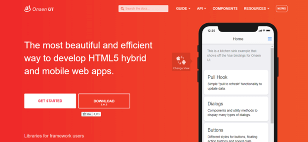
Image Source: [Onsen UI](https://onsen.io/)
[Onsen UI](https://onsen.io/)
is a mobile app development framework that works with Angular, Vue.js, and React. Since all the components are auto-styled based on the platform, the same source code can support both iOS and Android. The component library is completely CSS-based, with no JavaScript functionality.
Many popular React frameworks are compatible with Onsen UI. This tool comes with an interactive tutorial to help you get started.
### Features
- Simple to learn and use.
- Contains a number of ready-to-use UI components including tabs, toolbars, forms, sides menu, lists, stack navigation, and more.
- Also, you can build and package your apps with Onsen UI without installing or configuring the Android or iOS SDKs.
### Installation
You can easily install Onsen UI using NPM as follows:
```
npm i onsenui
```
### Usage
Use ES6 **imports** to specify the modules you want to use in the react-onsenui package as shown below:
```
import { Page, Toolbar, Button } from 'react-onsenui'; // Only import the necessary components
// import * as Ons from 'react-onsenui'; // Import everything and use it as 'Ons.Page', 'Ons.Button'
```
## Conclusion
In this article, I discussed 10 different React component libraries. Each of them has some unique features and can be used based on your requirements.
I hope my suggestions will help you choose the best React component library for your project. Thank you for reading.
If you have any questions or comments, you can contact us through our [support forums](https://www.syncfusion.com/forums)
, [support portal](https://support.syncfusion.com/)
, or [feedback portal](https://www.syncfusion.com/feedback/)
. We are always happy to assist you!
## Related blogs
- [Create Dynamic Forms in React Using React Hook Forms](https://www.syncfusion.com/blogs/post/create-dynamic-forms-in-react-using-react-hook-forms.aspx)
- [Everything You Should Know About React 18](https://www.syncfusion.com/blogs/post/everything-you-should-know-about-react-18.aspx)
- [Perform CRUD Operations in a React Data Grid Using Redux](https://www.syncfusion.com/blogs/post/how-to-perform-crud-operations-in-a-react-data-grid-using-redux-a-complete-guide.aspx)
- [Develop a Flight Tracker Application with React Gantt Chart](https://www.syncfusion.com/blogs/post/flight-tracker-application-with-react-gantt-chart.aspx)