---
title: "Visualize the Top 10 Countries Driving Renewable Energy Investments with Stunning React 3D Charts"
published_at: "2025-05-27T14:30:00+00:00"
modified_at: "2025-05-27T14:35:00+00:00"
url: "https://www.syncfusion.com/blogs/post/top-10-renewable-energy-react-3d-charts"
excerpt: "Discover how to visualize the top 10 countries in renewable energy investment with Syncfusion React 3D Column Chart, complete with code examples."
taxonomy_category:
- "Chart"
- "Data Visualization"
- "React"
- "Web Development"
- "Weekly Data Visualization"
taxonomy_post_tag:
- "3D"
- "Chart"
- "Data Visualization"
- "development"
- "React"
- "Web"
---
[Weekly Data Visualization](https://www.syncfusion.com/blogs/category/weekly-data-visualization)
# Visualize the Top 10 Countries Driving Renewable Energy Investments with Stunning React 3D Charts
[Soundeswari Selvam](https://www.syncfusion.com/blogs/author/soundeswari-selvam)
**TL;DR:** Learn to visualize the top 10 countries in renewable energy investment using Syncfusion’s React 3D Column Chart. Format your data into an array and bind it with Chart3DSeriesDirective. Customize axes, titles, labels, and tooltips for a clear, interactive data story. Ideal for presenting complex global energy trends with visual impact.
Welcome back to our latest installment of the ***Weekly data Visualization blog*** series!
In the dynamic field of data visualization, creating compelling and informative visuals is crucial. In this blog, we are excited to showcase Syncfusion’s dedicated [3D Chart control](https://www.syncfusion.com/react-components/react-3d-chart)
for React. This specialized tool offers a unique way to elevate your data presentations through immersive 3D visualizations. In this installment, we’ll demonstrate how to create a 3D Column Chart to illustrate the top 10 countries leading in renewable energy investment.
Let’s get started!
## Using Syncfusion® React 3D Charts to display global leaders in renewable energy investment
Syncfusion React 3D Charts are a powerful component that offers a more immersive and comprehensive way to understand data patterns. To get started with React 3D Charts, check out our [documentation](https://ej2.syncfusion.com/react/documentation/3d-chart/getting-started)
.
Follow the steps below to create a compelling [3D Column Chart](https://ej2.syncfusion.com/react/demos/#/tailwind3/three-dimension-chart/column)
using the **Syncfusion React Chart** control, showcasing the top 10 countries in the renewable energy sector.
## Step 1: Gather and analyze renewable energy investment data for global markets
Start by collecting accurate data from reputable sources to ensure the integrity of your visualization. For instance, [Energy Digital](https://energydigital.com/top10/top-10-countries-using-renewable-energy)
provides a comprehensive look at countries excelling in renewable energy usage. This foundational step is crucial as it underpins the accuracy and reliability of your entire chart.
## Step 2: Preparing data for the 3D Chart
After gathering the data, the next step is to organize it in a format that is suitable for creating visual representations. In this context
- The **country** property will be shown along the ** horizontal axis** to represent each country.
- The **percentage** property will be plotted on the ** vertical axis** to indicate the renewable energy usage percentages.
- Distinct colors will be used for each data point to improve visual differentiation.
Here’s a sample code snippet to prepare your data,
```
export let renewableEnergy: Object[] = [
{country: 'Iceland', percentage: 86.87, color: '#00A9D3'},
{country: 'Norway', percentage: 71.56, color: '#1E60A8'},
{country: 'Sweden', percentage: 50.92, color: '#A4D4A0'},
{country: 'Brazil', percentage: 46.22, color: '#FF7043'},
{country: 'New Zealand', percentage: 40.22, color: '#66BB6A'},
{country: 'Denmark', percentage: 39.25, color: '#FF6F61'},
{country: 'Austria', percentage: 37.48, color: '#F0F0F0'},
{country: 'Switzerland', percentage: 36.72, color: '#00B5E2'},
{country: 'Finland', percentage: 34.61, color: '#2F9E71'},
{country: 'Colombia', percentage: 33.02, color: '#FFEB3B'}
];
```
## Step 3: Binding the data to the Syncfusion® React Charts
Integrating data on the top 10 countries consuming renewable energy into a Syncfusion React Chart is straightforward using the [Chart3DSeriesDirective](https://www.syncfusion.com/blogs/post/investment-calculator-in-maui-toolkit)
. This directive allows you to bind the data source via the [dataSource](https://helpej2.syncfusion.com/react/documentation/api/chart3d/chart3DSeries/#datasource)
property, specify the **X** and ** Y** values using the [xName](https://helpej2.syncfusion.com/react/documentation/api/chart3d/chart3DSeries/#xname)
and [yName](https://helpej2.syncfusion.com/react/documentation/api/chart3d/chart3DSeries/#yname)
properties, and customize the chart’s appearance to suit your needs.
Here’s the complete code example for binding the data,
```
```
### Adding the title and subtitle for the chart
You can add a title and subtitle to the chart by using the [title](https://ej2.syncfusion.com/react/documentation/api/chart3d#title)
and [subTitle](https://ej2.syncfusion.com/react/documentation/api/chart3d#subtitle)
properties in the chart configuration.
Here’s an example code to add the title and subtitle,
```
```
### Customizing the axis labels
You can customize the axis labels by adjusting the font size and color using the [size](https://ej2.syncfusion.com/react/documentation/api/chart3d/chart3DTextFontModel/#size)
and [color](https://ej2.syncfusion.com/react/documentation/api/chart3d/chart3DTextFontModel/#color)
properties in the [labelStyle](https://ej2.syncfusion.com/react/documentation/api/chart3d/chart3DAxis/#labelstyle)
of the [primaryXAxis](https://ej2.syncfusion.com/react/documentation/api/chart3d#primaryxaxis)
and [primaryYAxis](https://ej2.syncfusion.com/react/documentation/api/chart3d#primaryyaxis)
. Additionally, the [labelFormat](https://ej2.syncfusion.com/react/documentation/api/chart3d/chart3DAxis/#labelformat)
property in the **primaryYAxis** allows you to define a custom format for the labels.
Refer to the following code for customizing the axis labels,
```
```
### Customizing the chart area
You can enable chart rotation by setting the [enableRotation](https://ej2.syncfusion.com/react/documentation/api/chart3d#enablerotation)
property to **true** in the chart configuration. You can define the rotation angle using the [rotation](https://ej2.syncfusion.com/react/documentation/api/chart3d#rotation)
property and adjust the slope angle for the 3D chart with the [tilt](https://ej2.syncfusion.com/react/documentation/api/chart3d#tilt)
property. Additionally, the depth of the 3D chart from the front view of the series to the background wall can be controlled using the [depth](https://ej2.syncfusion.com/react/documentation/api/chart3d#depth)
property.
Refer to the following code for customizing the chart area,
```
```
### Adding the data label
To display data labels in the chart, set the [visible](https://ej2.syncfusion.com/react/documentation/api/chart3d/chart3DDataLabelSettings/#visible)
property within the [dataLabel](https://ej2.syncfusion.com/react/documentation/api/chart3d/chart3DSeries/#datalabel)
settings of the chart series. To enable rendering of data labels, inject the **DataLabel3D** service into the chart. You can position the data labels at the top, bottom, or middle by configuring the [position](https://ej2.syncfusion.com/react/documentation/api/chart3d/chart3DDataLabelSettings/#position)
property. Additionally, you can customize the font style of the data labels using the [font](https://ej2.syncfusion.com/react/documentation/api/chart3d/chart3DDataLabelSettings/#font)
property within the **dataLabel** settings.
Refer to the following code to customize the data label,
```
<
```
### Adding the tooltip
To enable the tooltip in the chart, set the [enable](https://ej2.syncfusion.com/react/documentation/api/chart3d/chart3DTooltipSettingsModel/#enable)
property to **true** within the chart’s [tooltip](https://ej2.syncfusion.com/react/documentation/api/chart3d#tooltip)
settings. Ensure that the **Tooltip3D** service is injected into the chart’s services to render it. You can customize the tooltip’s appearance by setting the [fill](https://ej2.syncfusion.com/react/documentation/api/chart3d/chart3DTooltipSettingsModel/#fill)
property to specify the background color. Additionally, use the [format](https://ej2.syncfusion.com/react/documentation/api/chart3d/chart3DTooltipSettingsModel/#format)
property to define the tooltip’s content format.
Refer to the following code to add the tooltip,
```
${point.y}'
}}
```
With these enhancements, you can create a comprehensive and interactive visualization of the top 10 countries in renewable energy investment. This provides viewers with an engaging way to interpret complex data insights at a glance. The output will be displayed in the image below.
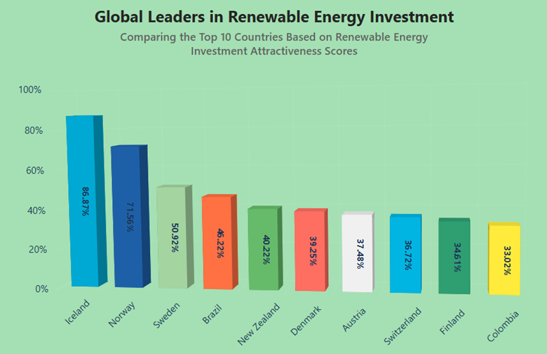
A React chart showing the top 10 countries for renewable energy investment
## Reference
For more information, refer to the [StackBlitz demo](https://stackblitz.com/edit/react-lxlpzsyn-gus9bdj2?file=index.js)
.
## Conclusion
Thank you for reading! In this article, we explored the top 10 countries leading in renewable energy investment using [Syncfusion React 3D Charts](https://www.syncfusion.com/react-components/react-3d-chart)
. By leveraging these charts, we enhanced the user experience and the clarity of these important data insights.
The new version of Essential Studio® is available for current customers from the [license and downloads page](https://www.syncfusion.com/account/downloads)
. If you are not a Syncfusion customer, try our 30-day [free trial](https://www.syncfusion.com/downloads)
to check out our newest features.
If you have queries, contact us through our [support forums](https://www.syncfusion.com/forums)
, [support portal](https://support.syncfusion.com/)
, or [feedback portal](https://www.syncfusion.com/feedback/)
. We are always happy to assist you. Happy coding!
## Related Blogs
[Real-Time Data Visualization in React using WebSockets and Charts](https://www.syncfusion.com/blogs/post/view-real-time-data-using-websocket)
[Top 5 React Stock Chart Libraries for 2026](https://www.syncfusion.com/blogs/post/top-5-react-stock-charts-in-2026)
[React UI Kit: Speed Up Development With Customizable UI Blocks](https://www.syncfusion.com/blogs/post/syncfusion-essential-ui-kit-for-react)
[React vs. Next.js: Choosing the Right Framework](https://www.syncfusion.com/blogs/post/react-vs-nextjs)