
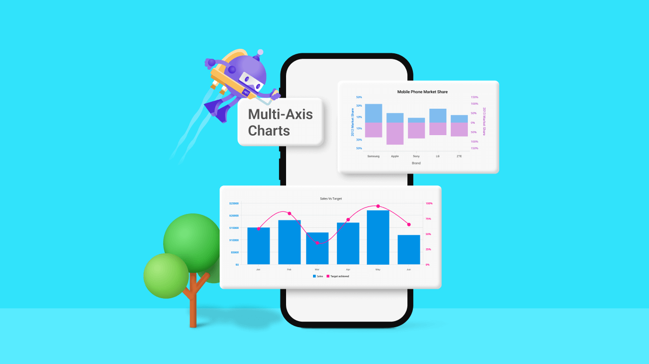
In today’s data-driven world, tracking multiple key metrics is crucial to understanding the relationships and trends in data.
That is where the Syncfusion .NET MAUI Cartesian Charts control’s multi-axis support comes in handy. This feature lets you easily track two or more metrics on separate axes and provides a more comprehensive view of your data.
How to visualize data in .NET MAUI Cartesian Charts
Please refer to the getting started with .NET MAUI Cartesian Charts documentation to see how to create charts with data, titles, data labels, legends, and tooltips. This step-by-step tutorial will walk you through setting up and customizing your chart to meet your needs.
Creating a multiple-axis chart in .NET MAUI
With the ability to specify the x-axis and y-axis for each series in the Cartesian Charts control, you can easily create customized visualizations that meet your specific needs.
Follow these steps to create a multi-axes chart in your .NET MAUI application:
Step 1: First, create XAxes and YAxes collections based on your data types. These axes can be arranged in a stacking order or side-by-side pattern.
Then, add the Name field in the y-axis for their identity.
<Chart:SfCartesianChart.YAxes>
   <Chart:NumericalAxis Name="yAxis1" />
   <Chart:NumericalAxis Name="yAxis2" />
   <Chart:NumericalAxis Name="yAxis3" />
</Chart:SfCartesianChart.YAxes>
Step 2: Next, add the necessary data series collection to the XBindingPath, YBindingPath, and ItemsSource attributes.
By default, the 0th index value of XAxes and YAxes is used to plot all the data series.
<Chart:SplineAreaSeries Label="Revenue"
                        Fill="#0091E6"
                        Opacity="0.5"
                        ItemsSource="{Binding SalesData2}"
                        XBindingPath="Month"
                        YBindingPath="Revenue" />
<Chart:SplineSeries Label="Profit"
                    ItemsSource="{Binding SalesData2}"
                    XBindingPath="Month"
                    YBindingPath="Profit" />
<Chart:SplineSeries Label="Expenses"
                    ItemsSource="{Binding SalesData2}"
                    XBindingPath="Month"
                    YBindingPath="Expenses"/>
Step 3: Add the XAxisName or YAxisName in the series for its data range representation.
<Chart:SplineAreaSeries Label="Revenue"
                        Fill="#0091E6"
                        Opacity="0.5"
                        ItemsSource="{Binding SalesData2}"
                        XBindingPath="Month"
                        YBindingPath="Revenue" />
<Chart:SplineSeries Label="Profit"
                    ItemsSource="{Binding SalesData2}"
                    XBindingPath="Month"
                    YBindingPath="Profit"
                    YAxisName="yAxis2" />
<Chart:SplineSeries Label="Expenses"
                    ItemsSource="{Binding SalesData2}"
                    XBindingPath="Month"
                    YBindingPath="Expenses"
                    YAxisName="yAxis3" />
Note: Using our axis crossing feature, you can place an axis in the opposite position.
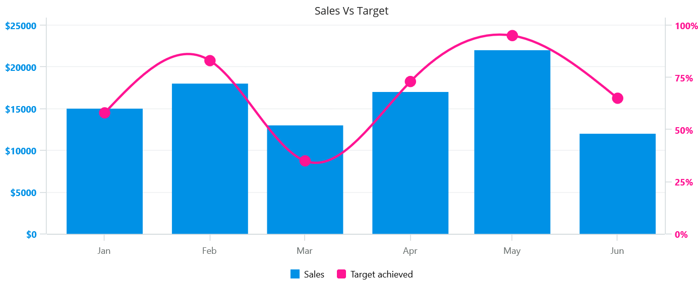
We are going to create a multi-axis combination chart to visualize the data for sales vs. target data.
<Chart:SfCartesianChart>
 <Chart:SfCartesianChart.Legend>
  <Chart:ChartLegend Placement="Bottom"/>
 </Chart:SfCartesianChart.Legend>
 <Chart:SfCartesianChart.Title>
  <Label Text="Sales Vs Target" HorizontalTextAlignment="Center" />
 </Chart:SfCartesianChart.Title>
 <Chart:SfCartesianChart.XAxes>
  <Chart:DateTimeAxis Interval="1"
                      Name="primaryX"
                      IntervalType="Months"
                      Minimum="2021-12-15"
                      Maximum="2022-06-15"
                      ShowMajorGridLines="False"
                      RangePadding="Additional" >
    <Chart:DateTimeAxis.LabelStyle>
     <Chart:ChartAxisLabelStyle  LabelFormat="MMM"
                                TextColor="#6d7372"
                                FontSize="12"/>
    </Chart:DateTimeAxis.LabelStyle>
  </Chart:DateTimeAxis>
 </Chart:SfCartesianChart.XAxes>
 <Chart:SfCartesianChart.YAxes>
  <Chart:NumericalAxis  Name="primaryY"
                        EdgeLabelsVisibilityMode="Visible"
                        Minimum="0"
                        Maximum="25000"
                        Interval="5000"
                        PlotOffsetEnd="10"
                        EdgeLabelsDrawingMode="Center">
   <Chart:NumericalAxis.LabelStyle>
    <Chart:ChartAxisLabelStyle TextColor="#0091E6"
                               FontSize="12"
                               FontAttributes="Bold"
                               LabelFormat="$0.#"/>
   </Chart:NumericalAxis.LabelStyle>
  </Chart:NumericalAxis>
  <Chart:NumericalAxis CrossesAt="{Static x:Double.MaxValue}"
                       ShowMajorGridLines="False"
                       RenderNextToCrossingValue="True"
                       Name="secondaryY"
                       Interval="25"
                       Minimum="0"
                       Maximum="100"
                       EdgeLabelsDrawingMode="Center"
                       PlotOffsetEnd="10">
    <Chart:NumericalAxis.LabelStyle>
     <Chart:ChartAxisLabelStyle TextColor="#ff1493"
                                FontSize="12"
                                FontAttributes="Bold"
                                LabelFormat="0.#'%'"/>
    </Chart:NumericalAxis.LabelStyle>
  </Chart:NumericalAxis>
 </Chart:SfCartesianChart.YAxes>

 <Chart:ColumnSeries Label="Sales"
                     Fill="#0091E6"
                     x:Name="series"
                     LegendIcon="Rectangle"
                     ItemsSource="{Binding Data}"
                     XBindingPath="Month"
                     YBindingPath="Sales"
                     YAxisName="primaryY"/>
 <Chart:SplineSeries Label="Target achieved"
                     Fill="#ff1493"
                     LegendIcon="HorizontalLine"
                     ItemsSource="{Binding Data}"
                     XBindingPath="Month"
                     YBindingPath="Target"
                     StrokeWidth="3"
                     YAxisName="secondaryY"
                     ShowMarkers="True">
   <Chart:SplineSeries.MarkerSettings>
    <Chart:ChartMarkerSettings Height="15" Width="15"/>
   </Chart:SplineSeries.MarkerSettings>
 </Chart:SplineSeries>
</Chart:SfCartesianChart>
Refer to the following image.
Different types of multi-axis charts
The .NET MAUI Cartesian Charts control contains a rich gallery of 10+ charts and graphs that cater to all charting scenarios. Of them, the following are the charts that provide multiple-axis support:
Let’s take a look at each of these.
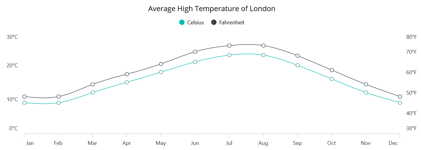
Spline Chart
The support for multiple axes in the spline chart allows you to compare two distinct metrics over a period of time without creating additional graphs.
Refer to the following code example. In it, we compare temperature data in two different units (Celsius and Fahrenheit).
<Chart:SfCartesianChart>

 <Chart:SfCartesianChart.BindingContext>
  <local:TemperatureDetails />
 </Chart:SfCartesianChart.BindingContext>

 <Chart:SfCartesianChart.Legend>
  <Chart:ChartLegend ToggleSeriesVisibility="True"/>
 </Chart:SfCartesianChart.Legend>

 <Chart:SfCartesianChart.Title>
  <Label Text="Average High Temperature of London"
         Margin="0"
         HorizontalOptions="Fill"
         HorizontalTextAlignment="Center"
         VerticalOptions="Center"
         FontSize="16"
         TextColor="Black"/>
 </Chart:SfCartesianChart.Title>

 <Chart:SfCartesianChart.XAxes>
  <Chart:CategoryAxis ShowMajorGridLines="false"
                      PlotOffsetStart="10"
                      PlotOffsetEnd="10"
                      AxisLineOffset="10">
  </Chart:CategoryAxis>
 </Chart:SfCartesianChart.XAxes>

 <Chart:SfCartesianChart.YAxes>
  <Chart:NumericalAxis x:Name="yAxis1"
                       Maximum="30"
                       Minimum="0"
                       Interval="10"
                       ShowMajorGridLines="False">
   <Chart:NumericalAxis.AxisLineStyle>
    <Chart:ChartLineStyle StrokeWidth="0">
    </Chart:ChartLineStyle>
   </Chart:NumericalAxis.AxisLineStyle>
   <Chart:NumericalAxis.MajorTickStyle>
    <Chart:ChartAxisTickStyle TickSize="0" />
   </Chart:NumericalAxis.MajorTickStyle>
   <Chart:NumericalAxis.LabelStyle>
    <Chart:ChartAxisLabelStyle LabelFormat="0'°C" />
   </Chart:NumericalAxis.LabelStyle>
  </Chart:NumericalAxis>
  <Chart:NumericalAxis Name="yAxis2"
                       Maximum="80"
                       Minimum="30"
                       Interval="10"
                       CrossesAt="{Static x:Double.MaxValue}"
                       ShowMajorGridLines="False"
                       RenderNextToCrossingValue="True">
   <Chart:NumericalAxis.AxisLineStyle>
    <Chart:ChartLineStyle StrokeWidth="0"/>
   </Chart:NumericalAxis.AxisLineStyle>
   <Chart:NumericalAxis.MajorTickStyle>
    <Chart:ChartAxisTickStyle TickSize="0" />
   </Chart:NumericalAxis.MajorTickStyle>
   <Chart:NumericalAxis.LabelStyle>
    <Chart:ChartAxisLabelStyle LabelFormat="0'°F" />
   </Chart:NumericalAxis.LabelStyle>
  </Chart:NumericalAxis>
 </Chart:SfCartesianChart.YAxes>

 <Chart:SplineSeries Label="Celsius"
                     ItemsSource="{Binding TemperatureData}"
                     XBindingPath="Month"
                     YBindingPath="Celsius"
                     ShowMarkers="True">
  <Chart:SplineSeries.MarkerSettings>
   <Chart:ChartMarkerSettings Width="8"
                              Height="8"
                              Fill="White"
                              Stroke="#48988B"
                              StrokeWidth="1"/>
  </Chart:SplineSeries.MarkerSettings>
 </Chart:SplineSeries>
 <Chart:SplineSeries Label="Fahrenheit"
                     ItemsSource="{Binding TemperatureData}"
                     XBindingPath="Month"
                     YBindingPath="Fahrenheit"
                     StrokeWidth="1"
                     ShowMarkers="True"
                     YAxisName="yAxis2">
  <Chart:SplineSeries.MarkerSettings>
   <Chart:ChartMarkerSettings Width="8"
                              Height="8"
                              Fill="White"
                              Stroke="#314A6E"
                              StrokeWidth="1"/>
  </Chart:SplineSeries.MarkerSettings>
 </Chart:SplineSeries>

</Chart:SfCartesianChart>
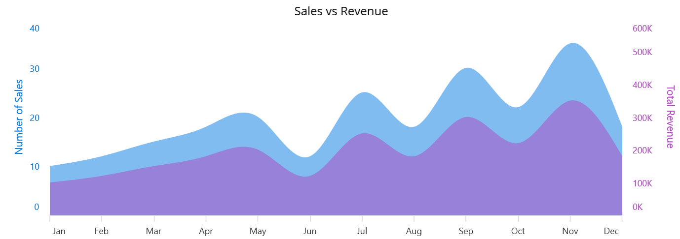
Area Chart
A multi-axis area chart can be used to illustrate the correlation between two different data sets over a period of time. This chart type can provide valuable insights into the relationship between two data series.
Refer to the following code example. In it, we compare sales and revenue data over a period of time.
<chart:SfCartesianChart >
 <chart:SfCartesianChart.XAxes>
  <chart:CategoryAxis>
  </chart:CategoryAxis>
 </chart:SfCartesianChart.XAxes>
 <chart:SfCartesianChart.YAxes>
  <chart:NumericalAxis x:Name="yAxis1"
                       Maximum="40"
                       Minimum="0"
                       Interval="10">
  </chart:NumericalAxis>
  <chart:NumericalAxis Name="yAxis2"
                       Maximum="600"
                       Minimum="0"
                       Interval="100"
                       CrossesAt="{Static x:Double.MaxValue}"
                       ShowMajorGridLines="False"
                       RenderNextToCrossingValue="True" >
  </chart:NumericalAxis>
 </chart:SfCartesianChart.YAxes>
 <chart:SfCartesianChart.Series>
  <chart:SplineAreaSeries ItemsSource="{Binding SalesData}"
                          XBindingPath="Month"
                          Fill="#0078DE"
                          YBindingPath="SalesCount"
                          Opacity="0.5" />

  <chart:SplineAreaSeries ItemsSource="{Binding SalesData}"
                          XBindingPath="Month"
                          Fill="#B146C2"
                          YBindingPath="Revenue"
                          YAxisName="yAxis2"
                          Opacity="0.5"/>


 </chart:SfCartesianChart.Series>
</chart:SfCartesianChart>
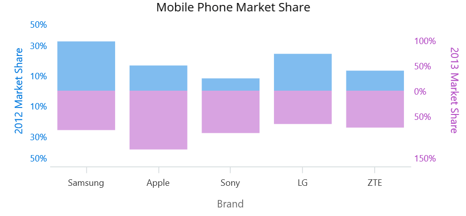
Column Chart
In a column chart with multi-axis support, two or more columns of data are placed one over the other, and each column has a vertical axis. The purpose of using multiple axes is to compare data sets with different scales or measurement units.
Refer to the following code example. In it, we compare a mobile phone manufacturing company’s market share details for two different years.
<Chart:SfCartesianChart EnableSideBySideSeriesPlacement="False" >
 <Chart:SfCartesianChart.BindingContext>
  <local:SalesDetails/>
 </Chart:SfCartesianChart.BindingContext>

 <Chart:SfCartesianChart.Title>
  <Label Text="Mobile Phone Market Share"
         HorizontalOptions="Fill"
         HorizontalTextAlignment="Center"
         VerticalOptions="Center"
         FontSize="16"
         TextColor="Black"/>
 </Chart:SfCartesianChart.Title>

 <Chart:SfCartesianChart.XAxes>
  <Chart:CategoryAxis  Name="xAxis1" ShowMajorGridLines="False">
   <Chart:CategoryAxis.Title>
    <Chart:ChartAxisTitle Text="Brand"/>
   </Chart:CategoryAxis.Title>
  </Chart:CategoryAxis>
 </Chart:SfCartesianChart.XAxes>

 <Chart:SfCartesianChart.YAxes>
  <Chart:NumericalAxis Name="yAxis1"
                       Maximum="50"
                       Minimum="-50"
                       ShowMajorGridLines="False"
                       LabelCreated="yAxis1_LabelCreated">
   <Chart:NumericalAxis.Title>
    <Chart:ChartAxisTitle Text="2012 Market Share"
                          TextColor="#0078DE"/>
   </Chart:NumericalAxis.Title>
   <Chart:NumericalAxis.AxisLineStyle>
    <Chart:ChartLineStyle Stroke="#0078DE" StrokeWidth="0"/>
   </Chart:NumericalAxis.AxisLineStyle>
   <Chart:NumericalAxis.MajorTickStyle>
    <Chart:ChartAxisTickStyle TickSize="0"/>
   </Chart:NumericalAxis.MajorTickStyle>
   <Chart:NumericalAxis.LabelStyle>
    <Chart:ChartAxisLabelStyle TextColor="#0078DE"/>
   </Chart:NumericalAxis.LabelStyle>
  </Chart:NumericalAxis>
  <Chart:NumericalAxis Name="yAxis2"
                       Maximum="150"
                       Minimum="-150"
                       ShowMajorGridLines="False"
                       CrossesAt="{Static x:Double.MaxValue}"
                       RenderNextToCrossingValue="True"
                       LabelCreated="yAxis1_LabelCreated">
   <Chart:NumericalAxis.Title>
    <Chart:ChartAxisTitle Text="2013 Market Share"
                          TextColor="#B146C2"/>
   </Chart:NumericalAxis.Title>
   <Chart:NumericalAxis.AxisLineStyle>
     <Chart:ChartLineStyle Stroke="#B146C2" StrokeWidth="0"/>
   </Chart:NumericalAxis.AxisLineStyle>
   <Chart:NumericalAxis.MajorTickStyle>
     <Chart:ChartAxisTickStyle TickSize="0"/>
   </Chart:NumericalAxis.MajorTickStyle>
   <Chart:NumericalAxis.LabelStyle>
     <Chart:ChartAxisLabelStyle TextColor="#B146C2"/>
   </Chart:NumericalAxis.LabelStyle>
  </Chart:NumericalAxis>
 </Chart:SfCartesianChart.YAxes>

 <Chart:ColumnSeries ItemsSource="{Binding SalesCollection1}"
                     XBindingPath="Category"
                     Fill="#0078DE"
                     YBindingPath="MarketShare"
                     Opacity="0.5" />

 <Chart:ColumnSeries ItemsSource="{Binding SalesCollection2}"
                     XBindingPath="Category"
                     Fill="#B146C2"
                     YBindingPath="MarketShare"
                     Opacity="0.5"
                     YAxisName="yAxis2"/>

</Chart:SfCartesianChart>
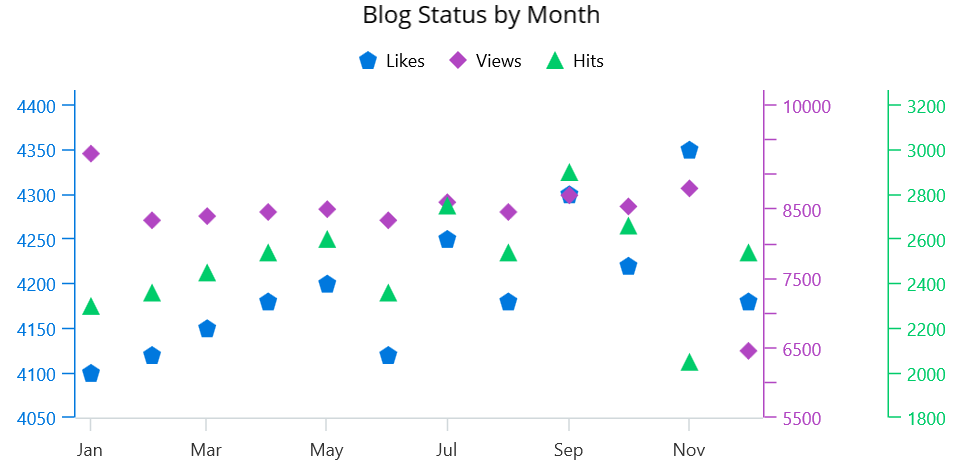
Scatter Chart
A scatter chart with multiple axes displays data points as a collection of points on a graph with two or more axes. Each data point is represented by a symbol or marker plotted at a specific location based on the data values.
Refer to the following code example. In it, we use the .NET MAUI scatter chart with multiple y-axes to compare monthly hits, views, and likes for a blog.
<Chart:SfCartesianChart>
 <Chart:SfCartesianChart.BindingContext>
  <local:BlogDetails/>
 </Chart:SfCartesianChart.BindingContext>
 <Chart:SfCartesianChart.Title>
  <Label Text="Blog Status by Month"
         HorizontalOptions="Fill"
         HorizontalTextAlignment="Center"
         VerticalOptions="Center"
         FontSize="16"
         TextColor="Black"/>
 </Chart:SfCartesianChart.Title>
 <Chart:SfCartesianChart.XAxes>
  <Chart:DateTimeAxis  Name="xAxis1" ShowMajorGridLines="False"
                       PlotOffsetStart="10"
                       PlotOffsetEnd="10"
                       EdgeLabelsDrawingMode="Center">
    <Chart:DateTimeAxis.LabelStyle>
     <Chart:ChartAxisLabelStyle LabelFormat="MMM"/>
    </Chart:DateTimeAxis.LabelStyle>
  </Chart:DateTimeAxis>
 </Chart:SfCartesianChart.XAxes>
 <Chart:SfCartesianChart.YAxes>
   <Chart:NumericalAxis Name="yAxis1" RangePadding="Additional"
                        ShowMajorGridLines="False"
                        EdgeLabelsDrawingMode="Center"
                        EdgeLabelsVisibilityMode="Visible"
                        PlotOffsetEnd="10">
    <Chart:NumericalAxis.AxisLineStyle>
     <Chart:ChartLineStyle Stroke="#0078DE"/>
    </Chart:NumericalAxis.AxisLineStyle>
    <Chart:NumericalAxis.MajorTickStyle>
     <Chart:ChartAxisTickStyle Stroke="#0078DE"/>
    </Chart:NumericalAxis.MajorTickStyle>
    <Chart:NumericalAxis.LabelStyle>
     <Chart:ChartAxisLabelStyle TextColor="#0078DE"/>
    </Chart:NumericalAxis.LabelStyle>
   </Chart:NumericalAxis>
   <Chart:NumericalAxis Name="yAxis2" RangePadding="Additional"
                        ShowMajorGridLines="False"
                        CrossesAt="{Static x:Double.MaxValue}"
                        RenderNextToCrossingValue="True"
                        EdgeLabelsDrawingMode="Center"
                        EdgeLabelsVisibilityMode="Visible"
                        PlotOffsetEnd="10">
    <Chart:NumericalAxis.Title>
     <Chart:ChartAxisTitle Text=" "/>
    </Chart:NumericalAxis.Title>
    <Chart:NumericalAxis.AxisLineStyle>
     <Chart:ChartLineStyle Stroke="#B146C2"/>
    </Chart:NumericalAxis.AxisLineStyle>
    <Chart:NumericalAxis.MajorTickStyle>
     <Chart:ChartAxisTickStyle Stroke="#B146C2"/>
    </Chart:NumericalAxis.MajorTickStyle>
    <Chart:NumericalAxis.LabelStyle>
     <Chart:ChartAxisLabelStyle TextColor="#B146C2"/>
    </Chart:NumericalAxis.LabelStyle>
   </Chart:NumericalAxis>
   <Chart:NumericalAxis Name="yAxis3" RangePadding="Additional"
                        ShowMajorGridLines="False"
                        CrossesAt="{Static x:Double.MaxValue}"
                        RenderNextToCrossingValue="True"
                        EdgeLabelsDrawingMode="Center"
                        EdgeLabelsVisibilityMode="Visible"
                        PlotOffsetEnd="10">
    <Chart:NumericalAxis.AxisLineStyle>
     <Chart:ChartLineStyle Stroke="#00CC6A"/>
    </Chart:NumericalAxis.AxisLineStyle>
    <Chart:NumericalAxis.MajorTickStyle>
     <Chart:ChartAxisTickStyle Stroke="#00CC6A"/>
    </Chart:NumericalAxis.MajorTickStyle>
    <Chart:NumericalAxis.LabelStyle>
     <Chart:ChartAxisLabelStyle TextColor="#00CC6A"/>
    </Chart:NumericalAxis.LabelStyle>
   </Chart:NumericalAxis>
  </Chart:SfCartesianChart.YAxes>
  <Chart:SfCartesianChart.Legend>
   <Chart:ChartLegend/>
  </Chart:SfCartesianChart.Legend>
  <Chart:ScatterSeries Label="Likes"
                       ItemsSource="{Binding BlogData}"
                       XBindingPath="DateTime"
                       Fill="#0078DE"
                       PointHeight="12" PointWidth="12"
                       YBindingPath="Likes"
                       Type="Pentagon"
                       LegendIcon="Pentagon"/>

  <Chart:ScatterSeries Label="Views"
                       ItemsSource="{Binding BlogData}"
                       XBindingPath="DateTime"
                       Fill="#B146C2"
                       YBindingPath="Views"
                       PointHeight="12"
                       PointWidth="12"
                       YAxisName="yAxis2"
                       Type="Diamond"
                       LegendIcon="Diamond"/>

  <Chart:ScatterSeries Label="Hits"
                       ItemsSource="{Binding BlogData}"
                       XBindingPath="DateTime"
                       Fill="#00CC6A"
                       YBindingPath="Hits"
                       PointHeight="12"
                       PointWidth="12"
                       YAxisName="yAxis3"
                       Type="Triangle"
                       LegendIcon="Triangle"/>

</Chart:SfCartesianChart>
Combination chart
A combination chart with multiple axes can effectively display two different data sets (e.g., revenue and profit) on the same chart.
In this demo, we’ll create a combination chart with the spline (using the primary y-axis) and area (using the secondary y-axis) charts and visualize data for a monthly financial analysis with multiple axes.
<Chart:SfCartesianChart EnableSideBySideSeriesPlacement="True">

 <Chart:SfCartesianChart.BindingContext>
  <local:SalesDetails/>
 </Chart:SfCartesianChart.BindingContext>

 <Chart:SfCartesianChart.Legend>
  <Chart:ChartLegend Placement="Top"/>
 </Chart:SfCartesianChart.Legend>

 <Chart:SfCartesianChart.Title>
  <Label Text="Monthly finance analysis" HorizontalOptions="Center"/>
 </Chart:SfCartesianChart.Title>

 <Chart:SfCartesianChart.XAxes>
  <Chart:CategoryAxis ShowMajorGridLines="False"/>
 </Chart:SfCartesianChart.XAxes>

 <Chart:SfCartesianChart.YAxes>
  <Chart:NumericalAxis Name="yAxis1"
                       ShowMajorGridLines="False"
                       EdgeLabelsDrawingMode="Center"
                       EdgeLabelsVisibilityMode="Visible"
                       PlotOffsetEnd="10">
   <Chart:NumericalAxis.AxisLineStyle>
    <Chart:ChartLineStyle Stroke="#0078DE"/>
   </Chart:NumericalAxis.AxisLineStyle>
   <Chart:NumericalAxis.MajorTickStyle>
    <Chart:ChartAxisTickStyle Stroke="#0078DE"/>
   </Chart:NumericalAxis.MajorTickStyle>
   <Chart:NumericalAxis.LabelStyle>
    <Chart:ChartAxisLabelStyle TextColor="#0078DE"
                               LabelFormat="$0.#"/>
   </Chart:NumericalAxis.LabelStyle>
  </Chart:NumericalAxis>
  <Chart:NumericalAxis Name="yAxis2"
                       RangePadding="Additional"
                       ShowMajorGridLines="False"
                       EdgeLabelsDrawingMode="Center"
                       EdgeLabelsVisibilityMode="Visible"
                       PlotOffsetEnd="10">
   <Chart:NumericalAxis.Title>
    <Chart:ChartAxisTitle Text=" "/>
   </Chart:NumericalAxis.Title>
   <Chart:NumericalAxis.AxisLineStyle>
    <Chart:ChartLineStyle Stroke="#B146C2"/>
   </Chart:NumericalAxis.AxisLineStyle>
   <Chart:NumericalAxis.MajorTickStyle>
    <Chart:ChartAxisTickStyle Stroke="#B146C2"/>
   </Chart:NumericalAxis.MajorTickStyle>
   <Chart:NumericalAxis.LabelStyle>
    <Chart:ChartAxisLabelStyle TextColor="#B146C2"
                               LabelFormat="$0.#"/>
   </Chart:NumericalAxis.LabelStyle>
  </Chart:NumericalAxis>
  <Chart:NumericalAxis Name="yAxis3"
                       RangePadding="Additional"
                       ShowMajorGridLines="False"
                       CrossesAt="{Static x:Double.MaxValue}"
                       RenderNextToCrossingValue="True"
                       EdgeLabelsDrawingMode="Center"
                       EdgeLabelsVisibilityMode="Visible"
                       PlotOffsetEnd="10">
   <Chart:NumericalAxis.AxisLineStyle>
    <Chart:ChartLineStyle Stroke="#00CC6A"/>
   </Chart:NumericalAxis.AxisLineStyle>
   <Chart:NumericalAxis.MajorTickStyle>
    <Chart:ChartAxisTickStyle Stroke="#00CC6A"/>
   </Chart:NumericalAxis.MajorTickStyle>
   <Chart:NumericalAxis.LabelStyle>
    <Chart:ChartAxisLabelStyle TextColor="#00CC6A"
                               LabelFormat="$0.#"/>
   </Chart:NumericalAxis.LabelStyle>
  </Chart:NumericalAxis>
  <Chart:NumericalAxis Name="yAxis4"
                       RangePadding="Additional"
                       ShowMajorGridLines="False"
                       CrossesAt="{Static x:Double.MaxValue}"
                       RenderNextToCrossingValue="True"
                       EdgeLabelsDrawingMode="Center"
                       EdgeLabelsVisibilityMode="Visible"
                       PlotOffsetEnd="10">
   <Chart:NumericalAxis.AxisLineStyle>
    <Chart:ChartLineStyle Stroke="#FFB900"/>
   </Chart:NumericalAxis.AxisLineStyle>
   <Chart:NumericalAxis.MajorTickStyle>
    <Chart:ChartAxisTickStyle Stroke="#FFB900"/>
   </Chart:NumericalAxis.MajorTickStyle>
   <Chart:NumericalAxis.LabelStyle>
    <Chart:ChartAxisLabelStyle TextColor="#FFB900"
                               LabelFormat="$0.#"/>
   </Chart:NumericalAxis.LabelStyle>
  </Chart:NumericalAxis>
 </Chart:SfCartesianChart.YAxes>

 <Chart:SplineAreaSeries Label="Revenue"
                         Fill="#0091E6"
                         Opacity="0.5"
                         ItemsSource="{Binding SalesData2}"
                         XBindingPath="Month"
                         YBindingPath="Revenue"
                         LegendIcon="Pentagon"/>
 <Chart:SplineSeries Label="Profit"
                     ItemsSource="{Binding SalesData2}"
                     XBindingPath="Month"
                     YBindingPath="Profit"
                     Fill="#B146C2"
                     YAxisName="yAxis2"
                     ShowMarkers="True"
                     LegendIcon="HorizontalLine"
                     StrokeWidth="2"/>
 <Chart:SplineSeries Label="Expenses"
                     ItemsSource="{Binding SalesData2}"
                     XBindingPath="Month"
                     YBindingPath="Expenses"
                     Fill="#00CC6A"
                     YAxisName="yAxis3"
                     ShowMarkers="True"
                     LegendIcon="HorizontalLine"
                     StrokeWidth="2"/>
 <Chart:SplineSeries Label="CashFlow"
                     ItemsSource="{Binding SalesData2}"
                     XBindingPath="Month"
                     YBindingPath="CashFlow"
                     Fill="#FFB900"
                     YAxisName="yAxis4"
                     ShowMarkers="True"
                     LegendIcon="HorizontalLine"
                     StrokeWidth="2"/>

</Chart:SfCartesianChart>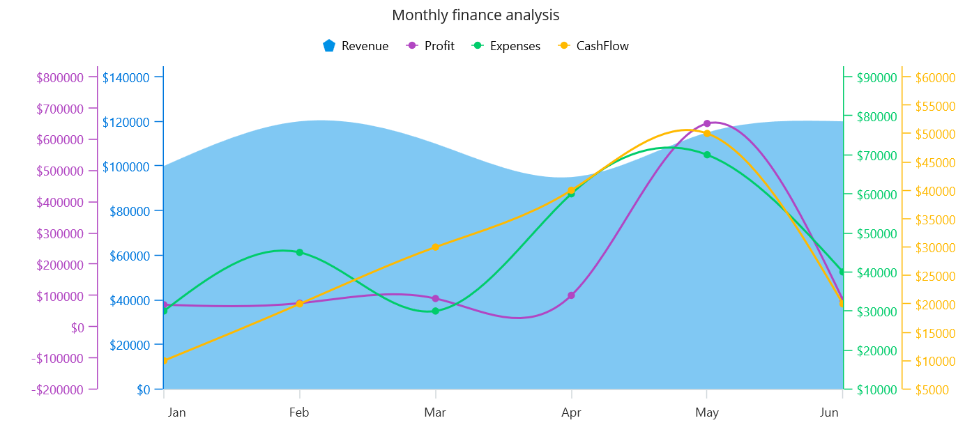
Note: For more details, refer to the axis crossing feature in the .NET MAUI charts documentation.
GitHub reference
Check out the .NET MAUI multi-axis charts demos on GitHub.
Conclusion
Thanks for reading! I hope you enjoyed learning about the multi-axis support in our .NET MAUI Cartesian Charts. This control also supports animation, legends, data labels, and more features. Try them out and leave your feedback in the comments section below!
The new version of Essential Studio® is available for current customers from the License and Downloads page. If you are not a Syncfusion customer, try our 30-day free trial to check out our newest features.
For questions, you can contact us through our support forums, support portal, or feedback portal. We are always happy to assist you!


