---
title: "Build a Profile Picture Editor in .NET MAUI with the Image Editor"
published_at: "2026-03-09T15:39:40+00:00"
modified_at: "2026-03-09T15:39:42+00:00"
url: "https://www.syncfusion.com/blogs/post/profile-picture-editor-maui"
excerpt: "Build a smooth, customizable profile picture editor using the .NET MAUI Image Editor with cropping, reset, and save workflows for a polished cross-platform UX."
taxonomy_category:
- ".NET MAUI"
- ".NET MAUI image editor"
- "Image editor"
- "Image Processing"
- "Mobile Development"
taxonomy_post_tag:
- ".NET MAUI"
- "Image Editor"
- "Mobile Development"
- "XAML"
---
# Build a Profile Picture Editor in .NET MAUI with the Image Editor
[Karthick Mani](https://www.syncfusion.com/blogs/author/karthick-mani)
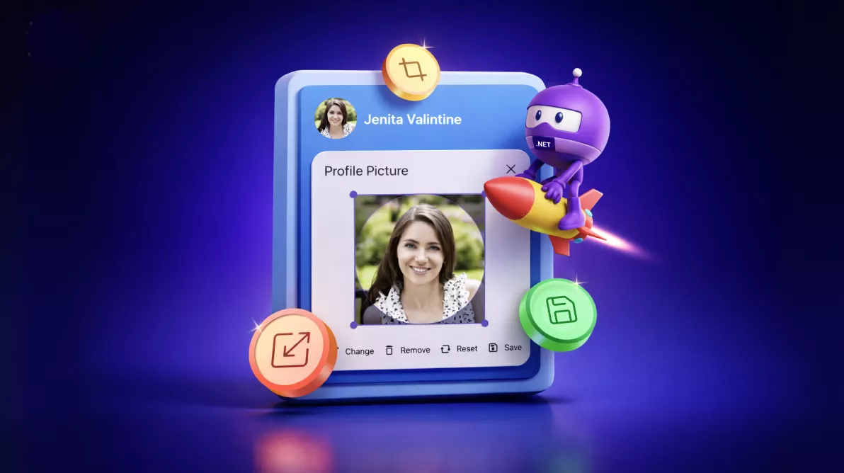
**TL;DR:** Looking to offer a clean, customizable profile image editing experience in your MAUI app? Create a cross-platform profile image editor in .NET MAUI with the Image Editor control, integrating a custom popup layout, chip toolbar commands, circular cropping, reset logic, and efficient state management.
Profile photos look simple until you build the editing flow: pick an image, enforce a circle crop, support reset/remove, and save reliably across Android, iOS, Windows, and macOS.
This tutorial shows how to build a beginner-friendly **.NET MAUI profile image editor** using the [Syncfusion® .NET MAUI Image Editor](https://www.syncfusion.com/maui-controls/maui-image-editor)
control. You’ll create a circular avatar with an edit badge that opens a popup editor, then drive the experience with a small custom chip toolbar (Change/Remove/Reset/Save).
**What you’ll build**
- A circular avatar that displays the current profile image.
- An edit badge (pencil) overlay to launch editing.
- A popup editor with the image loaded and ready to crop.
- A minimal action bar: Change, Remove, Reset, Save.
- A saved result that updates the avatar after editing.
## Why use Syncfusion Image Editor in .NET MAUI?
The **Syncfusion Image Editor** supports common editing actions you need for profile photos:
- Cropping, rotating, flipping, and resizing.
- Drawing and annotation tools.
- Text overlay and shape insertion.
- Undo/redo and zooming.
- Saving edited images in multiple formats.
Combined with .NET MAUI, you get a consistent cross-platform editing experience with one codebase.
## Setting up the Syncfusion Image Editor in .NET MAUI
Let’s create a profile editor using the Syncfusion .NET MAUI ImageEditor control. This implementation intentionally avoids the Image Editor’s built-in toolbar and uses a custom chip toolbar instead.
**Flow:**
1. Show the current profile image in an SfAvatarView.
2. Tap the edit badge to open an SfPopup.
3. Load the image into SfImageEditor with ShowToolbar=”False”.
4. Use a chip group to trigger actions:
- **Change**: pick a new photo and load it into the editor.
- **Remove**: swap to a default avatar image and close the popup.
- **Reset**: cancel edits/reset and re-apply circle crop.
- **Save**: commit edits and save.
### Prerequisites
- A .NET MAUI app (Android/iOS/Windows/Mac Catalyst).
- Syncfusion .NET MAUI controls installed and configured.
For setup, follow the Syncfusion .NET MAUI Image Editor getting started [documentation](https://help.syncfusion.com/maui/imageeditor/getting-started)
.
### Step 1: Create an Avatar View
Start by displaying the user’s profile photo with the [Syncfusion .NET MAUI Avatar View](https://www.syncfusion.com/maui-controls/maui-avatarview)
, using platform-specific dimensions to maintain consistent sizing across Android, iOS, Windows, and Mac Catalyst. The avatar remains centered within the layout and uses a circular shape with a subtle stroke for a polished appearance.
Here’s how you can do it in code:
XAML
```
```
### Step 2: Add an edit badge overlay (opens the editor)
A small circular [Syncfusion .NET MAUI Chip](https://www.syncfusion.com/maui-controls/maui-chips)
control with a pencil icon is positioned at the bottom‑right corner of the avatar. This chip includes basic hover and press states and triggers a method that opens the profile image editor popup.
Try this in your code:
XAML
```
```
### Step 3: Place the image editor inside a popup
We use [Syncfusion .NET MAUI Popup](https://www.syncfusion.com/maui-controls/maui-popup)
control to display the profile editor. The popup includes a header, the ImageEditor control as its main content, and a custom chip-based toolbar in the footer.
Below is the code you need:
XAML
```
```
### Step 4: Add a chip-based footer toolbar
Add an `SfChipGroup` to the popup footer with four actions such as **Change**, ** Remove**, ** Reset**, and ** Save**. All actions are handled through one event method for a clean and maintainable workflow.
Code example for quick integration:
XAML
```
```
### Step 5: Manage editing state in C#
To maintain a smooth and predictable editing experience, the code‑behind uses a few simple state flags:
- **`isImageRemoved`**: Determines whether the Remove and Reset actions should be enabled.
- `shouldReloadOriginalImage`: Ensures the editor resets to a clean state each time the popup opens.
- `originalBytes`: Stores the current avatar image as bytes for non‑destructive editing and quick reloading.
This avoids a “mystery state” when users open/close the popup multiple times.
### Step 6: Implement toolbar actions
Each chip in the footer corresponds to a specific editing workflow:
- **Change**: Select and load a new image.
- **Remove**: Removes the current image.
- **Reset**: Restores the editor to the initial state.
- **Save**: Apply edits and update the avatar.
Add this code example to your project:
C#
```
private void OnChipClicked(object? sender, EventArgs e)
{
if (sender is not SfChip chip)
{
return;
}
if (chip.Text == "Change")
{
this.UpdateChangeAction();
}
else if (chip.Text == "Remove")
{
this.UpdateRemoveAction();
}
else if (chip.Text == "Reset")
{
this.UpdateResetAction();
}
else if (chip.Text == "Save")
{
this.UpdateSaveAction();
}
}
private async void UpdateChangeAction()
{
var results = await MediaPicker.PickPhotosAsync(new MediaPickerOptions
{
Title = "Please select an image",
});
var result = results?.FirstOrDefault();
if (this.imageEditor == null || result == null || this.removeChip == null || this.resetChip == null)
{
return;
}
using (var stream = await result.OpenReadAsync())
{
originalBytes = await GetMemoryStreamBytes(stream);
}
this.imageEditor?.Source = ImageSource.FromStream(() => new MemoryStream(originalBytes, writable: false));
this.isImageRemoved = false;
this.removeChip.IsEnabled = true;
this.resetChip.IsEnabled = true;
this.shouldReloadOriginalImage = true;
}
private void UpdateRemoveAction()
{
if (this.imageEditor == null)
{
return;
}
Assembly assembly = typeof(SfImageSourceConverter).GetTypeInfo().Assembly;
var imagePath = "SampleBrowser.Maui.Base.Resources.Images.defaultprofileview.png";
var imageSource = ImageSource.FromResource(imagePath, assembly);
this.avatar.ImageSource = imageSource;
this.imageEditor.Source = imageSource;
this.isImageRemoved = true;
this.shouldReloadOriginalImage = false;
this.popup.IsOpen = false;
}
private void UpdateResetAction()
{
if (this.imageEditor == null)
{
return;
}
if (this.imageEditor.HasUnsavedEdits)
{
this.imageEditor.CancelEdits();
}
else
{
this.imageEditor.Reset();
}
if (!this.isImageRemoved)
{
this.imageEditor.Crop(ImageCropType.Circle);
}
}
private async void UpdateSaveAction()
{
if (this.imageEditor == null)
{
return;
}
if (this.imageEditor.HasUnsavedEdits && !this.isImageRemoved)
{
this.imageEditor.SaveEdits();
await Task.Delay(DeviceInfo.Platform == DevicePlatform.WinUI ? 500 : 200);
}
this.imageEditor.Save();
}
```
### Step 7: Reload the original image safely
To ensure consistency across platforms:
- On first load, capture the avatar’s current image bytes.
- Before reopening the editor, reset the editor and reapply circular crop.
Code snippet to achieve this:
C#
```
private async Task ReloadOriginalImageAsync()
{
if (this.imageEditor == null)
{
return;
}
await MainThread.InvokeOnMainThreadAsync(async () =>
{
this.imageEditor.Reset();
await Task.Delay(200);
if(!this.isImageRemoved)
{
this.imageEditor.Crop(ImageCropType.Circle);
}
});
}
```
### Step 8: Add utility helpers
Use helper methods like `GetMemoryStreamBytes` and `GetStreamImageBytesAsync` to handle stream‑to‑byte conversions cleanly. This avoids file locks and ensures images reload smoothly in the editor.
Implementation example:
C#
```
private async Task GetMemoryStreamBytes(Stream stream, CancellationToken cancellationToken = default)
{
using var memoryStream = new MemoryStream();
await stream.CopyToAsync(memoryStream, cancellationToken);
return memoryStream.ToArray();
}
private async Task GetStreamImageBytesAsync(ImageSource imageSource, CancellationToken cancellationToken = default)
{
if (imageSource is StreamImageSource streamImageSource)
{
using var stream = await streamImageSource.Stream(cancellationToken);
if (stream == null)
{
return Array.Empty();
}
return await GetMemoryStreamBytes(stream, cancellationToken);
}
return Array.Empty();
}
```
After executing all the above code examples, we’ll get the output that resembles the following image.

Profile Editor UI in .NET MAUI Image Editor
## GitHub reference
For more details, refer to the .NET MAUI ImageEditor control demo on [GitHub](https://github.com/SyncfusionExamples/Integrate-profile-image-editing-into-maui-apps-made-easy)
**.**
## Conclusion
Thanks for reading! In this blog, we walked through how to build a profile editor app using the [Syncfusion .NET MAUI ImageEditor](https://www.syncfusion.com/maui-controls/maui-image-editor)
control, a popup‑based editing experience, and a simple custom toolbar that focuses on the actions users actually need. Try out this user-friendly control and share your feedback in the comments section below.
If you’re a Syncfusion user, you can download the setup from the [license and downloads](https://www.syncfusion.com/sales/pricing)
page. Otherwise, you can download a free [30-day trial](https://www.syncfusion.com/downloads)
.
You can also contact us through our [support forums](https://www.syncfusion.com/forums)
, [support portal](https://support.syncfusion.com/)
, or [feedback portal](https://www.syncfusion.com/feedback)
for queries. We are always happy to assist you!
## Related Blogs
[Introducing the New .NET MAUI Image Editor Control](https://www.syncfusion.com/blogs/post/dotnet-maui-image-editor-control)
[Introducing the New Blazor Image Editor Component](https://www.syncfusion.com/blogs/post/new-blazor-image-editor)
[What’s New in Blazor Image Editor: 2024 Volume 2](https://www.syncfusion.com/blogs/post/blazor-image-editor-2024-volume-2)
[What’s New in Blazor Image Editor: 2023 Volume 3](https://www.syncfusion.com/blogs/post/whats-new-blazor-image-editor)