---
title: "Pick Colors Like a Boss Using Syncfusion Color Controls in WinUI"
published_at: "2021-09-02T11:06:18+00:00"
modified_at: "2026-02-10T07:49:22+00:00"
url: "https://www.syncfusion.com/blogs/post/pick-colors-like-a-boss-using-syncfusion-color-controls-in-winui"
excerpt: "The Syncfusion WinUI toolkit includes feature-rich controls like DataGrid, Charts, and TreeView, that embody a Fluent design for building modern and seamless Windows apps. In this blog, let’s see how to select solid, linear gradient, and radial gradient colors using..."
taxonomy_category:
- "Desktop"
- "UI"
- "WinUI"
taxonomy_post_tag:
- "Color Palatte"
- "color picker"
- "Project Reunion"
- "UI Components"
- "WinUI"
---
# Pick Colors Like a Boss Using Syncfusion Color Controls in WinUI
[Jegan R](https://www.syncfusion.com/blogs/author/jeganr)
The Syncfusion [WinUI toolkit](https://www.syncfusion.com/winui-controls)
includes feature-rich controls like [DataGrid](https://www.syncfusion.com/winui-controls/datagrid)
, [Charts](https://www.syncfusion.com/winui-controls/charts)
, and [TreeView](https://www.syncfusion.com/winui-controls/treeview)
, that embody a Fluent design for building modern and seamless Windows apps. In this blog, let’s see how to select solid, linear gradient, and radial gradient colors using these four distinct color controls in our WinUI suite:
- [ColorPalette](https://www.syncfusion.com/winui-controls/color-palette) : A rich visual interface for solid color selection. It supports standard colors and various theme colors.
- [ColorPicker](https://www.syncfusion.com/winui-controls/color-picker) : Pick a solid or gradient color and fine-tune it with a precise color. The control supports various color specifications like RGB (red green blue), HSV (hue saturation value), and hex codes.
- [DropDown ColorPalette](https://www.syncfusion.com/winui-controls/dropdown-color-palette) : This control hosts the WinUI ColorPalette as its flyout. You can customize the ColorPalette by attaching it as a flyout.
- [DropDown ColorPicker](https://www.syncfusion.com/winui-controls/dropdown-color-picker) : Similarly, the WinUI DropDown ColorPicker contains the WinUI ColorPicker as its flyout.
**Note:** As the ColorPalette and ColorPicker controls occupy a lot of space, they are hosted inside a dropdown to form the two latter controls in WinUI (DropDown ColorPalette and Picker).
## WinUI DropDown ColorPalette
Let’s see how to add the WinUI DropDown ColorPalette control to your application:
1. First, create a[WinUI 3 desktop app for C# and .NET 5](https://docs.microsoft.com/en-us/windows/apps/winui/winui3/get-started-winui3-for-desktop) .
2. Then, download and install the [Syncfusion.Editors.WinUI](https://www.nuget.org/packages/Syncfusion.Editors.WinUI) NuGet package in your project.
3. Import the control namespace **Syncfusion.UI.Xaml.Editors** in the XAML page.
4. Finally, initialize the WinUI DropDown ColorPalette control like in the following code example.``` ```
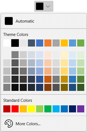
WinUI DropDown ColorPalette
**Note:** In the WinUI DropDown ColorPalette:
- By default, the black color will be attached as a flyout, and you can [customize the flyout color](https://help.syncfusion.com/winui/color-palette/ui-customization#setting-default-color) .
- You can get the currently selected brush using the [SelectedBrush](https://help.syncfusion.com/cr/winui/Syncfusion.UI.Xaml.Editors.SfColorPalette.html#Syncfusion_UI_Xaml_Editors_SfColorPalette_SelectedBrush) property.
- When the selected color is changed, then the [SelectedBrushChanged](https://help.syncfusion.com/cr/winui/Syncfusion.UI.Xaml.Editors.SfColorPalette.html#Syncfusion_UI_Xaml_Editors_SfColorPalette_SelectedBrushChanged) event will be triggered.
### Customizing the ColorPalette in the Dropdown
You can customize the ColorPalette control hosted inside the dropdown of the WinUI DropDown ColorPalette using the [AttachedFlyout](https://docs.microsoft.com/en-us/uwp/api/windows.ui.xaml.controls.primitives.flyoutbase.attachedflyout?view=winrt-19041)
and [DropDownFlyout](https://help.syncfusion.com/cr/winui/Syncfusion.UI.Xaml.Editors.DropDownFlyout.html#properties)
properties.
Refer to the following code example.
```
```
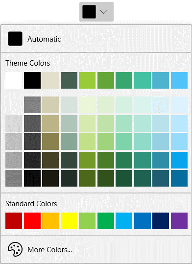
Customized Palette in WinUI DropDown ColorPalette
### Theme Colors
The ColorPalette has a variety of base theme colors shaded from light to dark.
You can change the displayed theme color palette using the [ActivePalette](https://help.syncfusion.com/cr/winui/Syncfusion.UI.Xaml.Editors.SfColorPalette.html#Syncfusion_UI_Xaml_Editors_SfColorPalette_ActivePalette)
property. By default, the value of the **ActivePalette** property is Office.
Refer to the following code example.
```
```
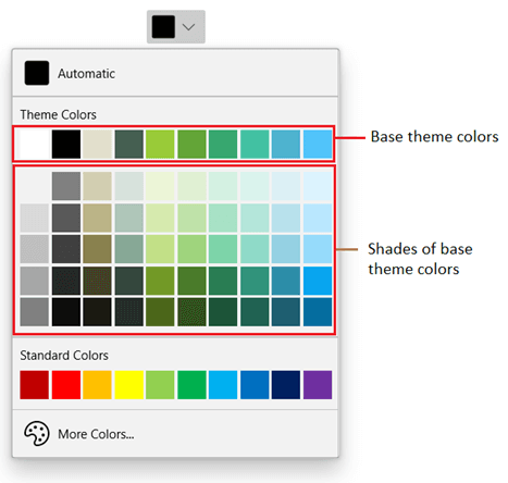
WinUI DropDown ColorPalette Theme Colors
You can also add your own set of theme colors in the ColorPalette control using the [PaletteColors](https://help.syncfusion.com/cr/winui/Syncfusion.UI.Xaml.Editors.SfColorPalette.html#Syncfusion_UI_Xaml_Editors_SfColorPalette_PaletteColors)
property and [ColorModel](https://help.syncfusion.com/cr/winui/Syncfusion.UI.Xaml.Editors.ColorModel.html)
class. The [ColorPaletteModel](https://help.syncfusion.com/cr/winui/Syncfusion.UI.Xaml.Editors.ColorPaletteModel.html)
class allows you to customize the header and show or hide the custom theme color shades.
Refer to the following code example.
```
```
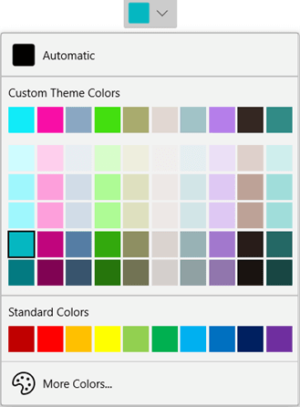
WinUI DropDown ColorPalette: Custom Theme Colors
Also, you can easily show or hide the base theme colors and their variants in the ColorPalette using the [ShowColors](https://help.syncfusion.com/cr/winui/Syncfusion.UI.Xaml.Editors.ColorPaletteModel.html#Syncfusion_UI_Xaml_Editors_ColorPaletteModel_ShowColors)
and [ShowColorShades](https://help.syncfusion.com/cr/winui/Syncfusion.UI.Xaml.Editors.ColorPaletteModel.html#Syncfusion_UI_Xaml_Editors_ColorPaletteModel_ShowColorShades)
properties in the **ColorPaletteModel** class. To hide all the theme colors in the ColorPalette, set the value of both the ** ShowColors** and ** ShowColorShades** properties to false.
Refer to the following screenshot.
| | | |
| --- | --- | --- |
Customizing the WinUI DropDown ColorPalette’s Theme Colors visible Mode
### Standard Colors
The ColorPalette supports a variety of standard colors. The colors’ shades are hidden by default.
Refer to the following code example.
```
```
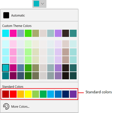
WinUI DropDown ColorPalette: Standard Colors
Like in the theme colors, you can also add your own set of standard colors in the ColorPalette control using the [StandardColors](https://help.syncfusion.com/cr/winui/Syncfusion.UI.Xaml.Editors.SfColorPalette.html#Syncfusion_UI_Xaml_Editors_SfColorPalette_StandardColors)
property and [ColorModel](https://help.syncfusion.com/cr/winUI/Syncfusion.UI.Xaml.Editors.ColorModel.html)
class. The [StandardPaletteModel](https://help.syncfusion.com/cr/winui/Syncfusion.UI.Xaml.Editors.StandardPaletteModel.html)
class allows you to customize the header and show or hide the custom standard colors and their shades.
Refer to the following code example.
```
```
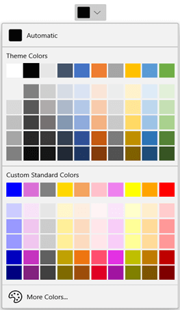
Customizing the Standard Colors of WinUI DropDown ColorPalette
You can show or hide the standard colors and their variants using the [ShowColors](https://help.syncfusion.com/cr/winui/Syncfusion.UI.Xaml.Editors.ColorPaletteModel.html#Syncfusion_UI_Xaml_Editors_ColorPaletteModel_ShowColors)
and [ShowColorShades](https://help.syncfusion.com/cr/winui/Syncfusion.UI.Xaml.Editors.ColorPaletteModel.html#Syncfusion_UI_Xaml_Editors_ColorPaletteModel_ShowColorShades)
properties in the **StandardPaletteModel**. To hide all the standard colors in the ColorPalette, set the value of both the ** ShowColors** and ** ShowColorShades** properties to false.
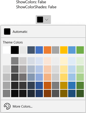
Hiding the Standard Color Palette in WinUI DropDown ColorPalette
### More Colors
If you want to choose a color that is not available in the theme and standard palette, click the **More Colors** button. Then, select a color from the color spectrum and click ** OK**. You can show or hide the More Colors button using the [ShowMoreColorsButton](https://help.syncfusion.com/cr/winui/Syncfusion.UI.Xaml.Editors.SfColorPalette.html#Syncfusion_UI_Xaml_Editors_SfColorPalette_ShowMoreColorsButton)
property.
| | |
| --- | --- |
Choosing Colors from the WinUI DropDown ColorPalette: More Colors Window
### Recent Colors
If you want to choose a color recently selected from the More Colors dialog, use the Recent Colors panel.
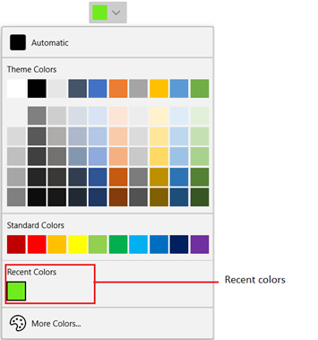
WinUI DropDown ColorPalette Showing Recent Colors
### No Color
You can reset the selected color back to transparent by using the **No Color** button. You can show or hide the No Color button using the [ShowNoColorButton](https://help.syncfusion.com/cr/winui/Syncfusion.UI.Xaml.Editors.SfColorPalette.html#Syncfusion_UI_Xaml_Editors_SfColorPalette_ShowNoColorButton)
property. By default, the value of the **ShowNoColorButton** property is false.
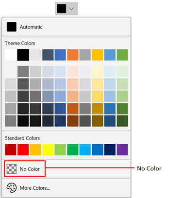
WinUI DropDown ColorPalette Displaying No Color Button
### Customize Content
Also, you can customize a selected color button using the [ContentTemplate](https://help.syncfusion.com/cr/winui/Syncfusion.UI.Xaml.Editors.SfDropDownBase.html#Syncfusion_UI_Xaml_Editors_SfDropDownBase_ContentTemplate)
property.
```
```
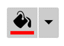
WinUI DropDown ColorPalette Header Customization
## DropDown ColorPicker
Let’s see how to add the WinUI DropDown ColorPicker control to your application:
1. First, create a [WinUI 3 desktop app for C# and .NET 5](https://docs.microsoft.com/en-us/windows/apps/winui/winui3/get-started-winui3-for-desktop) .
2. Then, download and install the [Syncfusion.Editors.WinUI](https://www.nuget.org/packages/Syncfusion.Editors.WinUI) NuGet package in the project.
3. Import the control namespace **Syncfusion.UI.Xaml.Editors** in your XAML page.
4. Finally, initialize the WinUI DropDown ColorPicker control like in the following code example.``` ```
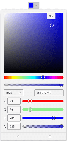
WinUI DropDown ColorPicker
**Note:** In the WinUI DropDown ColorPicker control:
- A default ColorPicker will be created and attached as a flyout.
- You can get the currently selected brush using the [SelectedBrush](https://help.syncfusion.com/cr/winui/Syncfusion.UI.Xaml.Editors.SfColorPicker.html#Syncfusion_UI_Xaml_Editors_SfColorPicker_SelectedBrush) property.
- When the selected color is changed, the [SelectedBrushChanged](https://help.syncfusion.com/cr/winui/Syncfusion.UI.Xaml.Editors.SfColorPicker.html#Syncfusion_UI_Xaml_Editors_SfColorPicker_SelectedBrushChanged) event will be triggered.
### Customizing the ColorPicker in the Dropdown
You can customize the ColorPicker control displayed in the dropdown using the [AttachedFlyout](https://docs.microsoft.com/en-us/uwp/api/windows.ui.xaml.controls.primitives.flyoutbase.attachedflyout?view=winrt-19041)
and [DropDownFlyout](https://help.syncfusion.com/cr/winui/Syncfusion.UI.Xaml.Editors.DropDownFlyout.html#properties)
properties.
Refer to the following code example.
```
```
### Switch among Solid, Linear, and Radial Gradient Editors
The ColorPicker allows you to select a solid, linear, or radial gradient bush using interactive editors. You can also restrict choosing a particular brush type using the [BrushTypeOptions](https://help.syncfusion.com/cr/winUI/Syncfusion.UI.Xaml.Editors.SfColorPicker.html#Syncfusion_UI_Xaml_Editors_SfColorPicker_BrushTypeOptions)
property.
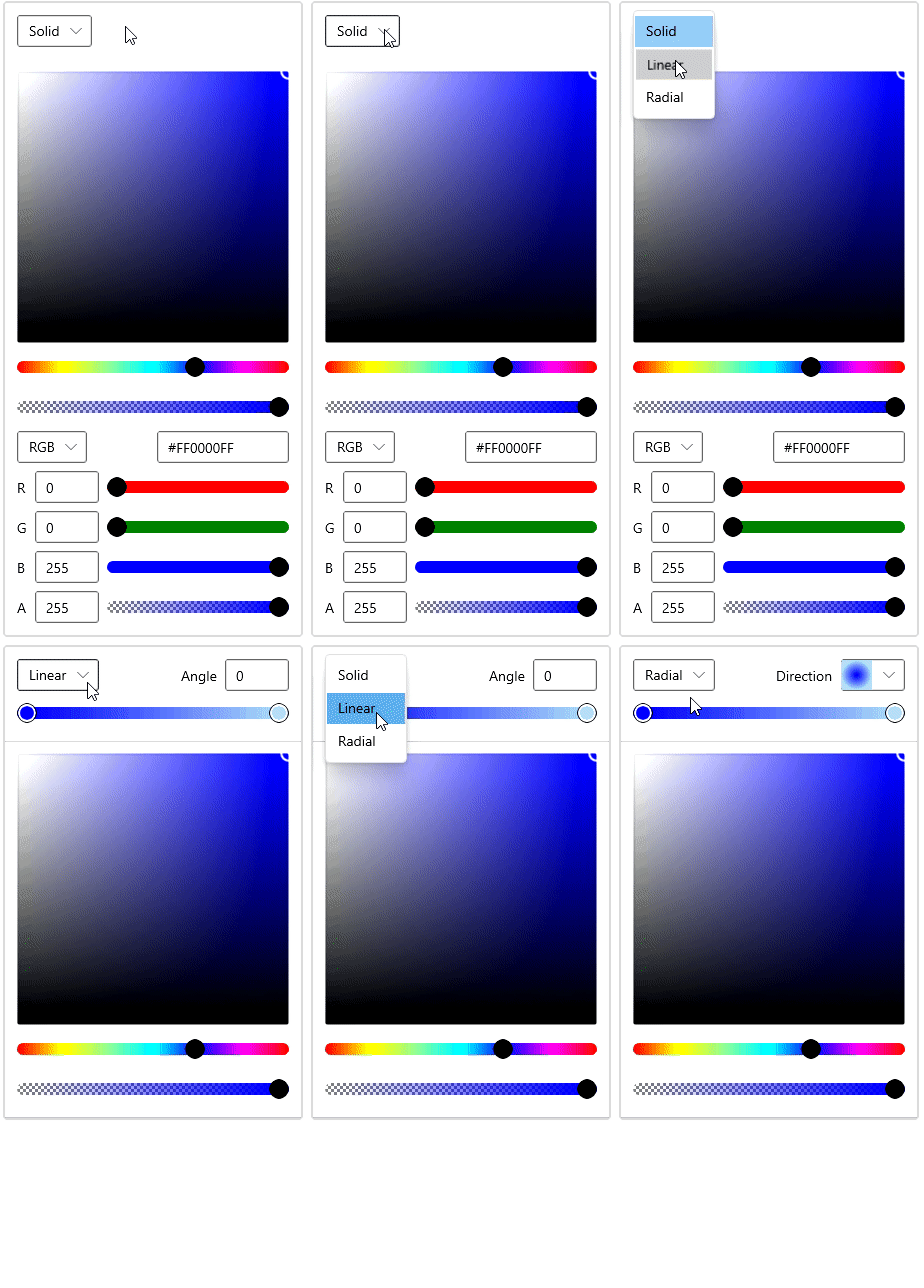
Switch among Solid, Linear, and Radial Gradient Editors
### Solid Color Brush
By default, the value of the [SelectedBrush](https://help.syncfusion.com/cr/winui/Syncfusion.UI.Xaml.Editors.SfColorPicker.html#Syncfusion_UI_Xaml_Editors_SfColorPicker_SelectedBrush)
property is **SolidColorBrush**. You can also choose a color using the spectrum, slider, number box, or hexadecimal editors.
```
```
#### Input Options and Their Visibility
There are various input options available to choose a precise color. You can show or hide them using the following properties:
- [ColorChannelInputOptions](https://help.syncfusion.com/cr/winUI/Syncfusion.UI.Xaml.Editors.SfColorPicker.html#Syncfusion_UI_Xaml_Editors_SfColorPicker_ColorChannelInputOptions) – Slider and number box inputs.
- [IsHexInputVisible](https://help.syncfusion.com/cr/winUI/Syncfusion.UI.Xaml.Editors.SfColorPicker.html#Syncfusion_UI_Xaml_Editors_SfColorPicker_IsHexInputVisible) – Hexadecimal input.
- [AlphaInputOptions](https://help.syncfusion.com/cr/winui/Syncfusion.UI.Xaml.Editors.SfColorPicker.html#Syncfusion_UI_Xaml_Editors_SfColorPicker_AlphaInputOptions) – Alpha input.
**Note:** By default, the Spectrum editor is always visible, you cannot hide it.
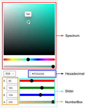
ColorPicker Editor Window With Various Input Options
#### Color Channels
The ColorPicker supports four color channels: [RGB](https://en.wikipedia.org/wiki/RGB_color_model)
, [HSV](https://en.wikipedia.org/wiki/HSL_and_HSV)
, [HSL](https://en.wikipedia.org/wiki/HSL_and_HSV)
, [CMYK](https://en.wikipedia.org/wiki/CMYK_color_model)
. You can limit the color channels using the [ColorChannelOptions](https://help.syncfusion.com/cr/winUI/Syncfusion.UI.Xaml.Editors.SfColorPicker.html#Syncfusion_UI_Xaml_Editors_SfColorPicker_ColorChannelOptions)
property. The end user can change a color channel interactively, using the editor combo box.
Refer to the following .gif image.
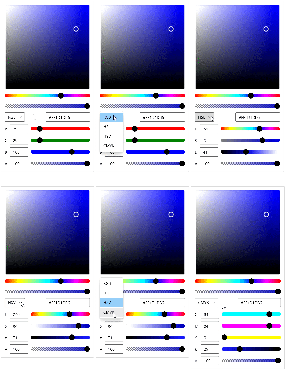
Color Channel Editor Window
### Gradient Brush
You can choose a linear or radial gradient brush using the **SelectedBrush** property. For more details, refer to the [LinearGraidentBrush](https://docs.microsoft.com/en-us/windows/winui/api/microsoft.ui.xaml.media.lineargradientbrush?view=winui-3.0)
and [RadialGradientBrush](https://docs.microsoft.com/en-us/windows/winui/api/microsoft.ui.xaml.media.radialgradientbrush?view=winui-3.0)
documentation.
Refer to the following code example.
**Linear gradient:**
```
```
**Radial gradient:**
```
```
#### Edit Gradient Stops
The WinUI DropDown ColorPicker allows you to add gradient stop and change its color interactively like in the following .gif image.
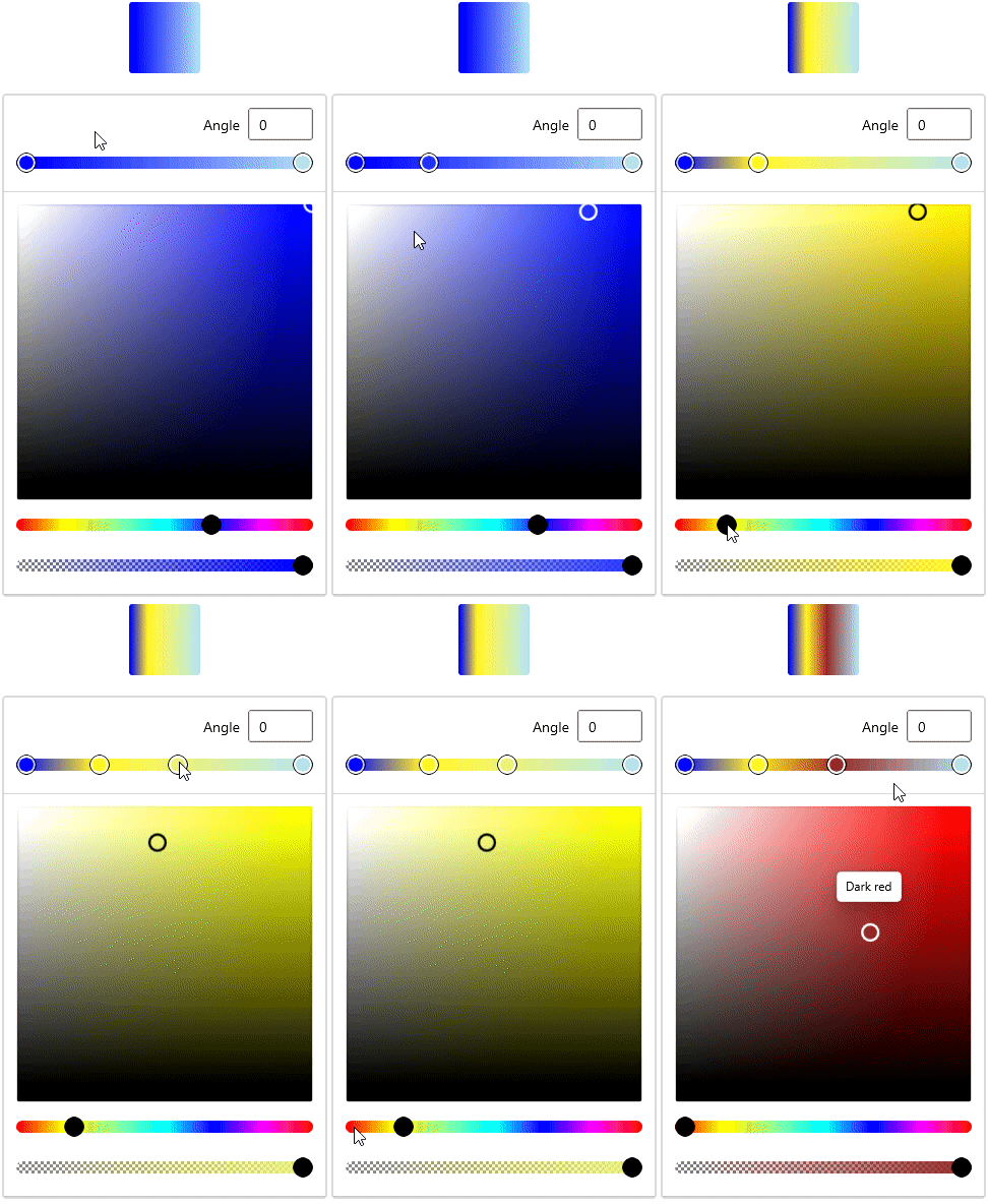
Editing Gradient Stops in WinUI DropDown ColorPicker
#### Edit Gradient Direction
The linear and radial gradient editors support both simple and advanced editing modes. You can switch between the modes using the [AxisInputOption](https://help.syncfusion.com/cr/winUI/Syncfusion.UI.Xaml.Editors.SfColorPicker.html#Syncfusion_UI_Xaml_Editors_SfColorPicker_AxisInputOption)
property.
In the Simple editor, you can change the linear gradient angle to anywhere between 0 and 365 degrees.
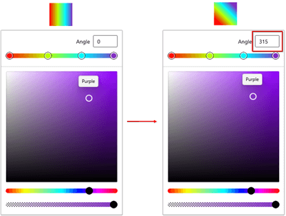
Simple Editor for Linear Gradient
In the advanced editor, you can fine-tune the linear gradient direction using the start and end points.
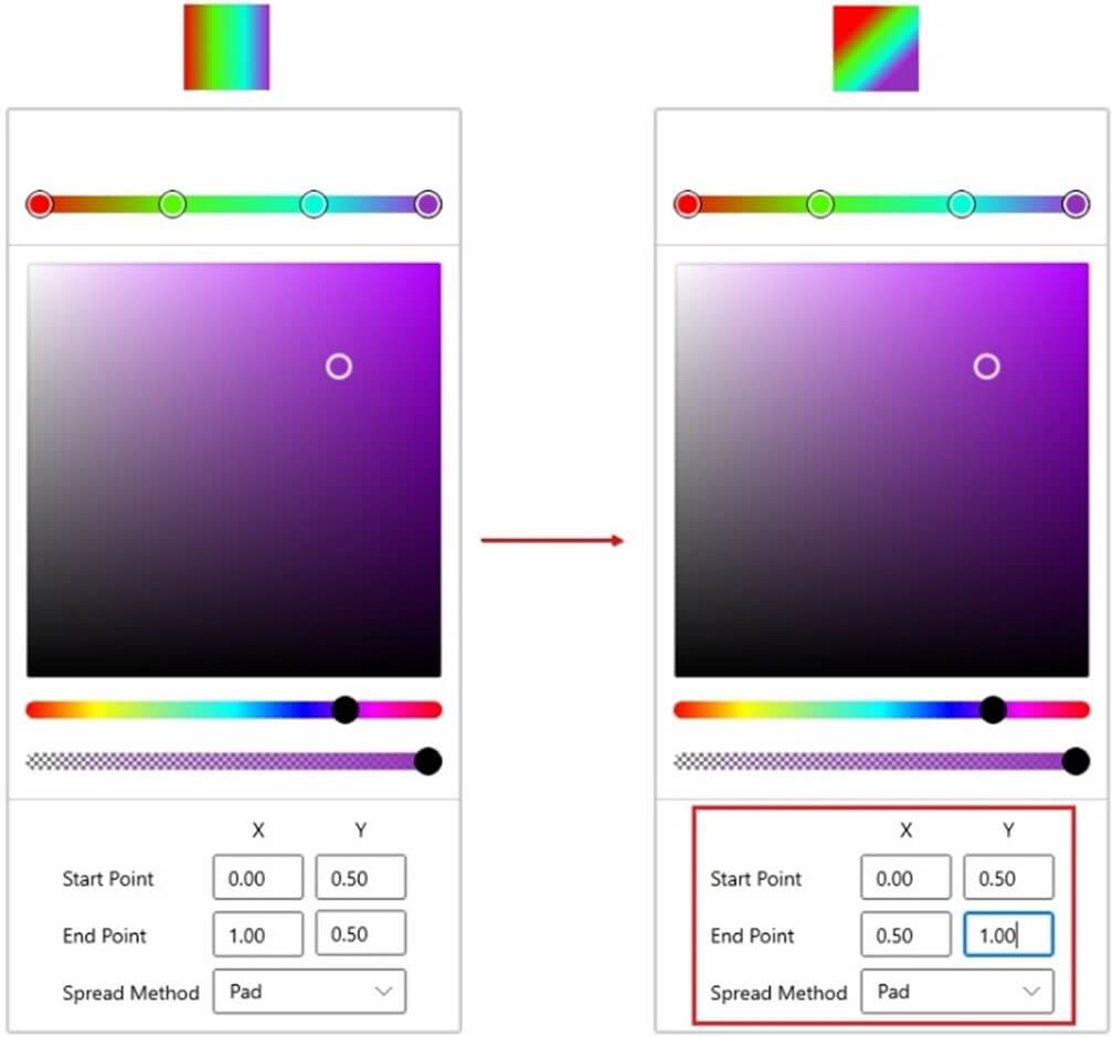
Advanced Editor for Linear Gradient
You can change the radial gradient direction using the Direction dropdown in the simple editor.
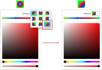
Simple Editor for Radial Gradient
Like for the linear gradient, you can also fine-tune the radial gradient direction using the start and end points in the advanced editor.
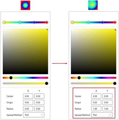
Advanced Editor for Radial Gradient
### Customize Content
Also, you can customize the selected color button using the [ContentTemplate](https://help.syncfusion.com/cr/winui/Syncfusion.UI.Xaml.Editors.SfDropDownBase.html#Syncfusion_UI_Xaml_Editors_SfDropDownBase_ContentTemplate)
property.
```
```

WinUI DropDown ColorPicker Header Customization
## Conclusion
Thanks for reading! In this blog post, we have explored the marvelous features of the WinUI [ColorPicker](https://www.syncfusion.com/winui-controls/color-picker)
, [ColorPalette](https://www.syncfusion.com/winui-controls/color-palette)
, [DropDown ColorPalette](https://www.syncfusion.com/winui-controls/dropdown-color-palette)
, and [DropDown ColorPicker](https://www.syncfusion.com/winui-controls/dropdown-color-picker)
controls. You can also download examples for the color controls in WinUI from this [GitHub](https://github.com/syncfusion/winui-demos/tree/master/editor)
repository.
So, try them out and design your application with appealing color patterns.
For existing customers, the newest version of Essential Studio® is available for download from the [license and downloads page](https://www.syncfusion.com/account/downloads)
. If you are not yet a customer, you can try our 30-day [free trial](https://www.syncfusion.com/downloads)
to check out these new features.
You can also contact us through [support forums](https://www.syncfusion.com/forums)
, [feedback portal](https://www.syncfusion.com/feedback)
, or the [Direct-Trac support system](https://www.syncfusion.com/support/directtrac/incidents)
. We are always happy to assist you!
## Related blogs
- [API Improvements in WinUI 3 Charts: 2021 Volume 2](https://www.syncfusion.com/blogs/post/api-improvements-in-winui-3-charts-2021-volume-2.aspx)
- [Everything You Need to Know About the WinUI 3 Range Slider](https://www.syncfusion.com/blogs/post/everything-you-need-to-know-about-the-winui-3-range-slider.aspx)
- [What’s New in 2021 Volume 2: WinUI](https://www.syncfusion.com/blogs/post/whats-new-in-2021-volume-2-winui.aspx)
- [Introducing the New WinUI NumberBox Control](https://www.syncfusion.com/blogs/post/introducing-the-new-winui-numberbox-control.aspx)