---
title: "New WinUI Segmented Control Is Here!"
published_at: "2021-10-15T11:54:37+00:00"
modified_at: "2025-03-24T07:22:00+00:00"
url: "https://www.syncfusion.com/blogs/post/new-winui-segmented-control-is-here"
excerpt: "We are glad to roll out the WinUI Segmented Control in our 2021 Volume 3 release. It provides a simple way to choose from a linear set of two or more segments, each of which functions as a mutually exclusive..."
taxonomy_category:
- "Desktop"
- "UI"
- "What's new"
- "WinUI"
taxonomy_post_tag:
- "desktop"
- "SegmentedControl"
- "UI"
- "What's New"
- "WinUI"
---
# New WinUI Segmented Control Is Here!
[Mageshyadav](https://www.syncfusion.com/blogs/author/mageshyadavm)
We are glad to roll out the [WinUI Segmented Control](https://www.syncfusion.com/winui-controls/segmented-control)
in our [2021 Volume 3](https://www.syncfusion.com/forums/160733/essential-studio-2021-volume-3-release-v19-3-0-43-is-available-for-download)
release. It provides a simple way to choose from a linear set of two or more segments, each of which functions as a mutually exclusive option.
Following are the key features of the WinUI Segmented Control:
- [Data binding](#data-binding)
- [Selection](#selection)
- [Customization](#customization)
- [Disable segments](#disable-segments)
- [RTL](#rtl)
- [Accessibility](#accessibility)
- [Themes](#themes)
Let’s check them out with code examples.
## Data binding
Follow these steps to add the WinUI Segmented Control to your app and bind the collection of strings or objects to the [ItemsSource](https://help.syncfusion.com/cr/winui/Syncfusion.UI.Xaml.Editors.SfSegmentedControl.html#Syncfusion_UI_Xaml_Editors_SfSegmentedControl_ItemsSource)
property.
### Step 1: Create a WinUI application.
First, create a [WinUI 3 desktop app for C# and .NET 5](https://docs.microsoft.com/en-us/windows/apps/winui/winui3/get-started-winui3-for-desktop)
.
### Step 2: Install the necessary NuGet package.
Then, download and reference the [Syncfusion.Editors.WinUI](https://www.nuget.org/packages/Syncfusion.Editors.WinUI)
NuGet package in the project.
### Step 3: Import namespace and initialize the Segmented control.
Now, import the **Syncfusion.UI.Xaml.Editors** namespace in XAML or C# code and initialize the WinUI Segmented control like in the following code example.
```
```
### Step 4: Populate items.
In the WinUI Segmented Control, we can populate items using:
- Strings
- Business objects
#### Populate items using strings
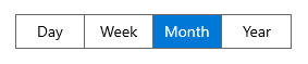
We are going to populate items using a collection of strings as the data source to the Segmented Control.
Refer to the following code example.
```
Day
Week
Month
Year
```
#### Populate items using business objects
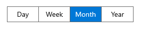
We can also populate items to the Segmented Control by setting the collection of business objects to the [ItemsSource](https://help.syncfusion.com/cr/winui/Syncfusion.UI.Xaml.Editors.SfSegmentedControl.html#Syncfusion_UI_Xaml_Editors_SfSegmentedControl_ItemsSource)
property.
##### DisplayMemberPath
The [DisplayMemberPath](https://help.syncfusion.com/cr/winui/Syncfusion.UI.Xaml.Editors.SfSegmentedControl.html#Syncfusion_UI_Xaml_Editors_SfSegmentedControl_DisplayMemberPath)
property denotes the path to a value on the source object set to the [ItemsSource](https://help.syncfusion.com/cr/winui/Syncfusion.UI.Xaml.Editors.SfSegmentedControl.html#Syncfusion_UI_Xaml_Editors_SfSegmentedControl_ItemsSource)
property that will be used as the visual representation for that object.
```
```
##### ItemTemplate
By defining the [ItemTemplate](https://help.syncfusion.com/cr/winui/Syncfusion.UI.Xaml.Editors.SfSegmentedControl.html#Syncfusion_UI_Xaml_Editors_SfSegmentedControl_ItemTemplate)
property, we can render a custom user interface (UI) to display each [SfSegmentedItem](https://help.syncfusion.com/cr/winui/Syncfusion.UI.Xaml.Editors.SfSegmentedItem.html)
.
**XAML**
```
```
**C#**
```
public class SegmentedViewModel
{
public SegmentedViewModel()
{
Days = new List();
Days.Add(new Segment() { Name = "Day", Icon = GetIconData() });
Days.Add(new Segment() { Name = "Week", Icon = GetIconData() });
Days.Add(new Segment() { Name = "Month", Icon = GetIconData() });
Days.Add(new Segment() { Name = "Year", Icon = GetIconData() });
}
public List Days
{
get; set;
}
private string GetIconData()
{
return "M16.5,24.500009L19.5,24.500009 19.5,27.50001 16.5,27.50001z M10.5,24.500009L13.5,24.500009 13.5,27.50001 10.5,27.50001z M4.5000002,24.500009L7.5000002,24.500009 7.5000002,27.50001 4.5000002,27.50001z M22.5,19.500009L25.5,19.500009 25.5,22.500009 22.5,22.500009z M16.5,19.500009L19.5,19.500009 19.5,22.500009 16.5,22.500009z M10.5,19.500009L13.5,19.500009 13.5,22.500009 10.5,22.500009z M4.5000002,19.500009L7.5000002,19.500009 7.5000002,22.500009 4.5000002,22.500009z M22.5,14.500009L25.5,14.500009 25.5,17.500009 22.5,17.500009z M16.5,14.500009L19.5,14.500009 19.5,17.500009 16.5,17.500009z M10.5,14.500009L13.5,14.500009 13.5,17.500009 10.5,17.500009z M4.5000002,14.500009L7.5000002,14.500009 7.5000002,17.500009 4.5000002,17.500009z M2.0000001,12.000008L2.0000001,30.00001 28,30.00001 28,12.000008z M2.0000001,5.0000091L2.0000001,10.000007 28,10.000007 28,5.0000091 23.956969,5.0000091 23.956969,6.9310009C23.956969,7.4830005 23.509968,7.9310007 22.956969,7.9310007 22.403969,7.9310007 21.956969,7.4830005 21.956969,6.9310009L21.956969,5.0000091 7.956969,5.0000091 7.956969,6.9310009C7.956969,7.4830005 7.509969,7.9310007 6.956969,7.9310007 6.403969,7.9310007 5.956969,7.4830005 5.956969,6.9310009L5.956969,5.0000091z M6.956969,0C7.509969,0,7.956969,0.44799995,7.956969,1L7.956969,3.0000091 21.956969,3.0000091 21.956969,1C21.956969,0.44799995 22.403969,0 22.956969,0 23.509968,0 23.956969,0.44799995 23.956969,1L23.956969,3.0000091 30,3.0000091 30,32.00001 0,32.00001 0,3.0000091 5.956969,3.0000091 5.956969,1C5.956969,0.44799995,6.403969,0,6.956969,0z";
}
public class Segment : INotifyPropertyChanged
{
private string name;
private string icon;
public string Name
{
get { return name; }
set { name = value; OnPropertyChanged("Name"); }
}
public string Icon
{
get { return icon; }
set { icon = value; OnPropertyChanged("Icon"); }
}
public event PropertyChangedEventHandler PropertyChanged;
private void OnPropertyChanged(string parameter)
{
PropertyChanged?.Invoke(this, new PropertyChangedEventArgs(parameter));
}
}
```

## Selection
You can select the segment items based on the data source index using the [SelectedIndex](https://help.syncfusion.com/cr/winui/Syncfusion.UI.Xaml.Editors.SfSegmentedControl.html#Syncfusion_UI_Xaml_Editors_SfSegmentedControl_SelectedIndex)
property or through mouse or touch interaction.
### Selected item customization
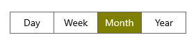
You can customize the appearance of a selected item using the [SelectedSegmentStyle](https://help.syncfusion.com/cr/winui/Syncfusion.UI.Xaml.Editors.SfSegmentedControl.html#Syncfusion_UI_Xaml_Editors_SfSegmentedControl_SelectedSegmentStyle)
property.
```
```
### Animation
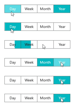
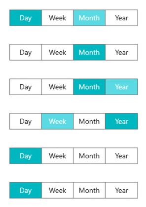
The Segmented Control supports slide animation while selecting an item. Also, users can enable or disable the selection animation by setting the value of [SelectionAnimationType](https://help.syncfusion.com/cr/winui/Syncfusion.UI.Xaml.Editors.SfSegmentedControl.html#Syncfusion_UI_Xaml_Editors_SfSegmentedControl_SelectionAnimationType)
property to:
- **Slide**: Applies the slide animation effect while selecting an item.
- **None**: Disables animation while selecting an item.
```
Day
Week
Month
Year
```
Refer to the following GIF images.
**Animation type: slide**
**Animation type: none**
## Customization
The WinUI Segmented Control supports a wide range of customizations. They are as follows.
### Border thickness
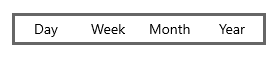
You can easily customize the border thickness using the [BorderThickness](https://docs.microsoft.com/en-us/windows/winui/api/microsoft.ui.xaml.controls.control.borderthickness?view=winui-3.0)
property.
```
Day
Week
Month
Year
```
### Item border thickness
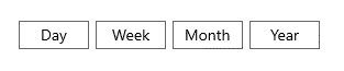
Customize the border thickness of a [SfSegmentedItem](https://help.syncfusion.com/cr/winui/Syncfusion.UI.Xaml.Editors.SfSegmentedItem.html)
using the [ItemBorderThickness](https://help.syncfusion.com/cr/winui/Syncfusion.UI.Xaml.Editors.SfSegmentedControl.html#Syncfusion_UI_Xaml_Editors_SfSegmentedControl_ItemBorderThickness)
property. Set item margin using the [ItemContainerStyle](https://help.syncfusion.com/cr/winui/Syncfusion.UI.Xaml.Editors.SfSegmentedControl.html#Syncfusion_UI_Xaml_Editors_SfSegmentedControl_ItemContainerStyle)
property. This helps avoid rendering a thick border when both the control border thickness and segment item border thickness are used simultaneously.
```
Day
Week
Month
Year
```
### Corner radius
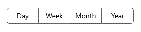
You can customize the corner radius of the Segmented Control using the [CornerRadius](https://docs.microsoft.com/en-us/windows/winui/api/microsoft.ui.xaml.controls.control.cornerradius?view=winui-3.0)
property. By setting the [ItemContainerStyle](https://help.syncfusion.com/cr/winui/Syncfusion.UI.Xaml.Editors.SfSegmentedControl.html#Syncfusion_UI_Xaml_Editors_SfSegmentedControl_ItemContainerStyle)
property, you can easily change the corner radius of a segment item using the [CornerRadius](https://docs.microsoft.com/en-us/windows/winui/api/microsoft.ui.xaml.controls.control.cornerradius?view=winui-3.0)
property in the [SfSegmentedItem](https://help.syncfusion.com/cr/winui/Syncfusion.UI.Xaml.Editors.SfSegmentedItem.html)
.
```
Day
Week
Month
Year
```
### Border color
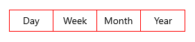
Customize the border color of the Segmented Control using the [BorderBrush](https://docs.microsoft.com/en-us/windows/winui/api/microsoft.ui.xaml.controls.control.borderbrush?view=winui-3.0)
property. Also, by setting the [ItemContainerStyle](https://help.syncfusion.com/cr/winui/Syncfusion.UI.Xaml.Editors.SfSegmentedControl.html#Syncfusion_UI_Xaml_Editors_SfSegmentedControl_ItemContainerStyle)
property, you can change the border color of the segment item using the [BorderBrush](https://docs.microsoft.com/en-us/windows/winui/api/microsoft.ui.xaml.controls.control.borderbrush?view=winui-3.0)
property in the [SfSegmentedItem](https://help.syncfusion.com/cr/winui/Syncfusion.UI.Xaml.Editors.SfSegmentedItem.html)
.
```
Day
Week
Month
Year
```
### ItemTemplateSelector
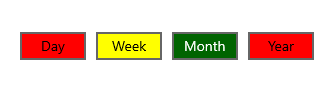
You can add custom logic for choosing a template used to display each item with the [ItemTemplateSelector](https://help.syncfusion.com/cr/winui/Syncfusion.UI.Xaml.Editors.SfSegmentedControl.html#Syncfusion_UI_Xaml_Editors_SfSegmentedControl_ItemTemplateSelector)
property. For more details, refer to the [ItemTemplateSelector documentation](https://help.syncfusion.com/winui/segmentedcontrol/ui-customization#itemtemplateselector)
.
### ItemContainerStyleSelector
Specify custom style selection logic for each generated container in the [SfSegmentedItem](https://help.syncfusion.com/cr/winui/Syncfusion.UI.Xaml.Editors.SfSegmentedItem.html)
using the [ItemContainerStyleSelector](https://help.syncfusion.com/cr/winui/Syncfusion.UI.Xaml.Editors.SfSegmentedControl.html#Syncfusion_UI_Xaml_Editors_SfSegmentedControl_ItemContainerStyleSelector)
property. For more details, refer to [ItemContainerStyleSelector documentation](https://help.syncfusion.com/winui/segmentedcontrol/ui-customization#itemcontainerstyleselector)
.
## Disable segments
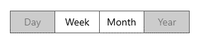
You can disable the items in the Segmented Control in the [SetItemEnabled](https://help.syncfusion.com/cr/winui/Syncfusion.UI.Xaml.Editors.SfSegmentedControl.html#Syncfusion_UI_Xaml_Editors_SfSegmentedControl_SetItemEnabled_System_Int32_System_Boolean_)
method. The method has the following two parameters:
- **index**: The integer value indicating the index of the item.
- **isEnabled**: The Boolean value indicating whether the item should be enabled or not.
```
using Microsoft.UI.Xaml;
using Syncfusion.UI.Xaml.Editors;
public sealed partial class MainWindow: Window
{
public MainWindow()
{
this.InitializeComponent();
segmentedControl.SetItemEnabled(0, false);
segmentedControl.SetItemEnabled(3, false);
}
}
```
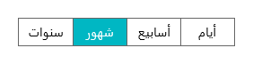
## Right-to-left (RTL) rendering
The WinUI Segmented Control supports right-to-left rendering.
## Accessibility
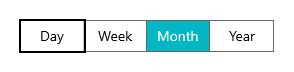
Users can easily interact with the control through mouse, touch, keyboard, and voice recognition.
## Themes
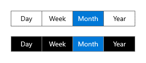
The WinUI Segmented Control is available in both light and dark themes.
## References
To get complete details, refer to:
- [Getting Started with WinUI Segmented Control](https://help.syncfusion.com/winui/segmentedcontrol/getting-started)
- [WinUI Segmented Control demos on GitHub](https://github.com/SyncfusionExamples/syncfusion-winui-segmentedcontrol-examples/)
## Conclusion
Thanks for reading! In this blog post, we have explored the features of the new [WinUI Segmented Control](https://www.syncfusion.com/winui-controls/segmented-control)
rolled out in the [2021 Volume 3](https://www.syncfusion.com/forums/160733/essential-studio-2021-volume-3-release-v19-3-0-43-is-available-for-download)
release. Information on this control is also available on our [Release Notes](https://help.syncfusion.com/common/essential-studio/release-notes/v19.3.0.43)
and [What’s New](https://www.syncfusion.com/products/whatsnew)
pages. Try this control and leave your feedback in the comments section of this blog post!
We encourage you to try our other WinUI demos from this [GitHub](https://github.com/syncfusion/winui-demos/tree/master/editor)
location. Also, you can download and install the WinUI demos from the [Microsoft Store](https://www.microsoft.com/en-us/p/syncfusion-winui-controls-gallery/9n0fp16ddc06?activetab=pivot:overviewtab)
.
For current Syncfusion customers, the newest version of Essential Studio® is available for download from the [license and downloads page](https://www.syncfusion.com/account/downloads)
. If you are not yet a customer, you can try our 30-day [free trial](https://www.syncfusion.com/downloads)
to check out these new features.
You can also contact us through [support forums](https://www.syncfusion.com/forums)
, [feedback portal](https://www.syncfusion.com/feedback)
, or [Direct-Trac support system](https://www.syncfusion.com/support/directtrac/incidents)
. We are always happy to assist you!
## Related blogs
- [Syncfusion Essential Studio® 2021 Volume 3 Is Here!](https://www.syncfusion.com/blogs/post/syncfusion-essential-studio-2021-volume-3-is-here.aspx)
- [Introducing the New WinUI 3 ComboBox](https://www.syncfusion.com/blogs/post/introducing-the-new-winui-3-combobox.aspx)
- [What’s New in 2021 Volume 3: WinUI and WPF](https://www.syncfusion.com/blogs/post/whats-new-in-2021-volume-3-winui-and-wpf.aspx)
- [WinUI Scheduler: A Smart Tool to Handle Appointments in a Hospital](https://www.syncfusion.com/blogs/post/winui-scheduler-a-smart-tool-to-handle-appointments-in-a-hospital.aspx)