---
title: "Introducing .NET MAUI Pickers for Efficient User Interactions"
published_at: "2023-10-04T12:59:20+00:00"
modified_at: "2026-02-10T08:32:47+00:00"
url: "https://www.syncfusion.com/blogs/post/new-dotnet-maui-pickers"
excerpt: "This blog explains the features of the new .NET MAUI Picker, Date Picker, Time Picker, and Date Time Picker controls added in the 2023 Volume 3."
taxonomy_category:
- ".NET MAUI"
- "Desktop"
- "Mobile"
- "Syncfusion"
- "UI"
- "What's new"
taxonomy_post_tag:
- ".NET MAUI"
- "desktop"
- "MAUI"
- "Mobile"
- "What's New"
---
# Introducing .NET MAUI Pickers for Efficient User Interactions
[Sasi Kumar Arumugam](https://www.syncfusion.com/blogs/author/sasi-kumar-arumugam)
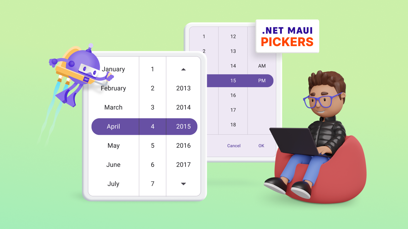
We are happy to introduce the new picker controls in our Syncfusion [.NET MAUI](https://www.syncfusion.com/maui-controls)
suite from the [2023 Volume 3](https://www.syncfusion.com/forums/184588/essential-studio-2023-volume-3-main-release-v23-1-36-is-available-for-download)
release!
The Syncfusion .NET MAUI picker controls are fully customizable components that offer a simple yet attractive UI, enhancing your application with a smooth and touch-friendly user experience. These controls provide a unified UI across all platforms, simplifying the selection process.
Let’s explore the features of the following new picker controls rolled out in the 2023 Volume 3 release and the steps to get started with them:
- [Picker](#Picker)
- [Date Picker](#Date)
- [Time Picker](#Time)
- [Date Time Picker](#Date_Time)
## Picker
The new [.NET MAUI Picker (SfPicker)](https://www.syncfusion.com/maui-controls/maui-picker)
is a versatile control that empowers users to select a single item from a list of options. It offers a seamless and highly customizable solution to enhance the user experience.
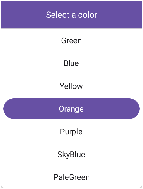
.NET MAUI Picker
### Key features
The key features of the .NET MAUI Picker control are as follows:
- **Multiple columns:** Users can select items from lists organized into multiple columns.
- **Header view:** Display and customize header text.
- **Column header view:** Use a customizable column header view to differentiate headings for each column.
- **Footer view:** Show or hide the footer view and customize the footer validation buttons (** OK** and ** Cancel**).
- **Selection view:** Highlight a selected item and customize the appearance of the highlight.
- **Picker modes:** The .NET MAUI Picker control offers three display modes:
- **Default mode:** Seamlessly integrates the Picker into your app’s layout.
- **Dialog mode:** Presents the Picker in a pop-up dialog, offering a clean and focused interaction for users.
- **Relative dialog mode:** Presents the Picker in a pop-up dialog with the dialog’s position relative to the Picker’s location within the app layout.
- **Picker interactions:** Select an item through tap and scroll interactions.
- **Item template:** Customize the appearance of Picker items using item template support.
### Getting started with .NET MAUI Picker control
Follow these steps to integrate the .NET MAUI Picker control into your app:
1. First, [create a new .NET MAUI app](https://learn.microsoft.com/en-us/dotnet/maui/get-started/first-app?view=net-maui-7.0&tabs=vswin&pivots=devices-android) in [Visual Studio](https://visualstudio.microsoft.com/) .
2. Syncfusion .NET MAUI components are available in the [NuGet Gallery](https://www.nuget.org/) . To add the SfPicker to your project, open the **NuGet package manager** in ** Visual Studio**, and search for [Syncfusion.Maui.Picker](https://www.nuget.org/packages/Syncfusion.Maui.Picker) , then install it.
3. The **Syncfusion.Maui.Core** NuGet is a dependent package for all Syncfusion .NET MAUI controls. In the **MauiProgram.cs** file, register the handler for Syncfusion core. ** MauiProgram.cs**``` using Syncfusion.Maui.Core.Hosting; public static class MauiProgram { public static MauiApp CreateMauiApp() { var builder = MauiApp.CreateBuilder(); builder.ConfigureSyncfusionCore(); } } ```
1. Finally, import the control namespace **Syncfusion.Maui.Picker** in XAML or C# code and then initialize the Picker control. Refer to the following code to initialize the .NET MAUI Picker control and add items to it. **MainPage.xaml**``` Pink Green Blue Yellow Orange Purple SkyBlue PaleGreen Gray LiteGreen Brown ```
**Note:** For more details, refer to the [.NET MAUI Picker control documentation](https://help.syncfusion.com/maui/picker/getting-started)
.
## Date Picker
The new [.NET MAUI Date Picker (SfDatePicker)](https://www.syncfusion.com/maui-controls/maui-datepicker)
control allows you to select a date from a list of dates, providing a seamless and highly customizable solution to enhance the user experience.
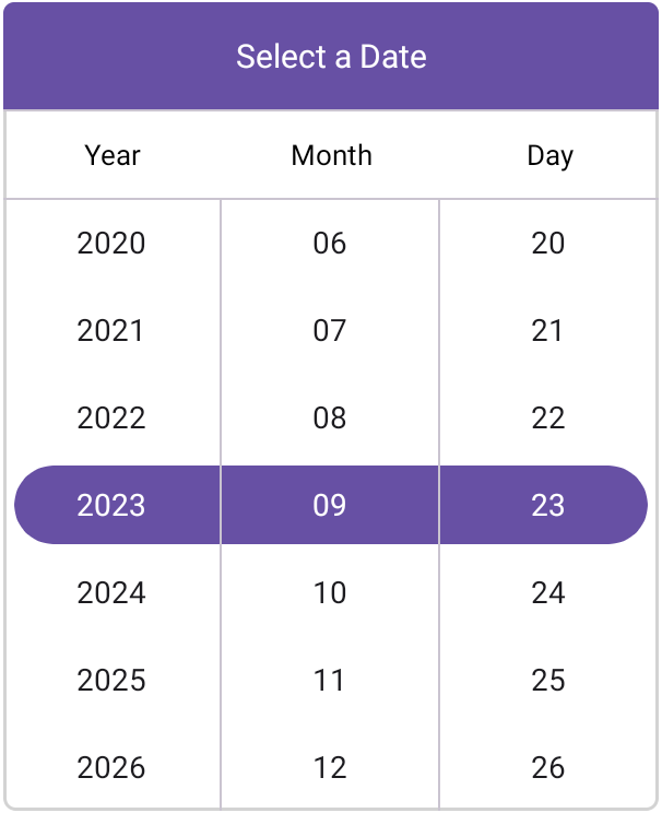
.NET MAUI Date Picker
### Key features
The key features of the .NET MAUI Date Picker control are as follows:
- **Header view:** Display and customize the header text.
- **Column header view:** Customize all the column header views and their text.
- **Footer view:** Show or hide the footer view and customize the footer validation buttons (** OK** and ** Cancel**).
- **Selection view:** Highlight the selected date and customize the appearance of the highlight.
- **Picker modes:** The .NET MAUI Date Picker control offers three display modes:
- **Default mode:** Seamlessly integrates the Date Picker into your app’s layout.
- **Dialog mode:** Presents the Date Picker in a pop-up dialog, offering a clean and focused interaction for users.
- **Relative dialog mode:** Presents the Date Picker in a pop-up dialog with the dialog’s position relative to the picker’s location within the app layout.
- **Picker interactions:** You can select an item through tap and scroll interactions.
- **Date formats:** Offers eight predefined formats to represent the values of dates in different string formats.
- **Date restriction:** Restrict date selections to a specified range, ensuring users choose dates within the desired minimum and maximum dates.
- **Intervals:** The date values can be populated individually with intervals for days, months, and years.
### Getting started with .NET MAUI Date Picker control
Follow these steps to integrate the .NET MAUI Date Picker control into your app:
1. After creating a .NET MAUI app, open the NuGet package manager in Visual Studio, and search for [Syncfusion.Maui.Picker](https://www.nuget.org/packages/Syncfusion.Maui.Picker) , and then install it.
2. Now, import the control namespace **Syncfusion.Maui.Picker** in XAML or C# code and then initialize the SfDatePicker control. Refer to the following code to initialize the .NET MAUI Date Picker control and add items to it.**MainPage.xaml** ``` ```
**Note:** For more details, refer to the [.NET MAUI Date Picker control documentation](https://help.syncfusion.com/maui/datepicker/getting-started)
.
## Time Picker
The [.NET MAUI Time Picker (SfTimePicker)](https://www.syncfusion.com/maui-controls/maui-timepicker)
control enables users to select a time from a list of times, offering a seamless and highly customizable solution to enhance the user experience.
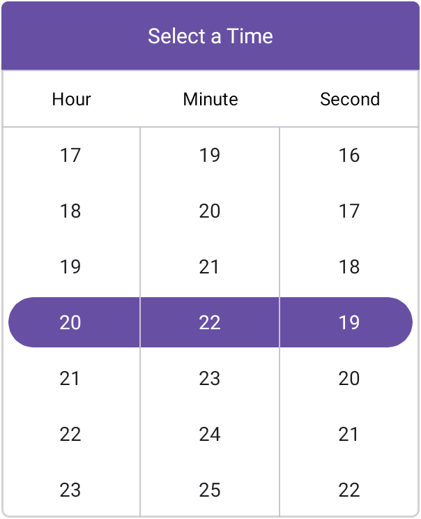
.NET MAUI Time Picker
### Key features
The key features of the .NET MAUI Time Picker control are as follows:
- **Header view:** Display and customize the header text.
- **Column header view:** Customize all column header views and their text.
- **Footer view:** Show or hide the footer view and customize the footer validation buttons (** OK** and ** Cancel**).
- **Selection view:** Highlight the selected time and customize the appearance of the highlight.
- **Picker modes:** The .NET MAUI Time Picker control offers three display modes:
- **Default mode:** Seamlessly integrates the Time Picker into your app’s layout.
- **Dialog mode:** Presents the Time Picker in a pop-up dialog, offering a clean and focused interaction for users.
- **Relative dialog mode:** Positions the Time Picker’s pop-up dialog relative to the picker’s location within the app layout.
- **Picker interactions:** You can select an item through tap and scroll interactions.
- **Time formats:** Offers nine predefined formats to represent the values of the times in different string formats, enhancing flexibility and usability.
- **Intervals:** Time values can be populated individually with intervals for hours, minutes, and seconds, providing fine-grained control over time selection.
### Getting started with the .NET MAUI Time Picker control
Follow these steps to integrate the .NET MAUI Time Picker control in your app:
1. After creating a new .NET MAUI app, open the NuGet package manager in Visual Studio, search for [Syncfusion.Maui.Picker](https://www.nuget.org/packages/Syncfusion.Maui.Picker) , and then install it.
2. Now, import the control namespace **Syncfusion.Maui.Picker** in XAML or C# code and then initialize the **SfTimePicker** control.Refer to the following code to initialize the .NET MAUI Time Picker control and add items to it. ** MainPage.xaml** ``` ```
**Note:** For more details, refer to the [.NET MAUI Time Picker control documentation](https://help.syncfusion.com/maui/timepicker/getting-started)
.
## Date Time Picker
The [.NET MAUI Date Time Picker (SfDateTimePicker)](https://www.syncfusion.com/maui-controls/maui-datetimepicker)
control enables you to select a date-time value from a list of dates and times, offering a seamless and highly customizable solution to enhance the user experience.
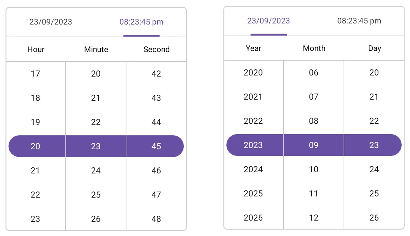
.NET MAUI Date Time Picker
### Key features
The key features of the .NET MAUI Date Time Picker control are as follows:
- **Header view:** Display and customize the header text and its selection.
- **Column header view:** Customize all column header views and their text.
- **Footer view:** Show or hide the footer view and customize the footer validation buttons (** OK** and ** Cancel**).
- **Selection view:** Highlight the selected date-time and customize the appearance of the highlight.
- **Picker modes:** The .NET MAUI Date Time Picker control offers three display modes:
- **Default mode:** Seamlessly integrates the Date Time Picker into your app’s layout.
- **Dialog Mode:** Presents the Date Time Picker in a pop-up dialog, offering a clean and focused interaction for users.
- **Relative dialog mode:** Positions the Date Time Picker’s pop-up dialog relative to the picker’s location within the app layout.
- **Picker interactions:** You can select an item through tap and scroll interactions.
- **Date formats:** Offers eight predefined formats to represent the values of the dates in different string formats.
- **Time formats:** Offers nine predefined formats to represent the values of the times in different string formats, enhancing flexibility and usability.
- **Date restriction:** Restrict date-time selections to a specified range, ensuring users choose date-times within the desired minimum and maximum date-time values.
- **Intervals:** Date-time values can be populated individually with intervals for seconds, minutes, hours, days, months, and years.
### Getting started with the .NET MAUI Date Time Picker control
Follow these steps to integrate the .NET MAUI Date Time Picker control in your app:
1. After creating a .NET MAUI app, open the NuGet package manager in Visual Studio, and search for [Syncfusion.Maui.Picker](https://www.nuget.org/packages/Syncfusion.Maui.Picker) , and then install it.
2. Now, import the control namespace **Syncfusion.Maui.Picker** in XAML or C# code and initialize the **SfDateTimePicker** control.Refer to the following code to initialize the .NET MAUI Date Time Picker control and add items to it. ** MainPage.xaml** ``` ```
**Note:** For more details, refer to the [.NET MAUI Date Time Picker control documentation](https://help.syncfusion.com/maui/datetimepicker/getting-started)
.
## Conclusion
Thanks for reading! In this blog, we’ve explored the features of the new .NET MAUI picker controls introduced in the [2023 Volume 3](https://www.syncfusion.com/forums/184588/essential-studio-2023-volume-3-main-release-v23-1-36-is-available-for-download)
release. Try these controls out and share your feedback in the comments section below.
If you are not a Syncfusion customer, try our 30-day [free trial](https://www.syncfusion.com/downloads)
to see how our components can enhance your projects.
If you have any questions, you can contact us through our [support forum](https://www.syncfusion.com/forums)
, [support portal](https://support.syncfusion.com/)
, or [feedback portal](https://www.syncfusion.com/feedback/home)
. We are always happy to assist you!
## Related Blogs
- [Syncfusion Essential Studio® 2023 Volume 3 Is Here!](https://www.syncfusion.com/blogs/post/syncfusion-essential-studio-2023-volume-3.aspx)
- [Introducing the New .NET MAUI TreeView Control](https://www.syncfusion.com/blogs/post/new-dotnet-maui-treeview.aspx)
- [Introducing the new .NET MAUI Button Control](https://www.syncfusion.com/blogs/post/new-dotnet-maui-button-control.aspx)
- [Introducing the .NET MAUI Segmented Control for Effortless Selection](https://www.syncfusion.com/blogs/post/dotnet-maui-segmented-control.aspx)