---
title: "Introducing the New Blazor Timeline Component"
published_at: "2024-04-08T09:39:12+00:00"
modified_at: "2026-02-10T12:23:54+00:00"
url: "https://www.syncfusion.com/blogs/post/new-blazor-timeline-component"
excerpt: "This blog explains the features of the new Blazor Timeline component added in the 2024 Volume 1 release."
taxonomy_category:
- "Blazor"
- "Development"
- "Syncfusion"
- "UI"
- "What's new"
taxonomy_post_tag:
- "Blazor"
- "development"
- "Syncfusion"
- "Web"
- "What's New"
---
# Introducing the New Blazor Timeline Component
[Indrajith Srinivasan](https://www.syncfusion.com/blogs/author/indrajith-srinivasan)
**TLDR:** Exploring the robust features of the new Syncfusion Blazor Timeline, highlighting its orientation, items alignment, and customization of displaying items using templates.
We’re thrilled to introduce the new Syncfusion [Blazor Timeline](https://www.syncfusion.com/blazor-components/blazor-timeline)
component as part of our [Essential Studio 2024 Volume 1](https://www.syncfusion.com/forums/187257/essential-studio-2024-volume-1-main-release-v25-1-35-is-available-for-download)
release.
The [Blazor Timeline](https://blazor.syncfusion.com/documentation/timeline/getting-started)
is a tool to display a series of data in chronological order, providing a visually compelling and user-friendly experience. This showcases user activities, tracking progress, narrating historical timelines, and more. It includes several built-in features, such as orientation, opposite content, item alignment, reverse timeline, and template customization.
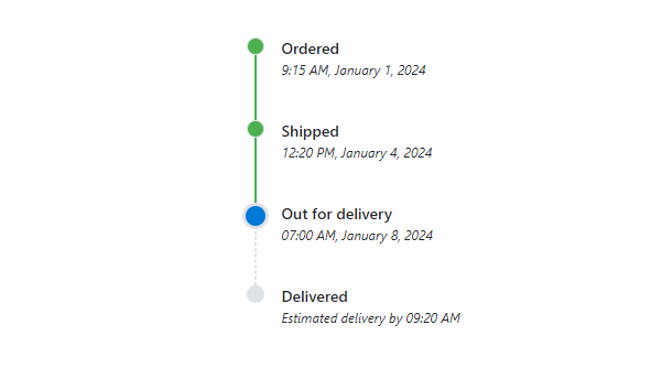
Integrating the Timeline Component in Blazor
In this blog, we’ll explore the key features of the Blazor Timeline component.
## Use Cases
The Blazor Timeline component is well-suited for various applications:
- **Historical Events**: Showcase historical milestones or company achievements with a clear and organized display of events over different years.
- **Project Management**: Effortlessly track project milestones, deadlines, and achievements, providing teams with a visual representation of progress throughout the project lifecycle.
- **Order Tracking**: Guide users through the stages of an e-commerce application, from adding items to the cart to finalizing orders with clear and organized steps.
## Key Features
The key features of the Timeline component are as follows:
- [Orientations](#Orientations)
- [Display Additional Information](#Display)
- [Items alignment](#Items)
- [Reverse Timeline](#ReverseTimeline)
- [Customization using Templates.](#Customization)
## Orientations
The Blazor Timeline component has two orientation modes:
- **Horizontal**: Displays items side-by-side.
- **Vertical**: Default orientation that displays items one below the other.
In the following code example, the [Orientation](https://help.syncfusion.com/cr/blazor/Syncfusion.Blazor.Layouts.SfTimeline.html#Syncfusion_Blazor_Layouts_SfTimeline_Orientation)
property defines the layout options with possible values of [TimelineOrientation](https://help.syncfusion.com/cr/blazor/Syncfusion.Blazor.Layouts.TimelineOrientation.html)
.
```
@using Syncfusion.Blazor.Layouts
@using Syncfusion.Blazor.Buttons
Change Orientation
January 1, 2022April 5, 2023February 12, 2024
@code {
private TimelineOrientation orientation = TimelineOrientation.Horizontal;
private void ChangeOrientation()
{
orientation = orientation == TimelineOrientation.Horizontal ? TimelineOrientation.Vertical : TimelineOrientation.Horizontal;
}
}
```
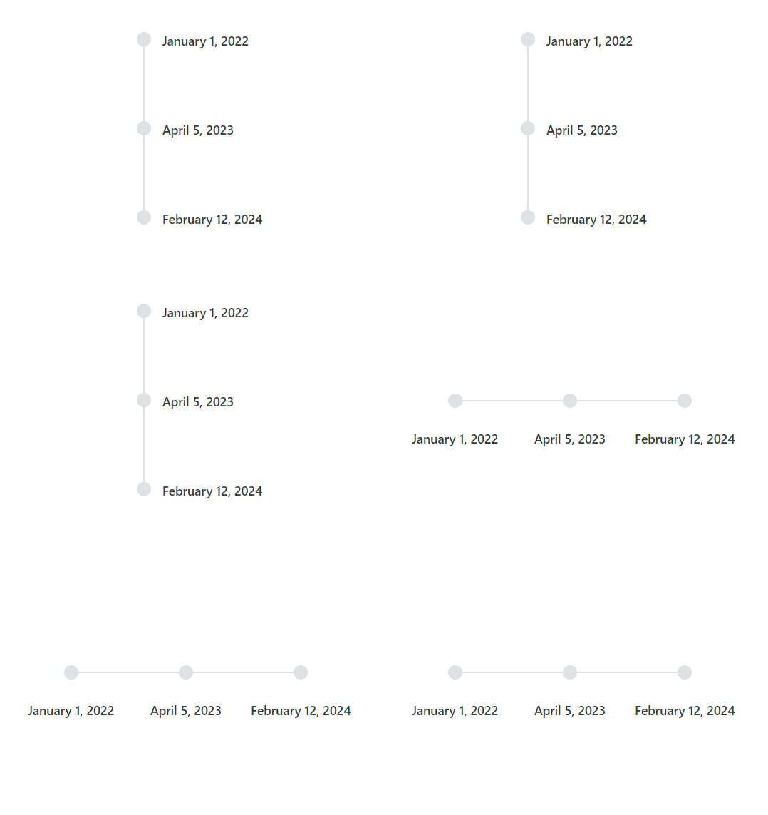
Orientations options in Blazor Timeline
**Note:** For more details, refer to [layout options in Blazor Timeline](https://blazor.syncfusion.com/documentation/timeline/orientations)
and [GitHub demos](https://blazor.syncfusion.com/demos/timeline/api?theme=fluent)
.
## Display Additional Information
Enhance each timeline item with supplementary information positioned alongside the main content. This additional information, placed opposite to the main content, enriches the context of every item, providing users with a comprehensive view of the timeline.
You can set the supplementary information for each item using the [OppositeContent](https://help.syncfusion.com/cr/blazor/Syncfusion.Blazor.Layouts.TimelineItem.html#Syncfusion_Blazor_Layouts_TimelineItem_OppositeContent)
property.
Refer to the following example.
```
@using Syncfusion.Blazor.Layouts
Order Recieved6:45 PMPreparing Order6:50 PMOn The Way7:05 PMDelivered!7:15 PM
```
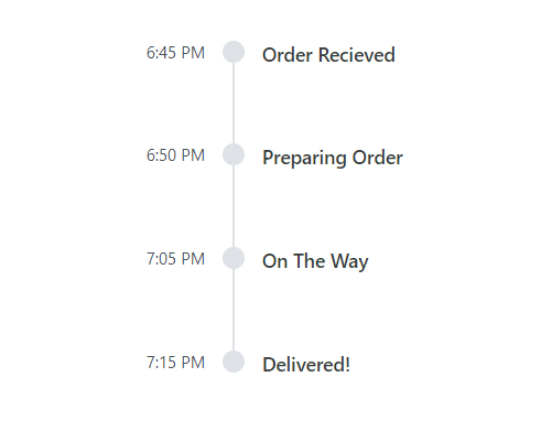
Display Additional Information in Blazor Timeline
**Note:** For more details, refer to [set additional information to each Timeline item documentation.](https://blazor.syncfusion.com/documentation/timeline/items#adding-opposite-content)
## Items alignment
The Blazor Timeline component supports aligning the items’ content and opposite content as follows:
- **Before**: Align the item content to the left (or top for horizontal orientation) and the opposite content to the right (or bottom).
- **After**: The default alignment aligns the item content to the right (or bottom for horizontal orientation) and the opposite content to the left (or top).
- **Alternate**: Align the content of the first item to the right and the opposite content to the left, and vice versa for subsequent items.
- **AlternateReverse**: Align the content of the first item to the left and the opposite content to the right, and vice versa for subsequent items.
In the following code example, the [Alignment](https://help.syncfusion.com/cr/blazor/Syncfusion.Blazor.Layouts.SfTimeline.html#Syncfusion_Blazor_Layouts_SfTimeline_Alignment)
property aligns the items’ content and opposite content with possible values specified by [TimelineAlignment](https://help.syncfusion.com/cr/blazor/Syncfusion.Blazor.Layouts.TimelineAlignment.html)
.
```
@using Syncfusion.Blazor.Layouts
Order Recieved6:45 PMPreparing Order6:50 PMOn The Way7:05 PMDelivered!7:15 PM
```
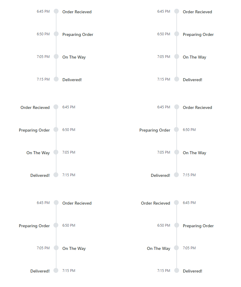
Items alignment in Blazor Timeline
**Note:** For more details, refer to [aligning the items’ content and opposite content documentation](https://blazor.syncfusion.com/documentation/timeline/align)
and the [GitHub live demo](https://blazor.syncfusion.com/demos/timeline/api?theme=fluent)
.
## Reverse Timeline
The Blazor Timeline component offers the option to present timeline items in reverse order, providing a unique perspective and enhancing user engagement. This feature allows users to focus on the most recent events first, improving the overall usability of the timeline.
You can specify whether to display the Timeline items in reverse order using the [Reverse](https://help.syncfusion.com/cr/blazor/Syncfusion.Blazor.Layouts.SfTimeline.html#Syncfusion_Blazor_Layouts_SfTimeline_Reverse)
property.
Refer to the following code example.
```
@using Syncfusion.Blazor.Layouts
@using Syncfusion.Blazor.Buttons
Change to Reverse
OrderShippedOut for deliveryDelivered
@code {
private bool isReverseTimeline { get; set; } = false;
private void UpdateTimeline()
{
isReverseTimeline = !isReverseTimeline;
}
}
```
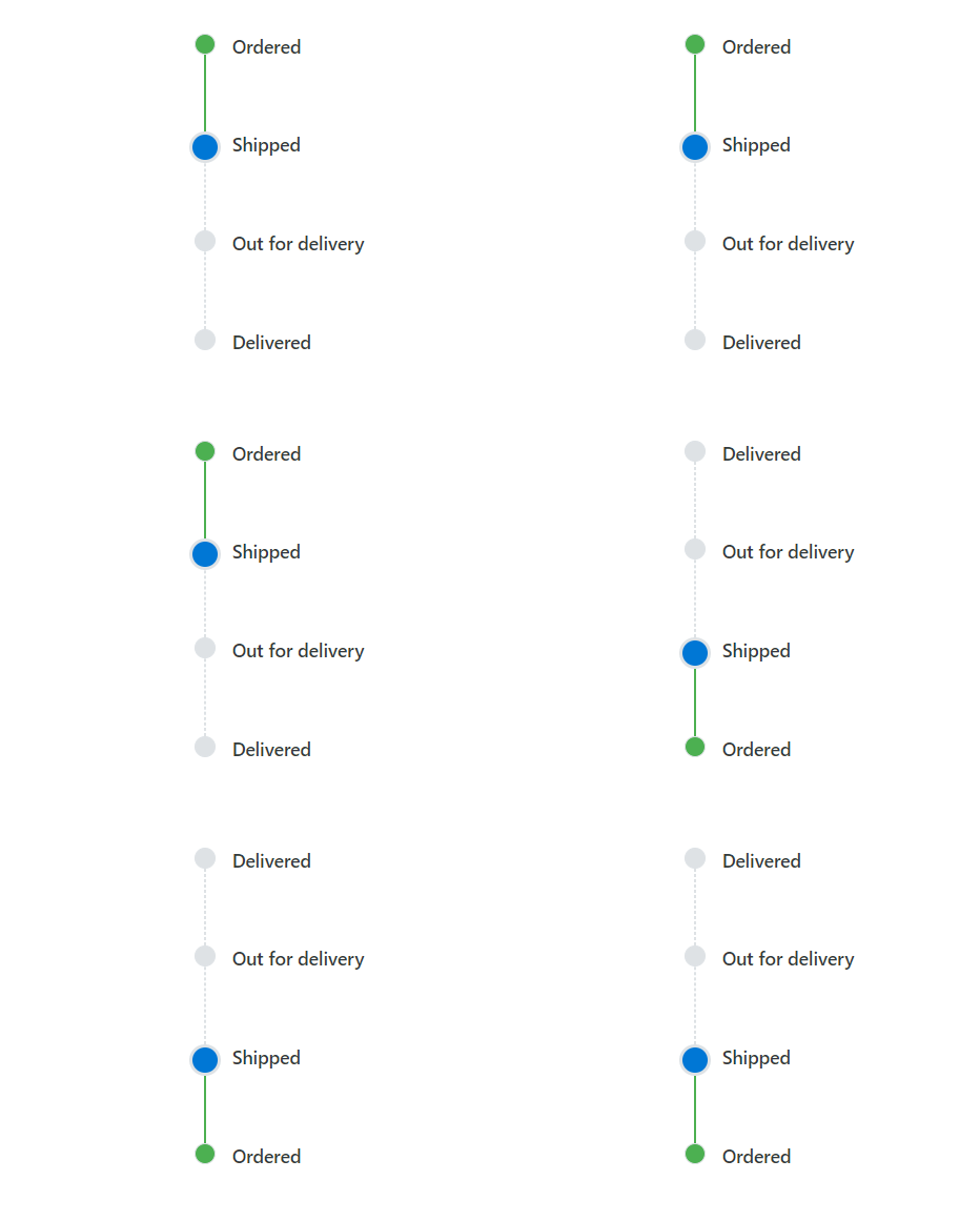
Reverse Timeline in Blazor Timeline
**Note:** For more details, refer to [reversing the order of timeline items documentation](https://blazor.syncfusion.com/documentation/timeline/reverse)
.
## Customization using Templates
With the Blazor Timeline component, you can easily customize its appearance, including styling dot items and templating content. This feature provides a high level of flexibility and control over the timeline’s presentation, ensuring it matches your application’s design perfectly.
The following code example demonstrates the project management phases using the [Template](https://help.syncfusion.com/cr/blazor/Syncfusion.Blazor.Layouts.SfTimeline.html#Syncfusion_Blazor_Layouts_SfTimeline_Template)
property for customizing each item and its styling.
```
@using Syncfusion.Blazor.Layouts
```
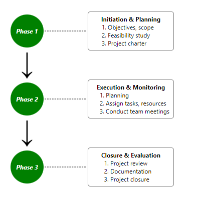
Customization Templates in Blazor Timeline
**Note:** For more details, refer to the [customizing the display of items using templates in the Blazor Timeline documentation](https://blazor.syncfusion.com/documentation/timeline/template)
.
## References
For more details, refer to our complete [Blazor Timeline component demos](https://blazor.syncfusion.com/demos/timeline/default-functionalities?theme=fluent)
and [documentation](https://blazor.syncfusion.com/documentation/timeline/getting-started)
.
## Supported Platforms
The Timeline component is also available on the following platforms.
| Platform | Live Demo | Documentation |
| --- | --- | --- |
| JavaScript | JavaScript Timeline Demos | Getting Started with JavaScript Timeline |
| Angular | Angular Timeline Demos | Getting Started with Angular Timeline |
| React | React Timeline Demos | Getting Started with React Timeline |
| Vue | Vue Timeline Demos | Getting Started with Vue Timeline |
| ASP.Net Core | ASP.Net Core Timeline Demos | Getting Started with ASP.Net Core Timeline |
| ASP.Net MVC | ASP.Net MVC Timeline Demos | Getting Started with ASP.Net MVC Timeline |
## Conclusion
Thanks for reading! In this blog, we have seen the features of the new Syncfusion [Blazor Timeline](https://www.syncfusion.com/blazor-components/blazor-timeline)
component that rolled out in our [2024 Volume 1](https://www.syncfusion.com/forums/187257/essential-studio-2024-volume-1-main-release-v25-1-35-is-available-for-download)
release. These features are also listed on our [Release Notes](https://help.syncfusion.com/common/essential-studio/release-notes/v25.1.35)
and the [What’s New](https://www.syncfusion.com/products/whatsnew)
pages. Try out the component and share your feedback as comments on this blog.
You can also reach us through our [support forums](https://www.syncfusion.com/forums)
, [support portal](https://support.syncfusion.com/)
, or [feedback portal](https://www.syncfusion.com/feedback)
. Our team is always ready to assist you!
## Related blogs
- [Effortless Remote Debugging with Dev Tunnel in Visual Studio 2022](https://www.syncfusion.com/blogs/post/dev-tunnel-remote-debug-vs-2022)
- [What’s New in Syncfusion Blazor: 2024 Volume 1](https://www.syncfusion.com/blogs/post/whats-new-blazor-2024-vol-1)
- [Create Responsive Web Designs Like a Pro with Blazor Media Query](https://www.syncfusion.com/blogs/post/responsive-web-blazor-mediaquery)
- [Perform Effortless CRUD Actions in Blazor DataGrid with Fluxor](https://www.syncfusion.com/blogs/post/crud-blazor-datagrid-fluxor)