---
title: "Design Smarter Data Tables in .NET MAUI with the DataGrid Control"
published_at: "2025-09-09T11:24:14+00:00"
modified_at: "2026-06-23T09:00:20+00:00"
url: "https://www.syncfusion.com/blogs/post/maui-datagrid-guide"
excerpt: "Struggling with data presentation in MAUI apps? Discover how the DataGrid control simplifies building fast, flexible, and interactive tables across platforms."
taxonomy_category:
  - ".NET MAUI"
  - "Data Visualization"
  - "DataGrid"
  - "MAUI"
  - "UI Controls"
  - "Web Development"
taxonomy_post_tag:
  - ".NET MAUI"
  - "Cross-Platform UI"
  - "Data Presentation"
  - "DataTable"
  - "Developer-friendly Grid"
  - "High-Performance Grid"
  - "Interactive Data Tables"
  - "Interactive Tables"
  - "MAUI Data Grid"
  - "MAUI DataGrid"
  - "MAUI Grid"
---

# Design Smarter Data Tables in .NET MAUI with the DataGrid Control

[Farjana Parveen](https://www.syncfusion.com/blogs/author/farjanaparveena)
![Design Smarter Data Tables in .NET MAUI with the DataGrid Control](https://www.syncfusion.com/blogs/wp-content/uploads/2025/09/Design-Smarter-Data-Tables-in-.NET-MAUI-with-the-DataGrid-Control.jpg)


**TL;DR:** The MAUI DataGrid is a powerful control for building responsive, feature-rich data tables in cross-platform .NET MAUI apps. This guide explores its advanced capabilities, like sorting, filtering, and UI virtualization, to help developers create high-performance, interactive UIs with ease.

Building responsive and interactive data tables in cross-platform apps can be challenging. That’s where the [Syncfusion® MAUI DataGrid](https://www.syncfusion.com/maui-controls/maui-datagrid)
 shines, a feature-rich component designed to handle everything from simple data tables to complex, interactive data experiences.

This blog post will guide you through implementing the **Syncfusion® MAUI DataGrid**, from initial setup to harnessing its most advanced features. Whether you’re displaying a list of orders, managing inventory, or building a complex data-driven dashboard, the ** SfDataGrid** is the tool you need.

## What makes the Syncfusion® DataGrid stand out?

- **High performance:** Built from the ground up with performance in mind. It uses row and column UI virtualization to handle thousands, or even millions, of records with a smooth scrolling experience.
- **Extensive feature set:** It’s more than just a table. It comes packed with essential features like sorting, grouping, filtering, summaries, editing, and more.
- **Highly customizable:** Tailor every aspect of the grid’s appearance, from cell styles to custom column templates, to match your application’s design.
- **Intuitive API:** A well-designed and easy-to-use API makes development fast and straightforward.

Let’s dive deeper into the key features that make the **SfDataGrid** so powerful.

## Sorting

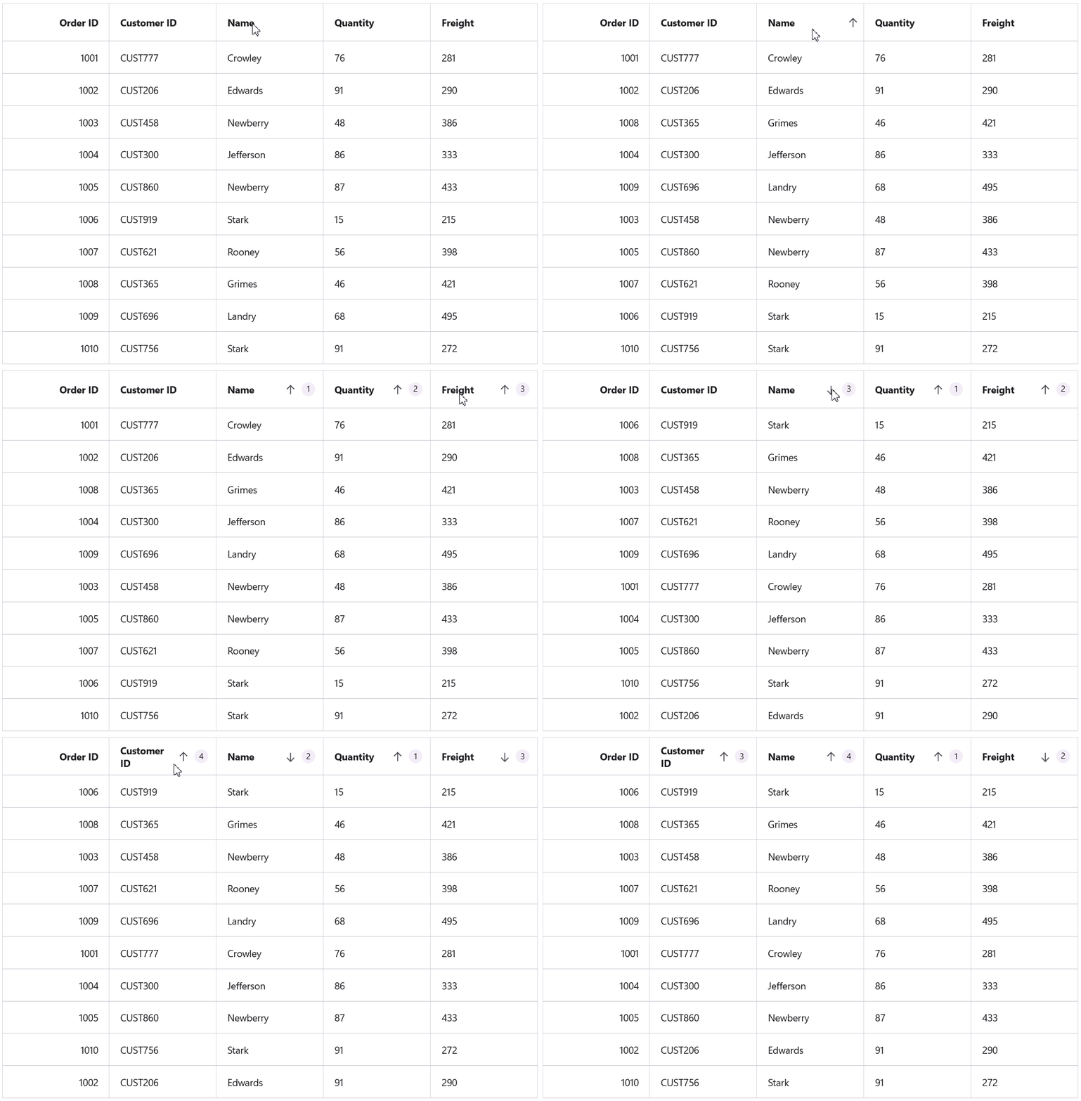
**SfDataGrid** offers a seamless sorting experience with a simple tap on any column header. A visual icon immediately appears, indicating the current sort direction. For more control, enable `AllowTriStateSorting` to cycle through ascending, descending, and unsorted states. The grid also supports multi-column sorting for organizing complex data. To view the sort order, setting `ShowSortNumbers` to true displays a numeric priority on the headers.

```
<syncfusion:SfDataGrid 
    SortingMode="Multiple"
    ShowSortNumbers="True"
    ItemsSource="{Binding DealerInformation}" />
```

![Sorting feature in MAUI DataGrid](https://www.syncfusion.com/blogs/wp-content/uploads/2025/09/image001.gif)

Sorting feature in MAUI DataGrid

## Grouping

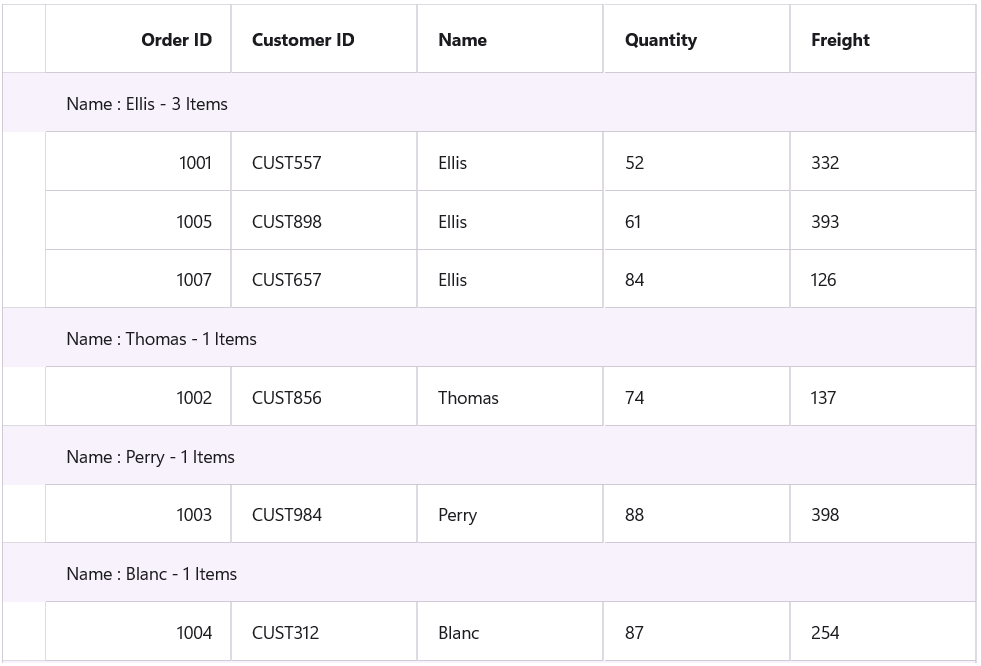
**SfDataGrid** enhances data readability by organizing records into a hierarchical structure under descriptive caption rows. This is enabled programmatically by adding `GroupColumnDescription`objects for the columns to group by. For more advanced scenarios, a Converter can be used to apply custom grouping logic to the data. To create nested, multi-level structures, set the `GroupingMode` property to ** Multiple**.

```
<syncfusion:SfDataGrid GroupingMode="Multiple"
                       ItemsSource="{Binding DealerInformation}">
    <syncfusion:SfDataGrid.GroupColumnDescriptions>
        <syncfusion:GroupColumnDescription ColumnName="Name" />
    </syncfusion:SfDataGrid.GroupColumnDescriptions>
</syncfusion:SfDataGrid>
```

![Grouping feature in MAUI DataGrid](https://www.syncfusion.com/blogs/wp-content/uploads/2025/09/image002.png)

Grouping feature in MAUI DataGrid

Simplify .NET MAUI DataGrid Development

Spend less time building grid features from scratch. Syncfusion .NET MAUI DataGrid includes ready-to-use support for data binding, paging, sorting, filtering, editing, and exporting.

[Start Building Today](https://www.syncfusion.com/maui-controls/maui-datagrid)

## Summaries

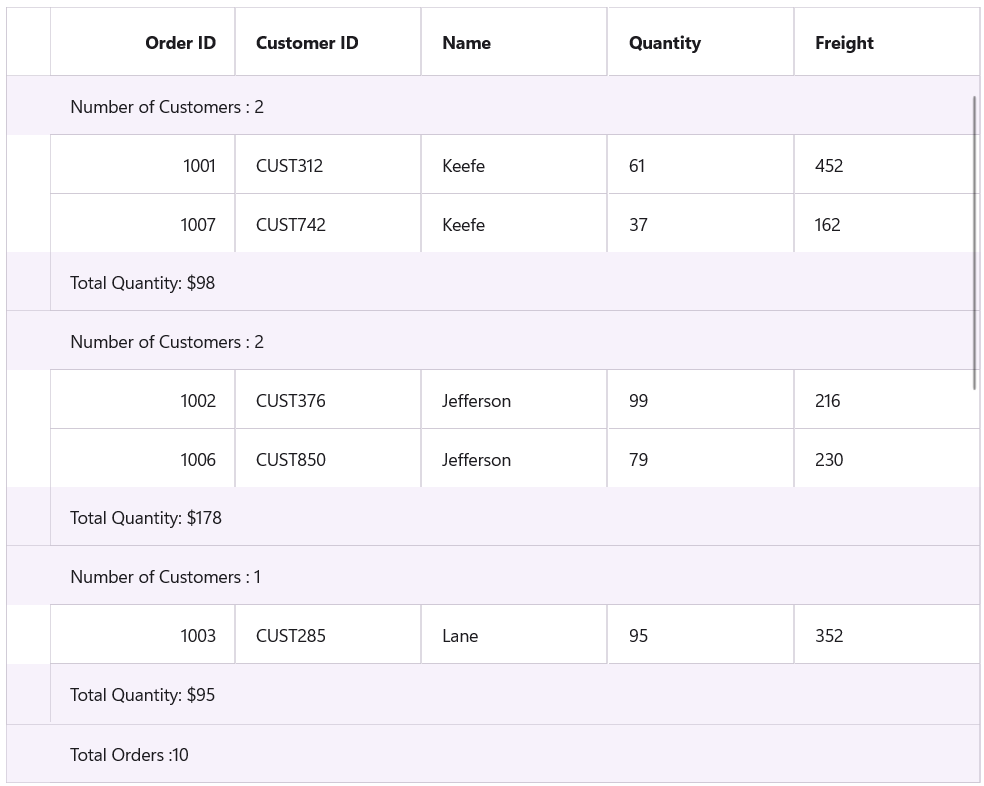
**SfDataGrid** enhances data analysis by displaying concise summaries of your data objects. It provides three powerful summary types to fit different reporting needs. Use ** Caption Summary** to show details in group headers, and ** Group Summary** for calculations within each group. The ** Table Summary** displays aggregate information for the entire grid for a complete overview.

```
<syncfusion:SfDataGrid GroupingMode="Multiple"
                        ItemsSource="{Binding DealerInformation}">

    <syncfusion:SfDataGrid.GroupColumnDescriptions>
        <syncfusion:GroupColumnDescription ColumnName="DealerName" />
    </syncfusion:SfDataGrid.GroupColumnDescriptions>

    <syncfusion:SfDataGrid.CaptionSummaryRow>
        <syncfusion:DataGridSummaryRow Title="Number of Customers: {CustomerName}"
                                       ShowSummaryInRow="True">
            <syncfusion:DataGridSummaryRow.SummaryColumns>
                <syncfusion:DataGridSummaryColumn Name="CustomerName"
                                                  Format="{}{Count}"
                                                  MappingName="Name"
                                                  SummaryType="CountAggregate" />
            </syncfusion:DataGridSummaryRow.SummaryColumns>
        </syncfusion:DataGridSummaryRow>
    </syncfusion:SfDataGrid.CaptionSummaryRow>

    <syncfusion:SfDataGrid.GroupSummaryRows>
        <syncfusion:DataGridSummaryRow ShowSummaryInRow="True"
                                       Title="Total Quantity: {Quantity}">
            <syncfusion:DataGridSummaryRow.SummaryColumns>
                <syncfusion:DataGridSummaryColumn Name="Quantity"
                                                  MappingName="Quantity"
                                                  Format="{}{Sum:C0}"
                                                  SummaryType="DoubleAggregate" />
            </syncfusion:DataGridSummaryRow.SummaryColumns>
        </syncfusion:DataGridSummaryRow>
    </syncfusion:SfDataGrid.GroupSummaryRows>

    <syncfusion:SfDataGrid.TableSummaryRows>
        <syncfusion:DataGridTableSummaryRow Title="Total Orders: {TotalOrders}"
                                            ShowSummaryInRow="True">
            <syncfusion:DataGridTableSummaryRow.SummaryColumns>
                <syncfusion:DataGridSummaryColumn Name="TotalOrders"
                                                  Format="{}{Count}"
                                                  MappingName="OrderID"
                                                  SummaryType="CountAggregate" />
            </syncfusion:DataGridTableSummaryRow.SummaryColumns>
        </syncfusion:DataGridTableSummaryRow>
    </syncfusion:SfDataGrid.TableSummaryRows>

</syncfusion:SfDataGrid>
```

![Summary display feature in MAUI DataGrid](https://www.syncfusion.com/blogs/wp-content/uploads/2025/09/image004.png)

Summary display feature in MAUI DataGrid

## Filtering

**SfDataGrid** streamlines data analysis by enabling view filtering to display only records that meet specific criteria. This feature is activated by setting a condition on the ** SfDataGrid.View.Filter** property. The filtering logic can be applied narrowly to specific columns or broadly to the entire data source. Common conditions like ** Equals**, ** Does not equal,** and ** Contains** are readily available to refine the view.

```
private void SfDataGrid_Loaded(object sender, EventArgs e)
{
    dataGrid.View.Filter = FilterRecords;
    dataGrid.View.RefreshFilter();
}

public bool FilterRecords(object record)
{
    TemplateModel? templateModel = record as TemplateModel;

    if (templateModel != null && templateModel.DealerName == "Jefferson")
    {
        return true;
    }

    return false;
}
```
![Filtering feature in MAUI DataGrid](https://www.syncfusion.com/blogs/wp-content/uploads/2025/09/image006.png)

Filtering feature in MAUI DataGrid

## Selection

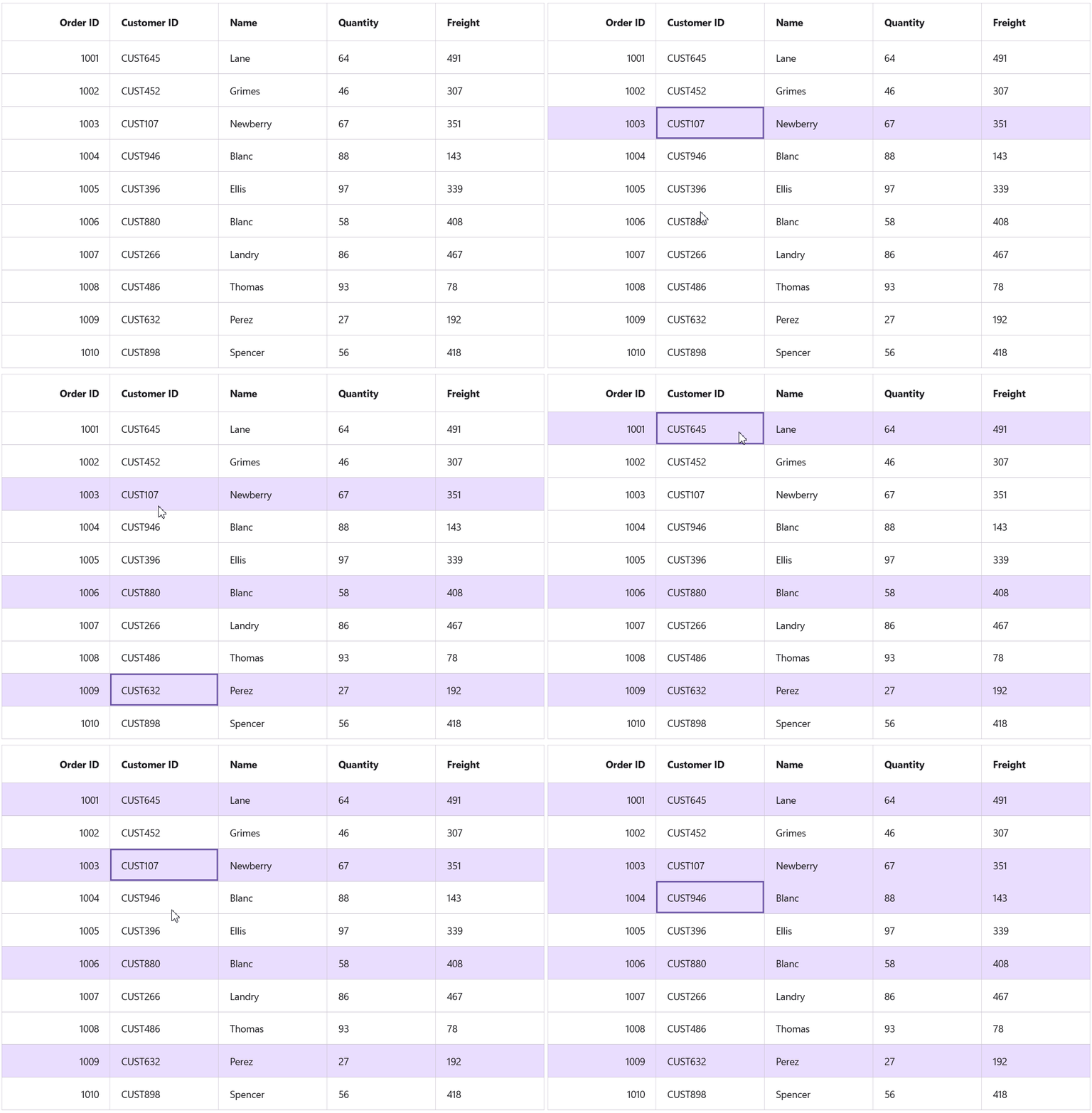
In **SfDataGrid**, user selection is controlled with two key properties. First, define what can be selected by setting the `SelectionUnit` to either Row or Cell. Next, configure how items are selected using `SelectionMode`, with options like Single for one item or Multiple for many. These properties work in tandem to customize the grid’s selection behavior to match an application’s requirements.

```
<syncfusion:SfDataGrid SelectionUnit="Row"
                        SelectionMode="Multiple"
                        ItemsSource="{Binding DealerInformation}" />
```

![Selection feature i n MAUI DataGrid](https://www.syncfusion.com/blogs/wp-content/uploads/2025/09/image008.gif)

Selection feature in MAUI DataGrid

## Editing

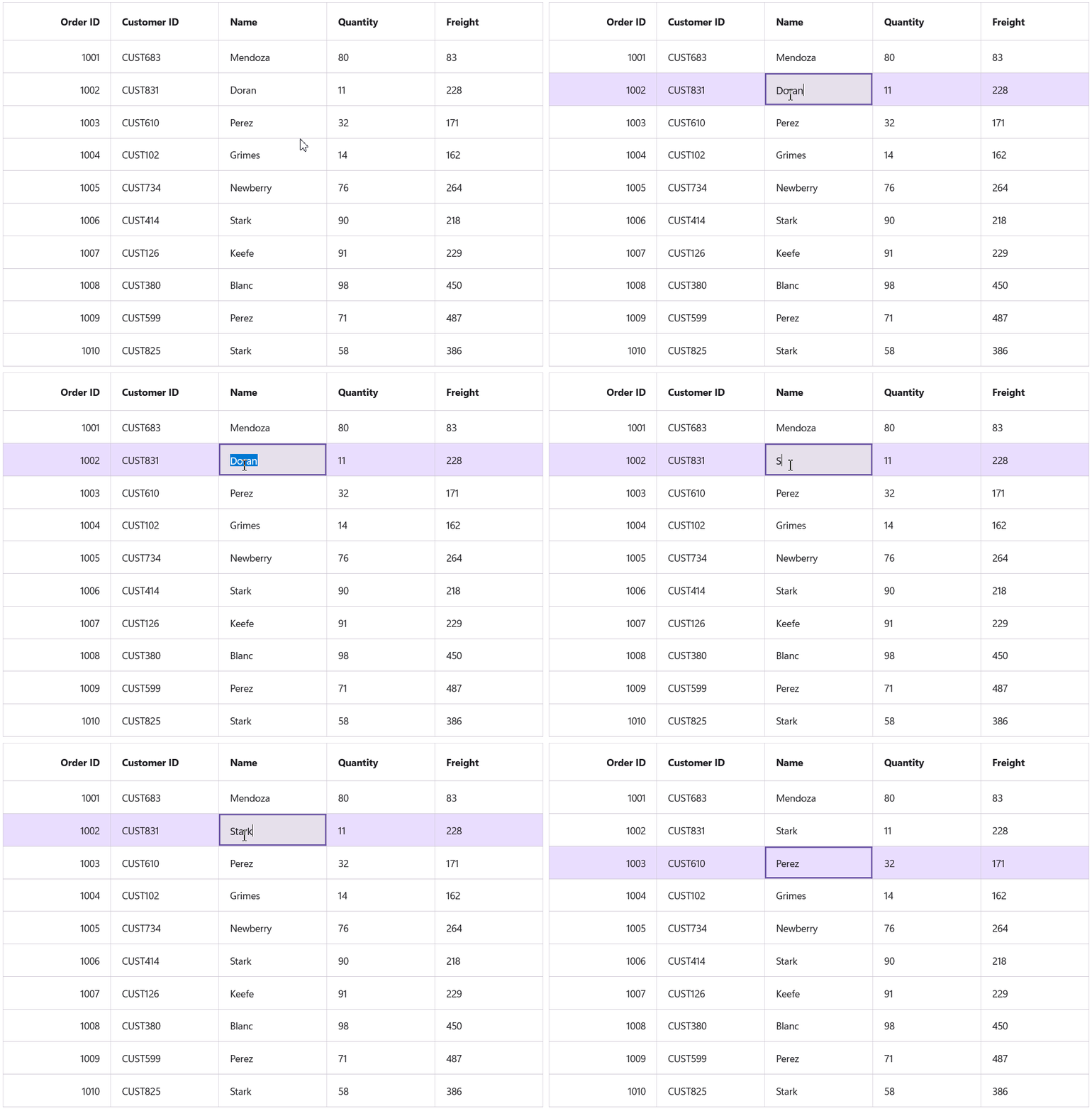
To enable editing in the **Syncfusion® .NET MAUI DataGrid**, set the `AllowEditing` property to ** true.** Fine-tune control by using `DataGridColumn.AllowEditing` to manage editing permissions for specific columns. Users can enter edit mode by tapping a cell, with the default trigger being a double-tap. This interaction can be customized by setting the ** EditTapAction** property to ** SingleTap** for a more immediate response.

```
<syncfusion:SfDataGrid NavigationMode="Cell"
                        AllowEditing="True"
                        SelectionMode="Single"
                        ItemsSource="{Binding DealerInformation}" />
```

![Editing feature in MAUI DataGrid](https://www.syncfusion.com/blogs/wp-content/uploads/2025/09/image009.gif)

Editing feature in MAUI DataGrid

## MasterDetailsView

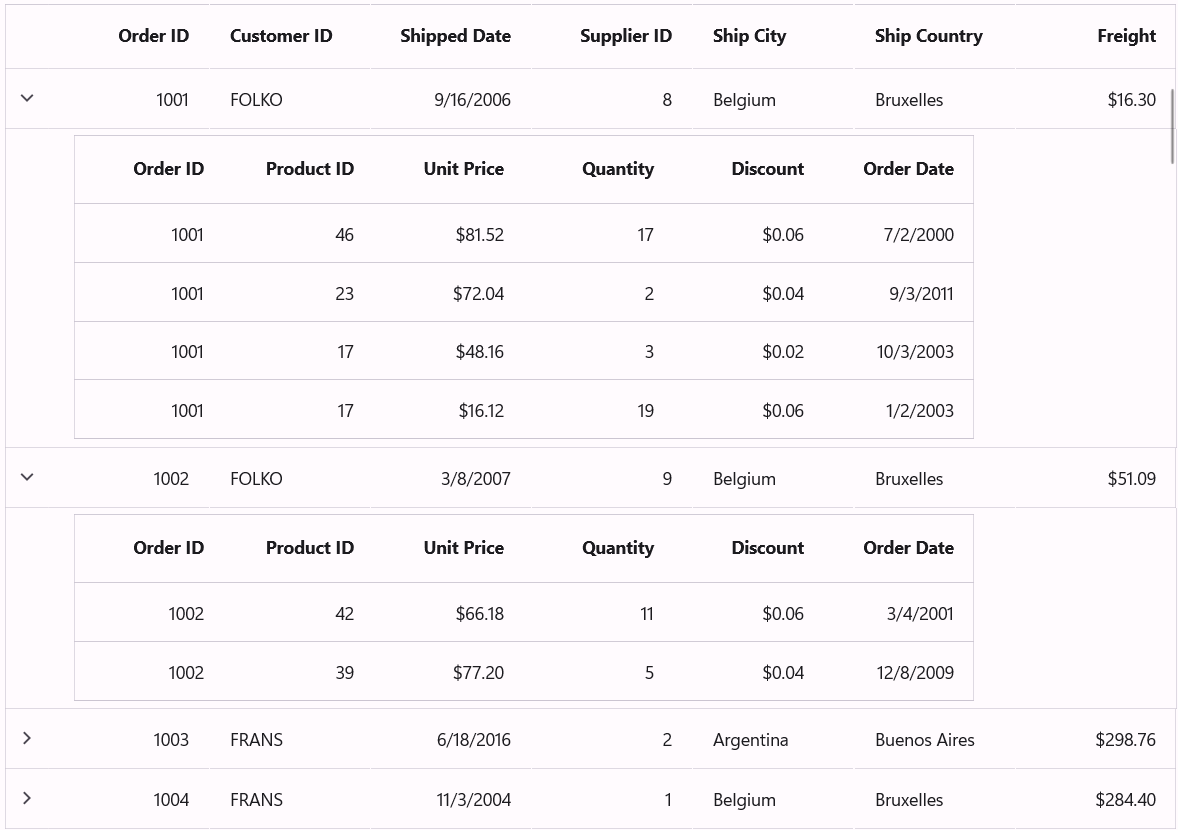
**SfDataGrid** elegantly manages and displays hierarchical data through its powerful ** Master-details view**. This feature excels at representing parent-child relationships, transforming complex datasets into a structured and intuitive format. Nesting multiple levels of related information provides a clear and organized view of intricate data structures.

### Key capabilities of the master-details view include:

- **Structured nested tables**: Present relational data in a clear, hierarchical format, making complex relationships easy to understand.
- **Interactive expansion:** A built-in expander allows rows to be expanded or collapsed with a simple click. This behavior can also be controlled programmatically for guided user experiences.
- **Unlimited nesting:** The feature supports limitless levels of nesting, ensuring it can handle even the most deeply layered relational data models.

```
<syncfusion:SfDataGrid 
    AutoGenerateRelations="False"
    ItemsSource="{Binding OrderList}">

    <syncfusion:SfDataGrid.DetailsViewDefinition>
        <syncfusion:DataGridViewDefinition RelationalColumn="OrdersList">
            <syncfusion:DataGridViewDefinition.DataGrid>
                <syncfusion:SfDataGrid 
                    x:Name="FirstLevelNestedGrid"
                    AutoGenerateColumnsMode="None"
                    DefaultColumnWidth="{OnPlatform WinUI=120, MacCatalyst=120}">

                    <syncfusion:SfDataGrid.Columns>
                        <syncfusion:DataGridNumericColumn 
                            Format="D" 
                            MappingName="OrderID" 
                            HeaderText="Order ID"/>

                        <syncfusion:DataGridNumericColumn 
                            Format="D" 
                            MappingName="ProductID" 
                            HeaderText="Product ID"/>

                        <syncfusion:DataGridNumericColumn 
                            Format="C" 
                            MappingName="UnitPrice" 
                            HeaderText="Unit Price"/>

                        <syncfusion:DataGridNumericColumn 
                            Format="D" 
                            MappingName="Quantity" 
                            HeaderText="Quantity" 
                            Visible="{StaticResource visible}"/>

                        <syncfusion:DataGridNumericColumn 
                            Format="C" 
                            MappingName="Discount" 
                            HeaderText="Discount" 
                            Visible="{StaticResource visible}"/>

                        <syncfusion:DataGridDateColumn 
                            MappingName="OrderDate" 
                            HeaderText="Order Date" 
                            Visible="{StaticResource visible}"/>
                    </syncfusion:SfDataGrid.Columns>

                </syncfusion:SfDataGrid>
            </syncfusion:DataGridViewDefinition.DataGrid>
        </syncfusion:DataGridViewDefinition>
    </syncfusion:SfDataGrid.DetailsViewDefinition>

</syncfusion:SfDataGrid>
```

![Master-details viewing feature in MAUI DataGrid](https://www.syncfusion.com/blogs/wp-content/uploads/2025/09/image010.png)

MasterDetailsViewing feature in MAUI DataGrid

## Record template view

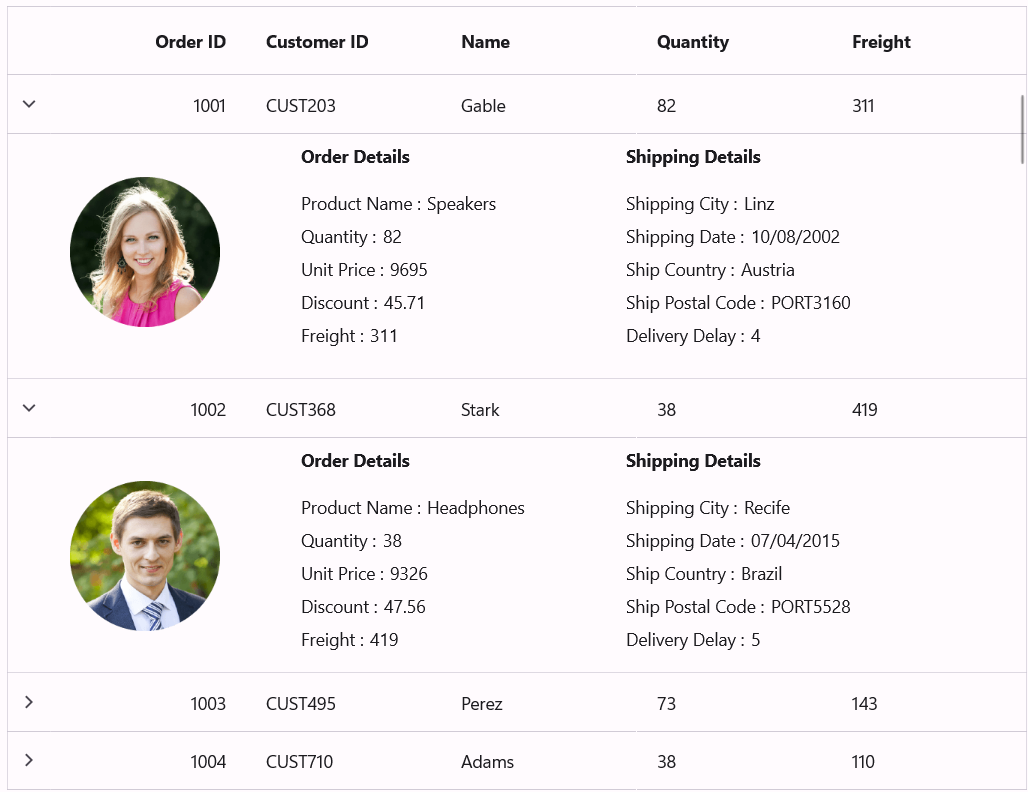
**SfDataGrid** offers a powerful way to display additional information for any row using its `TemplateViewDefinition` feature. This allows creating a custom, expandable section beneath a row to present supplementary details that don’t fit into the primary columns.

The true flexibility of this feature lies in the `RowTemplate`, where any control can be loaded. This opens up endless possibilities: embed a detailed chart, display an image, provide formatted notes, or add interactive buttons. The `TemplateViewDefinition` transforms a standard row into a rich, interactive element. To keep the interface clean, the user can intuitively expand or collapse this template view via an expander icon or controlled programmatically for a more guided experience.

```
<ContentPage.Resources>
    <DataTemplate x:Key="DetailsViewTemplate">
        <Grid>
            <Grid.RowDefinitions>
                <RowDefinition Height="30" />
                <RowDefinition Height="150" />
            </Grid.RowDefinitions>
            <Grid.ColumnDefinitions>
                <ColumnDefinition Width="150" />
                <ColumnDefinition Width="300" />
                <ColumnDefinition Width="300" />
            </Grid.ColumnDefinitions>

            <Image Grid.Row="0"
                   Grid.RowSpan="2"
                   Grid.Column="0"
                   Margin="15"
                   HorizontalOptions="Start"
                   Source="{Binding Data.DealerImage}" />

            <Label Grid.Row="0"
                   Grid.Column="1"
                   HorizontalOptions="Start"
                   VerticalOptions="Center"
                   Text="Order Details"
                   FontAttributes="Bold" />

            <StackLayout Grid.Row="1"
                         Grid.Column="1"
                         HorizontalOptions="Start"
                         VerticalOptions="Center"
                         Orientation="Vertical">

                <StackLayout Orientation="Horizontal">
                    <Label HorizontalOptions="Start"
                           VerticalOptions="Center"
                           Text="Product Name :" />
                    <Label Margin="5"
                           HorizontalOptions="Start"
                           VerticalOptions="Center"
                           Text="{Binding Data.ElectonicProduct}" />
                </StackLayout>

                <StackLayout Orientation="Horizontal">
                    <Label HorizontalOptions="Start"
                           VerticalOptions="Center"
                           Text="Quantity :" />
                    <Label Margin="5"
                           HorizontalOptions="Start"
                           VerticalOptions="Center"
                           Text="{Binding Data.Quantity}" />
                </StackLayout>

                <StackLayout Orientation="Horizontal">
                    <Label HorizontalOptions="Start"
                           VerticalOptions="Center"
                           Text="Unit Price :" />
                    <Label Margin="5"
                           HorizontalOptions="Start"
                           VerticalOptions="Center"
                           Text="{Binding Data.ProductPrice}" />
                </StackLayout>

                <StackLayout Orientation="Horizontal">
                    <Label HorizontalOptions="Start"
                           VerticalOptions="Center"
                           Text="Discount :" />
                    <Label Margin="5"
                           HorizontalOptions="Start"
                           VerticalOptions="Center"
                           Text="{Binding Data.Discount, StringFormat='{}{0:0.00}'}" />
                </StackLayout>

                <StackLayout Orientation="Horizontal">
                    <Label HorizontalOptions="Start"
                           VerticalOptions="Center"
                           Text="Freight :" />
                    <Label Margin="5"
                           HorizontalOptions="Start"
                           VerticalOptions="Center"
                           Text="{Binding Data.Freight}" />
                </StackLayout>

            </StackLayout>

            <Label Grid.Row="0"
                   Grid.Column="2"
                   Margin="10,0,0,0"
                   HorizontalOptions="Start"
                   VerticalOptions="Center"
                   Text="Shipping Details"
                   FontAttributes="Bold" />

            <StackLayout Grid.Row="1"
                         Grid.Column="2"
                         Margin="10,0,0,0"
                         HorizontalOptions="Start"
                         VerticalOptions="Center"
                         Orientation="Vertical">

                <StackLayout Orientation="Horizontal">
                    <Label HorizontalOptions="End"
                           VerticalOptions="Center"
                           Text="Shipping City :" />
                    <Label Margin="5"
                           HorizontalOptions="Start"
                           VerticalOptions="Center"
                           Text="{Binding Data.ShipCity}" />
                </StackLayout>

                <StackLayout Orientation="Horizontal">
                    <Label HorizontalOptions="End"
                           VerticalOptions="Center"
                           Text="Shipping Date :" />
                    <Label Margin="5"
                           HorizontalOptions="Start"
                           VerticalOptions="Center"
                           Text="{Binding Data.ShippedDate, StringFormat='{}{0:MM/dd/yyyy}'}" />
                </StackLayout>

                <StackLayout Orientation="Horizontal">
                    <Label HorizontalOptions="End"
                           VerticalOptions="Center"
                           Text="Ship Country :" />
                    <Label Margin="5"
                           HorizontalOptions="Start"
                           VerticalOptions="Center"
                           Text="{Binding Data.ShipCountry}" />
                </StackLayout>

                <StackLayout Orientation="Horizontal">
                    <Label HorizontalOptions="End"
                           VerticalOptions="Center"
                           Text="Ship Postal Code :" />
                    <Label Margin="5"
                           HorizontalOptions="Start"
                           VerticalOptions="Center"
                           Text="{Binding Data.ShipPortalCode}" />
                </StackLayout>

                <StackLayout Orientation="Horizontal">
                    <Label HorizontalOptions="End"
                           VerticalOptions="Center"
                           Text="Delivery Delay :" />
                    <Label Margin="5"
                           HorizontalOptions="Start"
                           VerticalOptions="Center"
                           Text="{Binding Data.DeliveryDelay}" />
                </StackLayout>

            </StackLayout&gt>
        </Grid>
    </DataTemplate>
</ContentPage.Resources>

<syncfusion:SfDataGrid ItemsSource="{Binding DealerInformation}">
    <syncfusion:SfDataGrid.DetailsViewDefinition>
        <syncfusion:TemplateViewDefinition RowTemplate="{StaticResource DetailsViewTemplate}"
                                           HeightMode="Auto" />
    </syncfusion:SfDataGrid.DetailsViewDefinition>
</syncfusion:SfDataGrid>
```

![Record template viewing feature in MAUI DataGrid](https://www.syncfusion.com/blogs/wp-content/uploads/2025/09/image012.png)

Record template viewing feature in MAUI DataGrid

## Incremental loading

The MAUI DataGrid supports incremental loading, fetching data in chunks as users scroll. It uses the **ISupportIncrementalLoading** interface to load more items on demand. The `ItemsSource` can be bound to the built-in `IncrementalList` or a custom collection. The `DataFetchSize` property determines how many items are fetched in each new request.

```
<syncfusion:SfDataGrid DataFetchSize="20"
                        ItemsSource="{Binding IncrementalItemsSource}" />
public class ViewModel
{
    public ViewModel()
    {
        IncrementalItemsSource = new IncrementalList(LoadMoreItems) { MaxItemsCount = 200 };
    }

    private IncrementalList _incrementalItemsSource;

    public IncrementalList IncrementalItemsSource
    {
        get { return _incrementalItemsSource; }
        set { _incrementalItemsSource = value; }
    }

    async void LoadMoreItems(uint count, int baseIndex)
    {
        var _orders = this.GenerateOrders();
        var list = GenerateOrders().Skip(baseIndex).Take(5).ToList();
        IncrementalItemsSource.LoadItems(list);
    }
}
```

## GitHub reference

For more details, refer to the [GitHub](https://github.com/SyncfusionExamples/Mastering-Data-Presentation-A-Deep-Dive-into-the-Syncfusion-MAUI-DataGrid)
 demo.


## Conclusion

The [Syncfusion® MAUI DataGrid](https://www.syncfusion.com/maui-controls/maui-datagrid)
 is a high-performance, feature-rich grid control that provides an exceptional solution for displaying and manipulating tabular data in .NET Multi-platform App UI ([MAUI](https://www.syncfusion.com/maui-controls)
) applications. Designed to handle vast datasets gracefully, it offers responsive rendering, smooth scrolling, and efficient memory management across **iOS, Android, Windows,** and ** macOS** platforms.

Existing customers can download the new version of Essential Studio® on the [license and downloads](https://www.syncfusion.com/account/downloads)
 page. If you are not a Syncfusion® customer, try our 30-day [free trial](https://www.syncfusion.com/downloads)
 to check our incredible features.

If you require any assistance, please don’t hesitate to contact us via our [support forum](https://www.syncfusion.com/forums)
, [support portal](https://support.syncfusion.com/)
, or [feedback portal](https://www.syncfusion.com/feedback)
. We are always eager to help you!

## Related Blogs


[Style Summary Rows in .NET MAUI DataGrid: Simplified Customization Guide](https://www.syncfusion.com/blogs/post/maui-datagrid-summary-styling)


[Build a School Gradesheet App Easily with .NET MAUI DataGrid](https://www.syncfusion.com/blogs/post/gradesheet-app-dotnet-maui-datagrid)


[Boost .NET MAUI DataGrid Performance with Efficient Pagination Techniques](https://www.syncfusion.com/blogs/post/maui-datagrid-performance-pagination)


[Turn Default into Delight: MAUI DataGrid Customization, Part 1—Row Styling Simplified](https://www.syncfusion.com/blogs/post/maui-datagrid-style-tips)