---
title: "Exploring Key Features of Blazor MultiSelect Dropdown"
published_at: "2021-06-10T11:02:01+00:00"
modified_at: "2025-04-22T09:19:09+00:00"
url: "https://www.syncfusion.com/blogs/post/key-features-of-blazor-multiselect-dropdown"
excerpt: "Syncfusion’s Blazor MultiSelect Dropdown is a textbox component that allows a user to type or select multiple values from a list of predefined options. It works in both Blazor Server and WebAssembly (WASM) applications. You can bind the MultiSelect Dropdown..."
taxonomy_category:
  - "Blazor"
  - "Web"
taxonomy_post_tag:
  - "Blazor"
  - "dropdown"
  - "multiselect"
  - "Web Development"
  - "WebAssembly"
---

# Exploring Key Features of Blazor MultiSelect Dropdown

[Saravanan G](https://www.syncfusion.com/blogs/author/saravanang)
![Exploring Key Features of Blazor MultiSelect Dropdown](https://www.syncfusion.com/blogs/wp-content/uploads/2021/06/Exploring-Key-Features-of-Blazor-MultiSelect-Dropdown.png)


Syncfusion’s Blazor [MultiSelect Dropdown](https://www.syncfusion.com/blazor-components/blazor-multiselect-dropdown)
 is a textbox component that allows a user to type or select multiple values from a list of predefined options. It works in both [Blazor Server](https://docs.microsoft.com/en-us/aspnet/core/blazor/hosting-models?view=aspnetcore-5.0#blazor-server)
 and [WebAssembly](https://en.wikipedia.org/wiki/WebAssembly)
 (WASM) applications. You can bind the MultiSelect Dropdown to a data source using different modes like default, chip (box), delimiter, and check box.

A real-time example of using the MultiSelect Dropdown in an application is to select multiple email IDs for the To and CC fields.

This blog will explain the following key features of the Blazor MultiSelect Dropdown component along with code examples:

- [Data Binding](#data-binding)
- [Filtering Data](#filtering-data)
- [Customize Appearance with Template](#customize-appearance-with-template)
- [Check Box Mode](#checkbox-mode)
- [Grouping List Items](#grouping-the-list-items)

## Data binding

The Blazor MultiSelect Dropdown component provides the following two methods to bind [data sources](https://blazor.syncfusion.com/documentation/multiselect-dropdown/data-source/)
 to it:

- [Local Data Binding](#local-data-binding)
- [Remote Data Binding](#remote-data-binding)

### Local data binding

For this approach, create the required model classes and data. Then, bind the data to the **DataSource** property of the Blazor MultiSelect Dropdown.

The following code example in the Razor file binds the local data to the Blazor MultiSelect Dropdown.

```
<SfMultiSelect TValue="string[]" TItem="Countries" Placeholder="e.g. Australia" DataSource="@Country">
    <MultiSelectFieldSettings Text="Name" Value="Code"></MultiSelectFieldSettings>
</SfMultiSelect>
@code {
    public class Countries
    {
        public string Name { get; set; }
        public string Code { get; set; }
    }
    List<Countries> Country = new List<Countries>
    {
    new Countries() { Name = "Australia", Code = "AU" },
    new Countries() { Name = "Bermuda", Code = "BM" },
    new Countries() { Name = "Canada", Code = "CA" },
    new Countries() { Name = "Cameroon", Code = "CM" },
    new Countries() { Name = "Denmark", Code = "DK" },
    new Countries() { Name = "France", Code = "FR" },
    new Countries() { Name = "Finland", Code = "FI" },
    new Countries() { Name = "Germany", Code = "DE" },
    new Countries() { Name = "Greenland", Code = "GL" }
    };
}
```
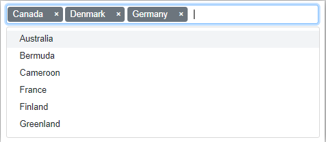
![Local Data Binding in Blazor MultiSelect Dropdown Component](https://www.syncfusion.com/blogs/wp-content/uploads/2021/06/Local-Data-Binding-in-Blazor-MultiSelect-Dropdown-Component.png)

Local Data Binding in Blazor MultiSelect Dropdown

### Remote data binding

Use the [Syncfusion Data Manager](https://blazor.syncfusion.com/documentation/data/)
 to retrieve tasks from a remote data source. Then, define the value and text fields to bind the data with the MultiSelect Dropdown component.

Refer to the following code example.

```
@using Syncfusion.Blazor.Data
@using Syncfusion.Blazor.DropDowns

<SfMultiSelect TValue="string[]" TItem="CustomerDetails" Placeholder="Select a customer" Query="@Query">
    <SfDataManager Url="https://services.odata.org/V4/Northwind/Northwind.svc/Customers" Adaptor="Syncfusion.Blazor.Adaptors.ODataV4Adaptor" CrossDomain=true></SfDataManager>
    <MultiSelectFieldSettings Text="ContactName" Value="CustomerID"></MultiSelectFieldSettings>
</SfMultiSelect>
@code {
    public Query Query = new Query().Select(new List<string> { "ContactName", "CustomerID" }).Take(10).RequiresCount();
    public class CustomerDetails
    {
        public string CustomerID { get; set; }
        public string CompanyName { get; set; }
        public string ContactName { get; set; }
        public string Country { get; set; }
        public string Address { get; set; }
    }
}
```
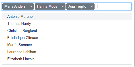
![Remote Data Binding in Blazor MultiSelect Dropdown](https://www.syncfusion.com/blogs/wp-content/uploads/2021/06/Remote-Data-Binding-in-Blazor-MultiSelect-Dropdown.png)

Remote Data Binding in Blazor MultiSelect Dropdown

## Filtering data

When displaying a huge amount of data in a drop-down list, users may find it difficult to locate and select the items of their choice. The MultiSelect Dropdown has built-in [filtering](https://blazor.syncfusion.com/documentation/multiselect-dropdown/filtering/)
 support to overcome this issue. You can enable this by setting the **AllowFiltering** property as ** true**.

Refer to the following code example.

```
@using Syncfusion.Blazor.Data
@using Syncfusion.Blazor.DropDowns

<SfMultiSelect TValue="string[]" TItem="CustomerDetails" Placeholder="Select a customer" AllowFiltering=true Query="@Query">
    <SfDataManager Url="https://services.odata.org/V4/Northwind/Northwind.svc/Customers" Adaptor="Syncfusion.Blazor.Adaptors.ODataV4Adaptor" CrossDomain=true></SfDataManager>
    <MultiSelectFieldSettings Text="ContactName" Value="CustomerID"></MultiSelectFieldSettings>
</SfMultiSelect>
@code {
    public Query Query = new Query().Select(new List<string> { "ContactName", "CustomerID" }).Take(10).RequiresCount();
    public class CustomerDetails
    {
        public string CustomerID { get; set; }
        public string CompanyName { get; set; }
        public string ContactName { get; set; }
        public string Country { get; set; }
        public string Address { get; set; }
    }
}
```
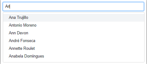
![Filtering Data in Blazor MultiSelect Dropdown](https://www.syncfusion.com/blogs/wp-content/uploads/2021/06/Filtering-data-in-Blazor-MultiSelect-Dropdown.png)

Filtering Data in Blazor MultiSelect Dropdown

## Customize appearance with template

The Blazor MultiSelect Dropdown provides the following template options to customize the default UI based on your needs:

- [Item Template](#item-template)
- [Header Template](#header-template)
- [Value Template (Chips)](#value-template)
- [Footer Template](#footer-template)

The Template tag provides an implicit parameter named **context** to access its corresponding attributes. For example, the ** Item template’s** context property provides all the information about a list of data such as value field, text filed, and so on.

In the upcoming examples, we will display a list of items in multiple columns like a grid view.

**Note:** We have provided a multicolumn style class in the built-in Syncfusion Blazor theme files. So, we need to provide the multicolumn root class API name as ** e-multi-column** in the ** CssClass**.

### Item template

Customize the content of each list item within the drop-down list using the [ItemTemplate](https://blazor.syncfusion.com/documentation/multiselect-dropdown/templates/#item-template)
 tag.

Refer to the following code example.

```
<SfMultiSelect TValue="string[]" TItem="CustomerDetails" Placeholder="Select a customer" AllowFiltering=true CssClass="e-multi-column" Query="@Query">
        <SfDataManager Url="https://services.odata.org/V4/Northwind/Northwind.svc/Customers" Adaptor="Syncfusion.Blazor.Adaptors.ODataV4Adaptor" CrossDomain=true></SfDataManager>
        <MultiSelectTemplates TItem="CustomerDetails">
            <ItemTemplate>
                <table><tbody><tr><td>@((context as CustomerDetails).ContactName)</td><td width="240px">@((context as CustomerDetails).Country)</td></tr> </tbody></table>
            </ItemTemplate>
        </MultiSelectTemplates>
        <MultiSelectFieldSettings Text="ContactName" Value="CustomerID"></MultiSelectFieldSettings>
    </SfMultiSelect>
@code {
    public Query Query = new Query().Select(new List<string> { "ContactName", "CustomerID", "Country" }).Take(10).RequiresCount();
    public class CustomerDetails
    {
        public string CustomerID { get; set; }
        public string CompanyName { get; set; }
        public string ContactName { get; set; }
        public string Country { get; set; }
        public string Address { get; set; }
    }
}
```

![Item Template in Blazor MultiSelect Dropdown](https://www.syncfusion.com/blogs/wp-content/uploads/2021/06/Item-Template-in-Blazor-MultiSelect-Dropdown.png)

Item Template Customization in Blazor MultiSelect Dropdown

### Header template

The header element is shown statically at the top of the pop-up menu. You can place any custom element as the header using the [HeaderTemplate](https://blazor.syncfusion.com/documentation/multiselect-dropdown/templates/#header-template)
 tag.

```
<HeaderTemplate>
  <table><tr><th><b>Contact Name</b></th><th width="240px"><b>Country</b></th></tr></table>
</HeaderTemplate>
```

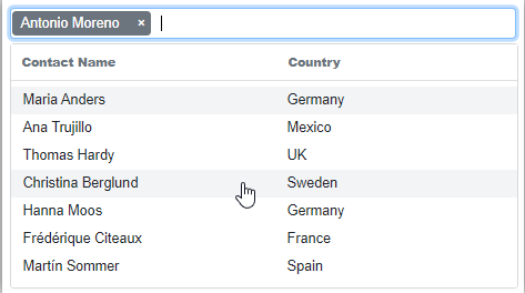
![Header Template in Blazor MultiSelect Dropdown](https://www.syncfusion.com/blogs/wp-content/uploads/2021/06/Header-Template-in-Blazor-MultiSelect-Dropdown.png)

Header Template Customization in Blazor MultiSelect Dropdown

### Value template (chip)

The currently selected value will be displayed by default on the MultiSelect Dropdown input. You can also customize it by using the [ValueTemplate](https://blazor.syncfusion.com/documentation/multiselect-dropdown/templates/#value-template)
 tag.

Refer to the following code example.

```
<ValueTemplate>
   <span>@((context as CustomerDetails).ContactName) - <i>@((context as CustomerDetails).Country)</i></span>
</ValueTemplate>
```

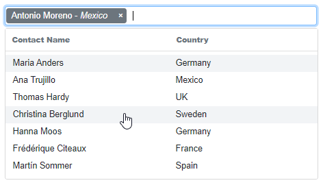
![Value Template in Blazor MultiSelect Dropdown](https://www.syncfusion.com/blogs/wp-content/uploads/2021/06/Value-Template-in-Blazor-MultiSelect-Dropdown.png)

Value Template Customization in Blazor MultiSelect Dropdown

### Footer template

You can place any custom element as the footer of the drop-down list pop-up menu by using the [FooterTemplate](https://blazor.syncfusion.com/documentation/multiselect-dropdown/templates/#footer-template)
 tag.

Refer to the following code example.

```
@using Syncfusion.Blazor.Data
@using Syncfusion.Blazor.DropDowns

    <SfMultiSelect TValue="string[]" TItem="CustomerDetails" Placeholder="Select a customer" AllowFiltering=true CssClass="e-multi-column" Query="@Query">
        <SfDataManager Url="https://services.odata.org/V4/Northwind/Northwind.svc/Customers" Adaptor="Syncfusion.Blazor.Adaptors.ODataV4Adaptor" CrossDomain=true></SfDataManager>
        <MultiSelectTemplates TItem="CustomerDetails">
            <HeaderTemplate>
                <table><tr><th><b>Contact Name</b></th><th width="240px"><b>Country</b></th></tr></table>
            </HeaderTemplate>
            <ItemTemplate>
                <table><tbody><tr><td>@((context as CustomerDetails).ContactName)</td><td width="240px">@((context as CustomerDetails).Country)</td></tr> </tbody></table>
            </ItemTemplate>
            <ValueTemplate>
                <span>@((context as CustomerDetails).ContactName) - <i>@((context as CustomerDetails).Country)</i></span>
            </ValueTemplate>
            <FooterTemplate>
                <span class='e-footer'><b>Total list items: 8 </b></span>
            </FooterTemplate>
        </MultiSelectTemplates>
        <MultiSelectFieldSettings Text="ContactName" Value="CustomerID"></MultiSelectFieldSettings>
    </SfMultiSelect>
@code {
    public Query Query = new Query().Select(new List<string> { "ContactName", "CustomerID", "Country" }).Take(8).RequiresCount();
    public class CustomerDetails
    {
        public string CustomerID { get; set; }
        public string CompanyName { get; set; }
        public string ContactName { get; set; }
        public string Country { get; set; }
        public string Address { get; set; }
    }
}
```

![Footer Template in Blazor MultiSelect Dropdown](https://www.syncfusion.com/blogs/wp-content/uploads/2021/06/Footer-Template-in-Blazor-MultiSelect-Dropdown.png)

Footer Template Customization in Blazor MultiSelect Dropdown

## Check box mode

The Blazor MultiSelect Dropdown component has [check box](https://blazor.syncfusion.com/documentation/multiselect-dropdown/checkbox/)
 support. Enabling check box mode helps users to easily handle multiple selected values. It has built-in support for select all, selection limits, and selection reordering.

Refer to the following code example.

```
@using Syncfusion.Blazor.Data
@using Syncfusion.Blazor.DropDowns

    <SfMultiSelect TValue="string[]" TItem="CustomerDetails" Placeholder="Select a customer" Mode="VisualMode.CheckBox" AllowFiltering=true CssClass="e-multi-column" Query="@Query">
        <SfDataManager Url="https://services.odata.org/V4/Northwind/Northwind.svc/Customers" Adaptor="Syncfusion.Blazor.Adaptors.ODataV4Adaptor" CrossDomain=true></SfDataManager>
        <MultiSelectFieldSettings Text="ContactName" Value="CustomerID"></MultiSelectFieldSettings>
    </SfMultiSelect>
@code {
    public Query Query = new Query().Select(new List<string> { "ContactName", "CustomerID", "Country" }).Take(10).RequiresCount();
    public class CustomerDetails
    {
        public string CustomerID { get; set; }
        public string CompanyName { get; set; }
        public string ContactName { get; set; }
        public string Country { get; set; }
        public string Address { get; set; }
    }
}
```

![Checkbox Mode in Blazor MultiSelect Dropdown](https://www.syncfusion.com/blogs/wp-content/uploads/2021/06/Checkbox-Mode-in-Blazor-MultiSelect-Dropdown.png)

Checkbox Mode in Blazor MultiSelect Dropdown

## Grouping list items

We can arrange logically related items as groups in the MultiSelect Dropdown. A group’s header can be displayed both inline and statically above the groups of items.

To display the group header, map the [GroupBy](https://blazor.syncfusion.com/documentation/multiselect-dropdown/grouping/)
 field as **Category.** Then, enable the **EnableGroupCheckBox** property by setting it as ** True**. This lets us select and deselect a complete group of items using the header check box.

Refer to the following code example.

```
@using Syncfusion.Blazor.DropDowns

<SfMultiSelect TValue="string[]" TItem="Vegetables" Mode="VisualMode.CheckBox" EnableGroupCheckBox=true Placeholder="Select a vegetable" DataSource="@LocalData">
    <MultiSelectFieldSettings GroupBy="Category" Value="Vegetable"></MultiSelectFieldSettings>
</SfMultiSelect>
@code {
    public List<Vegetables> LocalData { get; set; } = new Vegetables().VegetablesList();
    public class Vegetables
    {
        public string Vegetable { get; set; }
        public string Category { get; set; }
        public string ID { get; set; }
        public List<Vegetables> VegetablesList()
        {
            List<Vegetables> Veg = new List<Vegetables>();
            Veg.Add(new Vegetables { Vegetable = "Cabbage", Category = "Leafy and Salad", ID = "item1" });
            Veg.Add(new Vegetables { Vegetable = "Chickpea", Category = "Beans", ID = "item2" });
            Veg.Add(new Vegetables { Vegetable = "Garlic", Category = "Bulb and Stem", ID = "item3" });
            Veg.Add(new Vegetables { Vegetable = "Green bean", Category = "Beans", ID = "item4" });
            Veg.Add(new Vegetables { Vegetable = "Horse gram", Category = "Beans", ID = "item5" });
            Veg.Add(new Vegetables { Vegetable = "Nopal", Category = "Bulb and Stem", ID = "item6" });
            Veg.Add(new Vegetables { Vegetable = "Onion", Category = "Bulb and Stem", ID = "item7" });
            Veg.Add(new Vegetables { Vegetable = "Pumpkins", Category = "Leafy and Salad", ID = "item8" });
            Veg.Add(new Vegetables { Vegetable = "Spinach", Category = "Leafy and Salad", ID = "item9" });
            Veg.Add(new Vegetables { Vegetable = "Wheat grass", Category = "Leafy and Salad", ID = "item10" });
            Veg.Add(new Vegetables { Vegetable = "Yarrow", Category = "Leafy and Salad", ID = "item11" });
            return Veg;
        }
    }
}
```

![Grouping the List Items in Blazor MultiSelect Dropdown](https://www.syncfusion.com/blogs/wp-content/uploads/2021/06/Grouping-the-List-Items-in-Blazor-MultiSelect-Dropdown.png)

Grouping the List Items in Blazor MultiSelect Dropdown

## Conclusion

In this blog, we have seen the key features of the [Blazor MultiSelect Dropdown component](https://www.syncfusion.com/blazor-components/blazor-multiselect-dropdown)
 . It also provides built-in themes, sorting capabilities, HTML form support, and several out-of-the-box features. You can easily customize its pop-up menu with multiple modes, which you can learn to do in our [online examples](https://blazor.syncfusion.com/demos/multiselect-dropdown/default-functionalities?theme=bootstrap4)
, [GitHub demos](https://github.com/syncfusion/blazor-samples/tree/master/Pages/DropDowns/MultiSelect)
, and [documentation](https://blazor.syncfusion.com/documentation/multiselect-dropdown/getting-started/)
.

Try our Blazor MultiSelect Dropdown component by downloading a [free 30-day trial](https://www.syncfusion.com/account/manage-trials/downloads)
 or from our [NuGet package](https://www.nuget.org/packages/Syncfusion.Blazor)
.

Our MultiSelect Dropdown component is available in our [Blazor](https://www.syncfusion.com/blazor-components/blazor-multiselect-dropdown)
, ASP.NET ([Core](https://www.syncfusion.com/aspnet-core-ui-controls/multiselect-dropdown)
, [MVC](https://www.syncfusion.com/aspnet-mvc-ui-controls/multiselect-dropdown)
), [JavaScript](https://www.syncfusion.com/javascript-ui-controls/js-multiselect-dropdown)
, [Angular](https://www.syncfusion.com/angular-ui-components/angular-multiselect-dropdown)
, [React](https://www.syncfusion.com/react-ui-components/react-multiselect-dropdown)
, and [Vue](https://www.syncfusion.com/vue-ui-components/vue-multiselect-dropdown)
 component suites. So, try them out and enhance your users’ visual experience while selecting multiple items!

If you have any questions, please let us know in the comments section below. You can also contact us through our [support forum](https://www.syncfusion.com/forums/blazor-components)
, [feedback portal](https://www.syncfusion.com/feedback/)
, or [Direct-Trac](https://www.syncfusion.com/support/directtrac/incidents/newincident)
. We are always happy to assist you!

## Related blogs

- [Data Entry Made Easy with Blazor Multicolumn AutoComplete](https://www.syncfusion.com/blogs/post/data-entry-made-easy-with-blazor-multicolumn-autocomplete.aspx)
- [Easiest Way to Create a Multicolumn ComboBox in Blazor](https://www.syncfusion.com/blogs/post/easiest-way-to-create-a-multicolumn-combobox-in-blazor.aspx)
- [ASP.NET Core Blazor Component Virtualization in .NET 5 – An Overview](https://www.syncfusion.com/blogs/post/asp-net-core-blazor-component-virtualization-in-net-5.aspx)
- [Key Features of the Syncfusion Blazor Kanban Board](https://www.syncfusion.com/blogs/post/key-features-of-the-syncfusion-blazor-kanban-board.aspx)