---
title: "Introducing the New Blazor AppBar Component"
published_at: "2022-10-13T11:00:59+00:00"
modified_at: "2025-04-22T12:31:34+00:00"
url: "https://www.syncfusion.com/blogs/post/introducing-the-new-blazor-appbar-component"
excerpt: "We are happy to introduce the new Blazor AppBar component in our Essential Studio 2022 Volume 3 release. The AppBar component is used to display information related to the current application page. Let’s explore the Blazor AppBar component, its UI..."
taxonomy_category:
  - "Blazor"
  - "UI"
  - "Web"
  - "What's new"
taxonomy_post_tag:
  - "Blazor"
  - "productivity"
  - "UI"
  - "Web"
  - "What's New"
---

# Introducing the New Blazor AppBar Component

[Vengatesh Maniraj](https://www.syncfusion.com/blogs/author/vengatesh-maniraj)
![Introducing the New Blazor AppBar Component](https://www.syncfusion.com/blogs/wp-content/uploads/2022/10/Introducing-the-New-Blazor-AppBar-Component-1.png)


We are happy to introduce the new [Blazor AppBar](https://www.syncfusion.com/blazor-components/blazor-appbar)
 component in our Essential Studio [2022 Volume 3](https://www.syncfusion.com/forums/177858/essential-studio-2022-volume-3-main-release-v20-3-0-47-is-available-for-download)
 release. The AppBar component is used to display information related to the current application page.

Let’s explore the Blazor AppBar component, its UI design, and its available features, with code examples.

## Overview

The Blazor AppBar is also known as an action bar or nav bar. It displays information and actions related to the current app screen. We can use this component to show branding, screen titles, navigation, and actions.

## Key features

The key features of the Blazor AppBar component are:

- [AppBar modes](#appbar-modes)
- [AppBar colors](#appbar-color-modes)
- [Position](#appbar-position)
- [Sticky AppBar](#sticky-appbar)
- [Content arrangements](#content-arrangements)
- [Responsiveness](#responsive-appbar)

### AppBar modes

The AppBar provides different types of height modes: **r***** egular***, ** p***** rominent***, and ** d***** ense******.***

#### Regular mode

The regular mode is the default mode, letting the control be viewed with its default height. Refer to the following code.

```
<SfAppBar ColorMode="AppBarColor.Primary">
  <SfButton CssClass="e-inherit" IconCss="e-icons e-menu"></SfButton>
  <span class="regular">Blazor AppBar</span>
  <AppBarSpacer></AppBarSpacer>
  <SfButton CssClass="e-inherit" Content="FREE TRIAL"></SfButton>
</SfAppBar>
```

![Blazor AppBar Regular Mode](https://www.syncfusion.com/blogs/wp-content/uploads/2022/10/Blazor-AppBar-Regular-Mode.png)

#### Prominent mode

You can view the Blazor AppBar with longer titles and images, and provide a stronger presence, by setting the **Mode** property to ** AppBarMode.Prominent**.

Refer to the following code example.

```
<SfAppBar Mode="AppBarMode.Prominent" CssClass="prominent-appbar" ColorMode="AppBarColor.Primary">
    <SfButton aria-label="menu" CssClass="e-inherit menu" IconCss="e-icons e-menu"></SfButton>
    <span class="prominent">Blazor AppBar Component with Prominent mode</span>
    <AppBarSpacer></AppBarSpacer>
    <SfButton CssClass="e-inherit login" Content="FREE TRIAL"></SfButton>
</SfAppBar>
 
<style>
    .prominent {
        align-self: center;
        white-space: break-spaces;
        text-align: inherit;
        font-size: 35px;
        line-height: 50px;
    }
 
    .e-appbar.prominent-appbar {
        background-image: url("@UriHelper.ToAbsoluteUri($"{SampleService.WebAssetsPath}images/appbar/prominent.png")");
        background-size: 100% 400px;
        color: #ffffff;
        background-repeat: no-repeat;
        height: 400px;
    }
</style>
```

![Blazor AppBar Prominent Mode](https://www.syncfusion.com/blogs/wp-content/uploads/2022/10/Blazor-AppBar-Prominent-Mode.png)

#### Dense mode

Dense mode helps us to compress the AppBar to accommodate all its content in a denser layout. To do so, set the **Mode** property to ** AppBarMode.Dense**like in the following code example.

```
<SfAppBar Mode="AppBarMode.Dense" ColorMode="AppBarColor.Primary">
    <SfButton CssClass="e-inherit" IconCss="e-icons e-menu"></SfButton>
    <span class="dense">Blazor AppBar</span>
    <AppBarSpacer></AppBarSpacer>
    <SfButton CssClass="e-inherit" Content="FREE TRIAL"></SfButton>
</SfAppBar>
```

![Blazor AppBar Dense Mode](https://www.syncfusion.com/blogs/wp-content/uploads/2022/10/Blazor-AppBar-Dense-Mode.png)

### AppBar color modes

You can use the following color modes in the AppBar:

- Primary
- Light
- Dark
- Inherit

#### Primary

You can render the AppBar with the primary mode by setting the **ColorMode** property to **AppBarColor.Primary**.

```
<SfAppBar ColorMode=”AppBarColor.Primary”> 
    <SfButton CssClass=”e-inherit” IconCss=”e-icons e-menu”></SfButton> 
    <span class=”regular”>Blazor AppBar</span> 
    <AppBarSpacer></AppBarSpacer> 
    <SfButton CssClass=”e-inherit” Content=”FREE TRIAL”></SfButton> 
</SfAppBar>
```

![Blazor AppBar Primary Color Mode](https://www.syncfusion.com/blogs/wp-content/uploads/2022/10/Blazor-AppBar-Primary-Color-Mode.png)

#### Light

To render the AppBar with the light mode, set the **ColorMode** property to **AppBarColor.Light**.

```
<SfAppBar ColorMode="AppBarColor.Light"> 
    <SfButton CssClass="e-inherit" IconCss="e-icons e-menu"></SfButton> 
    <span class="regular">Blazor AppBar</span> 
    <AppBarSpacer></AppBarSpacer> 
    <SfButton IsPrimary="true" Content="FREE TRIAL"></SfButton> 
</SfAppBar>
```

![Blazor AppBar Light color](https://www.syncfusion.com/blogs/wp-content/uploads/2022/10/Blazor-AppBar-Light-color.png)

#### Dark

Render the AppBar with the dark color by setting the **ColorMode** property to **AppBarColor.Dark**.

```
<SfAppBar ColorMode="AppBarColor.Dark"> 
    <SfButton CssClass="e-inherit" IconCss="e-icons e-menu"></SfButton> 
    <span class="regular">Blazor AppBar</span> 
    <AppBarSpacer></AppBarSpacer> 
    <SfButton CssClass="e-inherit" Content="FREE TRIAL"></SfButton> 
</SfAppBar>
```

![Blazor AppBar Dark Color](https://www.syncfusion.com/blogs/wp-content/uploads/2022/10/Blazor-AppBar-Dark-Color.png)

#### Inherit

The AppBar can inherit its color from its parent element. To render the AppBar with its parent element’s color, set the **ColorMode** property to **AppBarColor.Inherit**.

```
<SfAppBar ColorMode="AppBarColor.Inherit">   
    <SfButton CssClass="e-inherit" IconCss="e-icons e-menu"></SfButton> 
    <span class="regular">Blazor AppBar</span> 
    <AppBarSpacer></AppBarSpacer> 
    <SfButton IsPrimary="true" Content="FREE TRIAL"></SfButton> 
</SfAppBar>
```

![Blazor AppBar Inherit](https://www.syncfusion.com/blogs/wp-content/uploads/2022/10/Blazor-AppBar-Inherit.png)If you render the following Syncfusion components inside the AppBar component, you can use the **e-inherit** class in its **CssClass** to inherit the AppBar’s styles:

- [Button](https://www.syncfusion.com/blazor-components/blazor-button)
- [Menu Bar](https://www.syncfusion.com/blazor-components/blazor-menu-bar)
- [DropdownButton](https://www.syncfusion.com/blazor-components/blazor-dropdown-menu)

Refer to the following code example.

```
<SfAppBar ColorMode="AppBarColor.Primary">
    <SfButton CssClass="e-inherit menu" IconCss="e-icons e-menu"></SfButton>
    <SfButton CssClass="e-inherit home e-appbar-menu e-primary" Content="Home"></SfButton>
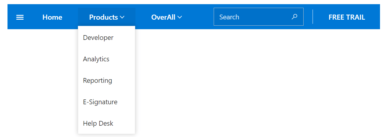
    <SfDropDownButton CssClass="e-inherit e-appbar-menu e-primary" Content="Products">
        <DropDownMenuItems>
            <DropDownMenuItem Text="Developer"></DropDownMenuItem>
            <DropDownMenuItem Text="Analytics"></DropDownMenuItem>
            <DropDownMenuItem Text="Reporting"></DropDownMenuItem>
        </DropDownMenuItems>
    </SfDropDownButton>
    <SfMenu CssClass="e-inherit e-appbar-icon-menu e-primary" TValue="MenuItem">
        <MenuItems>
            <MenuItem Text="OverAll">
                <MenuItems>
                    <MenuItem Text="Products">
                        <MenuItems>
                            <MenuItem Text="Developer"></MenuItem>
                            <MenuItem Text="Analytics"></MenuItem>
                            <MenuItem Text="Reporting"></MenuItem>
                        </MenuItems>
                    </MenuItem>
                    <MenuItem Text="Company">
                        <MenuItems>
                            <MenuItem Text="About Us"></MenuItem>
                            <MenuItem Text="Careers"></MenuItem>
                        </MenuItems>
                    </MenuItem>
                </MenuItems>
            </MenuItem>
        </MenuItems>
    </SfMenu>
    <AppBarSpacer></AppBarSpacer>
    <div style="width: 200px; margin-right:10px">
        <span class="e-input-group e-control-wrapper e-inherit">
            <input type="text" class="e-searchinput e-input" placeholder="Search">
            <span class="e-icons e-search e-input-group-icon"></span>
        </span>
    </div>
    <AppBarSeparator></AppBarSeparator>
    <SfButton CssClass="e-inherit" Content="FREE TRIAL"></SfButton>
</SfAppBar>
```

![Blazor AppBar Inherit1](https://www.syncfusion.com/blogs/wp-content/uploads/2022/10/Blazor-AppBar-Inherit1.png)

### AppBar position

You can place the AppBar component at the top or bottom of your app page.

#### Top

To place the AppBar at the top of the page, set the **Position** property to **AppBarPosition.Top.**

```
<SfAppBar ColorMode=”AppBarColor.Primary” Position=”AppBarPosition.Top”>
    <SfButton CssClass=”e-inherit” IconCss=”e-icons e-menu”></SfButton>
    <AppBarSpacer></AppBarSpacer>
    <SfButton CssClass=”e-inherit” Content=”FREE TRIAL”></SfButton>
</SfAppBar>
```

![Balzor AppBar placed on the top](https://www.syncfusion.com/blogs/wp-content/uploads/2022/10/Balzor-AppBar-placed-on-the-top.png)

#### Bottom

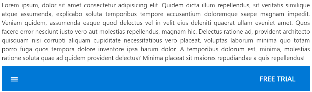
To place the AppBar at the bottom of the page, set the **Position** property to **AppBarPosition.Bottom.**

```
<SfAppBar ColorMode="AppBarColor.Primary" Position="AppBarPosition.Bottom">
    <SfButton CssClass="e-inherit" IconCss="e-icons e-menu"></SfButton>
    <AppBarSpacer></AppBarSpacer>   
    <SfButton CssClass="e-inherit" Content="FREE TRIAL"></SfButton>
</SfAppBar>
```

![Balzor AppBar placed on the bottom](https://www.syncfusion.com/blogs/wp-content/uploads/2022/10/Balzor-AppBar-placed-on-the-bottom.png)

### Sticky AppBar

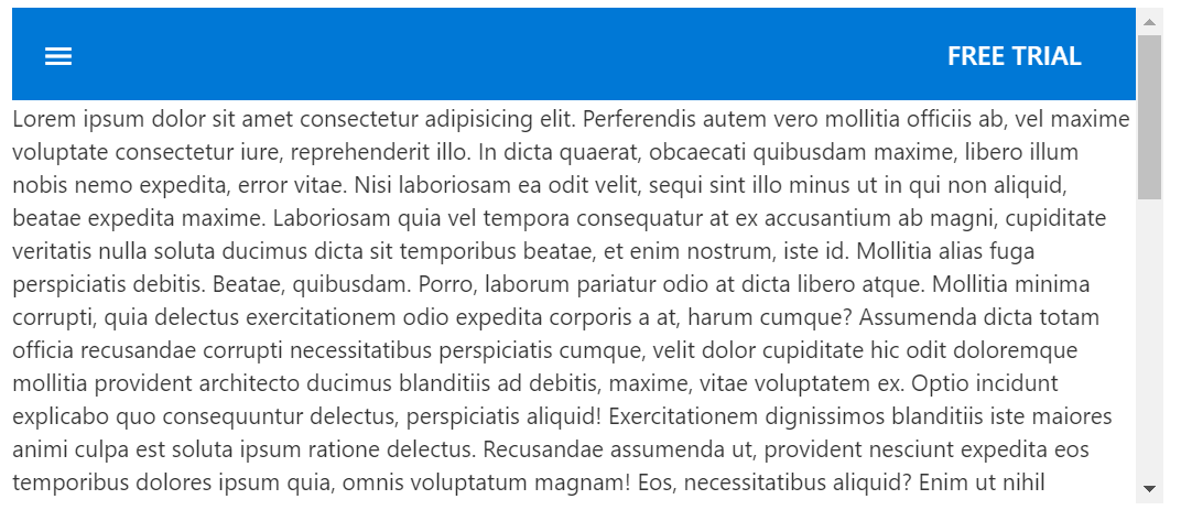
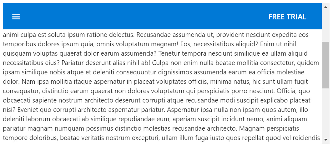
You can render the AppBar with a fixed position while scrolling the page. This will not impact the other content of the page, and some of the content will be displayed behind the AppBar. You can achieve this by enabling the **IsSticky** property.

Refer to the following code example.

```
<SfAppBar ColorMode=”AppBarColor.Primary” IsSticky=”true”>
    <SfButton CssClass=”e-inherit” IconCss=”e-icons e-menu”></SfButton>
    <AppBarSpacer></AppBarSpacer>
    <AppBarSeparator></AppBarSeparator>
    <SfButton CssClass=”e-inherit” Content=”FREE TRIAL”></SfButton>
</SfAppBar>
```

![Blazor AppBar marked as sticky](https://www.syncfusion.com/blogs/wp-content/uploads/2022/10/Blazor-AppBar-marked-as-sticky.png)

### Content arrangements

The Blazor AppBar supports the following two child components to arrange the AppBar content:

- AppBarSpacer
- AppBarSeparator

#### AppBarSpacer

AppBarSpacer inserts space among the AppBar contents, which gives additional space to the content layout.

Refer to the following code to use the **AppBarSpacer** in primary color mode.

```
<SfAppBar ColorMode="AppBarColor.Primary">
    <SfButton CssClass="e-inherit" IconCss="e-icons e-menu"></SfButton>
    <AppBarSpacer></AppBarSpacer>
    <SfButton CssClass="e-inherit" Content="FREE TRIAL"></SfButton>
</SfAppBar>
```

![Blazor AppBarSpacer in primary color mode](https://www.syncfusion.com/blogs/wp-content/uploads/2022/10/Blazor-AppBarSpacer-in-primary-color-mode.png)  
 Refer to the following code example to use the **AppBarSpacer** in light color mode.

```
<SfAppBar ColorMode="AppBarColor.Light">
  <SfButton CssClass="e-inherit" IconCss="e-icons e-menu"></SfButton>
  <AppBarSpacer></AppBarSpacer>
  <span class="regular">Blazor AppBar</span>
  <AppBarSpacer></AppBarSpacer>
  <SfButton CssClass="e-inherit" Content="FREE TRIAL"></SfButton>
</SfAppBar>
```

![Blazor AppBarSpacer in light color mode](https://www.syncfusion.com/blogs/wp-content/uploads/2022/10/Blazor-AppBarSpacer-in-light-color-mode.png)

#### AppBarSeparator

AppBarSeparator displays a separator line to visually group or separate the AppBar contents.

Refer to the following code example. In it, we have rendered a separator between the **Search** box and the ** FREE TRIAL** button.

```
<SfAppBar ColorMode="AppBarColor.Light">
    <SfButton CssClass="e-inherit menu" IconCss="e-icons e-menu"></SfButton>
    <SfButton CssClass="e-inherit home e-appbar-menu e-primary" Content="Home"></SfButton>    
    <AppBarSpacer></AppBarSpacer>
    <div style="width: 200px; margin-right:10px">
        <span class="e-input-group e-control-wrapper e-inherit">
            <input type="text" class="e-searchinput e-input" placeholder="Search">
            <span class="e-icons e-search e-input-group-icon"></span>
        </span>
    </div>
    <AppBarSeparator></AppBarSeparator>
    <SfButton IsPrimary="true" Content="FREE TRIAL"></SfButton>
</SfAppBar>
```

![Blazor AppBar with Separator](https://www.syncfusion.com/blogs/wp-content/uploads/2022/10/Blazor-AppBar-with-Separator.png)

### Responsive AppBar

The Blazor AppBar is a highly responsive UI component. It will adapt and fit any device screen size.

Refer to the following code example.

```
<SfAppBar ColorMode="AppBarColor.Primary">
    <SfButton CssClass="e-inherit" IconCss="e-icons e-menu"></SfButton>
    <SfButton CssClass="e-inherit" Content="Essential Studio for Blazor"></SfButton>
    <AppBarSpacer></AppBarSpacer>
    <div style="width: 400px;">
        <span class="e-input-group e-control-wrapper e-inherit">
            <input type="text" class="e-searchinput e-input" placeholder="Search">
            <span class="e-icons e-search e-input-group-icon"></span>
        </span>
    </div>
    <AppBarSpacer></AppBarSpacer>
    <SfButton CssClass="e-inherit home e-appbar-menu e-primary" Content="Contact Us"></SfButton>
    <SfButton CssClass="e-inherit" IconCss="e-icons e-settings"></SfButton>
    <SfButton CssClass="e-inherit" IconCss="e-icons e-circle-info"></SfButton>    
    <AppBarSeparator></AppBarSeparator>
    <SfButton CssClass="e-inherit login" Content="FREE TRIAL"></SfButton>
</SfAppBar>
```

![Responsiveness in Blazor AppBar](https://www.syncfusion.com/blogs/wp-content/uploads/2022/10/Responsiveness-in-Blazor-AppBar.gif)

## References

For more details, refer to our [Getting Started with the Blazor AppBar Component documentation](https://blazor.syncfusion.com/documentation/appbar/getting-started/)
 and [demos](https://blazor.syncfusion.com/demos/appbar/default-functionalities?theme=bootstrap5)
.

## Conclusion

Thanks for reading! We hope you enjoyed this quick introduction to the [Blazor AppBar](https://www.syncfusion.com/blazor-components/blazor-appbar)
 component, rolled out in the [2022 Volume 3](https://www.syncfusion.com/forums/177858/essential-studio-2022-volume-3-main-release-v20-3-0-47-is-available-for-download)
 release. Try this control out and let us know your feedback in the comments section below.

Check out our [Release Notes](https://help.syncfusion.com/common/essential-studio/release-notes/v20.3.0.47)
 and [What’s New](https://www.syncfusion.com/products/whatsnew)
 pages to see the other updates in this release.

For questions, you can contact us through our [support forums](https://www.syncfusion.com/forums)
, [support portal](https://support.syncfusion.com/)
, or [feedback portal](https://www.syncfusion.com/feedback/)
. We are always happy to assist you!

## Related blogs

- [Syncfusion Essential Studio 2022 Volume 3 Is Here!](https://www.syncfusion.com/blogs/post/syncfusion-essential-studio-2022-volume-3-is-here.aspx)
- [Deploying a Blazor Server-Side Application to Azure App Service Using GitHub Actions](https://www.syncfusion.com/blogs/post/deploying-blazor-server-application-to-azure-app-service-using-github-actions.aspx)
- [Simple Steps to Integrate a Blazor WebAssembly Project with an Existing ASP.NET Core Application](https://www.syncfusion.com/blogs/post/integrate-blazor-webassembly-in-asp-net-core-application.aspx)
- [A Full-Stack Web App Using Blazor WebAssembly and GraphQL: Part 6](https://www.syncfusion.com/blogs/post/a-full-stack-web-app-using-blazor-webassembly-and-graphql-part-6.aspx)