---
title: "Build a Modern HR Recruitment Dashboard Using .NET MAUI Toolkit Charts"
published_at: "2025-12-10T14:44:29+00:00"
modified_at: "2026-01-14T06:54:19+00:00"
url: "https://www.syncfusion.com/blogs/post/hr-recruitment-dashboard-maui-toolkit"
excerpt: "Learn how to build an HR recruitment dashboard using .NET MAUI Toolkit charts to visualize KPIs like candidate pipeline and offer acceptance ratio."
taxonomy_category:
- ".NET MAUI"
- "Chart of the week"
- "Data Visualization"
- "HR Dashboard"
- "MAUI ToolKit"
taxonomy_post_tag:
- ".NET MAUI"
- "Charts"
- "HR Dashboard"
- "MAUI TOOLKIT"
- "Recruitment-KPIs"
---
[Chart of the week](https://www.syncfusion.com/blogs/category/chart-of-the-week)
# Build a Modern HR Recruitment Dashboard Using .NET MAUI Toolkit Charts
[Naveen Kesavaraj](https://www.syncfusion.com/blogs/author/naveenkesavaraj)
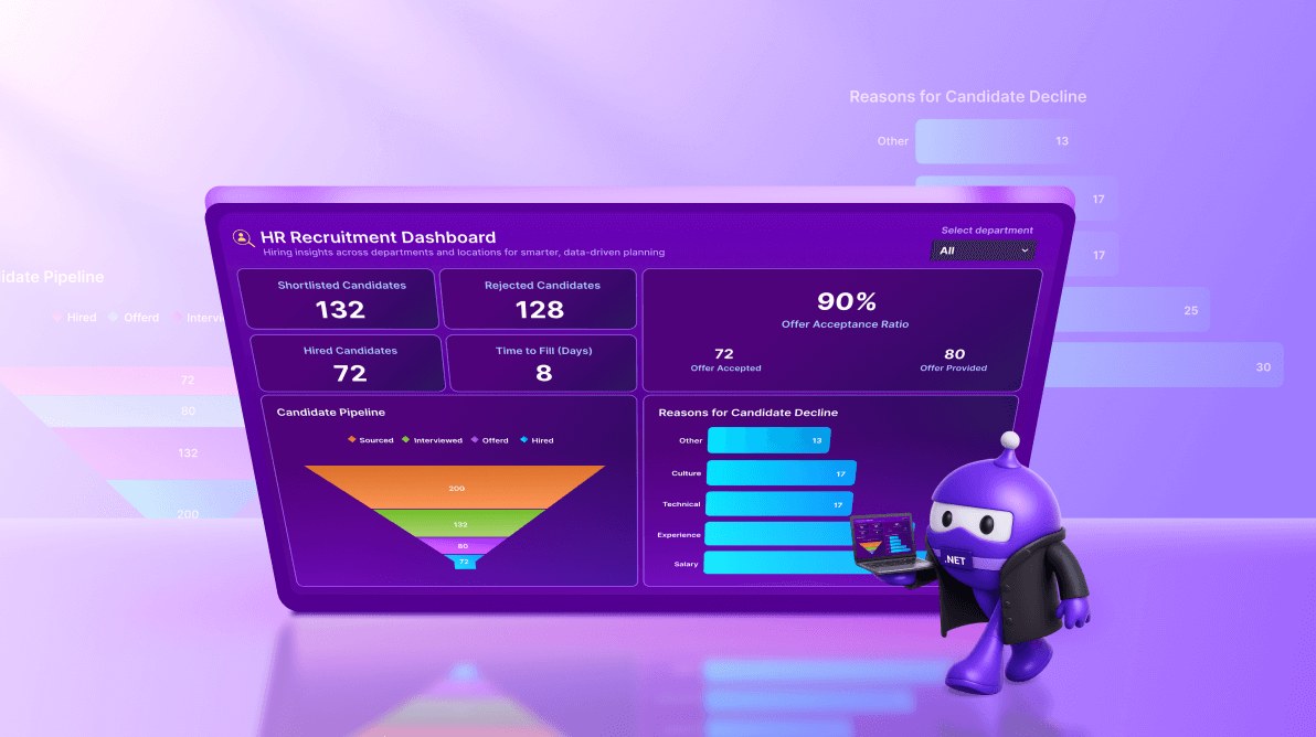
**TL;DR:** Want to streamline hiring insights? Learn how to build a responsive HR recruitment dashboard using .NET MAUI Toolkit Charts. Visualize KPIs like candidate pipeline, offer acceptance ratio, and decline reasons all in one interactive dashboard for smarter HR decisions
Welcome to our **Chart of the Week** series!
Charts are essential for transforming complex recruitment data into actionable insights. While basic charts convey information, modern HR teams need interactive, visually refined dashboards that provide quick comparisons and deliver a seamless cross-platform experience.
This blog demonstrates how to build a modern HR Recruitment Dashboard using [Syncfusion® MAUI Toolkit](https://www.syncfusion.com/net-maui-toolkit)
Charts. The dashboard includes:
- A **department filter** for dynamic data segmentation.
- **KPI cards** for metrics like Shortlisted, Rejected, Hired, and Time-to-Fill metrics.
- An **offer acceptance ratio** summary.
- A **candidate pipeline funnel chart** for recruitment process tracking.
- A **decline reasons bar chart** for actionable insights.
- A **responsive layout** optimized for desktop and mobile.
## HR dashboard highlights
- Enables quick insights into recruitment health.
- Identifies bottlenecks in the hiring process.
- Reveals patterns behind candidate declines.
- Supports data-driven decisions to improve hiring speed and offer conversions.
Here are the classes you need to build the dashboard, as shown in the code example below.
```
public class DeclineReason
{
// Reason for candidate decline -> drives the horizontal bar chart
}
public class PipelineStage
{
// Candidate pipeline stage -> drives the funnel chart
}
public class SummaryMetrics
{
// Small card metrics at the top
}
public class OfferMetrics
{
// Offer stats (with computed acceptance ratio)
// % Offer Acceptance ratio shown in the oversized tile
}
```
Let’s walk through the steps to build an HR dashboard.
## Step 1: Display title and department filter
The header sets the tone for the dashboard with a clean, structured design. It features a bold title, a concise subtitle for context, and a department filter for quick segmentation. The filter combines a label and a picker control, ensuring intuitive interaction and a streamlined user experience.
```
…
```
Here’s how the header looks after adding the title and department filter.
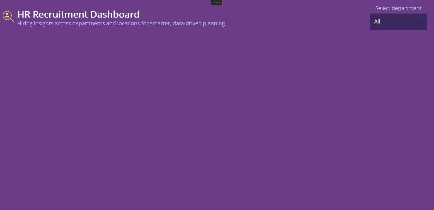
Title and department filter on the HR dashboard
## Step 2: Display Recruitment KPI tiles
Display key hiring metrics in a glance-friendly format. Each KPI card features a bold title and a large value, styled for readability on a dark background. Bind each card to its respective property:
- **Shortlisted Candidates**: Represents the number of candidates who passed the initial screening.
- **Rejected Candidates:** Shows the total count of candidates rejected during the process. Includes optional hover tooltip for detailed info.
- **Hired Candidates**: Indicates the final number of candidates successfully hired.
- **Time to Fill (Days):** Displays the average number of days taken to fill a role, critical for tracking efficiency and identifying bottlenecks.
Refer to the code example below for displaying Recruitment KPI tiles**.**
```
…
…
…
…
…
```
These KPIs provide immediate insight into recruitment performance, as shown below.
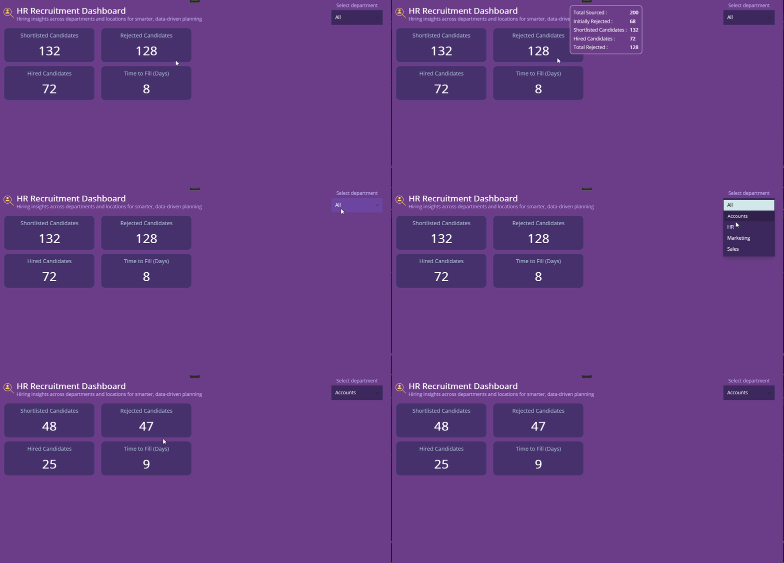
Recruitment KPI tiles on the HR dashboard
## Step 3: Display offer acceptance ratio
This metric highlights how effectively the organization converts job offers into hires. The main percentage is displayed prominently, supported by a breakdown of **Offers Accepted** and ** Offers Provided**.
Use the following XAML code example to create the Offer Acceptance Ratio section.
```
```
Here’s how the Offer Acceptance Ratio section looks in the dashboard.
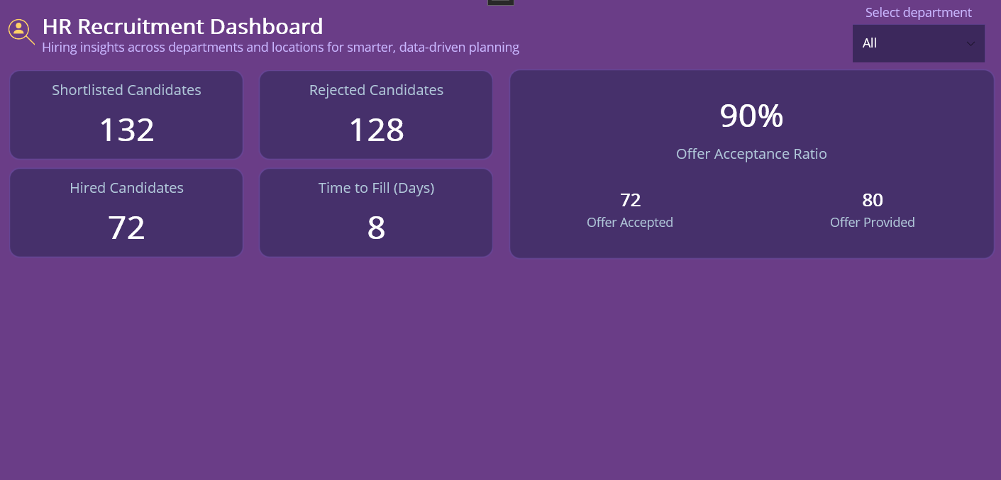
Offer Acceptance Ratio on the HR Dashboard
## Step 4: Display candidate pipeline (Funnel chart)
[Funnel charts](https://www.syncfusion.com/maui-controls/maui-funnel-charts)
visualize conversion rates across recruitment stages: **Applied → Screened → Interviewed → Offered → Hired**. This helps identify bottlenecks and leaks in the hiring process.
Enhancements for Better UI:
- [GapRatio](https://help.syncfusion.com/maui-toolkit/funnel-charts/segment-spacing) : Adds spacing between segments for better readability.
- [Data Labels](https://help.syncfusion.com/maui-toolkit/funnel-charts/datalabels) : Displays stage values directly on the chart for quick insights.
- [Legend](https://help.syncfusion.com/maui-toolkit/funnel-charts/legend) : A well-styled legend improves chart interpretation and aligns with the theme.
Use the following XAML code example to create a Funnel Chart.
```
```
Here’s how the Candidate Pipeline Funnel Chart looks in the dashboard.
Candidate Pipeline Funnel Chart on the HR dashboard
## Step 5: Visualizing candidates decline reasons
Analyzing why candidates decline Job offers to improve recruitment strategies. A [bar chart](https://help.syncfusion.com/maui-toolkit/cartesian-charts/barchart)
is ideal for comparing multiple reasons side by side, such as **Compensation**, L** ocation**, and** Role Fit**.
Enhancements for Better UI:
- Enable [data labels](https://help.syncfusion.com/maui-toolkit/cartesian-charts/datalabels) for quick readability
- Hide unnecessary gridlines for a clean look
- Apply [custom palettes](https://help.syncfusion.com/maui-toolkit/cartesian-charts/appearance?cs-save-lang=1&cs-lang=csharp#applying-gradient) for visual appeal
Use the following XAML snippet to create a bar chart that visualizes candidate decline reasons.
```
```
Here’s how the Candidate Decline Reasons are displayed on the dashboard:
Visualizing Candidate Decline Reasons on the Dashboard
By completing these steps, you’ll have a complete HR dashboard in .NET MAUI, as shown below.
Visualizing the HR Recruitment Dashboard in .NET MAUI
## GitHub reference
For more details, refer to the building HR dashboards using Syncfusion MAUI Toolkit Charts [GitHub](https://github.com/SyncfusionExamples/.NET-MAUI-HR-Recruitment-Dashboard)
demo.
## Conclusion
Thank you for following this dashboard walkthrough! You’ve learned how to create a clean, real-time HR dashboard using [.NET MAUI Toolkit](https://www.syncfusion.com/net-maui-toolkit)
Charts, empowering organizations to turn raw hiring data into actionable insights. With Syncfusion’s rich charting components, you can deliver interactive, visually compelling dashboards that work seamlessly across platforms. Start implementing these steps today to elevate your HR analytics and make data-driven decisions.
If you’re a Syncfusion user, you can download the setup from the [license and downloads](https://www.syncfusion.com/account/downloads)
page. Otherwise, you can download a free [30-day trial](https://www.syncfusion.com/downloads)
.
You can also contact us through our [support forum](https://www.syncfusion.com/forums)
, [support portal](https://support.syncfusion.com/)
, or [feedback portal](https://www.syncfusion.com/feedback)
for queries. We are always happy to assist you!
## Related Blogs
[12 Chart Design Tips Every Developer Needs To Know](https://www.syncfusion.com/blogs/post/chart-design-tips-for-every-developer)
[Visualize Global AI Investment Trends Using .NET MAUI Drilldown Charts](https://www.syncfusion.com/blogs/post/dotnet-maui-drilldown-charts)
[Build Interactive Doughnut Charts in .NET MAUI for Mobile Dashboards](https://www.syncfusion.com/blogs/post/dotnet-maui-doughnut-chart-customization)
[How to Build a .NET MAUI Beeswarm Chart for Stock Price Volatility Visualization](https://www.syncfusion.com/blogs/post/dotnet-maui-beeswarm-chart-volatility)