---
title: "How to Use Angular Native Animations"
published_at: "2022-09-29T11:00:00+00:00"
modified_at: "2024-11-20T05:18:21+00:00"
url: "https://www.syncfusion.com/blogs/post/how-to-use-angular-native-animations"
excerpt: "The modern web is moving towards highly intuitive interfaces and rich graphical content to keep users glued to their devices. Animations come in handy when making web applications that stand out from the rest. As a key player in the..."
taxonomy_category:
- "Angular"
- "Development"
- "Web"
taxonomy_post_tag:
- "Angular"
- "animation"
- "Web Development"
---
# How to Use Angular Native Animations
[Dulanka Karunasena](https://www.syncfusion.com/blogs/author/dulanka-karunasena)
The modern web is moving towards highly intuitive interfaces and rich graphical content to keep users glued to their devices. Animations come in handy when making web applications that stand out from the rest.
As a key player in the front-end development world, Angular ships with web animation support. Here’s everything you should know to include animation in Angular applications!
## Getting started
Angular animations are built on top of the native [Web Animations API](https://developer.mozilla.org/en-US/docs/Web/API/Web_Animations_API)
, making it easier to run across both Android and iOS platforms. Put simply, as developers, we will not be tied solely to the web browser implementation.
In animation, there are different states during each phase of the animation life cycle. This concept is common for Angular animations too.
You should be familiar with these three states and how they are defined when using animations powered by Angular:
- **Custom state:** We can provide a custom name to a specific state and use that name when implementing the animation.
- **Wildcard state:** This is the common state of an element. It is also known to be the default state.
- **Void state:** The state in which the element is not part of the DOM. This is the state where the element is not yet rendered or has already left the view.
## Angular animations in practice
To kick off our Angular animations journey, add **BrowserAnimationsModule** as an import to the ** app.module.ts** file.
```
import { BrowserAnimationsModule } from '@angular/platform-browser/animations';
@NgModule({
imports: [BrowserAnimationsModule]
})
```
Now, implement animations inside components by importing specific animation functions from **@angular/animations**. Some of the commonly used animation functions are a ** trigger, state, style, animate, and transition**.
```
import { trigger, state, style, animate, transition } from '@angular/animations';
```
Next, define the animations within the **animations:** metadata property inside the **@Component()** decorator of a component.
```
@Component({
selector: 'app-animation-test',
templateUrl: './animation-test.component.html',
styleUrls: ['./animation-test.component.css'],
animations: [
//animation implementation
]
})
```
## Animated to-do list
Now that we have set up the environment with all the prerequisites, it’s time to see Angular animations in action. Let’s develop the following animated to-do list.
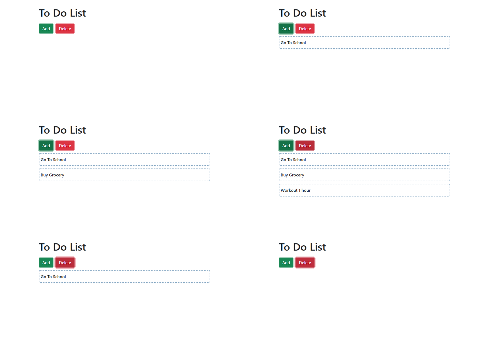In this simple project, the to-do items will slide in when the **Add** button is clicked and slide out on clicking the ** Delete** button. The following simple code block is responsible for this animation effect.
```
animations: [
trigger('addItem', [
state('void', style({
transform: 'translateX(-100%)'
})),
transition('void <=> *', animate('0.5s ease-in'))
]),
]
```
There are many helper methods that are essential when animating using Angular, so let’s look into their usage.
## Angular animation helper methods
### trigger()
The overall implementation of a single animation goes inside the **trigger()** method. A trigger should have a name that can be referenced from the DOM. In the above example, we have defined a trigger named ** addItem**, and it will be attached to the DOM element as follows.
```
```
### state()
The method **state()** defines different states that should be achieved at the end of an animation. The state can be any of the three states: ** custom, wildcard (*),** or ** void**. Inside the ** state()** method, define the styles associated with each state.
```
state('start', style({ backgroundColor: 'yellow' })),
```
In this snippet, we have defined a state named **start** and applied a yellow background color when that state is achieved.
### style()
We can use this method inside other methods like **state()** and ** transition()** to apply different styles. The ** style()** method will take an object of CSS properties.
```
style({ backgroundColor: 'yellow', opacity:0 })
```
### transition()
The **transition()** method defines the transition from one state to another. The first argument of this method defines how the states should change. For example, *** => void** refers to the scenario where an element is removed from the DOM. Similarly,**<=>** says that the animation can be applied in both directions.
The following are some examples of state change expressions:
- **void => ***: Element changes from void state to any other state.
- **initial => final**: State changes from initial to final.
- **void <=> ***: State changes from void to wildcard state and vice versa.
The second argument defines the timing properties for animation using the **animate()** method.
### animate()
The**animate()** method takes in timing properties like ** duration, delay,** and ** easing**. This method is essential for an animation to be complete. The syntax of the ** animate()** method will look as follows.
```
animate ('duration delay easing')
```
Now that we have a better idea of how animation helpers work, let’s go ahead and complete the to-do list animation. But first, add the following TypeScript code to complete the functionality of the buttons.
```
items = [
'Go To School',
'Buy Grocery',
'Workout 1 hour'
];
itemList: string[] = [];
count = 0;
addItem() {
if (this.items.length > this.count) {
this.itemList.push(this.items[this.count]);
this.count++;
}
}
removeItem() {
if(this.count > 0) {
this.itemList.pop();
this.count--;
}
}
```
Then, design the template using the following HTML block. Remember to add Bootstrap for the styling.
```
To Do List
{{list}}
```
## Alternative approaches
Apart from the above implementation, there are several approaches that we can use to achieve the same result. Let’s try out some alternative methods to implement the same animation just to get more familiar with Angular animations.
### Using transitions
We can avoid using the **state()** method and implement the same behavior using the** transition()** method. In the following code example, we use two** transition()** methods and define the ** style** before and after the transition.
```
animations: [
trigger('addItem', [
transition('void => *', [
style({ transform: 'translateX(-100%)' }),
animate('0.5s ease-in')
]),
transition('* => void', [
animate('0.5s ease-in', style({ transform: 'translateX(-100%)' }))
])
]),
]
```
### Using aliases
Since **void**=>***** and *****=>** void** are common scenarios, Angular provides **:enter** and **:leave** aliases to handle animations of elements entering and leaving the DOM. Refer to the following code example.
```
animations: [
trigger('addItem', [
transition(':enter', [
style({ transform: 'translateX(-100%)' }),
animate('0.5s ease-in')
]),
transition(':leave', [
animate('0.5s ease-in', style({ transform: 'translateX(-100%)' }))
])
]),
]
```
### Using custom states
We can also achieve the same result using custom states. Let’s introduce a state named **initial** instead of the wildcard state.
```
animations: [
trigger('addItem', [
state('void', style({
transform: 'translateX(-100%)'
})),
transition('void <=> initial', animate('0.5s ease-in'))
]),
]
```
When using custom states, we should bind them to the element. To do this, first declare a variable inside the component.
```
initialState = ‘initial’;
```
Then, bind the state to the template as follows.
```
```
## Conclusion
Animations create a better user experience by providing interactive interfaces. Angular provides you with a powerful tool to develop attractive animations.
Try out the to-do list app animations we discussed in this article and the alternative approaches to gain hands-on experience with Angular animations. For more insight, you can always refer to the Angular [documentation](https://angular.io/guide/animations)
.
Thank you for reading!
Syncfusion’s [Angular UI component](https://www.syncfusion.com/angular-ui-components)
library is the only suite you will ever need to build an app. It contains over 65 high-performance, lightweight, modular, and responsive UI components in a single package.
For existing customers, the newest Essential Studio®version is available for download from the [License and Downloads](https://www.syncfusion.com/account/downloads)
page. If you are not yet a Syncfusion customer, you can try our 30-day [free trial](https://www.syncfusion.com/downloads)
to check out the available features. Also, check out our demos on [GitHub](https://github.com/syncfusion)
.
If you have questions, you can contact us through our [support forums](https://www.syncfusion.com/forums)
, [support portal](https://support.syncfusion.com/)
, or [feedback portal](https://www.syncfusion.com/feedback/angular)
. We are always happy to assist you!
## Related blogs
- [Building Custom Structural And Attribute Directives In Angular](https://www.syncfusion.com/blogs/post/building-custom-structural-and-attribute-directives-in-angular.aspx)
- [Angular Template Driven Vs. Reactive Forms](https://www.syncfusion.com/blogs/post/angular-template-driven-vs-reactive-forms.aspx)
- [Implementing Route Protection In Angular Using Canactivate](https://www.syncfusion.com/blogs/post/implementing-route-protection-in-angular-using-canactivate.aspx)
- [Blazor Vs. Angular](https://www.syncfusion.com/blogs/post/blazor-vs-angular.aspx)