---
title: "Everything You Need to Know About WinUI 3 Slider"
published_at: "2021-07-16T05:10:23+00:00"
modified_at: "2025-03-24T07:35:46+00:00"
url: "https://www.syncfusion.com/blogs/post/everything-to-know-about-winui-3-slider"
excerpt: "The WinUI 3 – Windows App SDK Slider control is a highly interactive UI control, allowing users to select a single value from a range of values. It provides rich features: Numeric scale Labels Ticks Thumb Dividers Vertical orientation Tooltip..."
taxonomy_category:
- "Desktop"
- "UI"
- "WinUI"
taxonomy_post_tag:
- "desktop"
- "Project Reunion"
- "slider"
- "UI controls"
- "WinUI"
---
# Everything You Need to Know About WinUI 3 Slider
[Sheik Syed](https://www.syncfusion.com/blogs/author/sheiksyedm)

The [WinUI 3 – Windows App SDK Slider control](https://www.syncfusion.com/winui-controls/slider)
is a highly interactive UI control, allowing users to select a single value from a range of values. It provides rich features:
- [Numeric scale](#numeric-scale)
- [Labels](#labels)
- [Ticks](#ticks)
- [Thumb](#thumb)
- [Dividers](#dividers)
- [Vertical orientation](#vertical-orientation)
- [Tooltip](#tooltip)
- [Discrete selection](#discrete-selection)
- [RTL](#right-to-left)
Let’s check out these features and learn how to integrate the WinUI 3 Slider control into your application!
## Numeric scale
This feature provides the functionality for selecting numeric values in any range. You can also show the range with custom or logarithmic intervals.
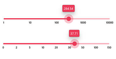
Numeric scale in WinUI 3 Slider
## Labels
Labels allow you to add numeric content to the WinUI Slider to depict the values in the scale. You can easily customize the label styles and value formats. Render them for specific intervals and add prefixes and suffixes. You can also visualize values as text, like Low, Medium, High.
Additionally, you can customize and differentiate the labels for active and inactive parts.
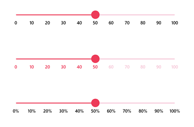
Label Customization in WinUI 3 Slider
## Ticks
This feature allows you to set two types of ticks in the WinUI 3 Slider axis:
- Major ticks: Use this to show the intervals clearly.
- Minor ticks: Help users choose values between two intervals easily.
You can also customize the positions of tick marks.
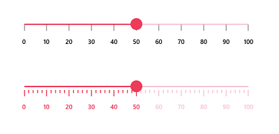
Major and Minor Ticks in WinUI 3 Slider
## Thumb
This feature allows you to easily select a numeric value by dragging (interacting with) the thumb. Customize the thumb shapes with built-in shapes such as circles, diamonds, ovals, rectangles, or a custom thumb. Add text or an icon inside the thumb using a data template.
You can also customize the thumb size, fill, stroke, pressed color, and hover fill color based on your requirements using the built-in APIs.
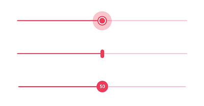
Custom Thumbs in WinUI 3 Slider
## Dividers
This feature allows you to render dividers in each interval to show the values intuitively. You can also easily customize the size, shape, and position of the dividers.
Additionally, you can customize and differentiate the dividers for active and inactive sections.
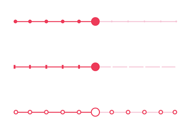
Dividers in WinUI 3 Slider
## Vertical orientation
This feature allows you to display the Slider vertically. You can enjoy all the available features of the horizontal Slider in the vertical orientation, too.
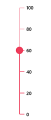
Vertical Orientation in WinUI 3 Slider
## Tooltip
This feature allows you to clearly indicate the current selection during the interaction. You can customize the format, styles, whole text, and visibility using the built-in APIs. You can also customize the position of the tooltip as above or below the track.
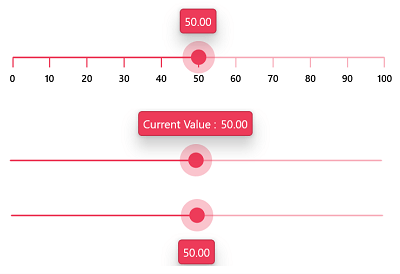
Tooltips in WinUI 3 Slider
## Discrete selection
This feature allows you to select only discrete numeric values. The values are selected continuously by default. However, in some cases, you can limit the value selection to specific values as shown in the following GIF image.
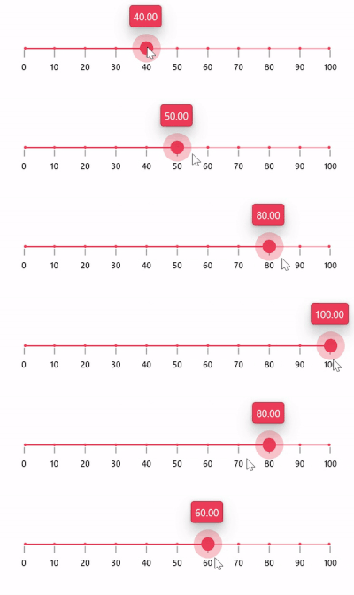
Discrete Selection in WinUI 3 Slider
## Right-to-left (RTL)
You can use this feature to arrange the axis scale values and move the thumb from the right-to-left direction. This is useful for users who work in RTL languages such as Hebrew, Arabic, and others.
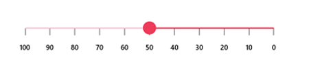
Rendering WinUI 3 Slider in Right-to-Left Direction
## Add the WinUI 3 Slider control to your application
We have seen the marvelous features of the WinUI 3 Slider control. Let’s learn how to create a simple WinUI 3 application with the Slider control to demonstrate its basic usage.
### Step 1: Create a WinUI 3 application
First, create a simple project using the instructions provided in [getting started with WinUI 3 apps](https://docs.microsoft.com/en-us/windows/apps/winui/winui3/create-your-first-winui3-app?tabs=desktop-csharp)
and follow the [Build apps with the Windows App SDK](https://docs.microsoft.com/en-us/windows/apps/windows-app-sdk/get-started)
documentation.
### Step 2: Install the necessary NuGet package
Then, install the latest [Syncfusion.Sliders.WinUI NuGet package](https://www.nuget.org/packages/Syncfusion.Sliders.WinUI)
to the application from [NuGet](https://www.nuget.org/)
or from the installed location, **C:\Program Files (x86)\Syncfusion\Essential Studio\WinUI\xx.x.x.xx\NuGetPackages**.
**Note:**** xx.x.x.xx** denotes the version of the Syncfusion WinUI 3 – Windows App SDK Slider package.
### Step 3: Add the namespace and initialize the Slider
Import the control’s namespace **Syncfusion.UI.Xaml.Sliders** in the XAML file and initialize the Slider control as shown in the following code example.
```
xmlns:slider="using:Syncfusion.UI.Xaml.Sliders"
...
```
### Step 4: Set value to the Slider
You can set the value in the Slider using the [Value](https://help.syncfusion.com/cr/winui/Syncfusion.UI.Xaml.Sliders.SfSlider.html#Syncfusion_UI_Xaml_Sliders_SfSlider_Value)
property. Specify the range of scale using the [Minimum](https://help.syncfusion.com/cr/winui/Syncfusion.UI.Xaml.Sliders.SliderBase.html#Syncfusion_UI_Xaml_Sliders_SliderBase_Minimum)
and [Maximum](https://help.syncfusion.com/cr/winui/Syncfusion.UI.Xaml.Sliders.SliderBase.html#Syncfusion_UI_Xaml_Sliders_SliderBase_Maximum)
properties. The default value of the Minimum and Maximum properties is 0 and 100, respectively. So, the Value property should be given within the default range.
```
```

Assigning Values to the WinUI 3 Slider
### Step 5: Enable ticks and labels
You can enable ticks in the Slider using the [ShowTicks](https://help.syncfusion.com/cr/winui/Syncfusion.UI.Xaml.Sliders.SliderBase.html#Syncfusion_UI_Xaml_Sliders_SliderBase_ShowTicks)
property and labels using the [ShowLabels](https://help.syncfusion.com/cr/winui/Syncfusion.UI.Xaml.Sliders.SliderBase.html#Syncfusion_UI_Xaml_Sliders_SliderBase_ShowLabels)
property. Refer to the following code example.
```
```
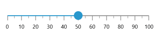
Enabling Ticks in WinUI 3 Slider
## GitHub reference
For more information, refer to our [WinUI Slider Getting Started demo project](https://github.com/SyncfusionExamples/WinUI_Sliders_Getting_Started/tree/main/SliderGettingStartedDesktop)
.
## Conclusion
Thanks for reading! I hope you enjoyed learning about the Syncfusion [WinUI 3 – Windows SDK App Slider control](https://www.syncfusion.com/winui-controls/slider)
and its features. For more details, refer to our [WinUI 3 Slider user guide](https://help.syncfusion.com/winui/slider/overview)
and [GitHub demos](https://github.com/syncfusion/winui-demos/tree/master/sliders)
. Additionally, you can download and check out our [demo app in the App Center](https://install.appcenter.ms/orgs/syncfusion-demos/apps/winui-demos/distribution_groups/release)
.
If you aren’t a customer yet, you can try our 30-day [free trial](https://www.syncfusion.com/downloads)
to check out these features.
If you need a specific feature in our WinUI Slider control, please let us know in the comments section below. You can also contact us through our [support forums](https://www.syncfusion.com/forums)
, [Direct-Trac](https://www.syncfusion.com/support/directtrac/incidents)
, or [feedback portal](https://www.syncfusion.com/feedback/winui)
. We are always happy to assist you!
## Related blogs
- [Introducing the New WinUI NumberBox Control](https://www.syncfusion.com/blogs/post/introducing-the-new-winui-numberbox-control.aspx)
- [What’s New in 2021 Volume 2: WinUI](https://www.syncfusion.com/blogs/post/whats-new-in-2021-volume-2-winui.aspx)
- [Introducing WinUI 3 – Project Reunion Radial Gauge](https://www.syncfusion.com/blogs/post/introducing-winui-3-project-reunion-radial-gauge.aspx)
- [Introducing Syncfusion Ribbon for WinUI](https://www.syncfusion.com/blogs/post/introducing-syncfusion-ribbon-for-winui.aspx)