
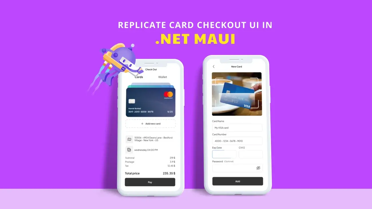
Practicing is always the best way to strengthen our knowledge. In this article, we will enhance your XAML skills by replicating a card checkout UI inspired by this Dribble design.
Let’s break down the creation of the UI into three steps. Each creates a set of visual elements that make up the UI. So, you can concentrate on each portion of the code and have a straightforward and faster understanding of XAML.
Refer to the following image.
Skills you’ll develop
In addition to strengthening your XAML skills, you will learn to implement the following .NET MAUI features in this article:
- Syncfusion .NET MAUI Tab View: An interface for tabbed browsing in mobile and desktop apps, where users can switch among different tabs.
- Syncfusion’s .NET MAUI ListView: Show your information in a list in portrait or landscape orientation.
- Borders: Add a border to the desired visual elements.
- Grid: Design the main layout.
- Appearance mode: To develop the UI for both light and dark modes, we’ll use the AppThemeBinding markup extension in some properties.
Let’s start coding!

General settings
Configuring the Tab View
To get started, we’ll build the CheckOutPage.xaml page. To design it, we are going to use the Syncfusion .NET MAUI Tab View. It will contain all the visual elements that were shown in the previous image.
First, refer to the Getting started with .NET MAUI Tab View documentation. Then, follow these steps to implement the Tab View control:
- Add the Syncfusion.Maui.TabView NuGet package.


- Go to the MauiProgram.cs file and register the handler for the Syncfusion .NET MAUI Tab View. To do this, navigate to the CreateMauiApp method and then, just before the line return builder.Build(); method, add the .ConfigureSyncfusionCore() method.
- Now, add the Syncfusion.Maui.TabView namespace in the XAML page.
xmlns:tabView="clr-namespace:Syncfusion.Maui.TabView;assembly=Syncfusion.Maui.TabView"
- Finally, in the XAML page, add the Tab View control inside a layout, in this case, a VerticalStackLayout.
<VerticalStackLayout>
 <tabView:SfTabView x:Name="tabView" IndicatorBackground="Silver">
  <tabView:SfTabView.Items>
   <tabView:SfTabItem Header="Cards" FontAttributes="Bold" TextColor="{AppThemeBinding Light=Black, Dark=White}">
     <tabView:SfTabItem.Content>
      <!--1. First page: Add the code of your first page here -->
     </tabView:SfTabItem.Content>
   </tabView:SfTabItem>
   <tabView:SfTabItem Header="New Cards" FontAttributes="Bold" TextColor="{AppThemeBinding Light=Black, Dark=White}">
    <tabView:SfTabItem.Content>
      <!--2. Second page: Add the code of your second page here -->
    </tabView:SfTabItem.Content>
   </tabView:SfTabItem>
  </tabView:SfTabView.Items>
 </tabView:SfTabView>
</VerticalStackLayout>
In the previous code example, you will find comments indicating where to add the first (steps 1 and 2) and second (step 3) pages. Keep this in mind so that you‘ll know where to add the code in the following explanations.
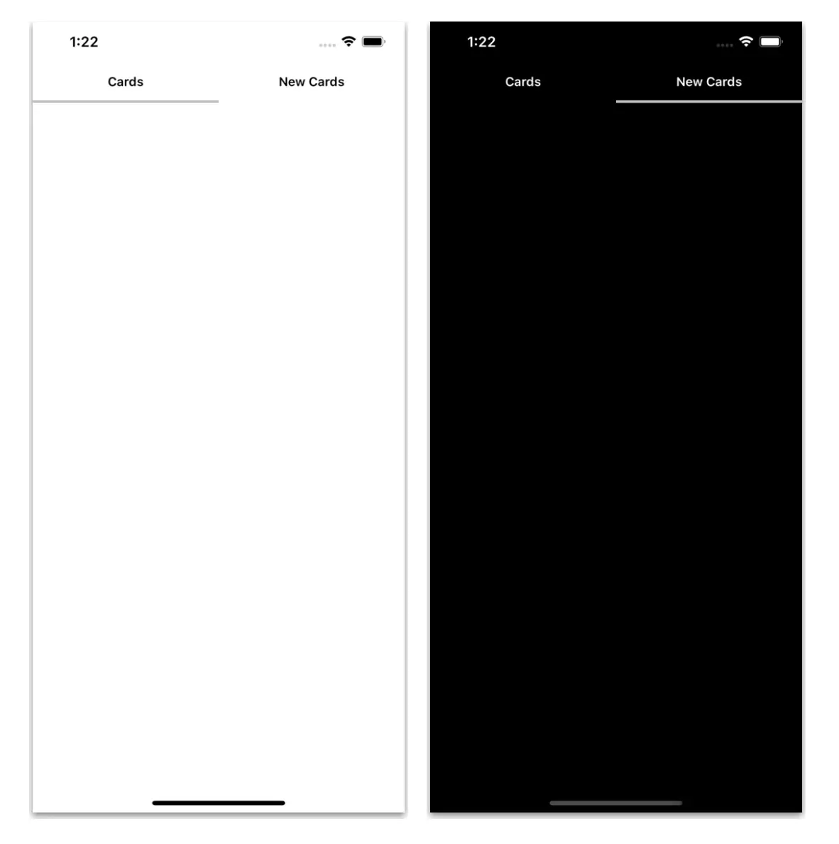
In the following, we can see how the Tab View will be rendered in both light and dark modes.
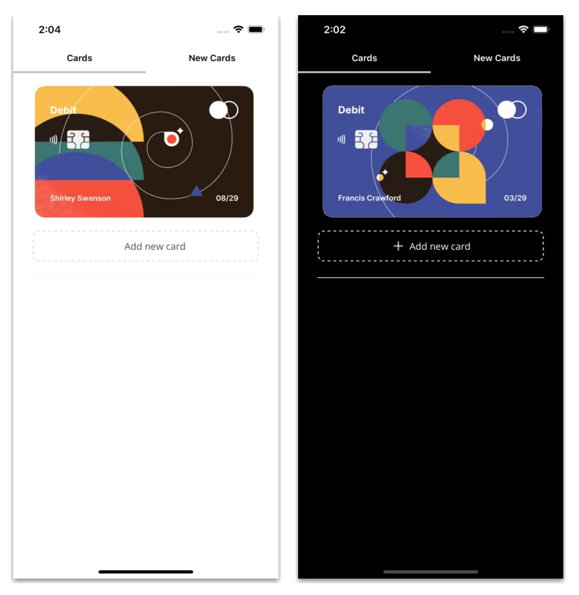
 We have configured the initial setup. Let’s start designing the first page of our UI, Cards.
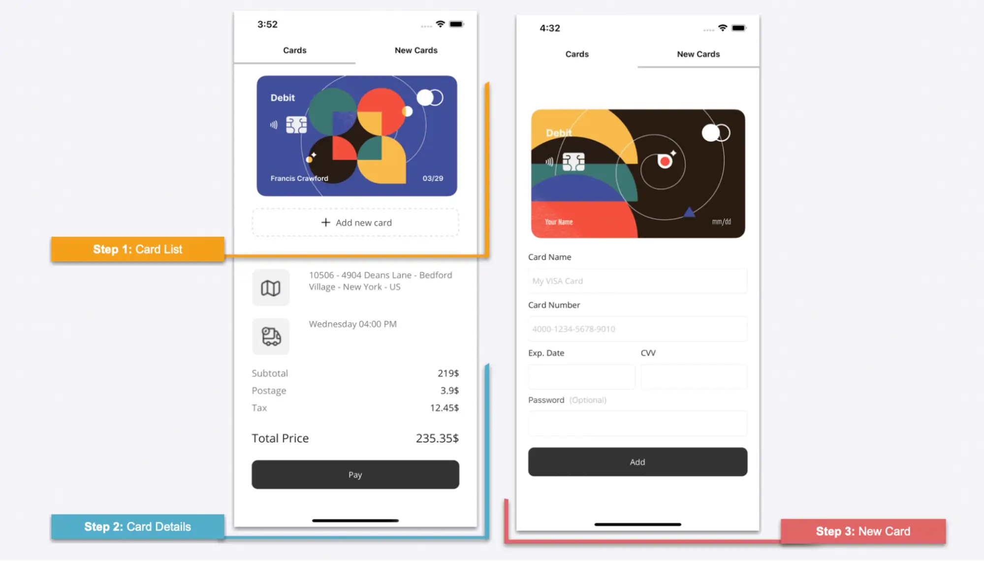
Step 1: Card list
We are going to render the following UI elements:
- Main layout
- Card list
- New card button
- Separator
Main layout
To design the main layout, use a DataGrid control. Refer to the following code example.
<Grid RowDefinitions="Auto,Auto,Auto,Auto,Auto,Auto,Auto,Auto" ColumnDefinitions="Auto,*" VerticalOptions="Start" Margin="30,0">
   <!-- Add here all the code explained in steps 1 and 2 -->
 </Grid>
Card list
As I said before, to show the list of cards, we are going to use the Syncfusion .NET MAUI ListView control. The cards will be organized horizontally.
First, refer to the Getting started with .NET MAUI ListView documentation. Then, follow these steps to implement the control:
- Add the Syncfusion.Maui.ListView NuGet package.

- Go to the MauiProgram.cs file and register the handler for the Syncfusion .NET MAUI ListView. To do so, navigate to the CreateMauiApp method and then, just before the line return builder.Build();, add the builder.ConfigureSyncfusionListView(); method.
- Now, add Syncfusion.Maui.ListView namespace in the XAML page.
xmlns:syncfusion="clr-namespace:Syncfusion.Maui.ListView;assembly=Syncfusion.Maui.ListView"
- Finally, add the following code in the XAML page.
<!-- Card list-->
<syncfusion:SfListView Grid.Row="0" Grid.Column="0" Grid.ColumnSpan="2"
                       ItemsSource="{Binding Cards}"
                       ItemSize="350"
                       ItemSpacing="5"
                       ScrollBarVisibility="Never"
                       HeightRequest="250"
                       Orientation="Horizontal"
                       VerticalOptions="Start"
                       HorizontalOptions="Start">
 <syncfusion:SfListView.ItemTemplate>
  <DataTemplate>
   <Image Source="{Binding Picture}" Aspect="AspectFit" />
  </DataTemplate>
 </syncfusion:SfListView.ItemTemplate>
</syncfusion:SfListView>
<!-- Add here all the code explained in the following code block -->
Note: The Card designs were obtained from this Dribbble design.
Rendering Add new card button
Next, we render the Add new card button with dashed border lines by following these steps:
- First, add a border with dashed lines.
<Border Grid.Row="1" Grid.Column="0" Grid.ColumnSpan="2" Margin="0,0,0,20" Stroke="#dadada" HorizontalOptions="FillAndExpand"
          StrokeThickness="3" StrokeDashArray="1.5" StrokeDashOffset="2"
          StrokeShape="RoundRectangle 10,10,10,10" HeightRequest="50">
   <!-- Add the Button here -->
</Border>
- Then, inside the border, add the Button element.
<!-- Button: Add new Card-->
<Button Text="Add new card" FontSize="15" ImageSource="{AppThemeBinding Light=add_black, Dark=add_white}" TextColor="{AppThemeBinding Light=#505050, Dark=white}" BackgroundColor="Transparent"/>
 <!-- Add here all the code explained in the following code block -->
Separator
Now, let’s simulate a separator below the Add new card button using the BoxView.
<!-- Separator-->
<BoxView Grid.Row="2" Grid.Column="0" Grid.ColumnSpan="2" HorizontalOptions="FillAndExpand" HeightRequest="1" Color="#f4f3f4" Margin="0,5,0,30"/>
 <!-- Add here all the code explained in the following code block -->
Note: You can also render the separator using lines.
After executing the previous code examples, our UI will look like the following image.
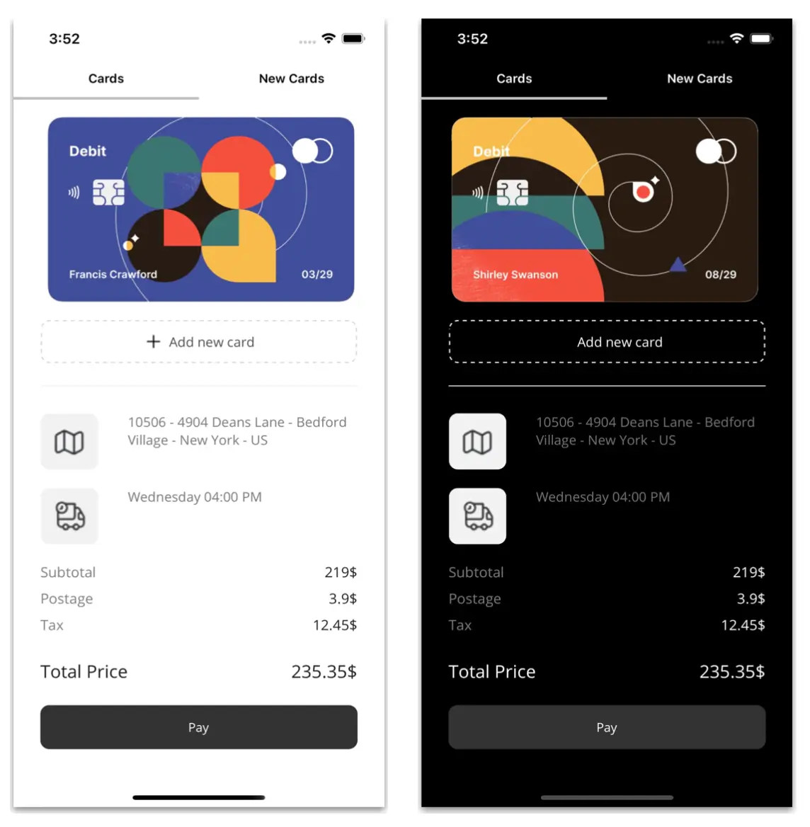
Step 2: Card details
We have finished designing the UI for the card list. Let’s next design the UI for the card details with the following elements:
- Address and date
- Invoice details
- Pay button
Address and date
We’ll display the card holder’s address and date details with the following visual elements:
- An image within a border with a background color and rounded edges.
- A label with detailed information.
Refer to the following code example.
<!-- Details: Address & Date-->
<!-- Address -->
<Border Grid.Row="3" Grid.Column="0" Margin="0,0,0,20" Stroke="Transparent" HorizontalOptions="Start" BackgroundColor="#f2f2f2" HeightRequest="65" WidthRequest="65" StrokeShape="RoundRectangle 10,10,10,10">
 <Image Source="location" HeightRequest="40" WidthRequest="40"/>
</Border>
<Label Grid.Row="3" Grid.Column="1" FontSize="15" TextColor="#777777" Text="10506 - 4904 Deans Lane - Bedford Village - New York - US"/>
<!-- Date -->
<Border Grid.Row="4" Grid.Column="0" Margin="0,0,0,20" Stroke="Transparent" HorizontalOptions="Start"  BackgroundColor="#f2f2f2" HeightRequest="65" WidthRequest="65" StrokeShape="RoundRectangle 10,10,10,10">
 <Image Source="truck" HeightRequest="40" WidthRequest="40"/>
</Border>
<Label Grid.Row="4" Grid.Column="1" FontSize="15" TextColor="#777777" Text="Wednesday 04:00 PM"/>
 <!-- Add here all the code explained in the following code block -->
Invoice details
Let’s use the Syncfusion .NET MAUI ListView control to render an invoice with the following information:
- Subtotal
- Postage
- Tax
Then, we’ll render the total price with a Label control, as shown in the following code example.
 <!-- Invoice information-->
<syncfusion:SfListView Grid.Row="5" Grid.Column="0" Grid.ColumnSpan="2"
                                    ItemsSource="{Binding Invoice}"
                                    ScrollBarVisibility="Never"
                                    ItemSize="30"
                                    HeightRequest="110"
                                    HorizontalOptions="FillAndExpand"
                                    Orientation="Vertical">
 <syncfusion:SfListView.ItemTemplate>
  <DataTemplate>
   <Grid ColumnDefinitions="*,*">
    <Label Grid.Column="0" Text="{Binding Description}" TextColor="#7e7e7e" FontSize="16" />
    <Label Grid.Column="1" Text="{Binding Price}" FontSize="16" HorizontalTextAlignment="End"/>
   </Grid>
  </DataTemplate>
 </syncfusion:SfListView.ItemTemplate>
</syncfusion:SfListView>
<!-- Total Price-->
<Label Grid.Row="6" Grid.Column="0" Text="Total Price" FontSize="20" FontAttributes="Bold"/>
<Label Grid.Row="6" Grid.Column="1" Text="235.35$" FontSize="20" HorizontalTextAlignment="End"/>
 <!-- Add here all the code explained in the following code block -->
Pay button
Refer to the following code example to design the Pay button.
 <!-- Add Button-->
<Button Grid.Row="7" Grid.Column="0" Grid.ColumnSpan="2" HeightRequest="50" CornerRadius="10"
        Margin="0,25,0,0" BackgroundColor="#333333" Text="Pay" TextColor="White"/>
After executing these code examples, our UI will look like the following image.
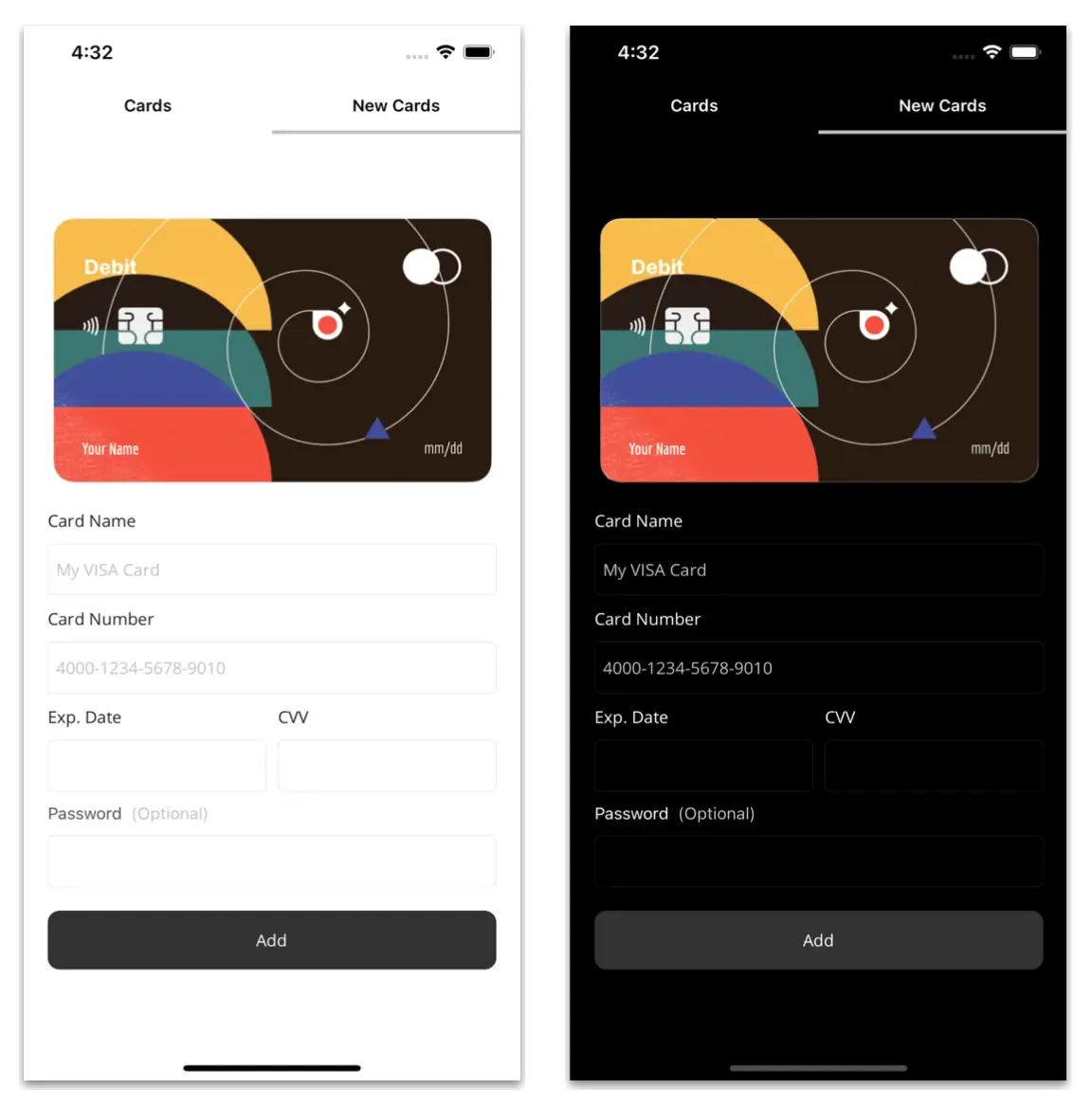
Step 3: New cards
Let’s design the second page of our UI, New Cards.
Do you remember when we implemented the Tab View? Go to the comment that says ‘’<!–2. Second page: Add the code of your second page here –>“. In this space, we need to add all the code that will be explained in this step.
We’ll design the UI with the following elements:
- Main layout
- Card information
- Add button
Main layout
Let’s use a DataGrid to design the main layout.
<Grid RowDefinitions="Auto,Auto,Auto,Auto,Auto,Auto,Auto,Auto,Auto,Auto"
      ColumnDefinitions="*,*" ColumnSpacing="10" RowSpacing="10" Margin="30,30,30,0" VerticalOptions="CenterAndExpand">
         <!-- Add here all the code explained in step 3  -->
 </Grid>
Then, replicate the main image for the card using the following code example.
<!-- Main image-->
 <Image Grid.Row="0" Grid.Column="0" Grid.ColumnSpan="2" Source="ccardbase" Aspect="AspectFit" HeightRequest="250" />
<!-- Add here all the code explained in the following code block -->
Card information
This section involves designing the UI to collect the following card information.
Card name and number
Refer to the following code example to get the card name and number details from the user.
<!--Card information-->
<!--Card Name-->
<Label Grid.Row="1" Grid.Column="0" Grid.ColumnSpan="2" Text="Card Name"/>
<Entry Grid.Row="2" Grid.Column="0" Grid.ColumnSpan="2"
        Placeholder="My VISA Card" PlaceholderColor="Silver"/>
<!--Card Number-->
<Label Grid.Row="3" Grid.Column="0" Grid.ColumnSpan="2" Text="Card Number"/>
<Entry Grid.Row="4" Grid.Column="0" Grid.ColumnSpan="2"
        Placeholder="4000-1234-5678-9010" PlaceholderColor="Silver"/>
 <!-- Add here all the code explained in the following code block -->
Expiration date and CVV
Refer to the following code example to collect the card expiration date and CVV details.
<!--Exp. Date-->
<Label Grid.Row="5" Grid.Column="0" Text="Exp. Date"/>
<Entry Grid.Row="6" Grid.Column="0" />
<!--CVV-->
<Label Grid.Row="5" Grid.Column="1" Text="CVV"/>
<Entry Grid.Row="6" Grid.Column="1" />
<!-- Add here all the code explained in the following code block -->
Password
Then, design the UI to set the password (optional) for the users’ cards.
<!--Password-->
<Label Grid.Row="7" Grid.Column="0" Grid.ColumnSpan="2">
 <Label.FormattedText>
  <FormattedString>
   <Span Text="Password " TextColor="{AppThemeBinding Light=#505050, Dark=white}" />
   <Span Text=" (Optional)" TextColor="Silver"/>
  </FormattedString>
 </Label.FormattedText>
</Label>
<Entry Grid.Row="8" Grid.Column="0" Grid.ColumnSpan="2" IsPassword="True"/>
 <!-- Add here all the code explained in the following code block -->
Add button
Refer to the following code example to render the Add button.
<!--Add Button-->
<Button Grid.Row="9" Grid.Column="0" Grid.ColumnSpan="2" HeightRequest="50" CornerRadius="10"
        Margin="0,10,0,0" BackgroundColor="#333333" Text="Add" TextColor="White"/>
Finally, let’s see the result of this step in both light and dark modes!
 That is all! We have now finished the development of our Card Check Out UI in .NET MAUI!
GitHub reference
To see the complete code structure of this project, see our demo for Card Check Out UI in .NET MAUI on GitHub.
Conclusion
Thanks for reading! In this blog, we enhanced your XAML knowledge by teaching you how to replicate a card checkout UI using Syncfusion .NET MAUI controls. Try out the steps outlined in the post and leave your thoughts in the comments section below.
Syncfusion’s .NET MAUI controls were created from the ground up using .NET MAUI, which makes them feel like native framework controls. These controls are optimized to manage large amounts of data, making them ideal for building top-notch, cross-platform mobile and desktop applications.
If you have any questions or need assistance, don’t hesitate to reach us through our support forum, support portal, or feedback portal. We are always available to help you!


