---
title: "Easily Create\\Edit Data Entry Forms in Xamarin.Forms Using Edit\\Input Controls"
published_at: "2019-02-15T05:42:42+00:00"
modified_at: "2025-03-20T11:57:10+00:00"
url: "https://www.syncfusion.com/blogs/post/easily-create-data-entry-forms-in-xamarin-forms-using-syncfusion-input-controls"
excerpt: "Introduction Welcome to a walkthrough of creating data entry forms using some of Syncfusion’s input controls, like the built-in DataForm control, for the Xamarin.Forms platform. The Xamarin.Forms DataForm control is used to display and edit the properties of any data..."
taxonomy_category:
- ".NET"
- "C#"
- "Desktop"
- "Development"
- "Uncategorized"
- "Xamarin"
taxonomy_post_tag:
- "Autocomplete"
- "button"
- "Calendar"
- "CheckBox"
- "chips"
- "ComboBox"
- "DataForm"
- "NumericEntry"
- "RadioButton"
- "RangeSlider"
- "rating"
- "switch"
---
# Easily Create\Edit Data Entry Forms in Xamarin.Forms Using Edit\Input Controls
[Selva Ganapathy Kathiresan](https://www.syncfusion.com/blogs/author/selva-ganapathy-k)

## Introduction
Welcome to a walkthrough of creating data entry forms using some of Syncfusion’s input controls, like the built-in [DataForm](https://www.syncfusion.com/xamarin-ui-controls/dataform)
control, for the Xamarin.Forms platform.
The Xamarin.Forms [DataForm](https://www.syncfusion.com/xamarin-ui-controls/dataform)
control is used to display and edit the properties of any data object using a wide range of built-in editors for different data types. It simplifies the development of various forms such as login, reservation, and data entry.
Apart from the [DataForm](https://www.syncfusion.com/xamarin-ui-controls/dataform)
control, Syncfusion Essential Studio® for Xamarin provides other individual input controls that enable you to create your own data entry form as you like: [Autocomplete](https://www.syncfusion.com/xamarin-ui-controls/autocomplete)
, [Button](https://www.syncfusion.com/xamarin-ui-controls/button)
, [Badge View](https://www.syncfusion.com/xamarin-ui-controls/badge-view)
, [Chips](https://www.syncfusion.com/xamarin-ui-controls/chips)
, [ComboBox](https://www.syncfusion.com/xamarin-ui-controls/combobox)
, [Picker](https://www.syncfusion.com/xamarin-ui-controls/picker)
, [Calendar](https://www.syncfusion.com/xamarin-ui-controls/calendar)
, [Numeric Entry](https://www.syncfusion.com/xamarin-ui-controls/numeric-entry)
, [NumericUpDown](https://www.syncfusion.com/xamarin-ui-controls/numericupdown)
, [Masked Entry](https://www.syncfusion.com/xamarin-ui-controls/masked-entry)
, [CheckBox](https://www.syncfusion.com/xamarin-ui-controls/checkbox)
, [Radio Button](https://www.syncfusion.com/xamarin-ui-controls/radio-button)
, [Range Slider](https://www.syncfusion.com/xamarin-ui-controls/range-slider)
, [Rating](https://www.syncfusion.com/xamarin-ui-controls/rating)
, and [Segmented Control](https://www.syncfusion.com/xamarin-ui-controls/segmented-control)
that enable you to create your own data entry form to your specifications.
## Use DataForm control if you have predefined models
If your application has a lot of forms and if you have predefined models, then we provide a [DataForm](https://www.syncfusion.com/xamarin-ui-controls/dataform)
control that can create forms based on your data objects, making the form creation process simple. [DataForm](https://www.syncfusion.com/xamarin-ui-controls/dataform)
helps you present data in a multitude of ways, like presenting a collection of model items in predefined layouts.
The following steps explain how to create a form with predefined models using [DataForm](https://www.syncfusion.com/xamarin-ui-controls/dataform)
:
Step 1: Import the control namespace “xmlns:dataForm=”clr-namespace:Syncfusion.XForms.DataForm;assembly=Syncfusion.SfDataForm.XForms” in a XAML page, create an instance of the DataForm control and add it as a view to the linear layout.
```
```
Step 2: The [DataForm](https://www.syncfusion.com/xamarin-ui-controls/dataform)
is a data edit control, so create a data object to edit the data object. Here, the data object named ItemInfo is created with some properties.
```
public class ItemInfo
{
public ItemInfo() { }
public int TotalAmount { get; set; }
public DateTime? Date { get; set; }
public string Name { get; set; }
public bool IsBillable { get; set; }
}
```
Step 3: Create a model repository class with the ItemInfo property initialized with required data in a new class file as shown in the following code example.
```
public class ViewModel
{
public ItemInfo ItemInfo { get; set; }
public ViewModel()
{
ItemInfo= new ItemInfo();
}
}
```
Step 4: To populate the labels and editors in the data form, set the DataObject property.
```
```
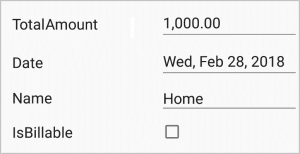
*Syncfusion’s Xamarin.Forms DataForm*
## Syncfusion’s Xamarin.Forms input controls form modelless data forms
So far, we discussed how the Syncfusion’s Xamarin.Forms DataForm controls help to create predefined model data forms. Now, let’s see how Syncfusion input controls greatly improve the data entry experience for your end users with rich features.
## Fast and feature-rich Autocomplete
Syncfusion’s Xamarin.Forms [Autocomplete](https://www.syncfusion.com/xamarin-ui-controls/autocomplete)
control prompts users as they type with a list of suggestions to choose from, making data entry faster and less error-prone. For instance, in a form, users can pick a zip code by searching with this control.
The high-performance search engine can load and search through 100,000 items in less than a second. Typo-toleration functionality for custom searches, on-demand loading for effective data utilization, multiple selection with token representation, highlighting for matching text, and diacritic sensitivity are several other important features of this control.
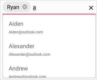
*Syncfusion’s Xamarin.Forms Autocomplete*
### How to add a Syncfusion input control into your data form
#### *Creating a project from a Visual Studio template*
Refer to [this section](https://developer.xamarin.com/guides/xamarin-forms/getting-started/)
of the Xamarin Getting Started guide to create a Xamarin.Forms application through Visual Studio.
#### *Adding references from NuGet*
Refer to our [documentation](https://help.syncfusion.com/xamarin/installation-and-upgrade/install-using-the-web-installer)
for the steps to installing Essential Studio® components in your solution.
*Note: Refer to our [documentation](https://help.syncfusion.com/xamarin/introduction/control-dependencies#sfautocomplete)
for the dependency assembly details for adding the Autocomplete**control to your project. After the assembly reference has been added, an additional step is required for [iOS](https://help.syncfusion.com/xamarin/sfautocomplete/getting-started#additional-step-for-ios)
and [UWP](https://help.syncfusion.com/xamarin/sfautocomplete/getting-started#additional-step-for-uwp)
projects.*
#### *Adding control initialization code*
In the following steps, the necessary XAML code has been added to initialize the control.
Step 1: Include the SfAutoComplete namespace in the respective page.
```
```
Step 2: Declare SfAutoComplete with the content page by defining the height as 40, since the address bar needs a 40-pixel height.
```
```
*Note: The previous steps are applicable to add all Syncfusion’s Xamarin.Forms input controls into a Xamarin.Forms application.*
#### *Adding suggestion items*
Naturally, the Autocomplete control can be bound with a data source as well as direct string items.
```
Aqua
Blue
Indigo
Red
Purple
```
## Advanced Button with toggle actions
The Xamarin.Forms [Button](https://www.syncfusion.com/xamarin-ui-controls/button)
is a custom button control with UI customization, toggle states, and theme support. You can set icons, background images, and corner edge radii as well as customize the appearance of different visual states using the visual state manager.
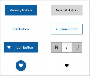
*Syncfusion’s Xamarin.Forms Button*
## Editable ComboBox
Xamarin.Forms [ComboBox](https://www.syncfusion.com/xamarin-ui-controls/combobox)
control is a data entry control that allows users to select options from a fixed list of items. The ComboBox is used to choose a country, either by opening the drop-down or simply typing beginning to type its name.

*Syncfusion’s Xamarin.Forms ComboBox*
## Versatile Picker
We even provide a versatile [Picker](https://www.syncfusion.com/xamarin-ui-controls/picker)
control that can be used to pick from any type of list data. This determines the nature of the Picker as a date picker, time picker, language picker, color picker, etc. Intuitive multicolumn options support cascading selection. The Picker control is the only component that automatically generates its columns based on data source structure. In this form, the Picker control can provide a common UI to pick a date value.
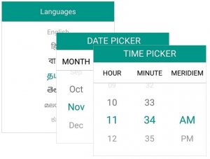
*Syncfusion’s Xamarin.Forms Picker*
## Lightweight calendar for date selection
Get precise date input using the powerful [Calendar](https://www.syncfusion.com/xamarin-ui-controls/calendar)
control. Users can navigate from month to year view.

*Syncfusion’s Xamarin.Forms Calendar*
## Modernize entry using Text Input Layout
The [Text Input Layout](https://www.syncfusion.com/xamarin-ui-controls/text-input-layout)
control informs users of the kind data that they are expected to enter and, if its wrong, alerts them with a validation message. It lets you add a password toggle icon to show or hide passwords; assistive labels such as floating labels; and hint, error, and help text on top of entry controls.
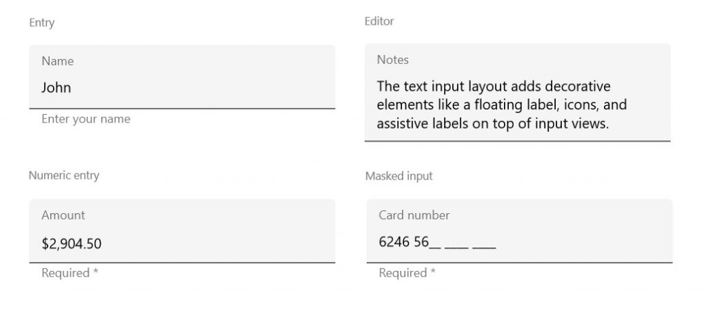
*Syncfusion’s Xamarin.Forms Text Input Layout*
## Numeric Entry with custom format
Restrict input to numeric values using the [Numeric Entry](https://www.syncfusion.com/xamarin-ui-controls/numeric-entry)
control. The control adapts to the device culture based on the region.
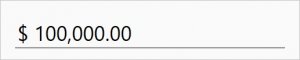
*Syncfusion’s Xamarin.Forms Numeric Entry*
## Spin numbers with NumericUpDown
Use the [NumericUpDown](https://www.syncfusion.com/xamarin-ui-controls/numericupdown)
control to restrict numeric inputs with frequent steps. It behaves as a repeat button to increment or decrement a numeric value with a simple button click.
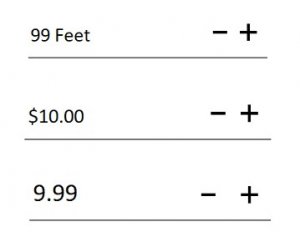
*Syncfusion’s Xamarin.Forms NumericUpDown*
## Specify patterns using Masked Entry
Ensure that input conforms to specific patterns using the [Masked Entry](https://www.syncfusion.com/xamarin-ui-controls/masked-entry)
control by providing custom masks or regex that restrict user input to certain types of characters, like text for inputs such as telephone numbers, IP addresses, and product IDs.

*Syncfusion’s Xamarin.Forms Masked Entry*
## Scrollable Segmented Control
Use [Segmented Control](https://www.syncfusion.com/xamarin-ui-controls/segmented-control)
to provide users an elegant interface for choosing from two or more contexts. The Xamarin.Forms [Segmented Control](https://www.syncfusion.com/xamarin-ui-controls/segmented-control)
can replace a traditional radio button.
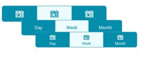
*Syncfusion’s Xamarin.Forms Segmented Control*
### Indeterminate switch with Segmented Control
On further customization of the [Segmented Control](https://www.syncfusion.com/xamarin-ui-controls/segmented-control)
, it can act as either a typical switch or an indeterminate switch with three states: on, off, and balanced.
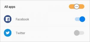
*Indeterminate switch with Syncfusion’s Xamarin.Forms Segmented Control*
## Feature-rich Range Slider
The [Range Slider](https://www.syncfusion.com/xamarin-ui-controls/range-slider)
control allows users to select a value or range of values within the min and max range using an elegant interface.

*Syncfusion’s Xamarin.Forms Range Slider*
## Group choices with Radio Button Group
The [Radio Button](https://www.syncfusion.com/xamarin-ui-controls/radio-button)
control provides users an elegant interface to choose from two or more choices without occupying much space.
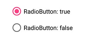
*Syncfusion’s Xamarin.Forms Radio Button*
## Indeterminate CheckBox
Using [CheckBox](https://www.syncfusion.com/xamarin-ui-controls/checkbox)
control, ensure all subchoices are selected or unselected by indicating with the indeterminate state when a collection of subchoices has both unselected and selected states.
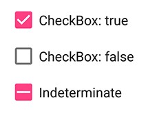
*Syncfusion’s Xamarin.Forms CheckBox*
## Custom view Rating
Instead of just a traditional star-like appearance, you can customize our Xamarin.Forms [Rating](https://www.syncfusion.com/xamarin-ui-controls/rating)
control to improve the user experience by building a reaction or mood interface like those in social network apps such as Facebook.
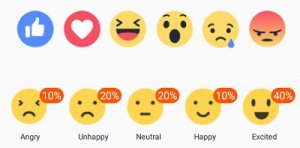
*Syncfusion’s Xamarin.Forms Rating control*
## Summary
In this blog post, we have walked through the Syncfusion Xamarin.Forms input controls used to create forms. We’ve seen how easily the [DataForm](https://www.syncfusion.com/xamarin-ui-controls/dataform)
control itself creates an object-based data form where the application needs a lot of forms. We invite you to check out our [Xamarin.Forms controls](https://www.syncfusion.com/xamarin-ui-controls/)
. You can always [download our free evaluation](https://www.syncfusion.com/downloads/xamarin)
to see all these controls in action. You can also explore our samples available on [Google Play](https://play.google.com/store/apps/details?id=com.syncfusion.samplebrowser)
and learn about advanced features in [our documentation](https://help.syncfusion.com/xamarin/)
.