---
title: "Create an Interactive Social Media App with .NET MAUI: Tabs, Feeds, and Quick Posts"
published_at: "2025-11-20T15:38:00+00:00"
modified_at: "2025-11-21T09:28:03+00:00"
url: "https://www.syncfusion.com/blogs/post/dotnet-maui-social-media-app"
excerpt: "Learn how to create a modern .NET MAUI social media app with Tab View navigation and a center button for quick post actions. Build an interactive feed, profile page, and more."
taxonomy_category:
- ".NET MAUI"
- ".NET MAUI List View"
- "Cross-Platform UI"
- "Social Media App"
- "TabView"
taxonomy_post_tag:
- ".NET MAUI"
- ".NET MAUI List View"
- "Cross-platform development"
- "Mobile UI"
- "Social Media App"
- "Tab View"
---
# Create an Interactive Social Media App with .NET MAUI: Tabs, Feeds, and Quick Posts
[Naveenkumar Sanjeevirayan](https://www.syncfusion.com/blogs/author/naveenkumar-sanjeevirayan)
**TL;DR:** Building a .NET MAUI social media app? Use Tab View for intuitive navigation and add a center button for quick post creation. Implement dynamic feeds, messages, and profile pages with a responsive UI.
Want to build a modern, mobile-friendly social media app? In this tutorial, we’ll show you how to build a feature-rich application using [.NET MAUI Tab View](https://www.syncfusion.com/maui-controls/maui-tab-view)
and [ListView](https://www.syncfusion.com/maui-controls/maui-listview)
controls. You’ll learn how to design intuitive navigation, implement a center button for quick actions, and create interactive feeds, all with Syncfusion’s .NET MAUI controls.
## Why a center button?
The center button enhances usability by providing quick access to key actions, such as creating a new post. This design pattern is widely adopted across various app types for its convenience. Common use cases include:
- **Social Media**: Upload photos, share videos, or start a live stream.
- **Messaging**: Initiate a new conversation instantly.
- **E-Commerce**: Quickly add products or create listings.
- **Finance**: Log transactions or add budget entries with ease.
## Key features
To make your .NET MAUI social media app engaging and easy to navigate, we’ll include the following core features:
- **Home Tab**: A personalized feed displaying posts tailored to the user.
- **Messages Tab**: Recent conversations with integrated search functionality.
- **Explore Tab**: A grid layout showcasing trending content for discovery.
- **Profile Tab**: User details along with their posts and activity.
- **Center Button**: A quick-access shortcut for creating new posts.
## Step-by-step implementation
### Step 1: Install Syncfusion .NET MAUI Tab View
Begin by adding the Tab View control to your project using the official [documentation](https://help.syncfusion.com/maui-toolkit/tabview/getting-started)
. This control enables a tabbed interface with customizable tabs and an optional center button for quick actions, ensuring smooth navigation throughout your app.
### Step 2: Define data models and ViewModel
Next, set up your data structure for efficient management. Create model classes such as a **Post Model** to represent social media posts with user details, images, and engagement metrics, and a ** Message Model** to handle chat data, including sender information and unread message counts. Then, implement a ** ViewModel**, ** SocialMediaViewModel**, that maintains collections of posts and messages. This ViewModel acts as the data context for your views and supports real-time UI updates using **`INotifyPropertyChanged`**.
**Note:** For complete implementation details, refer to the [GitHub](https://github.com/SyncfusionExamples/Designing-User-Friendly-Social-Media-App-using-.NET-MAUI-TabView/tree/master/SocialMediaAppMaui)
repository.
### Step 3: Design tab layout
Now, create tabs for Home, Messages, Explore, and Profile to structure your app’s navigation. Use font icons for a lightweight and visually appealing interface.
To highlight the active tab, apply **VisualStateManager** styling in **`SfTabItem`**. This approach allows you to define distinct visual states for selected and unselected tabs:
- **Default tabs** display black text for the normal state.
- **Selected tabs** use a highlight color (**#6750a4**) for better visibility.
Define this style once in **`ContentPage.Resources`** so it automatically applies to all tab items, ensuring consistency across the app. Additionally, bind each tab icon’s color to the tab’s `TextColor` so the icon dynamically reflects the selection state.
```
```
### Step 4: Enable center button
Enhance usability by adding a **center button** to your Tab View for quick post creation. This interactive element is positioned at the center of the tab bar and can be fully customized using ** CenterButtonSettings**.
With these settings, you can configure:
- `ImageSource` and`ImageSize` for the button icon.
- **DisplayMode** for positioning.
- Optional **custom content**, such as glyphs or icons.
In this example, a font icon `Glyph=""` from a custom font family is used to represent the center button, ensuring a clean and lightweight design.
```
```
### Step 5: Bind data with ViewModel
Next, to keep your UI responsive and fully data-driven, implement a ViewModel that uses **`INotifyPropertyChanged`** for real-time updates.
Start by creating a **`SocialMediaViewModel`** that manages collections such as ** Posts, Messages**, ** ExplorePosts**, and ** UserPosts**. After that, bind this ViewModel to your `ContentPage` so all tabs share the same data context:
**XML**
```
```
This ensures smooth data flow across tabs and supports dynamic updates without manual refresh.
### Step 6: Display dynamic content
Let’s bring your tabs to life by displaying dynamic content tailored to each section of your .NET MAUI social media app. The key to efficient rendering is **Syncfusion’s ListView**, a high-performance and highly customizable list control for .NET MAUI. Before proceeding, make sure you have installed and configured ListView by following the official [documentation](https://help.syncfusion.com/maui/listview/getting-started)
.
#### Home tab
Start with the Home tab, which displays a vertically scrolling feed of posts including user details, images, and captions. Use **ListView** for virtualization and templating to maintain smooth performance even with large datasets.
```
. . .
```
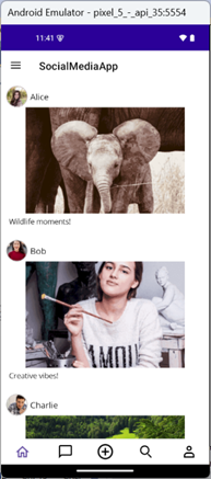
Home tab
#### Messages tab
Next, display recent conversations and unread notifications. Add a **SearchBar** for filtering chats by sender name and use ** SfBadgeView** to show unread counts. Filtering can be implemented using Syncfusion’s ListView and a simple text-change event that updates the data source.
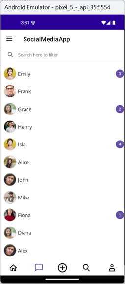
Messages tab
#### Explore tab
Showcase trending content in a Pinterest-style grid using **ListView** with ** GridLayout**. Include a SearchBar for filtering posts by username or image name.
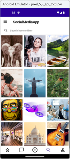
Explore tab
#### Profile tab
Finally, create a responsive profile view with user details and posts in a two-column grid layout. Include an **Edit Profile** button for image updates. Use a ** ScrollView** with ** VerticalStackLayout** for responsiveness. Profile data is managed via a ** UserProfile** model and bound through [SocialMediaViewModel](https://github.com/SyncfusionExamples/Designing-User-Friendly-Social-Media-App-using-.NET-MAUI-TabView/blob/master/SocialMediaAppMaui/ViewModel/SocialMediaViewModel.cs)
.
```
```
**Edit profile logic**
```
private async void OnEditProfileClicked(object sender, EventArgs e)
{
// Create and navigate to the image selection page
var imageSelectionPage = new ProfileImageSelectionPage(OnImageSelected);
await Navigation.PushAsync(imageSelectionPage);
}
// Callback method to receive selected image
private void OnImageSelected(string selectedImage)
{
if (!string.IsNullOrEmpty(selectedImage))
{
profileImage.Source = selectedImage;
}
}
```
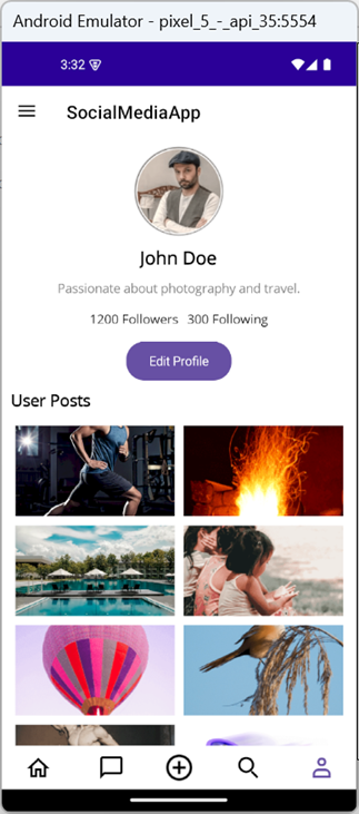
Profile tab
**Note:** You can find the full implementation of these tabs in the [GitHub](https://github.com/SyncfusionExamples/Designing-User-Friendly-Social-Media-App-using-.NET-MAUI-TabView/blob/master/SocialMediaAppMaui/Helper/Converter.cs)
repository.
### Step 7: Enhancing user experience
To make your app more engaging, start by adding **interactive post actions,** such as **Likes**, ** Comments**, and ** Shares**, in the ** Home tab**. Implement these using font icons and converters for dynamic behavior:
- **LikesToIconConverter** switches between filled and outline icons.
- **LikesToColorConverter** changes the icon color based on the like status.
```
. . .
```
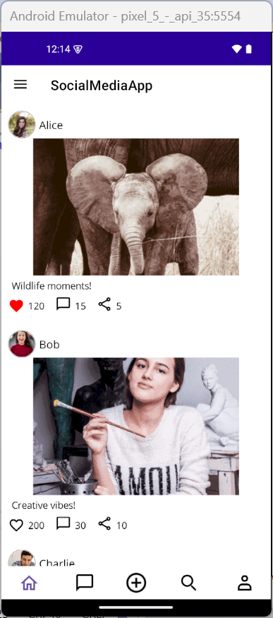
Home tab with interactions
### Step 8: Creating a new post
The **center button** in the tab view acts as a shortcut for users to create a new post. When tapped, it navigates to a dedicated post creation page where users can write a caption and upload an image. Add the CenterButtonTapped event to your Tab View:
```
```
Handle the tap event and navigate to the post creation page:
```
private async void OnCenterbuttonTapped(object sender, EventArgs e)
{
if (BindingContext is SocialMediaViewModel socialMediaViewModel)
{
Navigation.PushAsync(new CreatePostPage(socialMediaViewModel));
}
}
```
The [CreatePostPage](https://github.com/SyncfusionExamples/Designing-User-Friendly-Social-Media-App-using-.NET-MAUI-TabView/blob/master/SocialMediaAppMaui/View/CreatePostPage.xaml)
provides users with a simple and intuitive interface for sharing new content. It includes:
- A **caption editor** for writing thoughts or descriptions.
- An **image upload button** that opens a selection page.
- A **preview of the selected image**.
- A **publish button** to post the content.
Once the user selects an image and writes a caption, the post is added to both the general feed and the user’s profile. This page enhances user engagement by making content creation quick and accessible.
## Upload image
The **ImageSelectionPage** allows users to select an image from a predefined gallery. This page is used when creating or editing a post or profile. It displays images in a grid layout using ** Syncfusion’s SfListView**, and once an image is selected, it’s passed back to the calling page via a callback.
This modular design keeps the image selection process simple and reusable across different parts of the app.

.NET MAUI social media app
## GitHub references
For complete implementation details, check out the full guide on Designing a User-Friendly Social Media App using .NET MAUI TabView in our [GitHub](https://github.com/SyncfusionExamples/Designing-User-Friendly-Social-Media-App-using-.NET-MAUI-TabView)
repository.
## Conclusion
Thanks for reading! In this blog, we explored how to build a feature-rich social media application using Syncfusion’s [.NET MAUI Tab View](https://www.syncfusion.com/maui-controls/maui-tab-view)
and [ListView](https://www.syncfusion.com/maui-controls/maui-listview)
controls. By leveraging a Tab View with a Center Button, we created a seamless navigation experience that allows users to switch between app sections and quickly access core actions, like creating a new post.
From designing interactive feeds and searchable message lists to building a customizable profile page and post creation flow, this tutorial demonstrates how .NET MAUI can be used to craft modern, mobile-friendly social apps. Give them a try and leave your feedback in the comments section below!
If you’re a Syncfusion user, you can download the setup from the [license and downloads](https://www.syncfusion.com/account/downloads)
page. Otherwise, you can download a free [30-day trial](https://www.syncfusion.com/downloads/)
.
You can also contact us through our [support forum](https://www.syncfusion.com/forums)
, [support portal](https://support.syncfusion.com/)
, or [feedback portal](https://www.syncfusion.com/feedback/angular)
for queries. We are always happy to assist you!
## Related Blogs
[Create a Beautiful Photo Gallery Using .NET MAUI Tab View and ListView](https://www.syncfusion.com/blogs/post/dotnet-maui-photo-gallery)
[The All-New .NET MAUI Tabbed View Control Is Here](https://www.syncfusion.com/blogs/post/the-all-new-net-maui-tab-view-control-is-here)
[Build a Stunning Book Library App with .NET MAUI ListView – Fast, Flexible & Cross-Platform](https://www.syncfusion.com/blogs/post/maui-listview-book-library-app)
[Create Engaging Feedback Forms in .NET MAUI Using ListView](https://www.syncfusion.com/blogs/post/dotnet-maui-listview-feedback-forms)