
The .NET MAUI Radial Gauge control is a multi-purpose data visualization control. It displays numerical values on a circular scale. Its rich feature set includes axes, ranges, pointers, and annotations that are fully customizable and extendable. You can use this control to design speedometers, temperature monitors, sleep trackers, circular progress indicators, watches, compasses, and more.
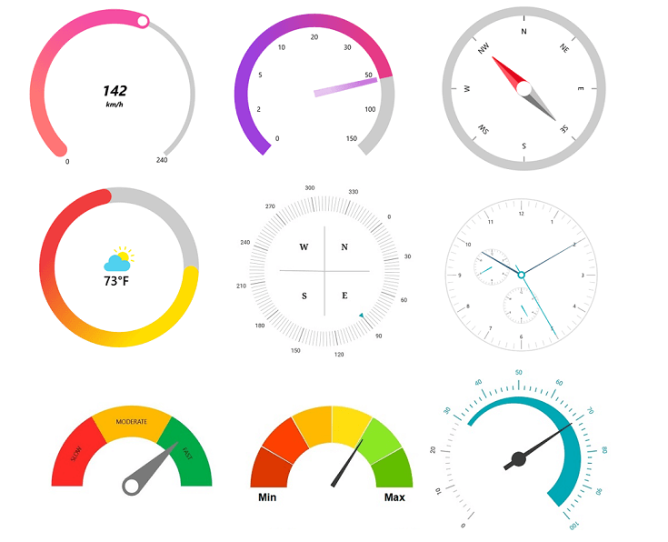
Let’s explore the following features of our .NET MAUI Radial Gauge control:
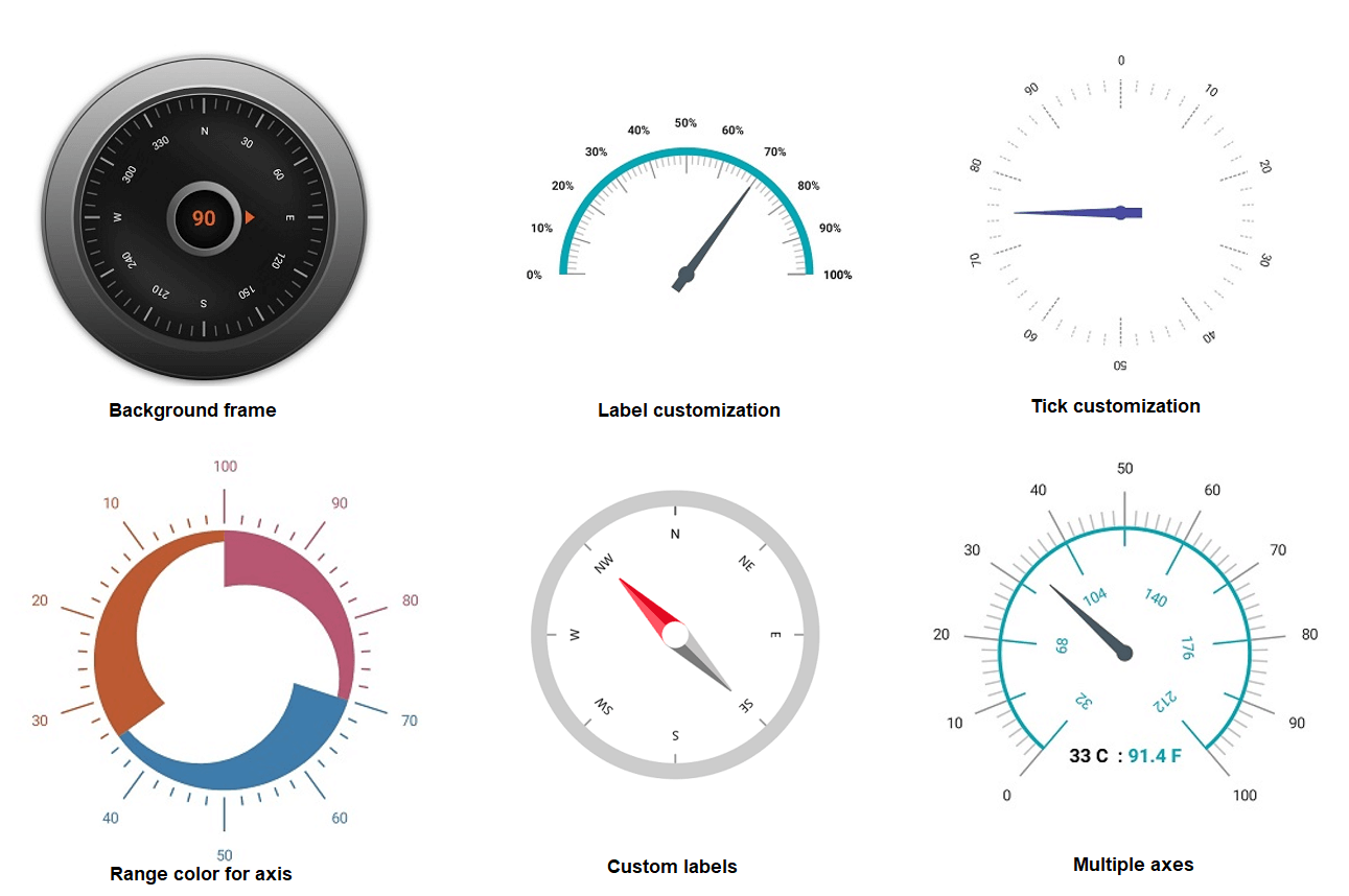
Radial axis
The radial axis is a circular arc in which values are displayed along a linear or custom scale. You can add any number of axes inside the Radial Gauge.
You can customize the radial axis elements to enhance axis readability and usability. Change scale ranges, labels, label rotation, label style, tick style, inversed axes, outside axis position, and the background frame.
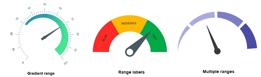
Radial range
The radial range is a color element that helps quickly visualize where a value falls on an axis. You can add any number of ranges inside a radial axis. Customize the range direction, position, and start and end widths, and annotate the text in annotations to improve readability.
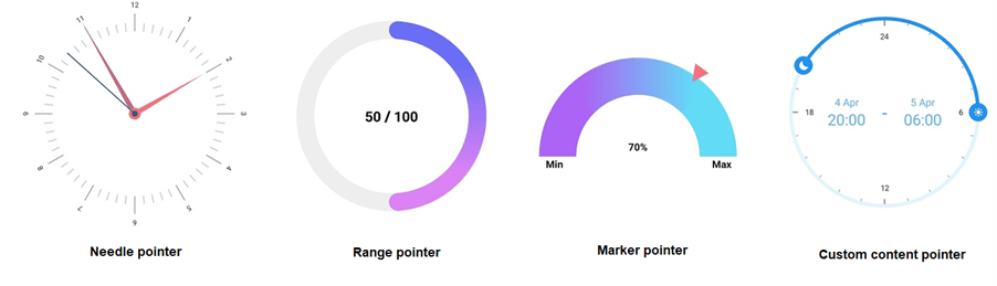
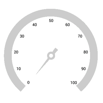
Pointers
Pointers indicate values on the radial axis. The Radial Gauge supports three types of pointers:
- Needle pointer
- Marker pointer
- Range pointer
You can customize all these pointers as needed.
In the needle pointer, one end of the needle is positioned at the middle of the Radial Gauge, and the other endpoints to the value on the radial axis. We can easily customize the knob and tail elements in the needle pointer to enhance the pointer appearance.
The marker pointer is used to indicate a value with built-in shapes, such as a circle, diamond, triangle, inverted triangle, or rectangle. You can also use custom marker elements such as images, icons, or shapes using the marker template support.
The range pointer is an arc element used to indicate the current value relative to the starting value of the radial axis. You can customize the pointer corner style to be rounded or curved and change its position.
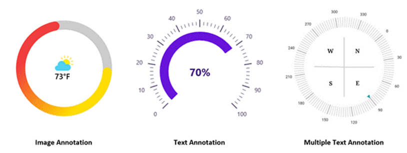
Annotation
You can add multiple types of content, such as text, images, and other custom content, as annotations inside the control. You can also customize the position of the annotations inside the gauge.
Pointer animation
You can animate the pointer in a visually appealing way when it moves from one value to another. Also, customize the animation with various easing options and duration.
Initial loading animation
The .NET MAUI Radial Gauge allows us to animate all of its elements on initial loading. We can control the animation duration based on the elements count.

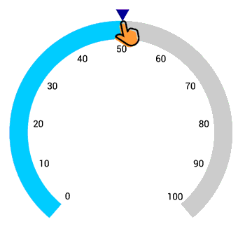
Pointer interaction
Drag a pointer from one value to another to change the value at the run time. We can also select discrete values while dragging the pointer.
Refer to the following GIF image.
Add the .NET MAUI Radial Gauge to your application
Let’s see how to create a simple .NET MAUI app with the Radial Gauge control to demonstrate its basic usage.
Step 1: Create a .NET MAUI app.
First, create a new .NET MAUI app in Visual Studio.
Step 2: Install the NuGet packages.
The Syncfusion .NET MAUI controls are available in nuget.org. To add SfRadialGauge to your project, open the NuGet package manager in Visual Studio. Search for Syncfusion.Maui.Gauges and then install it.
Step 3: Import the namespace.
Then, import the control namespace Syncfusion.Maui.Gauges in your XAML or C# code.
xmlns:gauge="clr-namespace:Syncfusion.Maui.Gauges;assembly=Syncfusion.Maui.Gauges"
Step 4: Initialize the Radial Gauge.
Now, initialize the SfRadialGauge control.
<gauge:SfRadialGauge />
Step 5: Handler registration.
The Syncfusion.Maui.Core NuGet package is a dependent package for all our Syncfusion .NET MAUI controls. In the MauiProgram.cs file, register the handler for Syncfusion core using the ConfigureSyncfusionCore() method.
public static MauiApp CreateMauiApp()
     {
	var builder = MauiApp.CreateBuilder();
	builder
	     .UseMauiApp<App>()
	     .ConfigureSyncfusionCore()
	     .ConfigureFonts(fonts =>
	     {
		 fonts.AddFont("OpenSans-Regular.ttf", "OpenSansRegular");
	      });

	return builder.Build();
      }
Step 6: Add an axis to the Radial Gauge.
Axes contain a list of axis elements, and we can add any number of radial axes inside the gauge. Specify the minimum and maximum values of the axis using the Minimum and Maximum properties, respectively.
Refer to the following code example.
<gauge:SfRadialGauge>
    <gauge:SfRadialGauge.Axes>
         <gauge:RadialAxis Minimum="0" Interval="10"
                           Maximum="150" />
    </gauge:SfRadialGauge.Axes>
</gauge:SfRadialGauge>
Step 7: Add a range to the Radial Gauge.
Ranges contain a list of range elements, and we can add any number of ranges inside the axis. Specify the start value, end value, and color for a range using the StartValue, EndValue, and Fill properties, respectively.
Refer to the following code example.
<gauge:SfRadialGauge>
    <gauge:SfRadialGauge.Axes>
        <gauge:RadialAxis Minimum="0" Interval="10"
                          Maximum="150" >
              <gauge:RadialAxis.Ranges>
                  <gauge:RadialRange StartValue="0"
                                     EndValue="50"
                                     Fill="Red" />
                  <gauge:RadialRange StartValue="50"
                                     EndValue="100"
                                     Fill="Orange" />
                  <gauge:RadialRange StartValue="100"
                                     EndValue="150"
                                     Fill="Green" />
              </gauge:RadialAxis.Ranges>
        </gauge:RadialAxis>
   </gauge:SfRadialGauge.Axes>
</gauge:SfRadialGauge>
Step 8: Add a pointer to the Radial Gauge.
Pointers contain a list of pointer elements, and we can add any kind of gauge pointer such as a NeedlePointer, RangePointer, and MarkerPointer inside the axis to indicate the value.
In this example, we will add the NeedlePointer to denote the value using the Value property.
<gauge:SfRadialGauge>
   <gauge:SfRadialGauge.Axes>
       <gauge:RadialAxis Minimum="0" Interval="10"
                         Maximum="150" >
        ...
            <gauge:RadialAxis.Pointers>
                 <gauge:NeedlePointer Value="90" />
            </gauge:RadialAxis.Pointers>
       </gauge:RadialAxis>
   </gauge:SfRadialGauge.Axes>
</gauge:SfRadialGauge>
Step 9: Add annotations to the Radial Gauge.
You can add any type of content, such as text or images, as an annotation inside the axis. You can customize the position of annotations using the DirectionUnit, DirectionValue, and PositionFactor properties.
Refer to the following code example.
<gauge:SfRadialGauge>
    <gauge:SfRadialGauge.Axes>
         <gauge:RadialAxis Minimum="0" Interval="10"
                           Maximum="150" >
             <gauge:RadialAxis.Pointers>
              ...
                  <gauge:NeedlePointer x:Name="pointer" Value="90"  />
             </gauge:RadialAxis.Pointers>
             <gauge:RadialAxis.Annotations>
                 <gauge:GaugeAnnotation x:Name="annotation"
                                       DirectionUnit="Angle"
                                       DirectionValue="90"
                                       PositionFactor="0.5">
                 <gauge:GaugeAnnotation.Content>
                 <Label Text="{Binding Source={x:Reference pointer}, Path=Value}"
                                       FontSize="25"
                                       FontAttributes="Bold"
                                       TextColor="Black"/>
                 </gauge:GaugeAnnotation.Content>
             </gauge:GaugeAnnotation>
          </gauge:RadialAxis.Annotations>
      </gauge:RadialAxis>
   </gauge:SfRadialGauge.Axes>
</gauge:SfRadialGauge>
GitHub reference
For more information, refer to our .NET MAUI Radial Gauge Getting Started demo project.
Conclusion
Thanks for reading! I hope you enjoyed learning about the Syncfusion .NET MAUI Radial Gauge control and its features. This control was developed from scratch with restructured APIs and the .NET MAUI graphics library with consideration for various use cases and performance aspects. For more details, check out the .NET MAUI Radial Gauge NuGet package, user guide, and GitHub demos.
Let’s use this marvelous .NET MAUI Radial Gauge data visualization control to design our speedometers, temperature monitors, sleep trackers, circular progress indicators, and more real-time applications!
If you need a specific feature in our .NET MAUI Radial Gauge control, please let us know in the comments section below. Also, you can contact us through our support forums, support portal, or feedback portal. We are always happy to assist you!