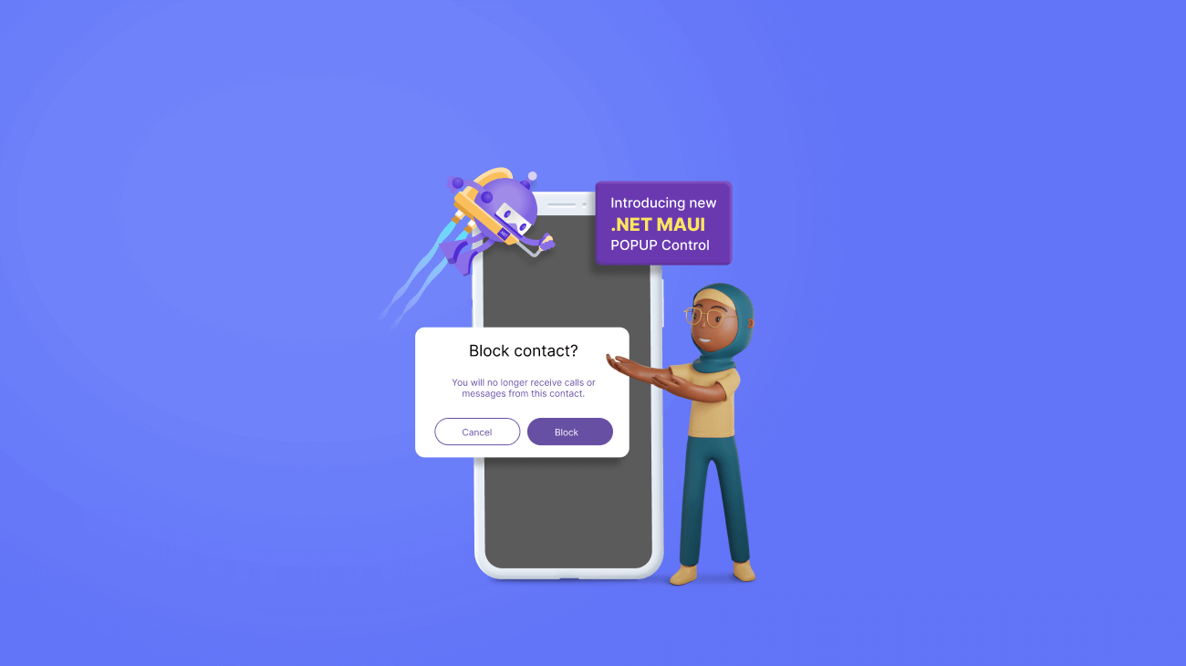
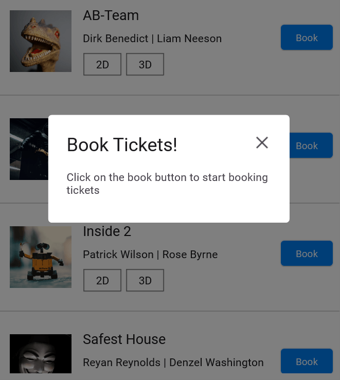
In Syncfusion’s Essential Studio 2023 Volume 1 release, we introduced a new Popup control for the .NET MAUI platform. The .NET MAUI Popup control (SfPopup) is an alert dialog displaying content in a separate window on the active screen. The Popup’s dialog can be shown in any desired position. You can customize the appearance of its header, body, and footer and display significant information precisely based on the application’s needs.
Let’s see the features of the new .NET MAUI Popup control and the steps to get started.
Key features
The key features of the .NET MAUI Popup control are:
Positioning
The .NET MAUI Popup control supports the following positioning options:
- Center positioning: Use the IsOpen property or SfPopup.Show method to display the Popup’s dialog at the center of the screen.

- Absolute positioning: Use the Show(x-position, y-position) method to display the Popup at any desired location on the screen by specifying the x- and y-coordinates.

- Relative positioning: Use the ShowRelativeToView(View, RelativePosition) method to display the Popup at any of the eight positions relative to the specified view.

- Absolute relative positioning: Use the ShowRelativeToView(View, RelativePosition,x position,y position) method to display the Popup at absolute x-y-coordinates from the relative position of the specified view.

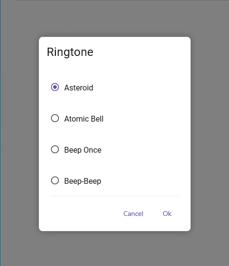
Full-screen mode
You can display the .NET MAUI Popup control in full-screen width and height using the IsFullScreen property or Show(isFullScreen = true) method. Refer to the following image.
Auto-sizing
The .NET MAUI Popup control can automatically adjust its width and height based on the loaded content.
Different layouts
You can choose default layouts, namely one-button and two-button layouts, to display simple, minimal information on the Popup.
Template support
Use the template support to load any view as the header, footer, and content of the Popup control.

Modal mode
You can make the Popup a modal dialog to prevent interactions with the underlying screen until certain actions are performed.
Getting started with the .NET MAUI Popup Control
We have seen the key features of the .NET MAUI Popup control. Now let’s see how to add it to your .NET MAUI application:
Step 1: Create a .NET MAUI project
First, create a .NET MAUI project.
Step 2: Add the .NET MAUI Popup NuGet package
Syncfusion .NET MAUI controls are available in the NuGet Gallery. To add the .NET MAUI Popup control to your project, open the NuGet package manager in Visual Studio, search for Syncfusion.Maui.Popup, and then install it.
Step 3: Register the handler
Syncfusion.Maui.Core NuGet is a dependent package for all Syncfusion .NET MAUI controls. In the MauiProgram.cs file, register the handler for Syncfusion core.
namespace PopupMAUI;
using Syncfusion.Maui.Core.Hosting;

public static class MauiProgram
{
       public static MauiApp CreateMauiApp()
       {
             var builder = MauiApp.CreateBuilder();
             builder
                .UseMauiApp<App>()
                .ConfigureSyncfusionCore()
                .ConfigureFonts(fonts =>
                {
                   fonts.AddFont("OpenSans-Regular.ttf", "OpenSansRegular");
                   fonts.AddFont("OpenSans-Semibold.ttf", "OpenSansSemibold");
                   fonts.AddFont("Roboto-Medium.ttf", "Roboto-Medium");
                   fonts.AddFont("Roboto-Regular.ttf", "Roboto-Regular");
                });
            return builder.Build();
       }
}
Step 4: Add the namespace
Now, add the Syncfusion.Maui.Popup namespace on your XAML page.
<xmlns:popup ="clr-namespace:Syncfusion.Maui.Popup;assembly=Syncfusion.Maui.Popup"/>
Step 5: Initialize the Popup control
Then, initialize the .NET MAUI Popup control using the following code.
<popup:SfPopup />
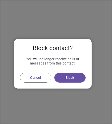
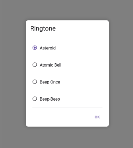
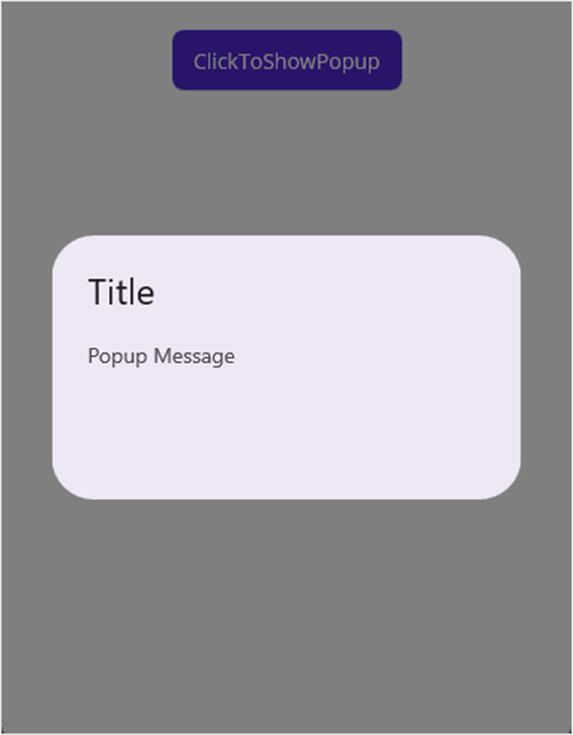
Step 6: Display the default Popup
Let’s display the default popup on your screen by calling the Show method. Refer to the following code example.
XAML
<?xml version="1.0" encoding="utf-8" ?>
 <ContentPage xmlns="http://schemas.microsoft.com/dotnet/2021/maui"
              xmlns:x="http://schemas.microsoft.com/winfx/2009/xaml"
              xmlns:popup ="clr-namespace:Syncfusion.Maui.Popup;assembly=Syncfusion.Maui.Popup"
              x:Class="PopupMAUI.MainPage">
  <StackLayout x:Name="mainLayout">
   <Button x:Name="clickToShowPopup"
           Text="ClickToShowPopup"
           VerticalOptions="Start"
           HorizontalOptions="Center"
           Clicked="ClickToShowPopup_Clicked" />
   <popup:SfPopup x:Name="popup" />
  </StackLayout>
 </ContentPage>
C#
namespace PopupMAUI;

public partial class MainPage : ContentPage
{
    public MainPage()
    {
       InitializeComponent();
    }

    private void ClickToShowPopup_Clicked(object sender, EventArgs e)
    {
        this.popup.Show();
    }
}
Refer to the following image.
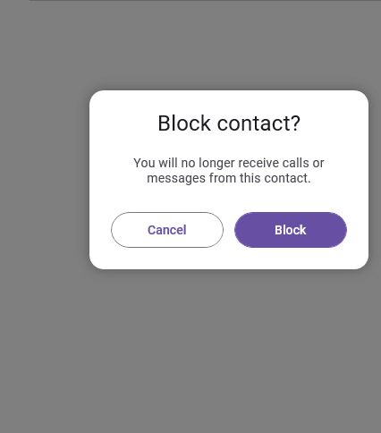
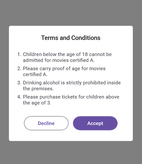
Step 7: Display the templated Popup
Using the template properties, customize the header, message, and footer content. Refer to the following code example.
XAML
<?xml version="1.0" encoding="utf-8" ?>
 <ContentPage xmlns="http://schemas.microsoft.com/dotnet/2021/maui"
              xmlns:x="http://schemas.microsoft.com/winfx/2009/xaml"
              xmlns:popup ="clr-namespace:Syncfusion.Maui.Popup;assembly=Syncfusion.Maui.Popup"
              xmlns:local="clr-namespace:PopupMAUI"
              x:Class="PopupMAUI.TermsAndCondition">

  <ContentPage.BindingContext>
   <local:GettingStartedViewModel/>
  </ContentPage.BindingContext>

  <ContentPage.Resources>

   <Style TargetType="Button" x:Key="DeclineButtonStyle">
    <Setter Property="CornerRadius" Value="20"/>
    <Setter Property="BorderColor" Value="#79747E"/>
    <Setter Property="BorderWidth" Value="1"/>
    <Setter Property="BackgroundColor" Value="#FFFFFF" />
    <Setter Property="TextColor" Value="#6750A4"/>
    <Setter Property="FontSize" Value="14"/>
    <Setter Property="FontFamily" Value="Roboto-Medium"/>
    <Setter Property="CharacterSpacing" Value="0.1"/>
   </Style>

   <Style TargetType="Button" x:Key="AcceptButtonStyle">
    <Setter Property="CornerRadius" Value="20"/>
    <Setter Property="BorderColor" Value="#6750A4"/>
    <Setter Property="BorderWidth" Value="1"/>
    <Setter Property="BackgroundColor" Value="#6750A4" />
    <Setter Property="TextColor" Value="#FFFFFF"/>
    <Setter Property="FontSize" Value="14"/>
    <Setter Property="FontFamily" Value="Roboto-Medium"/>
    <Setter Property="CharacterSpacing" Value="0.1"/>
   </Style>

   <Style TargetType="Label" x:Key="PopupContentLabelStyle">
    <Setter Property="TextColor" Value="#49454E"/>
    <Setter Property="FontFamily" Value="Roboto-Regular"/>
    <Setter Property="FontSize" Value="14"/>
    <Setter Property="CharacterSpacing" Value="0.24"/>
   </Style>

   <Style TargetType="Label" x:Key="PopupHeaderLabelStyle">
    <Setter Property="TextColor" Value="#1C1B1F"/>
    <Setter Property="FontFamily" Value="Roboto-Regular"/>
    <Setter Property="FontSize" Value="24"/>
    <Setter Property="CharacterSpacing" Value="0.15"/>
   </Style>
  </ContentPage.Resources>

  <!--Popup definition-->
   <popup:SfPopup x:Name="termsAndConditionsDialog"
                  StaysOpen="True"
                  IsOpen="{Binding IsOpen}"
                  ShowFooter="True" FooterHeight="100"
                  HeaderTitle="Terms and Conditions"
                  ShowCloseButton="False"
                  WidthRequest="350"
                  AutoSizeMode="Height">

   <!--Popup style-->
    <popup:SfPopup.PopupStyle>
     <popup:PopupStyle HeaderTextAlignment="Center"
                       HeaderBackground="White"
                       HeaderTextColor="#1C1B1F"
                       HeaderFontFamily="Roboto-Medium"
                       Stroke="Gray"
                       StrokeThickness="1"
                       HeaderFontSize="17"
                       MessageBackground="White"
                       FooterBackground="White"
                       CornerRadius="5">
     </popup:PopupStyle>
    </popup:SfPopup.PopupStyle>

   <!--Popup content customization-->
    <popup:SfPopup.ContentTemplate>
     <DataTemplate>
      <Grid RowDefinitions="Auto,Auto,Auto,Auto" ColumnDefinitions="Auto,*" RowSpacing="6" ColumnSpacing="4">
       <Label Text="1. " Style="{StaticResource PopupContentLabelStyle}" LineBreakMode="WordWrap"/>
       <Label Grid.Column="1"  Text="Children below the age of 18 cannot be admitted to movies certified A." Style="{StaticResource PopupContentLabelStyle}" LineBreakMode="WordWrap"/>
       <Label Grid.Row="1" Text="2. " Style="{StaticResource PopupContentLabelStyle}" LineBreakMode="WordWrap"/>
       <Label Grid.Row="1" Grid.Column="1" Text="Please carry proof of age for movies certified A." Style="{StaticResource PopupContentLabelStyle}" LineBreakMode="WordWrap"/>
       <Label Grid.Row="2" Text="3. " Style="{StaticResource PopupContentLabelStyle}" LineBreakMode="WordWrap"/>
       <Label Grid.Row="2" Grid.Column="1" Text="Drinking alcohol is strictly prohibited inside the premises." Style="{StaticResource PopupContentLabelStyle}" LineBreakMode="WordWrap"/>
       <Label Grid.Row="3" Text="4. " Style="{StaticResource PopupContentLabelStyle}" LineBreakMode="WordWrap"/>
       <Label Grid.Row="3" Grid.Column="1" Text="Please purchase tickets for children above the age of 3." Style="{StaticResource PopupContentLabelStyle}" LineBreakMode="WordWrap"/>
      </Grid>
     </DataTemplate>
    </popup:SfPopup.ContentTemplate>

   <!--Popup footer customization-->
    <popup:SfPopup.FooterTemplate>
     <DataTemplate>

      <Grid ColumnDefinitions="Auto,Auto" HorizontalOptions="Center" VerticalOptions="Center" ColumnSpacing="12">
       <Button Text="Decline"
               Command="{Binding Source={x:Reference viewModel}, Path=DeclineCommand}"
               CommandParameter="{x:Reference termsAndConditionPopup}"
               Style="{StaticResource DeclineButtonStyle}"
               WidthRequest="126"
               HeightRequest="40"/>
       <Button Text="Accept"
               Grid.Column="1"
               Command="{Binding Source={x:Reference viewModel}, Path=AcceptCommand}"
               CommandParameter="{x:Reference ticketBookingPopup}"
               Style="{StaticResource AcceptButtonStyle}"
               WidthRequest="126"
               HeightRequest="40"/>

      </Grid>
     </DataTemplate>
    </popup:SfPopup.FooterTemplate>
   </popup:SfPopup>
 </ContentPage>
Then, show the Popup with the MVVM model by setting the IsOpen property.
namespace PopupMAUI
{
    public partial class TermsAndCondition : ContentPage
    {
        public TermsAndCondition ()
        {
            InitializeComponent ();
            this.Loaded += TermsAndCondition_Loaded;
        }

        private void TermsAndCondition_Loaded(object sender, EventArgs e)
        {
            (this.BindingContext as GettingStartedViewModel).IsOpen = true;
        }
    }
}
Note: For more details, refer to the .NET MAUI Popup control documentation.
Conclusion
Thanks for reading! In this blog, we’ve explored the features of the new .NET MAUI Popup control introduced in the 2023 Volume 1 release. More information about our .NET MAUI controls and other features in this release can be found on our Release Notes and What’s New pages. Try out the upgrades and share your thoughts in the comment section below!
You can also contact us via our support forum, support portal, or feedback portal. We are always happy to assist you!