---
title: "Visualize Global AI Investment Trends Using .NET MAUI Drilldown Charts"
published_at: "2025-10-08T14:37:17+00:00"
modified_at: "2025-10-30T08:42:07+00:00"
url: "https://www.syncfusion.com/blogs/post/dotnet-maui-drilldown-charts"
excerpt: "Discover how to build .NET MAUI Drilldown Charts to visualize global AI investment trends using interactive Doughnut and Column series with smart labels and dynamic transitions."
taxonomy_category:
- ".NET MAUI"
- "Chart"
- "Chart of the week"
- "Data Visualization"
- "MAUI"
taxonomy_post_tag:
- ".NET MAUI Chart"
- ".NET MAUI Charts"
- "AI Investment Visualization"
- "Chart"
- "Chart Center View"
- "Column Chart"
- "Column Series"
- "Corporate Investment Trends"
- "Data Visualization"
- "Data Visualization in MAU"
- "DataViz"
- "Doughnut Chart"
- "Drilldown Charts"
- "Entity-wise Investment"
- "Exploding Segments"
- "MAUI TOOLKIT"
- "MAUI Toolkit Chart"
- "Smart Labels"
- "Year-wise Investment"
---
[Chart of the week](https://www.syncfusion.com/blogs/category/chart-of-the-week)
# Visualize Global AI Investment Trends Using .NET MAUI Drilldown Charts
[Hariram Subramanian](https://www.syncfusion.com/blogs/author/hariram-subramanian)

**TL;DR:** Transform complex AI investment data into clear, interactive insights with .NET MAUI Drilldown Charts. Use Doughnut and Column series to build dynamic dashboards with smart labels, exploding segments, and seamless drilldown transitions for an engaging data exploration experience.
Welcome to our**Chart of the Week** blog series!
When working with complex datasets, presenting all details in a single chart can be overwhelming for users. Drilldown charts solve this by allowing users to start with a high-level view and then navigate deeper into specific data points. This interactive approach improves clarity and user engagement.
## Understanding Drilldown Charts in .NET MAUI
Drilldown charts enable hierarchical data exploration. In .NET MAUI, Syncfusion provides powerful charting controls that make implementing drilldown functionality seamless. You can start with a Doughnut chart for top-level categories and drill down into a Column chart for detailed insights.
In this blog, we’ll explore how to visualize global corporate investment in AI using drilldown charts powered by the [Syncfusion .NET MAUI Toolkit](https://www.nuget.org/packages/Syncfusion.Maui.Toolkit)
. We will structure investment data to represent parent-child relationships. For example:
- **Parent level**: Investment by entity type (e.g., Private, Public, M&A).
- **Child level**: Year-wise investment details for each entity.
## Step 1: Configuring the Syncfusion .NET MAUI Doughnut Chart
Before implementing the [.NET MAUI Doughnut Chart](https://www.syncfusion.com/maui-controls/maui-circular-charts/maui-doughnut-chart)
, structure your hierarchical AI investment data, sourced from [Our World in Data](https://ourworldindata.org/grapher/corporate-investment-in-artificial-intelligence-by-type)
, to enable drilldown functionality.
We define models such as [InvestmentModel](https://github.com/SyncfusionExamples/Creating-.NET-MAUI-drill-down-chart-to-visualize-annual-global-corporate-investment-in-AI-trends/blob/master/DrilldownMAUIChart/DrilldownMAUIChart/Model/Model.cs)
and [InvestmentViewModel](https://github.com/SyncfusionExamples/Creating-.NET-MAUI-drill-down-chart-to-visualize-annual-global-corporate-investment-in-AI-trends/tree/master/DrilldownMAUIChart/DrilldownMAUIChart/ViewModel)
to organize this data efficiently.
Then, configure the Syncfusion .NET MAUI Doughnut Charts control using the code below.
```
```
To learn more about Doughnut Chart configuration, refer to this official [documentation](https://help.syncfusion.com/maui-toolkit/circular-charts/doughnutchart)
.
### Data binding
To visualize AI investments by entity type, we use the `SfCircularChart` with a `DoughnutSeries`. This series binds to the **`DoughnutData`** collection in the `InvestmentViewModel`, where each data point represents a top-level investment category like ** Merger/Acquisition** or ** Private Investment**.
```
...
```
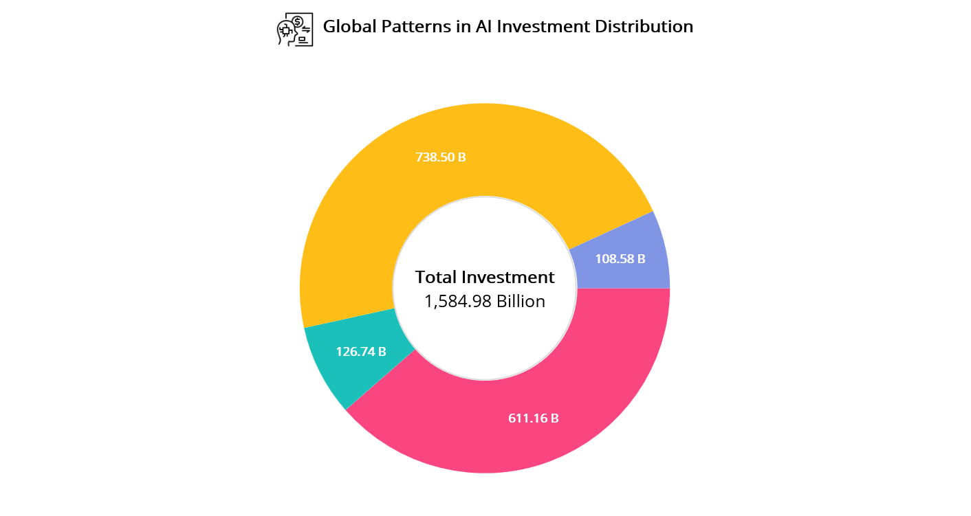
AI investment trends using .NET MAUI Doughnut Chart
### Legend customization
The legend adapts to screen size for better readability, appearing on the **right** for larger screens and at the ** bottom** on mobile. Each item matches the color of its chart slice, making it easy to identify categories like ** Merger/Acquisition** or ** Private Investment**.
To maintain a clean and responsive layout, a **`FlexLayout`** ensures the legend wraps neatly, keeps labels aligned, and prevents overlap.
```
```
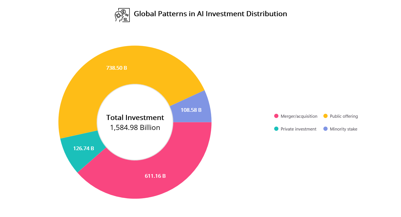
.NET MAUI Doughnut Chart with customized legends
## Step 2: Enabling drill-down navigation from Doughnut to Column Chart
To make the Doughnut chart interactive, we capture user taps and navigate to a detailed view with year-wise investment data. This drill-down turns a static summary into a dynamic, exploratory experience.
When a user taps a chart segment, the `SelectionChanging` event is triggered. This invokes the `OnDoughnutSeriesSelectionChanging` method, which handles navigation to a detailed **Column Chart** view. This interaction enables users to explore investment data from a high-level overview to specific yearly trends, all within a seamless and intuitive experience.
```
```
```
private void OnDoughnutSeriesSelectionChanging(object sender, ChartSelectionChangingEventArgs e)
{
var series = sender as DoughnutSeries;
var items = series?.ItemsSource as IList;
int selectedIndex = e.NewIndexes[0];
var selectedData = items![selectedIndex] as InvestmentModel;
Navigation.PushAsync(new YearlyInvestmentPage(selectedData!, series!.PaletteBrushes[selectedIndex]));
e.Cancel = true;
}
```
## Step 3: Visualizing year-wise investment trends with a Column Chart
Once a user taps a segment in the Doughnut Chart, it triggers a drilldown that navigates to the **`YearlyInvestment`** page. This page presents a detailed breakdown of AI investments by year using the Column Chart.
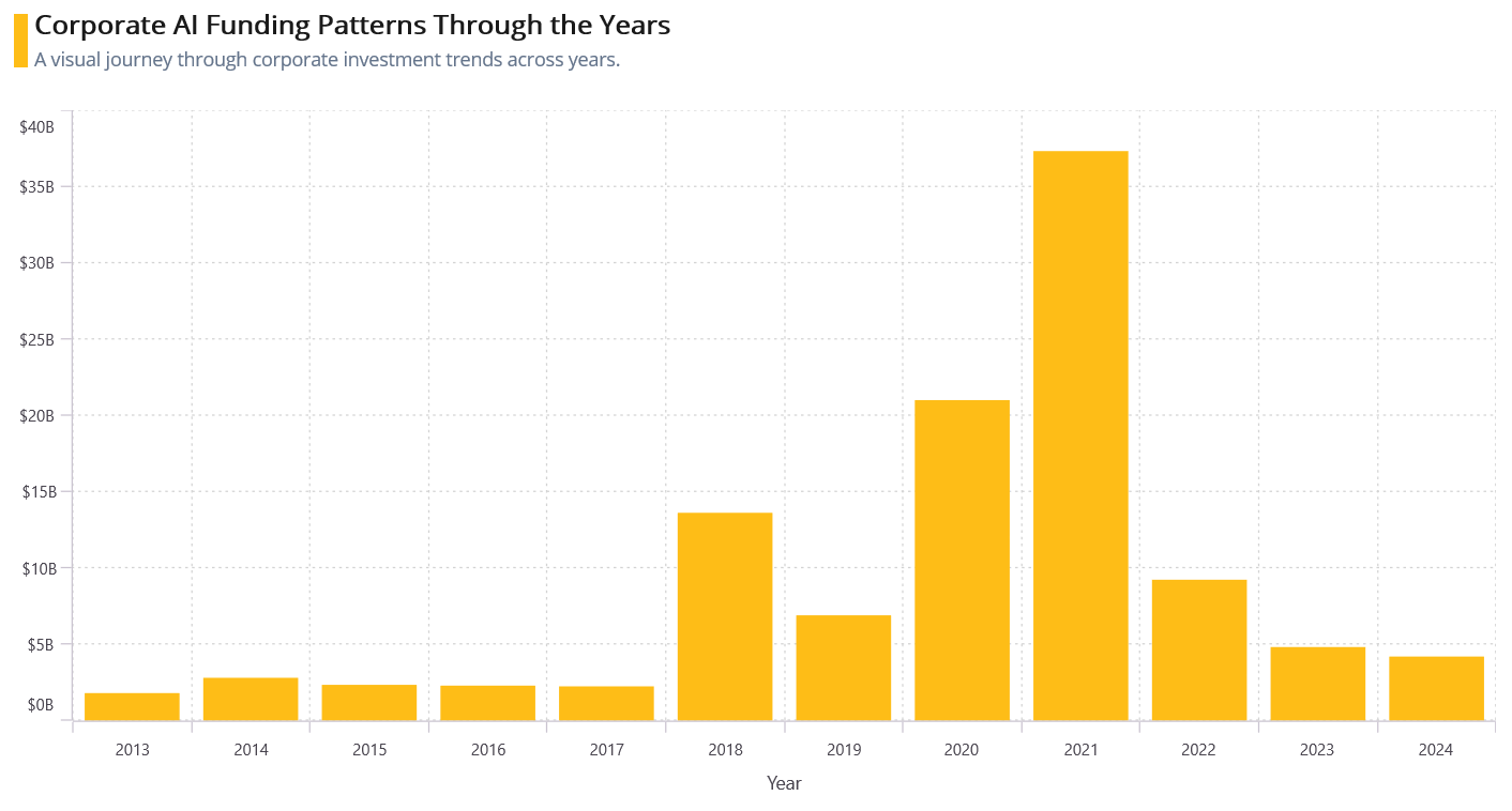
Year-wise AI investment trends using .NET MAUI Column chart after drilldown
Each vertical bar in the chart represents the investment value for a specific year, helping users identify growth patterns and fluctuations over time. To support this visualization, we define models like [YearlyInvestmentModel](https://github.com/SyncfusionExamples/Creating-.NET-MAUI-drill-down-chart-to-visualize-annual-global-corporate-investment-in-AI-trends/blob/master/DrilldownMAUIChart/DrilldownMAUIChart/Model/Model.cs)
and update [InvestmentViewModel](https://github.com/SyncfusionExamples/Creating-.NET-MAUI-drill-down-chart-to-visualize-annual-global-corporate-investment-in-AI-trends/tree/master/DrilldownMAUIChart/DrilldownMAUIChart/ViewModel)
to populate year-wise data for each investment category.
```
public class InvestmentViewModel
{
...
private ObservableCollection MergerAcquisitionData { get; set; }
…
public InvestmentViewModel()
{
MergerAcquisitionData = new ObservableCollection
{
new YearlyInvestmentModel("2013", 6886002147),
new YearlyInvestmentModel("2014", 7657430075),
…
};
}
}
```
The **`SfCartesianChart`** is ideal for plotting time-series or category-based data. By binding the `YearlyBreakdown` collection to the **`ColumnSeries`**, the chart dynamically reflects the correct data context based on user interaction, making the experience seamless and intuitive.
For detailed configuration options, refer to the official Syncfusion .NET MAUI Column Chart [documentation](https://help.syncfusion.com/maui-toolkit/cartesian-charts/column)
.
```
```
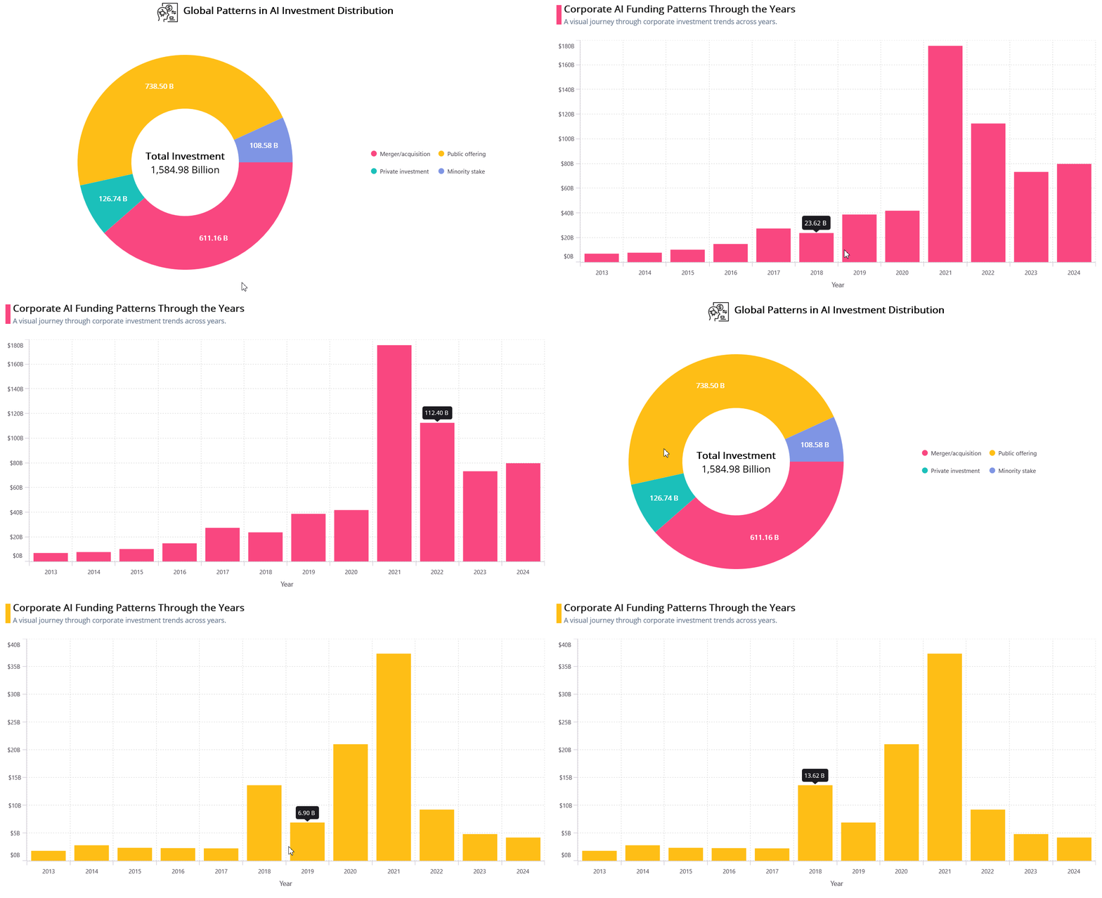
Interactive drilldown: From Doughnut Chart to year-wise investment insights
## GitHub reference
For more details, refer to the [GitHub](https://github.com/SyncfusionExamples/Creating-.NET-MAUI-drill-down-chart-to-visualize-annual-global-corporate-investment-in-AI-trends)
demo.
## Conclusion
Thank you for reading! In this blog, we explored how to visualize global corporate investment in AI using [Syncfusion .NET MAUI Toolkit](https://www.nuget.org/packages/Syncfusion.Maui.Toolkit)
Charts. From high-level entity comparisons to year-wise trends, we saw how drilldown charts can turn complex financial data into clear, interactive insights.
Try building your own version using the steps above, and feel free to share your thoughts or questions in the comments!
If you’re a Syncfusion user, you can download the setup from the [license and downloads](https://www.syncfusion.com/account)
page. Otherwise, try the free [30-day trial](https://www.syncfusion.com/downloads)
.
Need help? Reach out via [support forums](https://www.syncfusion.com/forums)
, [support portal](https://support.syncfusion.com/)
, or[feedback portal](https://www.syncfusion.com/feedback)
. We are always happy to assist you!
## Related Blogs
[Build Interactive Doughnut Charts in .NET MAUI for Mobile Dashboards](https://www.syncfusion.com/blogs/post/dotnet-maui-doughnut-chart-customization)
[Visualizing Skyscraper Data with .NET MAUI Doughnut Chart and Maps](https://www.syncfusion.com/blogs/post/dotnet-maui-chart-for-skyscrapers)
[Create a Flutter Semi-Doughnut Chart to Visualize Transport Emissions per Kilometer Traveled](https://www.syncfusion.com/blogs/post/flutter-semi-doughnut-chart-emissions)
[Creating a WPF Doughnut Chart to Visualize the New European Parliament’s Composition in 2024](https://www.syncfusion.com/blogs/post/wpf-doughnut-chart-europe-parliament)