---
title: "How to Design an Interactive Dashboard for COVID-19 Updates in JavaScript"
published_at: "2021-02-18T12:08:00+00:00"
modified_at: "2024-11-20T06:46:02+00:00"
url: "https://www.syncfusion.com/blogs/post/design-an-interactive-dashboard-for-covid-19-updates-in-javascript"
excerpt: "Syncfusion offers many UI components that help developers design charming web applications. In this blog, we are going to see how to build an interactive dashboard in JavaScript to display COVID-19 updates using the JavaScript Dashboard Layout and other JavaScript..."
taxonomy_category:
- "Dashboard"
- "Development"
- "JavaScript"
- "Tips and Tricks"
- "UI"
- "Web"
taxonomy_post_tag:
- "COVID-19"
- "dashboard"
- "JavaScript"
- "Web"
- "Web Development"
---
# How to Design an Interactive Dashboard for COVID-19 Updates in JavaScript
[Thirukumaran Murugan](https://www.syncfusion.com/blogs/author/thirukumaran-murugan)

Syncfusion offers many UI components that help developers design charming web applications. In this blog, we are going to see how to build an interactive dashboard in JavaScript to display COVID-19 updates using the [JavaScript Dashboard Layout](https://www.syncfusion.com/javascript-ui-controls/js-dashboard-layout)
and other [JavaScript UI controls](https://www.syncfusion.com/javascript-ui-controls)
.
In this dashboard, we are going to use the following UI components to represent the numbers of active, confirmed, recovered, and fatal COVID-19 cases for various countries:
- [Dropdown List](https://www.syncfusion.com/javascript-ui-controls/js-dropdown-list) : To select the country.
- [DateRangePicker](https://www.syncfusion.com/javascript-ui-controls/js-daterangepicker) : To select a range of dates.
- [Line, pie, and column charts](https://www.syncfusion.com/javascript-ui-controls/js-charts) : To visualize and compare the total number of active, confirmed, recovered, and fatal cases.
- [DataGrid](https://www.syncfusion.com/javascript-ui-controls/js-data-grid) : To display the list of all active, recovered, fatal, and confirmed cases in a table.
**Note:** To fetch data, we are using the free, public API for COVID-19 from the World Health Organization (WHO), [https://www.who.int/emergencies/diseases/novel-coronavirus-2019/advice-for-public](https://www.who.int/emergencies/diseases/novel-coronavirus-2019/advice-for-public)
.
## How to build the dashboard
### Step 1: Designing the dashboard
First, we’re going to design the basic layout using the Syncfusion JavaScript [Dashboard Layout](https://www.syncfusion.com/javascript-ui-controls/js-dashboard-layout)
component. In this dashboard, we have two ways of initializing components:
- **Inline rendering**: Adding a dashboard element and defining the ** panels**property as attributes in the HTML elements directly.
- **Property rendering**: Adding a dashboard element and defining the ** panels** property through a script.
The following code example uses inline rendering.
**HTML:**
```
```
**JavaScript:**
```
let dashboard: DashboardLayout = new DashboardLayout({
cellSpacing: [10, 10],
allowResizing: true,
columns: 4,
cellAspectRatio:2
});
```
Look at our basic dashboard layout in the following screenshot.
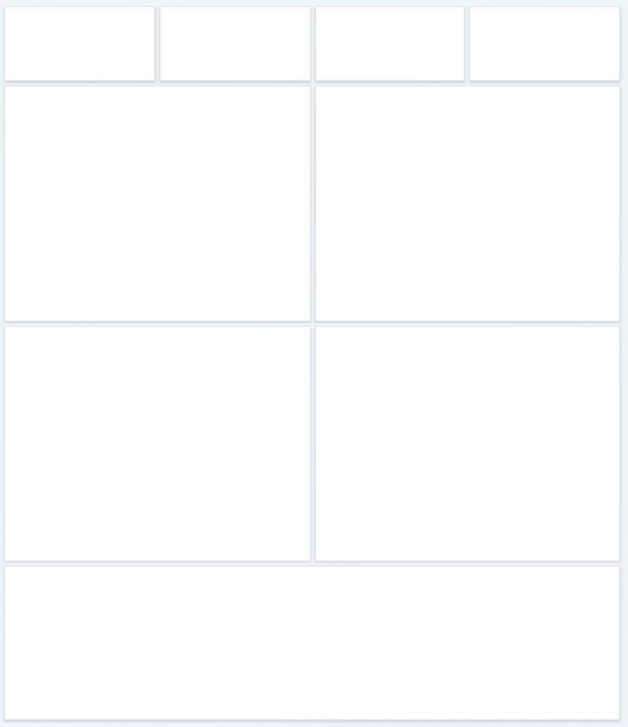
Layout of the Created Dashboard
### Step 2: Adding a Dropdown List for selecting countries
Next, we are going to add the Syncfusion [Dropdown List component](https://www.syncfusion.com/javascript-ui-controls/js-dropdown-list)
to select specific countries from the list. After selecting a country, its COVID-19 data will be displayed in the dashboard.
Refer to the following code.
```
// initialize DropDownList component
let dropDownListObj: DropDownList = new DropDownList({
// bind the DataManager instance to dataSource property
// bind the Query instance to query property
// map the appropriate columns to fields property
// set the placeholder to DropDownList input element
placeholder: "Select a country",
// sort the resulted items
sortOrder: "Ascending",
// set the height of the popup element
popupHeight: "200px",
change: onDateRangeChange
});
dropDownListObj.appendTo("#country");
```
### Step 3: Adding a date filter to the dashboard
Now, we will include a date filter into the dashboard using the Syncfusion [DateRangePicker](https://www.syncfusion.com/javascript-ui-controls/js-daterangepicker)
component, which will let us visualize data from a specific time period.
Based on the selected range of dates, the COVID-19 cases in a country reported at that time will be displayed in the dashboard.
Refer to the following code.
```
import { DateRangePicker, RangeEventArgs } from "@syncfusion/ej2-calendars";
dateRangePickerObject = new DateRangePicker({
format: "MM/dd/yyyy",
change: onDateRangeChange,
startDate: window.startDate,
endDate: window.endDate,
showClearButton: false,
allowEdit: false,
presets: [
{
label: "Last Month",
start: new Date("10/1/2017"),
end: new Date("10/31/2017")
},
{
label: "Last 3 Months",
start: new Date("9/1/2017"),
end: new Date("11/30/2017")
},
{
label: "All Time",
start: new Date("6/1/2017"),
end: new Date("11/30/2017")
}
]
});
dateRangePickerObject.appendTo("#daterange");
```
### Step 4: Designing the cards
The initial row of panels in the Dashboard Layout component will be used as cards to display the confirmed, fatal, recovered, and active cases in a country, as shown in the following screenshot. The code for creating these cards follows the image.

```
axios
.get(
"https://api.covid19api.com/total/country/" +
window.country +
"" +
"?from=" +
window.startDate.toISOString() +
"&to=" +
window.endDate.toISOString()
)
.then(function(response: any) {
var res = response["data"];
for (var i = 0; i < response.data.length; i++) {
response.data[i].Date = new Date(response.data[i].Date);
var Active = +response.data[i].Active;
var Deaths = +response.data[i].Deaths;
var Confirmed = +response.data[i].Confirmed;
var Recovered = +response.data[i].Recovered;
}
if (document.getElementById("Active")) {
document.getElementById("Active").textContent = Active.toString();
}
if (document.getElementById("Confirmed")) {
document.getElementById("Confirmed").textContent = Confirmed.toString();
}
if (document.getElementById("Recovered")) {
document.getElementById("Recovered").textContent = Recovered.toString();
}
if (document.getElementById("Deaths")) {
document.getElementById("Deaths").textContent = Deaths.toString();
}
});
```
### Step 5: Integrating Charts and DataGrid with the dashboard
To represent data in the dashboard, we will add the Charts and DataGrid visualization widgets within the Dashboard Layout component.
We are going to use the following Syncfusion UI components to visualize the COVID-19 data:
- [Pie Chart](#pie-chart)
- [Line Chart](#line-chart)
- [Column Chart](#column-chart)
- [DataGrid](#datagrid)
Let’s take a look at each one!
#### Pie chart
For the Syncfusion [Pie Chart](https://www.syncfusion.com/javascript-ui-controls/js-charts/chart-types/pie-chart)
, use the WHO COVID-19 APIs to render the chart based on the country and the range of start and end dates.
For example, if we select the country India, then the API requests will look like this:
- [https://api.covid19api.com/total/country/india/status/recovered](https://api.covid19api.com/total/country/india/status/recovered)
- [https://api.covid19api.com/total/country/india/status/deaths](https://api.covid19api.com/total/country/india/status/deaths)
- [https://api.covid19api.com/total/country/india/status/confirmed](https://api.covid19api.com/total/country/india/status/confirmed)
- [https://api.covid19api.com/total/country/india/status/active](https://api.covid19api.com/total/country/india/status/active)
Refer to the following code example.
**JavaScript:**
```
pie = new AccumulationChart({
enableSmartLabels: true,
width: '100%',
height: '350px',
center: { x: '50%', y: '50%' },
legendSettings: { visible: true },
series: [
{
dataSource: piedata,
xName: 'Status',
yName: 'Cases',
radius: '83%',
startAngle: 0,
endAngle: 360,
innerRadius: '50%',
dataLabel: {
name: 'Cases',
visible: true,
position: 'Inside',
font: {
color: 'Black',
size: '14px',
fontFamily: 'Roboto'
}
},
palettes: ['#61EFCD', '#CDDE1F', '#FEC200', '#CA765A', '#2485FA', '#F57D7D', '#C152D2',
'#8854D9', '#3D4EB8', '#00BCD7']
}
]
});
pie.appendTo('#total-expense');
```
**Output:**
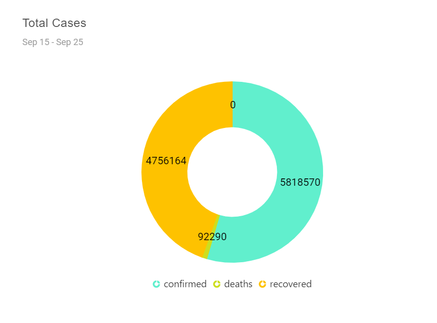
Pie Chart Showing COVID-19 Cases
#### Line chart
In the Syncfusion [Line Chart](https://www.syncfusion.com/javascript-ui-controls/js-charts/chart-types/line-chart)
, use the APIs to render the chart based on active and recovered cases in a country. For example, if we select India as the country, then the API requests will look like this:
- [https://api.covid19api.com/total/country/india/status/recovered](https://api.covid19api.com/total/country/india/status/recovered)
- [https://api.covid19api.com/total/country/india/status/active](https://api.covid19api.com/total/country/india/status/active)
Refer to the following code example.
**JavaScript:**
```
var content = 'Active - Recovered
';
linechartObj = new Chart({
primaryXAxis: {
valueType: 'DateTime',
labelFormat: 'MMM',
majorGridLines: { width: 0 },
intervalType: 'Months'
},
primaryYAxis: {},
useGroupingSeparator: true,
chartArea: {
border: {
width: 0
}
},
annotations: [{
content: content,
x: '75px', y: '9%', coordinateUnits: 'Pixel', region: 'Chart'
}],
series: [
{
type: 'Area',
dataSource: response.data,
xName: 'Date',
width: 2,
yName: 'Active',
name: 'Active',
fill: '#b3d4f3',
border: { width: 0.5, color: '#0470D8' },
marker: {
visible: true,
width: 10,
height: 10,
fill: 'white',
border: { width: 2, color: '#0470D8' },
},
},
{
type: 'Area',
dataSource: response.data,
xName: 'Date',
width: 2,
yName: 'Recovered',
name: 'Recovered',
fill: '#4273f942',
border: { width: 0.5, color: '#0470D8' },
marker: {
visible: true,
width: 10,
height: 10,
fill: 'white',
border: { width: 2, color: '#0470D8' },
},
},
],
margin: { top: 90 },
tooltip: {
fill: '#707070',
enable: true, shared: true,
format: '${series.name} : ${point.y}',
header: 'Month - ${point.x} '
}
});
linechartObj.appendTo('#balance');
```
**Output:**
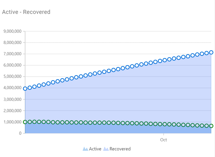
Line Chart Showing COVID-19 Active and Recovered Cases
#### Column chart
In the Syncfusion [Column Chart](https://www.syncfusion.com/javascript-ui-controls/js-charts/chart-types/column-chart)
, use the APIs to render the column chart based on the confirmed and recovered cases in a country. For example, if we select the country India in the dashboard, then the API requests will be:
- [https://api.covid19api.com/total/country/india/status/recovered](https://api.covid19api.com/total/country/india/status/recovered)
- [https://api.covid19api.com/total/country/india/status/confirmed](https://api.covid19api.com/total/country/india/status/confirmed)
Refer to the following code example.
**JavaScript:**
```
columnChartObj = new Chart({
primaryXAxis: {
labelFormat: 'MMM',
valueType: 'DateTime',
intervalType: 'Months',
},
primaryYAxis: {},
useGroupingSeparator: true,
series: [
{
type: 'Column',
dataSource: response.data,
xName: 'Date',
width: 2,
yName: 'Confirmed',
name: 'Confirmed',
fill: '#00bdae',
animation: { enable: false },
marker: {
visible: true, height: 10, width: 10
},
},
{
type: 'Column',
dataSource: response.data,
xName: 'Date',
width: 2,
yName: 'Recovered',
name: 'Recovered',
fill: '#357cd2',
animation: { enable: false },
marker: {
visible: true, height: 10, width: 10
},
},
],
annotations: [{
content: 'Confirmed - Recovered
',
x: '200px', y: '9%', coordinateUnits: 'Pixel', region: 'Chart'
}],
margin: { top: 90 },
legendSettings: { visible: true },
titleStyle: {
textAlignment: 'Near', fontWeight: '500', size: '16', color: '#000'
},
tooltip: {
fill: '#707070',
enable: true,
shared: true,
format: '${series.name} : ${point.y}',
header: 'Month - ${point.x} ',
}
});
columnChartObj.appendTo('#account-balance');
```
**Output:**
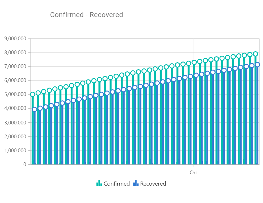
Column Chart Showing COVID-19 Confirmed and Recovered Cases
#### DataGrid
The [DataGrid component](https://www.syncfusion.com/javascript-ui-controls/js-data-grid)
is used to display lists of all active, recovered, fatal, and confirmed COVID-19 cases in a table based on the range of dates we have selected in the DateRangePicker.
Refer to the following code example.
**JavaScript:**
```
gridObj = new Grid({
dataSource: response.data,
allowSorting: true,
enableHover: false,
allowKeyboard: true,
allowPaging: true,
width: '100%',
pageSettings: {
pageCount: 4,
pageSize: 14
},
columns: [
{
field: 'Date',
headerText: 'Date',
width: 120,
format: 'yMd',
hideAtMedia: '(min-width: 600px)',
},
{
field: 'Active',
headerText: 'Active',
width: 170,
},
{
field: 'Recovered',
headerText: 'Recovered',
width: 160,
hideAtMedia: '(min-width: 600px)'
},
{
field: 'Deaths',
headerText: 'Deaths',
hideAtMedia: '(min-width: 1050px)'
},
{
field: 'Confirmed',
headerText: 'Confirmed',
width: 120,
textAlign: 'Right',
}
]
});
gridObj.appendTo('#recentexpense-grid');
```
**Output:**
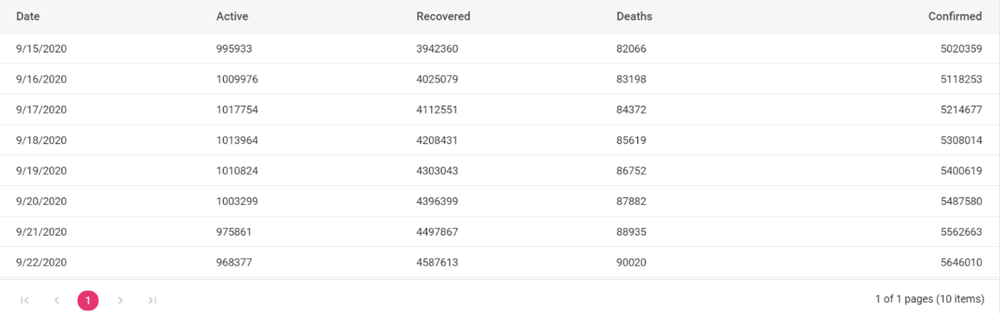
DataGrid Showing COVID-19 Data
### Step 6: Configuring the COVID-19 REST API data for the dashboard
Finally, we need to configure the [COVID-19 global REST API](https://covid19api.com/)
for the Dashboard Layout component. The COVID-19 API is a free API for visualizing data about the novel coronavirus. It helps you to access the data, build dashboards and mobile apps from it, or integrate it into other applications.
**Note:** Data is sourced from [Johns Hopkins CSSE](https://coronavirus.jhu.edu/map.html)
.
We are using the following API to retrieve the data: [https://api.covid19api.com/](https://api.covid19api.com/)
.
Refer to the following code example.
```
axios
.get(
"https://api.covid19api.com/total/country/" +
window.country +
"" +
"?from=" +
window.startDate.toISOString() +
"&to=" +
window.endDate.toISOString()
)
.then(function(response: any) {
var res = response["data"];
for (var i = 0; i < response.data.length; i++) {
response.data[i].Date = new Date(response.data[i].Date);
var Active = +response.data[i].Active;
var Deaths = +response.data[i].Deaths;
var Confirmed = +response.data[i].Confirmed;
var Recovered = +response.data[i].Recovered;
}
if (document.getElementById("Active")) {
document.getElementById("Active").textContent = Active.toString();
}
if (document.getElementById("Confirmed")) {
document.getElementById("Confirmed").textContent = Confirmed.toString();
}
if (document.getElementById("Recovered")) {
document.getElementById("Recovered").textContent = Recovered.toString();
}
if (document.getElementById("Deaths")) {
document.getElementById("Deaths").textContent = Deaths.toString();
}
});
```
After executing all of the previous code exmaples, we will get the combined output shown in the following screenshot.
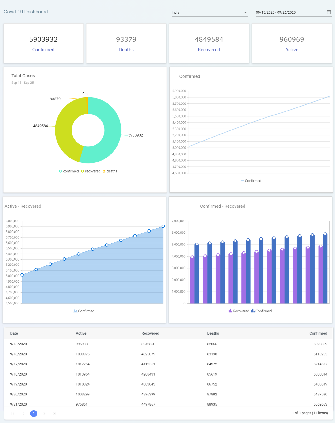
Interactive Dashboard in JavaScript for COVID-19 Updates
## Demo link:
You can get the complete source code for the dashboard from this link:
## Conclusion
Thanks for reading! In this blog post, we have learned how to design an interactive dashboard in JavaScript for COVID-19 updates using the Syncfusion Dashboard Layout and other UI components. With this dashboard, you can easily find COVID-19 updates for any country.
The Dashboard Layout component is available in our [Blazor](https://www.syncfusion.com/blazor-components/blazor-dashboard-layout)
, ASP.NET ([Core](https://www.syncfusion.com/aspnet-core-ui-controls/dashboard-layout)
, [MVC](https://www.syncfusion.com/aspnet-mvc-ui-controls/dashboard-layout)
), [JavaScript](https://www.syncfusion.com/javascript-ui-controls/js-dashboard-layout)
, [Angular](https://www.syncfusion.com/angular-ui-components/angular-dashboard-layout)
, [React](https://www.syncfusion.com/react-ui-components/react-dashboard-layout)
, and [Vue](https://www.syncfusion.com/vue-ui-components/vue-dashboard-layout)
suites. Use it to build impressive dashboards!
To learn more about the Dashboard Layout component, refer to the Syncfusion [online samples](https://ej2.syncfusion.com/demos/#/material/dashboard-layout/analytics-dashboard.html)
and [documentation](https://ej2.syncfusion.com/documentation/dashboard-layout/getting-started)
. We look forward to you trying this component and providing your feedback through our [feedback portal](https://www.syncfusion.com/feedback/)
. You can also contact us through our [support forums](https://www.syncfusion.com/forums)
or [Direct-Trac](https://www.syncfusion.com/support/directtrac/)
. We are always happy to assist you!
If you like this blog post, we think you’ll also like the following:
- [How to Create a Simple, Responsive, and Dynamic Dashboard](https://www.syncfusion.com/blogs/post/how-to-create-a-simple-responsive-and-dynamic-dashboard.aspx)
- [Syncfusion JavaScript Library and the SharePoint Framework: A Powerful Combo](https://www.syncfusion.com/blogs/post/syncfusion-javascript-library-and-the-sharepoint-framework-a-powerful-combo.aspx)
- [Why Essential JS 2 Is Still The Only JavaScript UI Toolkit You’ll Ever Need](https://www.syncfusion.com/blogs/post/why-essential-js-2-is-still-the-only-javascript-ui-toolkit-youll-ever-need-2.aspx)
- [JavaScript Succinctly](https://www.syncfusion.com/ebooks/javascript)