The flexbox, also known as the flexible box layout module, helps you efficiently design and build responsive webpages without using many positioning and float properties. Even when the size of flex items is unknown, you can easily resize and reposition the flex container and its items one-dimensionally and lay out the items to best fit the space available in the container.
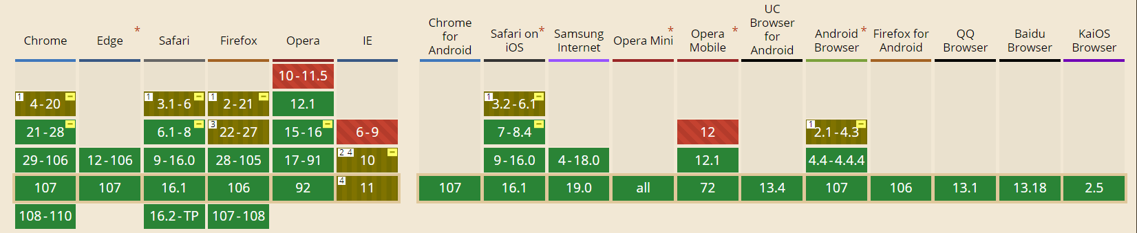
According to caniuse.com, all modern browsers support the CSS flexible box layout module.
Basics and Terminology
First, let’s familiarize ourselves with the key terms commonly used in flexbox:
- Flex line: Flex items are aligned along a flex line inside the flex container. By default, in a flex container, there’s only one flex line.
- Main axis: The primary axis along which the flexible components are arranged. Depending on the flex-direction property, this can be either vertical or horizontal.
- main-start edge and main-end edge: Flex items are arranged in the flex container from the main-start edge toward the main-end edge.
- Cross axis: Axis perpendicular to the main axis.
- cross-start edge and cross-end edge: In the container, flex lines start at the cross-start edge and end at the cross-end edge.

Getting Started
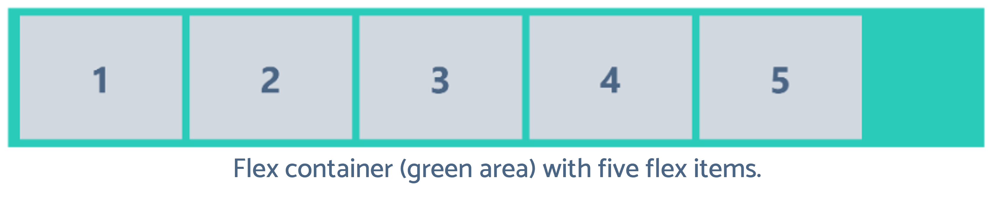
To start using the flexbox layout module, you first need to define the container as a flex container. Take a look at the following example.
<div class="flex-container">
   <div class="flex-item">1</div>
   <div class="flex-item">2</div>
   <div class="flex-item">3</div>
   <div class="flex-item">4</div>
   <div class="flex-item">5</div>
</div>
What you have to do is to set the container’s display property to flex. Then, it automatically converts the flex container’s direct child elements to flex items.
Flex Container Properties
Flex container properties define how browsers should lay out the items within the flexible box. There’re six flex container properties. Let’s walk through them:
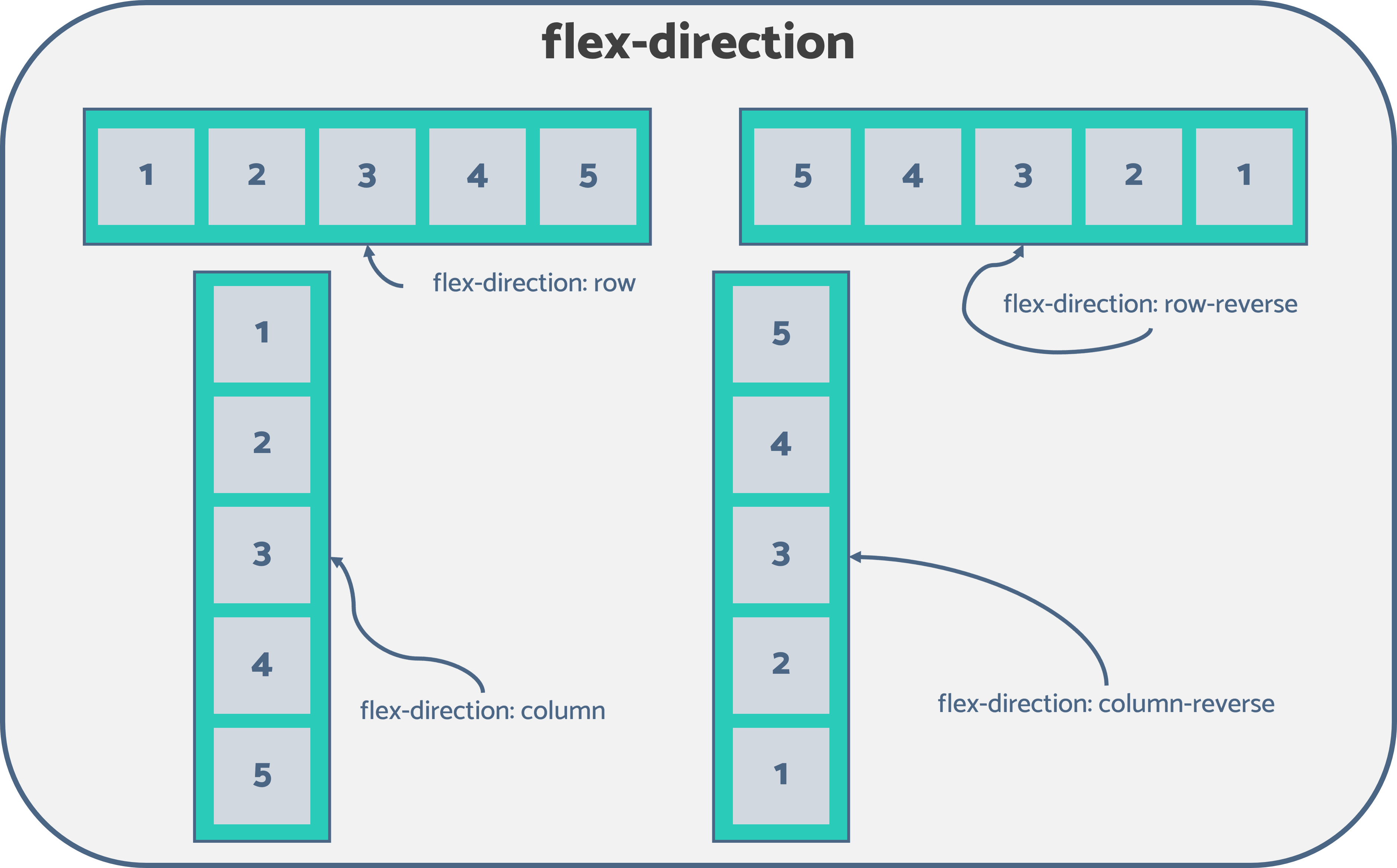
- flex-direction: Specifies the direction in which the flex items should be positioned inside the flexible container. Flexbox is a single-direction layout concept. Therefore, the flex items can only be stacked in vertical columns or horizontal rows. The flex-direction property accepts four values:
- row (default): Stacks the flexible items horizontally, from left to right.
- column: Stacks the flexible items vertically, from top to bottom.
- row-reverse: Stacks flex items horizontally, from right to left.
- column-reverse: Stacks flex items vertically, from bottom to top.

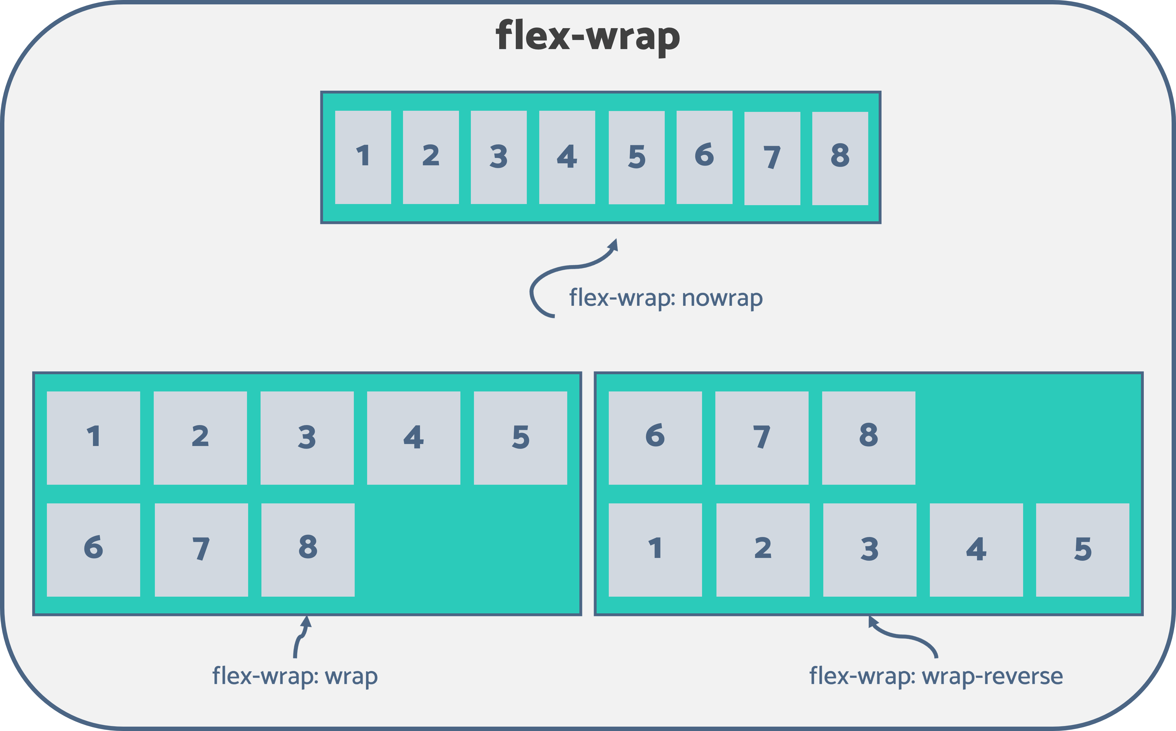
- flex-wrap: Flex items will attempt to fit into a single line by default. Thus, the excess items will overflow the container if all the flex items’ combined height (or width) is greater than the flexbox’s height (or width). flex-wrap indicates whether the overflowing flex items should be wrapped across multiple lines or not. The flex-wrap property accepts the following three values:
- nowrap (default): Forbids wrapping the flex items and forces all the items to be on a single line. This may cause an overflow of flex items out of the container.
- wrap: Wraps the flex items into multiple lines, if necessary.
- wrap-reverse: Functions similarly to wrap but in reverse order.
- flex-flow: This is the shorthand property to simultaneously set both flex-direction and flex-wrap properties. Refer to the following code example.
.flex-container {
  display: flex;
  flex-direction: row-reverse;
  flex-wrap: wrap;
}

You can alternatively use the following.
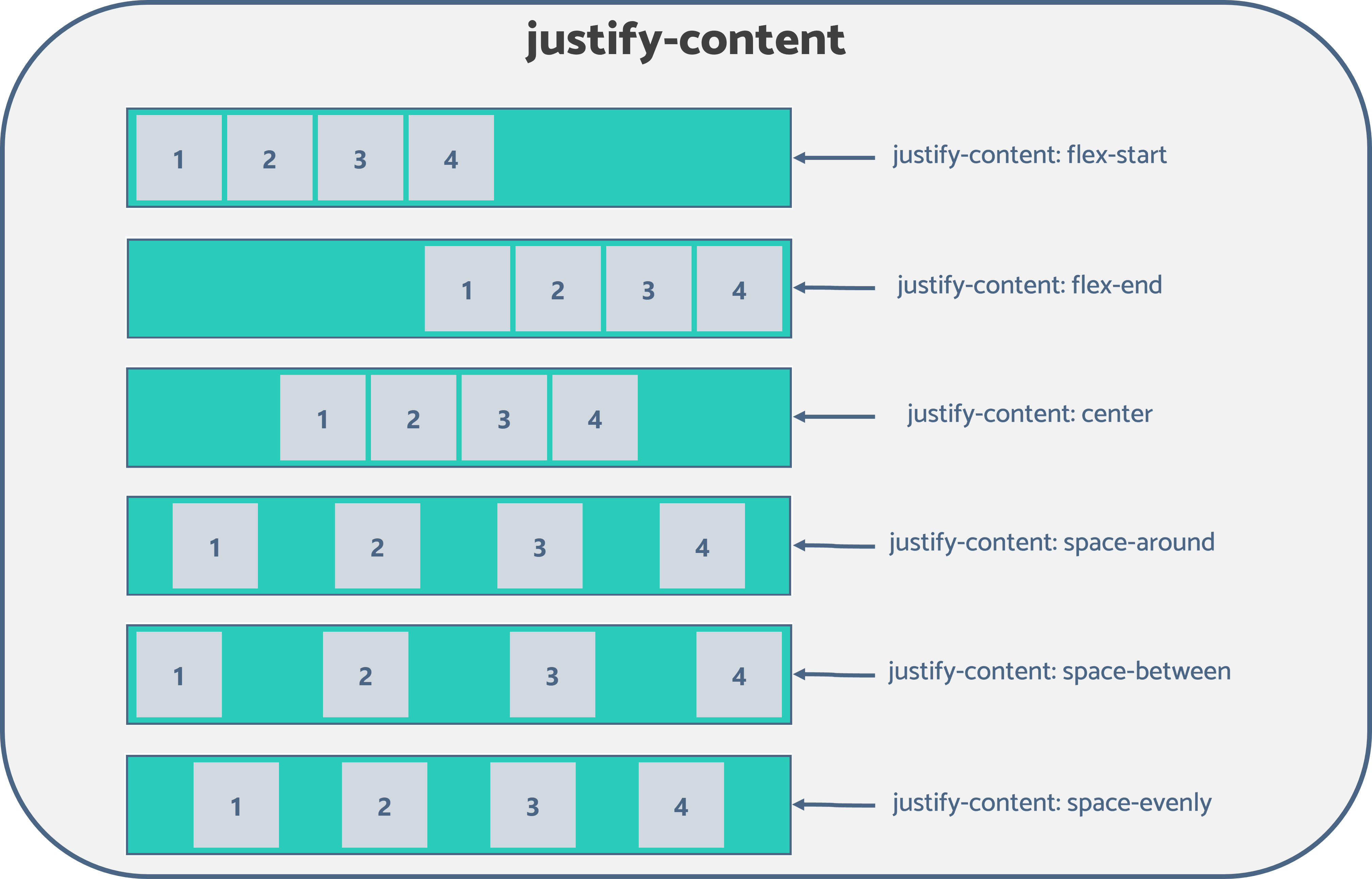
.flex-container { display: flex; flex-flow: row-reverse wrap; } - justify-content: Used to specify how the browser should align the flex items along the main axis of the flexbox. It defines how the space between and around the flexible items is distributed along the container’s main axis. The following values are accepted for this property:
- flex-start (default): Aligns the flex items to the beginning (main-start edge) of the flexbox’s main axis.
- flex-end: Aligns the flex items to the end (main-end edge) of the flexbox’s main axis.
- center: Flexible items are centered along the flexbox’s main axis.
- space-around: Flex items are evenly distributed along the main axis by allocating equal space to both sides of an item. Here, the space between the container’s main-start (or main-end) edge and the first (or last) flex item is half the width of the area compared to the distance between the two items.
- space-between: Aligns the first item to the main-start edge and the last item to the main-end edge of the main axis and creates even spacing between each adjacent flexible item.
- space-evenly: Within the container, flex items are distributed uniformly along the main axis. The space between each pair of subsequent items is equivalent to the distance between the first (or last) flex item and the container’s main-start (or main-end) edge.

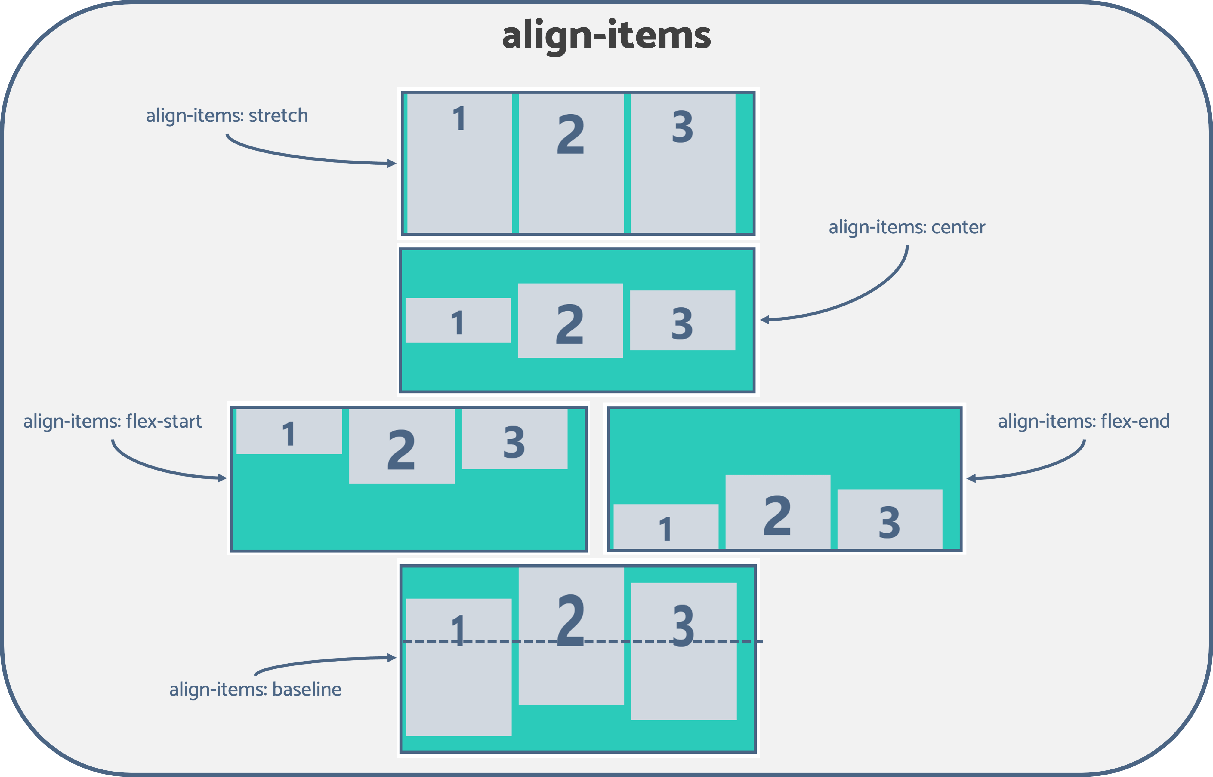
- align-items: Used to specify how the browser should position the flex items along the cross-axis of the flexbox. Its behavior is similar to justify-content but perpendicular to the main axis. The following values are accepted for this property:
- stretch (default): Stretches the flex items to fill the container’s vertical space while respecting the height and width constraints.
- center: Aligns the flex items to the middle of the container, or in other words, to the center of the container’s cross-axis.
- flex-start: Aligns the flex items at the cross-start edge. This means flexible items are aligned vertically at the top of the container.
- flex-end: Aligns the flex items at the cross-end edge. This means flexible items are vertically aligned at the bottom of the container.
- baseline: Aligns the flex items at the baseline of the cross-axis.
- align-content: Its behavior is similar to how the justify-content aligns flex items along the main axis when there’s extra space available in the main axis. But instead of the items, align-content aligns the flex lines and tells the browser how to position the flex container’s lines along the cross-axis. The following values are accepted for this property:
- stretch (default): Fills up the vertical space by equally distributing the remaining space amongst the flex lines.
- space-between: The first and last flex lines are aligned to the cross-start and the cross-end edges of the container, respectively, while creating equal spacing between each pair of lines between the first and last lines.
- space-evenly: Flex items are equally distributed by assigning even space above the first line, between two flex lines, and below the last line.
- space-around: Similar to space-evenly, but here it adds equal spacing around each line. Therefore, the space before (or after) the first (or last) line is half the width of the distance between two adjacent lines.
- flex-start: Each flex line will only fill the space it needs and move toward the cross-start edge of the container.
- flex-end: Each line will only fill the space it needs and move toward the container’s cross-end edge.
- center: Similar to flex-start and flex-end, but the flex lines are aligned to the center of the container’s cross-axis.
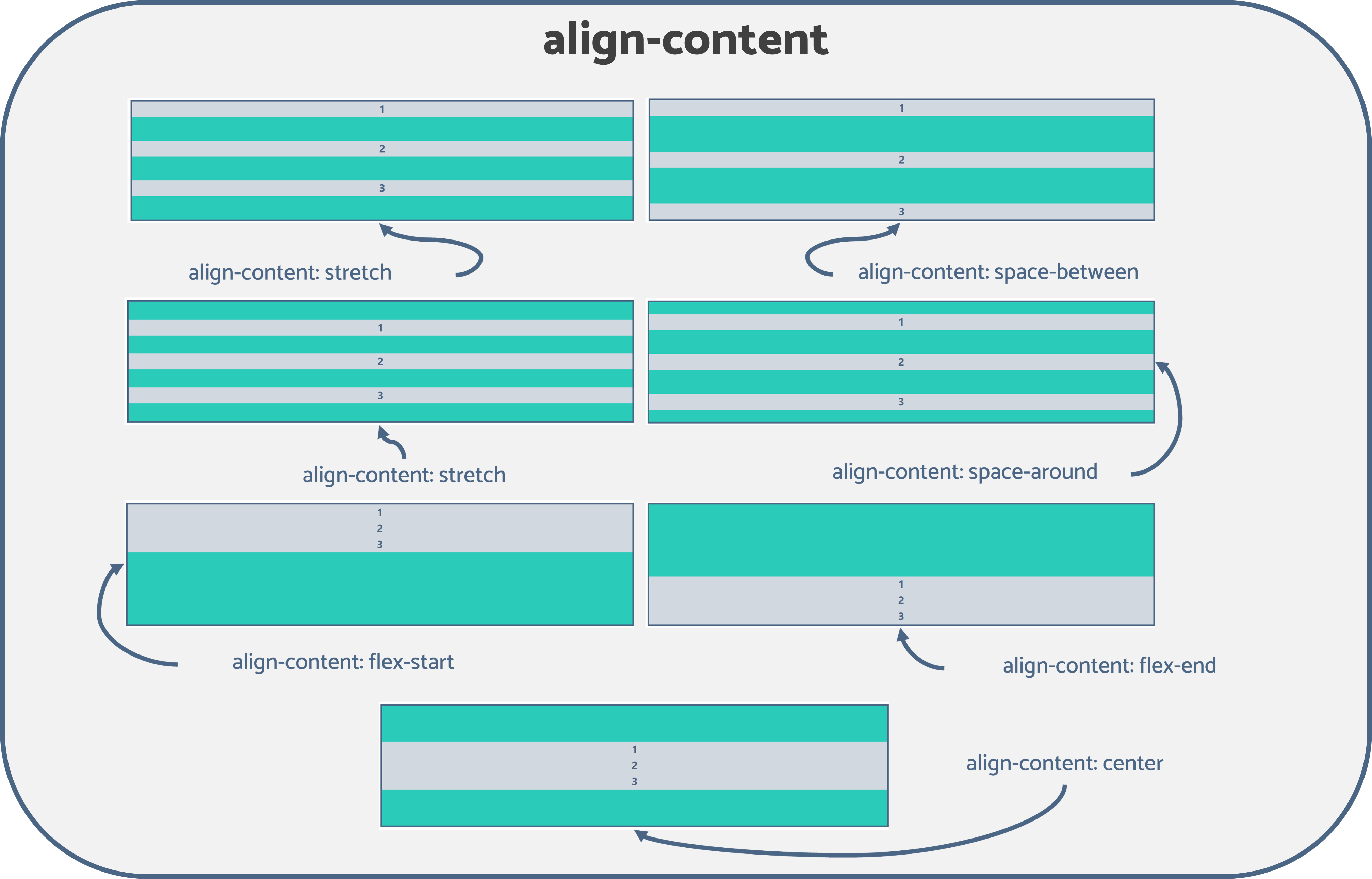
Note: align-content doesn’t work on single-line flex containers. To have an effect, the flexbox must be a multiline container with the flex-wrap property set to either wrap or wrap-reverse.
Flex Item Properties
Flex item properties define how browsers should lay out a specific item within the flexible box. There are six types of flex container properties. Let’s walk through them:
- order: By default, flex items are positioned based on the order defined in the HTML code. The order property specifies the order in which the flex items should appear in the flex container. The value must be a number, and by default, it is 0.
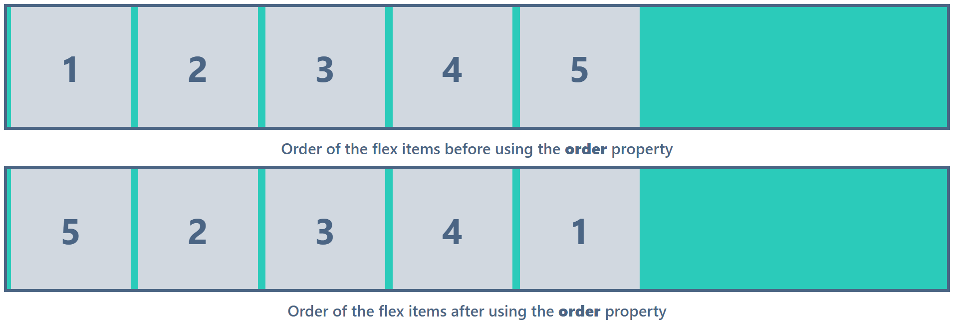

Take a look at the previous example. I’ve set the order property value of the first and last items to order: 5 and order: 1, respectively, to swap the two elements.
Note: Try to rearrange the HTML code and use the order property only if it’s actually required, as it can confuse the readers of the HTML document.
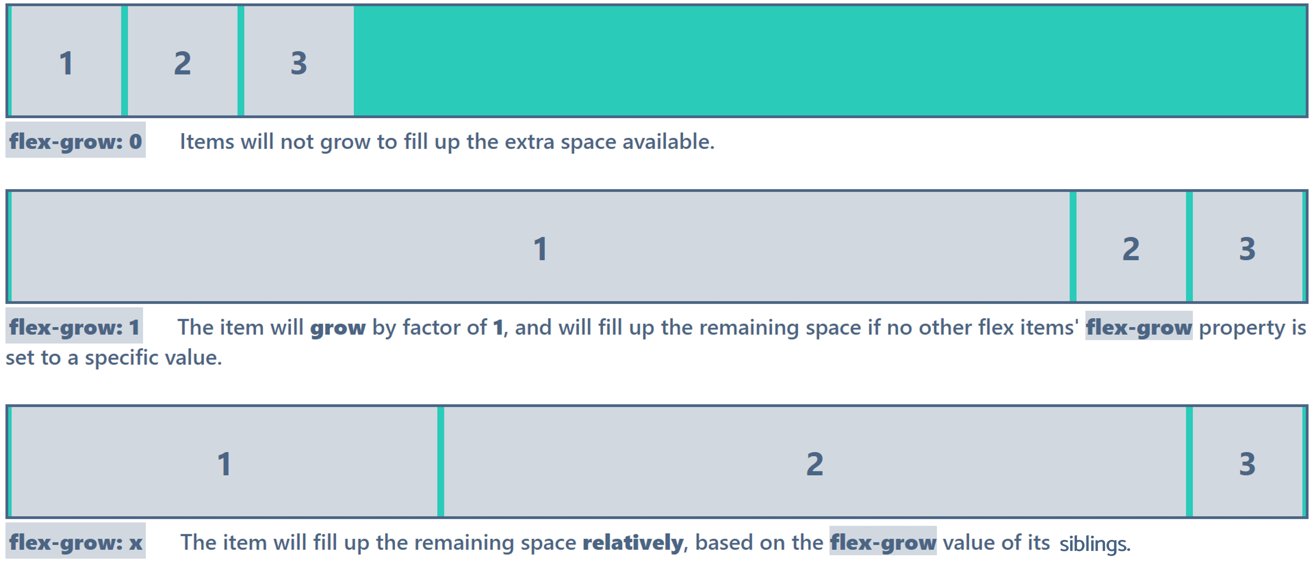
- flex-grow: Defines how much a flex item should grow relative to the other flex items inside the same container to fill up the excess space of the container. The value should be unitless, and the default is 0. If the flex-grow property is set to an equal value for all flex items, the remaining space of the flexbox will be distributed evenly among all items.

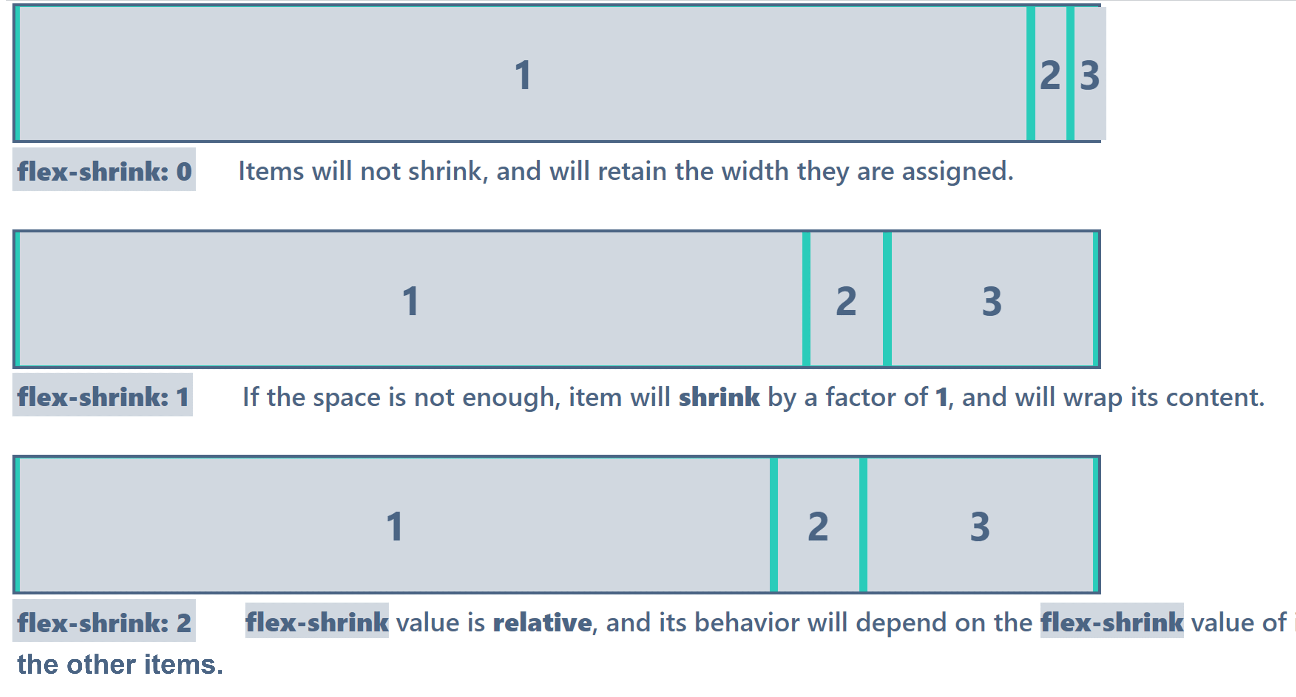
- flex-shrink: Defines how much a flex item should shrink relative to the other flex items when there’s not enough space in the container. The default value is 1.

- flex-basis: Defines the initial length of a flex item.
- flex: The shorthand property to set the flex-grow, flex-shrink, and flex-basis values at once. The default is flex: 0 1 auto.
Note: flex: initial (default) is equivalent to flex: 0 1 auto; flex: auto is equivalent to flex: 1 1 auto; flex: none is equal to flex: 0 0 auto; flex: inherit inherits the flex property values of its parent element, as the name suggests.
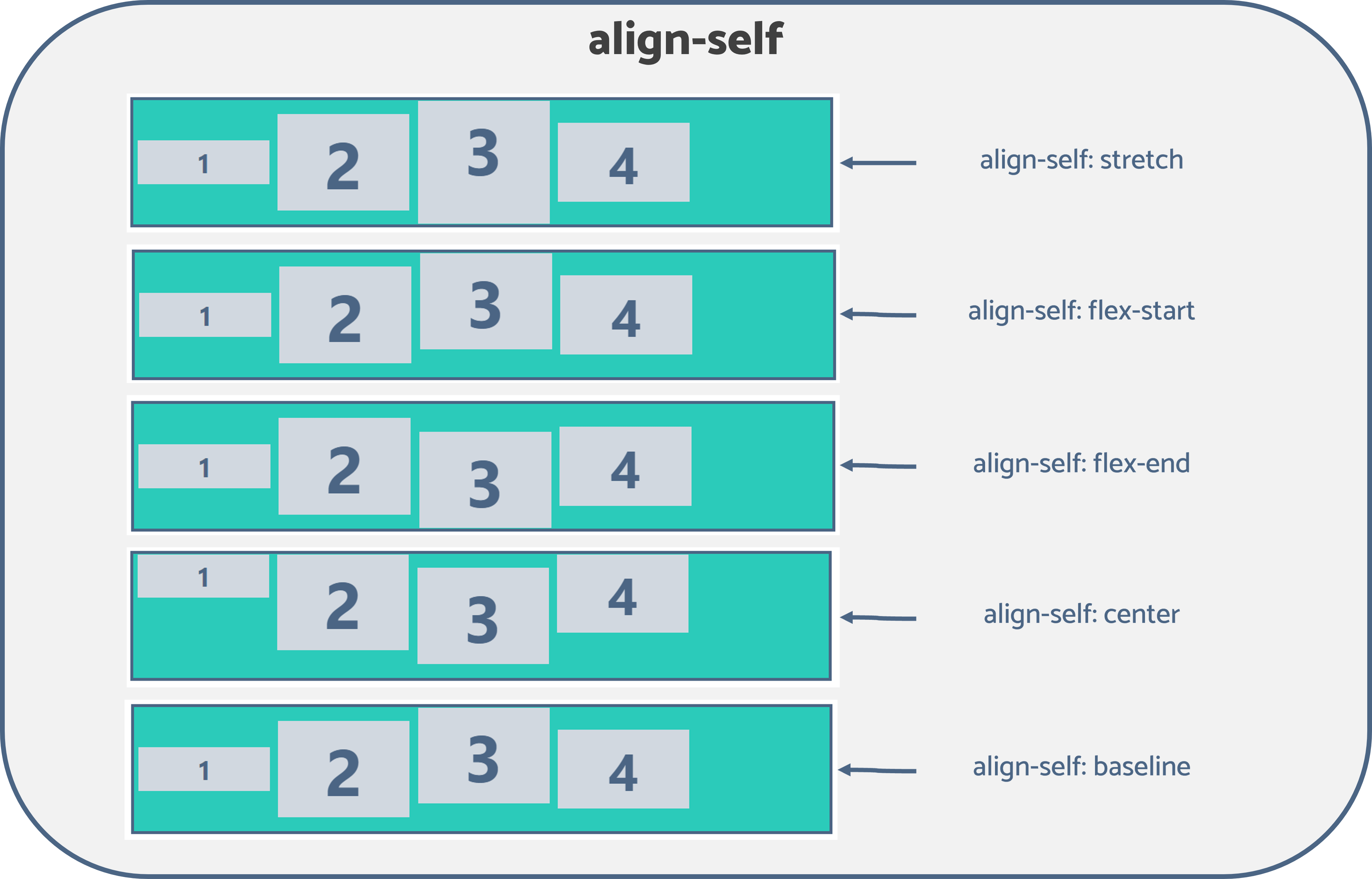
- align-self: This works similarly to the align-items property. However, the align-self doesn’t impact every flexible item in the container but only a selected item. Furthermore, it overrides the align-items property and defines the alignment of a selected item inside the flexbox.
Conclusion
This article discussed everything you need to know about the flexbox layout module to create a responsive website layout. However, it is vital to note its shortcomings. Although the flexbox layout works well for pages, it needs more flexibility in large and complex applications, especially when resizing, shrinking, stretching, or changing orientation.
The Syncfusion JavaScript suite will be the only suite you will ever need to build an application. It contains over 65 high-performance, lightweight, modular, and responsive UI components in a single package. Download the free trial and evaluate the controls today.
If you have any questions or comments, you can contact us through our support forums, support portal, or feedback portal. We are always happy to assist you!