---
title: "CSS Centering: Grid vs. Flexbox vs. Anchor Positioning"
published_at: "2026-09-04T12:36:21+00:00"
modified_at: "2026-09-04T12:41:27+00:00"
url: "https://www.syncfusion.com/blogs/post/css-centering-position-guide"
excerpt: "Learn how to choose between CSS Grid, Flexbox, safe alignment, and Anchor Positioning to build responsive, accessible layouts that stay centered when content and viewport sizes change."
taxonomy_category:
- "CSS centering"
- "CSS Layout"
- "Frontend development"
- "Responsive Design"
- "Syncfusion"
- "UI Engineering"
- "Web Development"
taxonomy_post_tag:
- "CSS anchor positioning"
- "CSS Grid"
- "Flexbox"
- "Responsive Layouts"
- "Safe Alignment CSS"
---
# CSS Centering: Grid vs. Flexbox vs. Anchor Positioning
[Arunachalam Kandasamy Raja](https://www.syncfusion.com/blogs/author/arunachalam-kandasamy-raja)
**TL;DR:** CSS centering is a layout decision, not a one-line fix. Learn when to use Grid, Flexbox, and Anchor Positioning to keep modals, tooltips, and responsive UI layouts usable and accessible as content and viewports change.
At some point, every frontend developer has seen this happen.
A card looks perfectly centered on a laptop. When QA opens the same screen on a smaller device, the content grows taller than expected, and suddenly the top of the modal becomes unreachable. No scrolling. No way out. Just a “centered” UI that quietly broke.
That’s the real CSS centering problem today.
Not how to center something, but what kind of centering behavior you actually want when the layout changes, content grows, or the viewport shrinks.
Modern CSS gives us excellent tools: Grid, Flexbox, safe alignment, logical properties, and now Anchor Positioning. The hard part is not knowing the syntax. It’s choosing the right centering model for the situation you’re in.
This guide is about making that decision without fighting your own layout later.
## Centering isn’t a snippet; it’s a layout decision
When someone says “center this element,” they could mean very different things:
- One element centered inside a panel
- A group of actions centered as a row
- A modal centered but still scrollable
- A tooltip centered relative to a button
- Content that stays reachable even when it overflows
CSS doesn’t have a single centering feature because layout itself isn’t singular. Grid, Flexbox, block layout, and anchored positioning all follow different rules. Alignment behaves differently depending on which system you’re using and what happens when space runs out.
The useful question is not “How do I center this?”
Instead, ask:
- What is being centered?
- Which layout model is being used?
- What should happen when the content no longer fits?
Once you answer that, the CSS choice usually becomes obvious.
## When grid is the right kind of centering
If your layout has one main thing that should sit in the middle, Grid is often the cleanest answer.
Think loaders, empty states, hero content, or a single card that needs to be visually balanced in both directions.
Grid is not inherently better than Flexbox for centering an element on two axes. Both layout models can center an element horizontally and vertically. Grid is often concise when the surrounding layout is track-based or two-dimensional, while Flexbox is usually more natural when elements form a directional row or column.
**Example**:
CSS
```
.hero {
min-block-size: 70vh;
display: grid;
place-items: center;
}
```
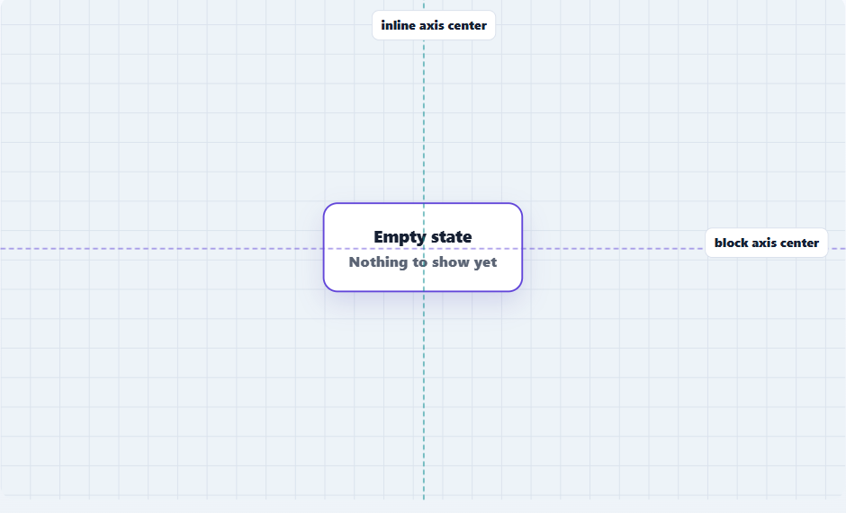
This kind of centering works well because it’s explicit and stable. You’re not relying on flex direction, item order, or spacing tricks. You’re saying: this thing belongs in the center of this space.
When the layout becomes primarily directional, such as a row of buttons or navigation items, Flexbox can express the intent more naturally. As soon as you’re arranging multiple related elements like buttons, text blocks, and icons, Grid’s strength becomes less relevant.
That’s where Flexbox earns its place.
## Flexbox is better when content flows
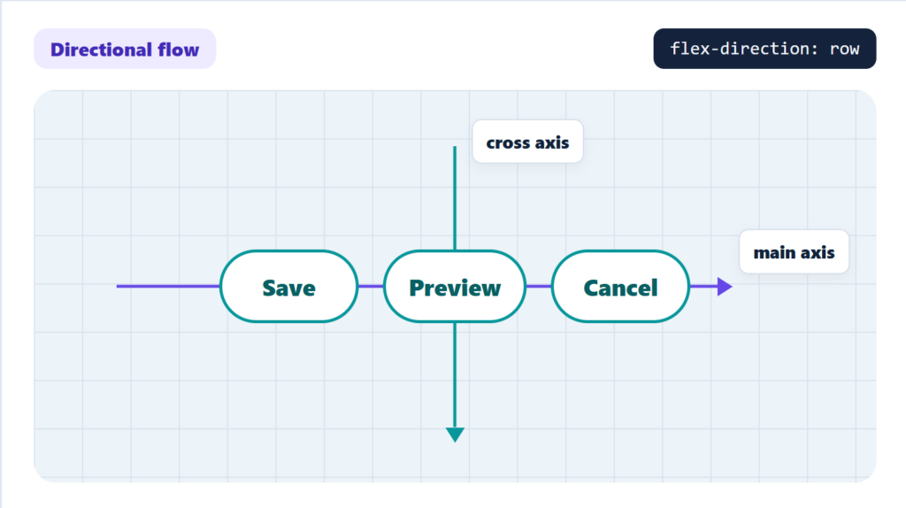
Flexbox is ideal when elements are arranged in a row or column and alignment depends on the flow of content. `justify-content` controls alignment along the main axis, while `align-items` controls the cross axis. When flex-direction changes from row to column, those axes change too. This makes explicit Flexbox alignment important for toolbars, action groups, navigation items, and other directional layouts.
### Why place-items isn’t a full replacement
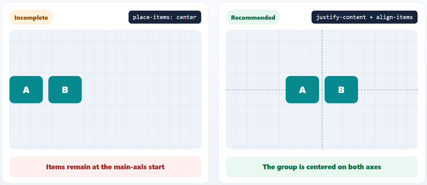
In a flex container, `place-items` affects cross-axis alignment through `align-items`, but its `justify-items` component does not align flex items on the main axis. For clear two-axis intent, use `justify-content` and `align-items` explicitly.
Avoid relying on this:
CSS
```
.toolbar {
display: flex;
place-items: center;
}
```
Prefer explicit flexbox alignment:
CSS
```
.toolbar {
display: flex;
justify-content: center;
align-items: center;
}
```
## place-items vs place-content: A common source of confusion
Both properties are useful, but they solve different problems.
`place-items` controls how grid items are aligned within their grid areas.
CSS
```
.panel {
display: grid;
place-items: center;
}
```
`place-content` controls how the grid’s tracks are aligned within the grid container.
CSS
```
.badge-cloud {
display: grid;
grid-template-columns: repeat(3, max-content);
place-content: center;
gap: 0.5rem;
}
```
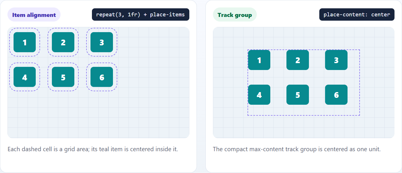
Using the wrong one often leads to layouts that feel almost right but behave strangely when space changes. If you find yourself compensating with margins, it’s usually a sign the alignment target is wrong.
## Safe alignment CSS: Centering without hiding content
Centering breaks down most often in modals and previews.
When content exceeds the viewport height, mathematically centered layouts can trap content off‑screen. Safe alignment allows the browser to avoid an alignment position that would cause content to overflow the alignment container in a way that makes it unreachable.
HTML
```
```
CSS
```
.modal-backdrop {
position: fixed;
inset: 0;
display: grid;
place-items: safe center;
overflow: auto;
padding: 1rem;
}
.modal {
inline-size: min(40rem, 100%);
}
```
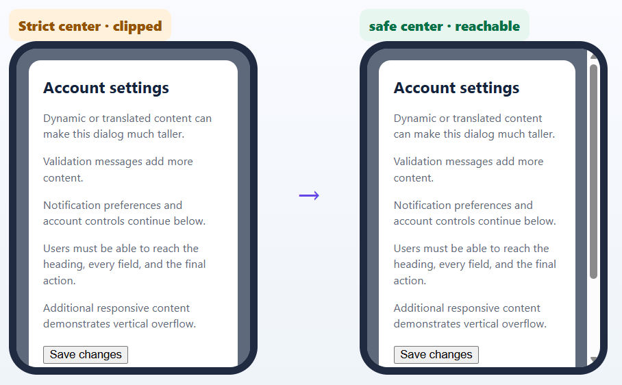
The backdrop serves as both the grid container and the scrolling container. safe center keeps the modal centered when space is available and falls back to a safer alignment when strict centering would make content unreachable. The safe keyword controls alignment only; `overflow: auto` independently provides scrolling when the modal exceeds the available space.
This example focuses on layout. A production modal should also include an accessible name, focus management, keyboard handling, and appropriate dialog semantics.
### Mobile viewport adjustment with dvh
On mobile devices, browser controls can change the visible viewport height as they appear or disappear. Add `min-block-size: 100dvh` to make the backdrop follow the currently available viewport height:
CSS
```
.modal-backdrop {
position: fixed;
inset: 0;
min-block-size: 100dvh;
display: grid;
place-items: safe center;
overflow: auto;
padding: 1rem;
}
```
The `dvh` unit addresses dynamic viewport-height changes on mobile devices.
## Centering Blocks with Auto Margins
Not every centering requirement needs Grid or Flexbox. When a block-level element should remain in normal flow and only needs horizontal, or inline-axis, centering, `margin-inline: auto` is often the simplest strategy.
CSS
```
.article {
inline-size: min(100% - 2rem, 70rem);
margin-inline: auto;
}
```
The element needs a constrained inline size or maximum inline size so that free space is available for the automatic inline margins to distribute.
This approach works well for:
- Article containers
- Page wrappers
- Forms with a maximum width
- Cards that remain in normal flow
Because `margin-inline` is a logical property, it also adapts better than physical left and right margins to different writing modes. It is primarily an inline-axis centering technique, not a general two-axis centering solution. Automatic margins remain a valid way to center a constrained element in normal flow.
## Centering with absolute positioning
Absolute positioning is appropriate when an element intentionally needs to be removed from normal flow, such as an overlay, decorative element, or independently positioned UI component.
HTML
```
Loading preview
```
CSS
```
.preview {
position: relative;
min-block-size: 20rem;
}
.preview-status {
position: absolute;
inset-block-start: 50%;
inset-inline-start: 50%;
translate: -50% -50%;
}
```
The logical inset properties place the element’s starting point at 50% of the containing block. The translate declaration then offsets the element by half of its own width and height, producing dimension-independent centering.
Use this approach when the centered element should not affect surrounding layout. Avoid using it as the default for regular page content because absolutely positioned elements do not reserve space in normal flow and can overlap other content when dimensions change.
## CSS Anchor Positioning: Centering relative to another element
Some UI doesn’t belong in the center of a container. It belongs relative to something else.
Tooltips, popovers, dropdowns, and contextual help all fall into this category. CSS anchor positioning allows these relationships to be expressed directly, without manual calculations.
**Example**:
HTML
```
Save changes before leaving.
```
CSS
```
.help-button {
anchor-name: --help;
}
.tooltip {
position: absolute;
position-anchor: --help;
position-area: top center;
margin-block-end: 0.5rem;
}
```
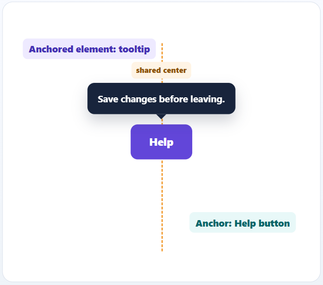
The button becomes the named anchor through `anchor-name`. The absolutely positioned tooltip is associated with that button through `position-anchor`, and `position-area: top center` places it in the area above the anchor while centering it along the anchor’s inline axis.
Anchor positioning can reduce manual offset calculations and JavaScript-based placement for straightforward anchored UI.
For more direct alignment with the anchor’s center, `anchor-center` can be used as an advanced variation:
CSS
```
.tooltip {
position: absolute;
position-anchor: --help;
inset-block-end: anchor(top);
justify-self: anchor-center;
}
```
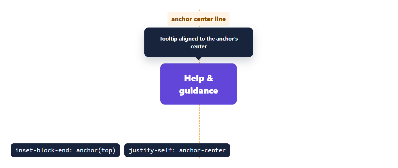
This keeps the tooltip aligned to the anchor’s center without relying on fixed offsets.
### Progressive enhancement for anchor positioning
Support for anchor positioning varies by browser and by feature, including `position-area`, `anchor()`, and `anchor-center`. Use it as a progressive enhancement with a conventional positioning fallback.
A practical fallback:
CSS
```
.help-control {
position: relative;
}
.tooltip {
position: absolute;
inset-block-end: 100%;
inset-inline-start: 50%;
translate: -50% -0.5rem;
}
@supports (position-area: top center) {
.help-button {
anchor-name: --help;
}
.tooltip {
position-anchor: --help;
position-area: top center;
inset: auto;
translate: none;
}
}
```
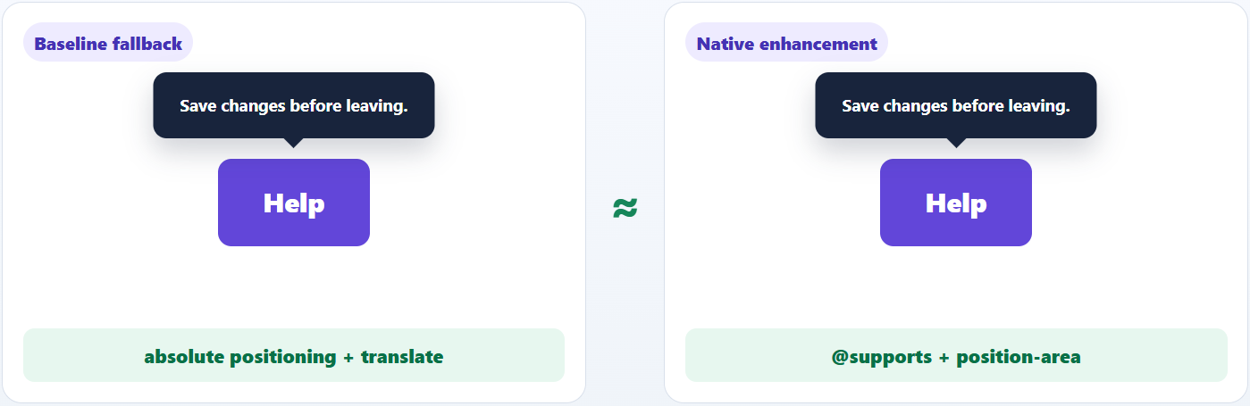
The baseline rule positions the tooltip relative to `.help-control`. Browsers that support position-area: top center apply the enhanced anchored placement. Because the query tests only that declaration, verify the other Anchor Positioning features used by the implementation during browser testing.
## CSS centering decision table
| If you need to | Use | Why |
| --- | --- | --- |
| Center one component in two dimensions | CSS Grid or Flexbox | Both support two-axis centering; choose based on the surrounding layout model |
| Center items in a row or column | Flexbox | Designed for directional layouts |
| Align grid items inside their areas | place-items | Controls item alignment |
| Position grid tracks inside a container | place-content | Controls track alignment |
| Keep centered content reachable when it overflows | Safe alignment | Avoids unsafe centering |
| Center a constrained block in normal flow | margin-inline: auto | Centers on the inline axis without creating a Grid or Flexbox container |
| Center an overlay outside normal flow | Absolute positioning with logical insets and translate | Positions the element independently of surrounding content |
| Position UI relative to a trigger | Anchor Positioning | Expresses anchor relationships in CSS |
| Use Anchor Positioning without breaking the baseline experience | Fallback positioning with @supports enhancement | Keeps the UI usable where the required Anchor Positioning feature is unavailable |
## Frequently Asked Questions
Why do centered modals behave differently on mobile?Mobile browser UI can change the visible viewport height as browser controls appear or disappear. Dynamic viewport units such as `dvh`, along with appropriate overflow handling, can help layouts adapt to those changes. The `svh` and `lvh` units are also available when a layout needs to account deliberately for the small or large viewport size.
Is margin: auto still useful?Yes. `margin-inline: auto` remains useful for horizontal centering of block-level elements when the element has a constrained width. For two-axis or component-level centering, Grid and Flexbox usually express the intent more clearly.
Can centering break in RTL or vertical writing modes?Yes. If physical properties are used everywhere. Logical properties and alignment keywords are safer for internationalized layouts.
## Final thought
CSS centering isn’t about memorizing clever snippets. It’s about choosing a layout model that still behaves sensibly when reality interferes.
If your centered UI keeps working when:
- content grows,
- layouts wrap,
- languages change,
- and viewports shrink,
you picked the right centering strategy.
That’s the bar worth aiming for.
## Related Blogs
[Choosing CSS Selectors for Production: Specificity, Modern Pseudo-Classes, and Maintainable Styles](https://www.syncfusion.com/blogs/post/choose-css-selectors-for-production)
[CSS Anchor Positioning: The End of Manual Tooltip Calculations?](https://www.syncfusion.com/blogs/post/css-anchor-positioning)
[Frontend Development Trends 2026: What Modern Web Teams Should Focus on Now](https://www.syncfusion.com/blogs/post/frontend-development-trends)
[Webpack vs Vite: Choosing the Right Bundler for Modern Frontend Development](https://www.syncfusion.com/blogs/post/webpack-vs-vite-bundler-comparison)