---
title: "Creating a Mendix Application with Syncfusion React Components"
published_at: "2023-03-07T11:19:41+00:00"
modified_at: "2024-11-19T11:12:04+00:00"
url: "https://www.syncfusion.com/blogs/post/creating-a-mendix-application-with-syncfusion-react-components"
excerpt: "This blog explains how to create a Mendix application using Syncfusion React UI components as custom widgets."
taxonomy_category:
- "Development"
- "React"
- "Syncfusion"
- "UI"
- "Web"
taxonomy_post_tag:
- "development"
- "productivity"
- "React"
- "Syncfusion"
- "Web"
---
# Creating a Mendix Application with Syncfusion React Components
[Ragunath Sukumaran](https://www.syncfusion.com/blogs/author/ragunath-sukumaran)

[Mendix](https://www.mendix.com/)
is one of the easiest low-code app development platforms. It enables us to quickly build, deploy, and operate mobile and web applications.
In this article, we’ll see how to create a Mendix application using Syncfusion [React UI components](https://www.syncfusion.com/react-components)
as custom widgets.
## Prerequisites
Before getting started, install the [prerequisites for creating a Mendix](https://docs.mendix.com/howto/extensibility/create-a-pluggable-widget-one/#2-prerequisites)
app.
## Create a Mendix app
We are going to create a simple Mendix app using the Syncfusion [React Data Grid](https://www.syncfusion.com/react-components/react-data-grid)
component as a custom widget. Follow these steps:
1. [Create a test app](https://docs.mendix.com/howto/extensibility/create-a-pluggable-widget-one/#creating-a-test-project) .
2. Create a **CustomWidget** folder in the Mendix app using the following commands:``` mkdir CustomWidgets ``` ``` cd CustomWidgets ```
## Add the Syncfusion React Data Grid in the Mendix app
Now that we have created a simple Mendix app, let’s see the steps to add the Syncfusion React Data Grid component to it:
1. [Create a custom Grid widget](https://docs.mendix.com/howto/extensibility/create-a-pluggable-widget-one/#32-widget-scaffolding) in the **CustomWidget** folder using the following command and respond to the Pluggable Widget Generator’s questions:``` yo @mendix/widget Grid ```
2. All Syncfusion React components are available in [npm](https://www.npmjs.com/search?q=ej2-react) . Install the [@syncfusion/ej2-react-grids](https://www.npmjs.com/package/@syncfusion/ej2-react-grids) package using the following command:``` npm install @syncfusion/ej2-react-grids --save ```
3. Refer to the Mendix documentation on [adding the attributes](https://docs.mendix.com/howto/extensibility/create-a-pluggable-widget-one/#33-adding-the-attribute) required to add a custom component to the Mendix app. After following the first two steps of the documentation, the **Grid.xml** file will look as follows:``` Grid My widget description Attribute (path) ```
4. Create a new file, **components/GridSample.tsx,** and add the Data Grid component to it.``` import { Component, ReactNode, createElement } from "react"; import { ColumnDirective, ColumnsDirective, GridComponent } from '@syncfusion/ej2-react-grids'; import { data } from './datasource'; export interface GridProps { value: string; } export class GridSample extends Component { render(): ReactNode { return (
Grid
); } } ```
5. Now let’s add the data source for the Syncfusion React Data Grid. Create the **src/component/datasource.ts** file and add the following data to it:\``` export let data: Object[] = [ { OrderID: 10248, CustomerID: 'VINET', EmployeeID: 5, OrderDate: new Date(8364186e5), ShipName: 'Vins et alcools Chevalier', ShipCity: 'Reims', ShipAddress: '59 rue de l Abbaye', ShipRegion: 'CJ', ShipPostalCode: '51100', ShipCountry: 'France', Freight: 32.38, Verified: !0 }, { OrderID: 10249, CustomerID: 'TOMSP', EmployeeID: 6, OrderDate: new Date(836505e6), ShipName: 'Toms Spezialitäten', ShipCity: 'Münster', ShipAddress: 'Luisenstr. 48', ShipRegion: 'CJ', ShipPostalCode: '44087', ShipCountry: 'Germany', Freight: 11.61, Verified: !1 }, { OrderID: 10250, CustomerID: 'HANAR', EmployeeID: 4, OrderDate: new Date(8367642e5), ShipName: 'Hanari Carnes', ShipCity: 'Rio de Janeiro', ShipAddress: 'Rua do Paço, 67', ShipRegion: 'RJ', ShipPostalCode: '05454-876', ShipCountry: 'Brazil', Freight: 65.83, Verified: !0 }]; ```
6. Create the **src/component/GridSample.css** file and add the CSS styles required for the Grid using the following code:``` @import "../node_modules/@syncfusion/ej2-base/styles/material.css"; @import '../../node_modules/@syncfusion/ej2-buttons/styles/material.css'; @import '../../node_modules/@syncfusion/ej2-calendars/styles/material.css'; @import '../../node_modules/@syncfusion/ej2-dropdowns/styles/material.css'; @import '../../node_modules/@syncfusion/ej2-inputs/styles/material.css'; @import '../../node_modules/@syncfusion/ej2-navigations/styles/material.css'; @import '../../node_modules/@syncfusion/ej2-popups/styles/material.css'; @import '../../node_modules/@syncfusion/ej2-splitbuttons/styles/material.css'; @import '../../node_modules/@syncfusion/ej2-notifications/styles/material.css'; @import "../../node_modules/@syncfusion/ej2-react-grids/styles/material.css"; ```
7. Import the **GridSample.css** style file in the ** src/component/GridSample.tsx** file. Refer to the following code example:``` import { Component, ReactNode, createElement } from "react"; import './GridSample.css'; import { ColumnDirective, ColumnsDirective, GridComponent } from '@syncfusion/ej2-react-grids'; import { data } from './datasource'; export interface GridProps { value: string; } export class GridSample extends Component { render(): ReactNode { return (
Grid
); } } ```
8. In the terminal, use the following code to run the created Grid widget. This will update the changes made in the **src** folder to the ** dist** folder.``` npm run start ```
9. Our Syncfusion React Data Grid is now ready to render. To synchronize the Grid with the Mendix app, refer to the seventh step in this [documentation](https://docs.mendix.com/howto/extensibility/create-a-pluggable-widget-one/#33-adding-the-attribute) . After configuring the custom Data Grid widget, it will appear in the **Widgets** area of the ** Toolbox**. Refer to the following image.
10. Drag and drop the created custom Data Grid widget in the layout.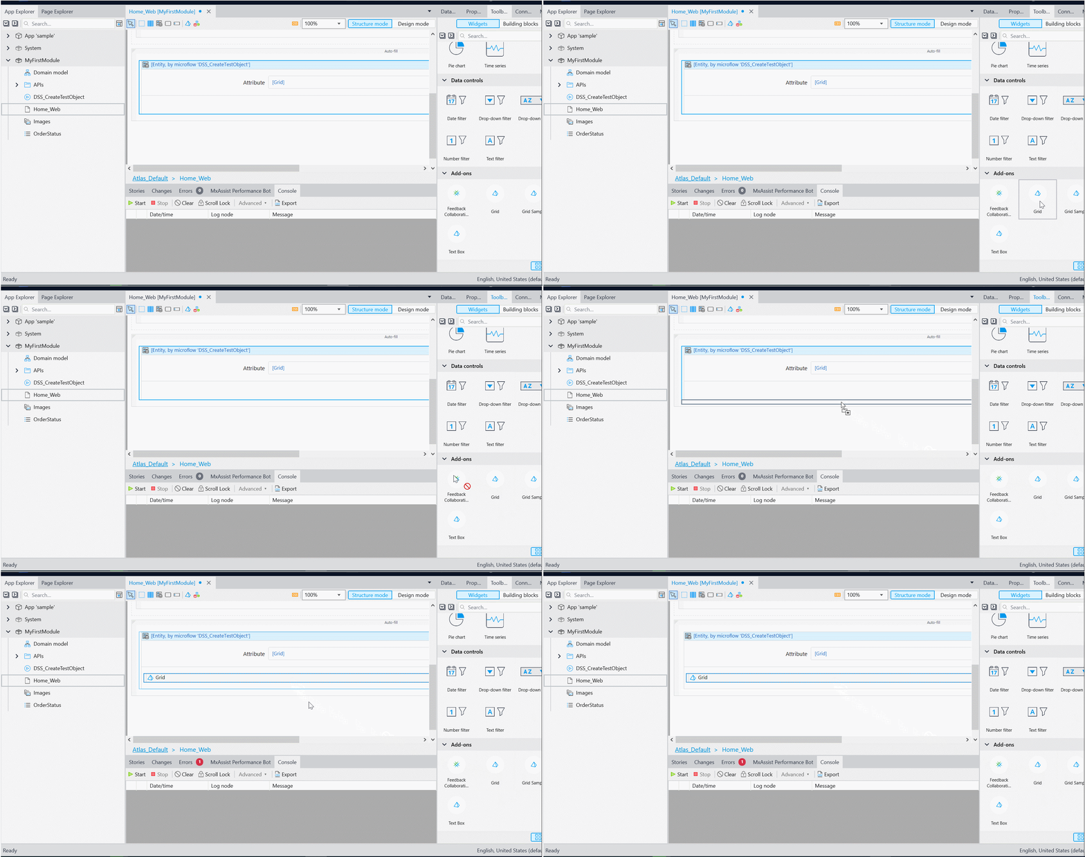
11. Click **Design mode**. The Data Grid will display the data we have provided in the data source.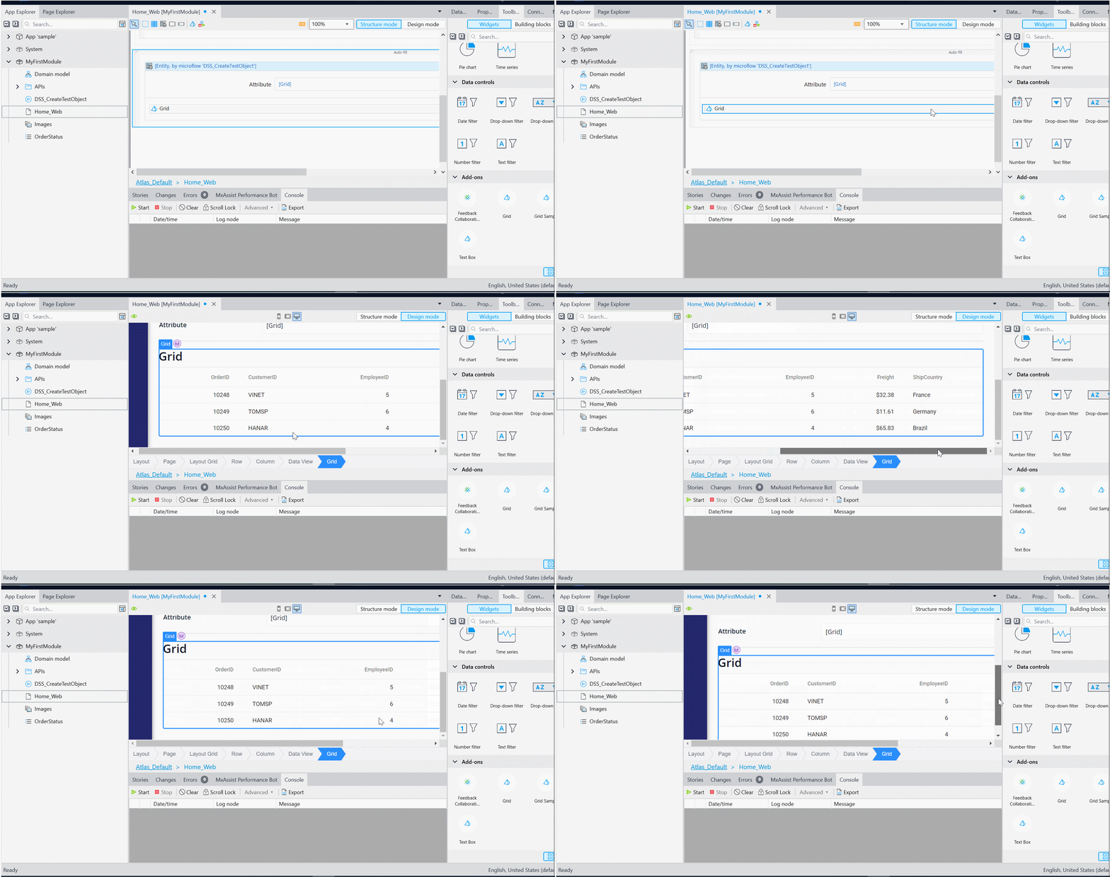
12. Click **Run locally** and navigate to the following URL to see the output in the browser.``` http://localhost:8080/ ``` The output should look like the following image: 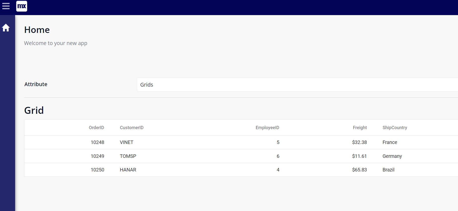 Mendix Application with Syncfusion React Data Grid
## **GitHub reference**
Check out the complete example code on GitHub for [creating a Mendix app with the Syncfusion React Data Grid](https://github.com/SyncfusionExamples/Creating-a-Mendix-application-with-Syncfusion-components-in-React)
.
## Conclusion
Thanks for reading! In this blog, we have seen how to create a Mendix app and integrate the Syncfusion [React Data Grid](https://www.syncfusion.com/react-components/react-data-grid)
. Following these steps, you can also use other Syncfusion React components as custom widgets in Mendix apps. Try out the guide provided in this blog and leave your feedback in the comments below!
The new version of Essential Studio® is available for current customers from the [License and Downloads](https://www.syncfusion.com/account/downloads)
page. If you are not a Syncfusion customer, you can try our 30-day [free trial](https://www.syncfusion.com/downloads)
to check out our available features.
You can contact us through our [support forum](https://www.syncfusion.com/forums)
, [support portal](https://support.syncfusion.com)
, or [feedback portal](https://www.syncfusion.com/feedback)
. We are always happy to assist you!
## Related blogs
- [Introducing the New React Image Editor](https://www.syncfusion.com/blogs/post/introducing-the-new-react-image-editor.aspx)
- [React Router vs. React Router DOM](https://www.syncfusion.com/blogs/post/react-router-vs-react-router-dom.aspx)
- [7 VS Code Extensions for React Developers](https://www.syncfusion.com/blogs/post/7-vs-code-extensions-for-react-developers.aspx)
- [Preact vs. React](https://www.syncfusion.com/blogs/post/preact-vs-react.aspx)