

Angular directives assist us in manipulating the DOM. We may customize a DOM element’s look, behavior, or layout using directives. In addition, they help us extend the power of HTML via actions, reactions, and interactions. For example, directives will accept arguments, perform some action with them, and then produce a reactive action on your HTML.
Angular provides three types of directives: component, structural, and attribute. This article will focus on structural and attribute directives and discuss how to create custom ones with Angular.
Structural directives
A structural directive is a type of directive that is responsible for the HTML layout. It dynamically reshapes the structure of the DOM by adding, removing, or manipulating the host elements to which they are attached. Angular has three primary built-in structural directives: NgFor, NgIf, and NgSwitch.
The following section is a complete step-by-step example of creating a custom structural directive.
Steps to create a custom structural directive
Let’s create a custom structural directive named Not, which will work opposite the NgIf directive. Our Not directive displays content when the condition is false.
1. Create a directive named Not using the following command on the Angular CLI.
ng generate directive Not
This step creates a directive class named NotDirective and defines the CSS selector appNot to identify the directive in a template. Our new directive should look like the following:
import { Directive } from '@angular/core';

@Directive({
selector: '[appNot]'
})

export class NotDirective {

constructor() {}

}
Note: The custom directive name shouldn’t be an Angular keyword. It also shouldn’t start with ng.
2. Configure the directive in the application.
Next, configure the created directive the same way a component is configured to make it globally available in the application. You can do this by following the example below.
Import { NotDirective } from ‘./directives/not.directive’;

@NgModule({

 declarations: [
 ------------------
 NotDirective
 ------------------
 ]
})
export class AppModule { }
3. Import Input, TemplateRef, and ViewContainerRef from @angular/core.
To create a custom directive, we need a few elements:
- Input: This decorator is used to communicate between two components. Here, it allows the data to be input into the directive from the parent component.
- TemplateRef: Represents the embedded template used to instantiate the embedded views linked to the template, which has yet to be rendered.
- ViewContainerRef: Provides a container where one or more views can be attached.
import { Directive, Input, TemplateRef, ViewContainerRef } from ‘@angular/core’;

@Directive({ selector: ‘[appNot]’})

export class NotDirective {
}
4. Inject TemplateRef and ViewContainerRef as private variables via the constructor.
constructor(
 private templateRef: TemplateRef<any>,
 private viewContainer: ViewContainerRef) { }
)
5. Create a setter method using the @Input decorator.
Make sure the method name is the same as the directive name.
@Input() set appNot(condition: boolean) {
}
Use the following code snippet if you need to use a different method name. Here, the @Input() alias should be the same as the directive name.
@Input('appNot') set myDirective(condition: boolean) {
}
6. Add the logic of the Not condition.
The Not custom structural directive will work in the opposite way of the NgIf directive. When a falsy condition is passed, the host element and its descendants are added to the DOM layout, and if the condition is truthy, the host element and its descendants are removed from the DOM layout.
@Input() set appNot(condition: boolean) {
 if (!condition && !this.hasView) {
     this.viewContainer.createEmbeddedView(this.templateRef);
     this.hasView = true;
 }
 else if (condition && this.hasView) {
     this.viewContainer.clear();
     this.hasView = false;
 }
}
In the code example above, the createEmbeddedView method of ViewContainerRef adds the host element to the DOM layout, while ViewContainerRef‘s clear method removes the content from the view container.
The complete directive.ts file is as follows:
import { Directive, Input, TemplateRef, ViewContainerRef } from ‘@angular/core’;

@Directive({ selector: ‘[appNot]’})

export class NotDirective {
 private hasView = false;

constructor(
 private templateRef: TemplateRef<any>,
 private viewContainer: ViewContainerRef) { }

@Input() set appNot(condition: boolean) {

/** Add the template content to the DOM unless the condition is true. */
if (!condition && !this.hasView) {
    this.viewContainer.createEmbeddedView(this.templateRef);
    this.hasView = true;
 }
else if (condition && this.hasView) {
    this.viewContainer.clear();
    this.hasView = false;
 }
}}
7. Testing the directive.
<p *appNot=”!condition”> A => This paragraph is displayed because the condition is true. </p>

<p *appNot=”condition”> B => This paragraph is displayed because the condition is false. </p>
When the condition is true, the page will display paragraph A, and paragraph B will disappear. When the condition is false, paragraph A will disappear, and paragraph B will be displayed.
The asterisk (*) on a structural directive (e.g., *appNot as in the example above) is a shorthand used by Angular. Angular transforms the * into a <ng-template> surrounding the host element and its descendants.
Attribute directives
Attribute directives are used to change or modify HTML elements’ look, behavior, properties, attributes, and components. Angular’s most commonly used built-in attribute directives are NgClass, NgModel, and NgStyle.
Steps to create a custom attribute directive
In the previous section, we discussed the steps to create a custom structural directive. The same approach is used to create a custom attribute directive as well. Let’s see a step-by-step example of creating an attribute directive that changes the background color of a host element to a color of our choice.
1. Create a directive named highlight using the following command on the Angular CLI.
ng generate directive highlight
Similar to creating the structural directive, this step will create a directive class named highlight and define the appHighlight CSS attribute selector used to identify the directive in a template. Our new directive should look like the following code snippet.
import { Directive } from '@angular/core';
@Directive({
  selector: '[appHighlight]',
})

export class HighlightDirective {
  constructor() {}
}
2. Make the custom directive globally available within the application.
To use our custom directive anywhere in our Angular application, we need to configure it in the app module the same way we configure a component.
import { HighlightDirective }  from './directives/highlight.directive';

@NgModule({

  declarations: [
        ------------------
    HighlightDirective
        ------------------
  ]
----------------
----------------
})
export class AppModule { }
3. Import @Input and ElementRef from @angular/core.
import { Directive, ElementRef, Input } from ‘@angular/core’;4. Using dependency injection, get an instance of ElementRef via the constructor.
Use ElementRef to access the DOM element and change its appearance or behavior.
import { Directive, ElementRef, Input } from '@angular/core';

@Directive({
  selector: '[appHighlight]',
})

export class HighlightDirective {
  constructor(private el: ElementRef) {}
}
5. Add a property named appHighlight using the @Input decorator for binding.
@Input('appHighlight') highlightColor: string;6. Add the logic to the HighlightDirective class.
ngOnInit(): void {
  this.el.nativeElement.style.backgroundColor = this.highlightColor;
}
The complete code of the directive.ts file is as follows:
import { Directive, ElementRef, Input, OnInit } from '@angular/core';

@Directive({
  selector: '[appHighlight]',
})

export class HighlightDirective implements OnInit {
  @Input('appHighlight') highlightColor: string;

  constructor(private el: ElementRef) {}

  ngOnInit(): void {
    this.el.nativeElement.style.backgroundColor = this.highlightColor;
  }
}
7. In the app.component.ts file, add a color property to the AppComponent.
export class AppComponent {
 color = 'yellow';
}
8. Apply the attribute directive.
Apply the appHighlight directive to the <p> element and set the directive’s highlight color using the property binding.
<p [appHighlight]="color">Highlight me!</p>
You’ll get the following output.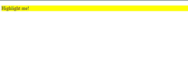

Conclusion
In this article, I walked you through how to build a custom structural directive and a custom attribute directive in Angular. I hope you found this helpful. Thank you for reading.
Syncfusion’s Angular UI component library is the only suite you will ever need to build an app. It contains over 65 high-performance, lightweight, modular, and responsive UI components in a single package.
For existing customers, the newest Essential Studio®version is available for download from the License and Downloads page. If you are not yet a Syncfusion customer, you can try our 30-day free trial to check out the available features. Also, check out our demos on GitHub.
For questions. you can contact us through our support forums, support portal, or feedback portal. We are always happy to assist you!

