---
title: "From Basic to Brilliant: Blazor Ribbon in Action"
published_at: "2025-07-17T16:32:13+00:00"
modified_at: "2025-07-21T15:10:21+00:00"
url: "https://www.syncfusion.com/blogs/post/blazor-ribbon-component-toolbar-ui"
excerpt: "Build modern, feature-rich toolbars in Blazor apps using Syncfusion’s Blazor Ribbon component. Learn how to implement layouts, tooltips, backstage view, and more."
taxonomy_category:
  - "Blazor"
  - "Blazor Development"
  - "Blazor Ribbon"
  - "Development"
  - "Enterprise Software Solutions"
  - "Frontend development"
  - "Toolbar Design"
  - "UI"
  - "Web Development"
taxonomy_post_tag:
  - "Adaptive Layouts"
  - "Adaptive UI"
  - "Blazor"
  - "Blazor Action Panel"
  - "Blazor Command Bar"
  - "Blazor Command Ribbon"
  - "Blazor Navigation Ribbon"
  - "Blazor Productivity Toolbar"
  - "Blazor Ribbon"
  - "Blazor Ribbon UI"
  - "Blazor Tabbed Toolbar"
  - "Blazor Toolbar UI"
  - "Blazor UI Ribbon"
  - "UI Design"
  - "Web Development"
---

# From Basic to Brilliant: Blazor Ribbon in Action

[Silambarasan Ilango](https://www.syncfusion.com/blogs/author/silambarasani)
![Exploring the Blazor Ribbon Component A Comprehensive UI for Enhanced Web Applications](https://www.syncfusion.com/blogs/wp-content/uploads/2025/04/Exploring-the-Blazor-Ribbon-Component-A-Comprehensive-UI-for-Enhanced-Web-Applications.jpg)


**TL;DR:** Struggling to organize complex UI commands in your Blazor app? The Syncfusion® Blazor Ribbon component delivers a Microsoft Office-style toolbar experience perfect for modern web applications. This comprehensive guide walks you through building intuitive, feature-rich toolbars using tabs, groups, collections, and items, plus advanced features like layout modes, adaptive galleries, tooltips, backstage views, and file menus.

Building complex web UIs in Blazor? The [Blazor Ribbon](https://www.syncfusion.com/blazor-components/blazor-ribbon)
 component from Syncfusion® offers a powerful way to organize commands into tabs and groups, just like Microsoft Office. As part of Syncfusion’s comprehensive Blazor UI suite, the Ribbon helps developers create structured, interactive toolbars that streamline user workflows.

In this guide, we’ll explore how to implement and customize the Blazor Ribbon to streamline your app’s interface and boost user productivity.

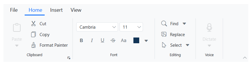
With its well-organized tabbed interface and logically grouped collections, the Ribbon makes it easy for users to quickly locate and access essential features, streamlining their experience and enhancing workflow efficiency.![Tabbed interface](https://www.syncfusion.com/blogs/wp-content/uploads/2025/07/Tabbed-interface.png)
## Use cases

The **Ribbon component** is an excellent choice for applications that require a structured and feature-rich toolbar. Here are some common use cases:

- **Enterprise software solutions**: Organize complex functions like data management and reporting into clear ribbon tabs, improving efficiency and quick access to essential tools.
- **Project management tools**: Provide an easy-to-navigate interface for features like time tracking, task organization, and streamlining project workflows.
- **Custom CRM systems**: Simplifies navigation for sales and support teams by organizing client information and reports into an intuitive ribbon interface, enhancing productivity.

## Understanding the Ribbon structure

The Ribbon component consists of several core elements: **Tabs**, ** Groups**, ** Collections**, and ** Items,**arranged hierarchically to create a seamless user experience. It allows easy navigation and interaction with commands within your application.

## Getting started

Before continuing, refer to the [documentation link](https://blazor.syncfusion.com/documentation/ribbon/getting-started-webapp#install-syncfusion-blazor-ribbon-and-themes-nuget-in-the-app)
 for a simple guide on setting up the component.

The [SfRibbon](https://help.syncfusion.com/cr/blazor/Syncfusion.Blazor.Ribbon.SfRibbon.html)
 tag serves as the root element of the Ribbon component. It contains and renders all other elements that form the complete Ribbon structure.

```
@using Syncfusion.Blazor.Ribbon

<SfRibbon></SfRibbon>
```

## Step 1: Defining Ribbon tabs

Tabs are the primary sections within the Ribbon, organizing related features and commands. Use the [RibbonTabs](https://help.syncfusion.com/cr/blazor/Syncfusion.Blazor.Ribbon.RibbonTabs.html)
 directive to define the entire collection of tabs, and the [RibbonTab](https://help.syncfusion.com/cr/blazor/Syncfusion.Blazor.Ribbon.RibbonTab.html)
 directive for individual tabs.

```
@using Syncfusion.Blazor.Ribbon

<SfRibbon>
    <RibbonTabs>
        <RibbonTab HeaderText="Home"></RibbonTab>
        <RibbonTab HeaderText="Insert"></RibbonTab>
    </RibbonTabs>
</SfRibbon>
```

## Step 2: Organizing commands with groups

Groups within tabs organize related commands into categories. These are defined using the [RibbonGroups](https://help.syncfusion.com/cr/blazor/Syncfusion.Blazor.Ribbon.RibbonGroups.html)
 and [RibbonGroup](https://help.syncfusion.com/cr/blazor/Syncfusion.Blazor.Ribbon.RibbonGroup.html)
 directives. Groups help logically group related functionalities for easier navigation by users.

```
@using Syncfusion.Blazor.Ribbon

<SfRibbon>
    <RibbonTabs>
        <RibbonTab HeaderText="Home">
            <RibbonGroups>
                <RibbonGroup HeaderText ="Clipboard"></RibbonGroup>
                <RibbonGroup HeaderText ="Editing"></RibbonGroup>
            </RibbonGroups>
        </RibbonTab>
    </RibbonTabs>
</SfRibbon>
```

**Note:** For more details about Ribbon Group, refer to the [documentation](https://blazor.syncfusion.com/documentation/ribbon/layouts#defining-group-properties)
.

## Step 3: Structuring commands with collections

Collections allow further organization of commands within groups. They adjust the layout and grouping of commands depending on orientation and other properties.

You define collections within groups using the [RibbonCollections](https://help.syncfusion.com/cr/blazor/Syncfusion.Blazor.Ribbon.RibbonCollections.html)
 and [RibbonCollection](https://help.syncfusion.com/cr/blazor/Syncfusion.Blazor.Ribbon.RibbonCollection.html)
 directives.

```
@using Syncfusion.Blazor.Ribbon

<SfRibbon>
    <RibbonTabs>
        <RibbonTab HeaderText="Home">
            <RibbonGroups>
                <RibbonGroup HeaderText="Clipboard">
                    <RibbonCollections>
                        <RibbonCollection></RibbonCollection>
                    </RibbonCollections>
                </RibbonGroup>
            </RibbonGroups>
        </RibbonTab>
    </RibbonTabs>
</SfRibbon>
```

## Step 4: Adding functional items to the Ribbon

Items are the interactive components within collections, such as buttons, checkboxes, or dropdowns. You define items within a collection using the [RibbonItems](https://help.syncfusion.com/cr/blazor/Syncfusion.Blazor.Ribbon.RibbonItems.html)
 and [RibbonItem](https://help.syncfusion.com/cr/blazor/Syncfusion.Blazor.Ribbon.RibbonItem.html)
 directives. Each item can be customized with properties like content, icons, or other settings.

```
@using Syncfusion.Blazor.Ribbon

<SfRibbon>
    <RibbonTabs>
        <RibbonTab HeaderText="Home">
            <RibbonGroups>
                <RibbonGroup HeaderText="Clipboard">
                    <RibbonCollections>
                        <RibbonCollection>
                            <RibbonItems>
                                <RibbonItem Type="RibbonItemType.Button">
                                    <RibbonButtonSettings Content="Cut" IconCss="e-icons e-cut">
                                    </RibbonButtonSettings>
                                </RibbonItem>
                            </RibbonItems>
                        </RibbonCollection>
                    </RibbonCollections>
                </RibbonGroup>
            </RibbonGroups>
        </RibbonTab>
    </RibbonTabs>
</SfRibbon>
```

**Note:** For more details on different item types, such as Button, Checkbox, DropDownButton, and others, refer to the official [Ribbon Items documentation](https://blazor.syncfusion.com/documentation/ribbon/items)
.

## Key features

The Blazor Ribbon component offers several key features that make it an essential UI tool for developers. Some of its standout features include:

- [Flexible Ribbon layouts](#Flexible)
- [Adaptive gallery item](#Adaptive)
- [Traditional file menu](#Traditional)
- [Enhanced backstage view](#Enhanced)
- [Help with tooltips](#Help)

Let’s take a closer look at each of these features in the Blazor Ribbon!

## Flexible Ribbon layouts

The Ribbon component offers two flexible layout options to accommodate various application requirements: the Classic layout and the Simplified layout.

### Classic layout

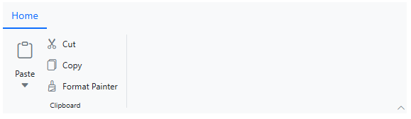
The Classic layout offers a detailed structure, organizing commands and groups for easy navigation and clear access to all functionalities. This layout is ideal for applications requiring a more comprehensive set of features, presented in a well-structured manner.

To enable the Classic layout, set the [ActiveLayout](https://help.syncfusion.com/cr/blazor/Syncfusion.Blazor.Ribbon.SfRibbon.html#Syncfusion_Blazor_Ribbon_SfRibbon_ActiveLayout)
 property to **RibbonLayout.Classic**. By default, the Ribbon component uses this layout.

```
@using Syncfusion.Blazor.Ribbon
@using Syncfusion.Blazor.SplitButtons;

<div style="width:30%">
   <SfRibbon ActiveLayout="RibbonLayout.Classic">
      <RibbonTabs>
         <RibbonTab HeaderText="Home">
            <RibbonGroups>
               <RibbonGroup HeaderText="Clipboard">
                  <RibbonCollections>
                     <RibbonCollection>
                        <RibbonItems>
                           <RibbonItem Type=RibbonItemType.SplitButton>
                              <RibbonSplitButtonSettings Content="Paste" IconCss="e-icons e-paste" Items="@formatItems"></RibbonSplitButtonSettings>
                           </RibbonItem>
                        </RibbonItems>
                     </RibbonCollection>
                     <RibbonCollection>
                        <RibbonItems>
                           <RibbonItem Type=RibbonItemType.Button>
                              <RibbonButtonSettings Content="Cut" IconCss="e-icons e-cut"></RibbonButtonSettings>
                           </RibbonItem>
                           <RibbonItem Type=RibbonItemType.Button>
                              <RibbonButtonSettings Content="Copy" IconCss="e-icons e-copy"></RibbonButtonSettings>
                           </RibbonItem>
                           <RibbonItem Type=RibbonItemType.Button>
                              <RibbonButtonSettings Content="Format Painter" IconCss="e-icons e-format-painter"></RibbonButtonSettings>
                           </RibbonItem>
                        </RibbonItems>
                     </RibbonCollection>
                  </RibbonCollections>
               </RibbonGroup>
            </RibbonGroups>
         </RibbonTab>
      </RibbonTabs>
   </SfRibbon>
</div>

@code {
    List<DropDownMenuItem> formatItems = new List<DropDownMenuItem>()
    {
        new DropDownMenuItem{ Text = "Keep Source Format" },
        new DropDownMenuItem{ Text = "Merge Format" },
        new DropDownMenuItem{ Text = "Keep Text Only" }
    };
}
```

Refer to the following image.
![Classic layout Interface](https://www.syncfusion.com/blogs/wp-content/uploads/2025/04/Classic-layout-Interface.png)

Classic layout Interface

### Simplified layout

The Simplified layout offers a streamlined design by organizing items into a single-row layout, creating a modern and space-efficient interface. This layout is ideal for applications that require a minimalist interface or have space constraints.

To enable the simplified layout, set the [ActiveLayout](https://help.syncfusion.com/cr/blazor/Syncfusion.Blazor.Ribbon.SfRibbon.html#Syncfusion_Blazor_Ribbon_SfRibbon_ActiveLayout)
 property to **RibbonLayout.Simplified**.

```
@using Syncfusion.Blazor.Ribbon;
@using Syncfusion.Blazor.SplitButtons;

<div style="width:30%">
    <SfRibbon ActiveLayout="RibbonLayout.Simplified">
        <RibbonTabs>
            <RibbonTab HeaderText="Home">
                <RibbonGroups>
                    <RibbonGroup HeaderText="Clipboard">
                        <RibbonCollections>
                            <RibbonCollection>
                                <RibbonItems>
                                    <RibbonItem Type=RibbonItemType.SplitButton>
                                        <RibbonSplitButtonSettings Content="Paste" IconCss="e-icons e-paste" Items="@formatItems"></RibbonSplitButtonSettings>
                                    </RibbonItem>
                                </RibbonItems>
                            </RibbonCollection>
                            <RibbonCollection>
                                <RibbonItems>
                                    <RibbonItem Type=RibbonItemType.Button>
                                        <RibbonButtonSettings Content="Cut" IconCss="e-icons e-cut"></RibbonButtonSettings>
                                    </RibbonItem>
                                    <RibbonItem Type=RibbonItemType.Button>
                                        <RibbonButtonSettings Content="Copy" IconCss="e-icons e-copy"></RibbonButtonSettings>
                                    </RibbonItem>
                                    <RibbonItem Type=RibbonItemType.Button>
                                        <RibbonButtonSettings Content="Format Painter" IconCss="e-icons e-format-painter"></RibbonButtonSettings>
                                    </RibbonItem>
                                </RibbonItems>
                            </RibbonCollection>
                        </RibbonCollections>
                    </RibbonGroup>
                </RibbonGroups>
            </RibbonTab>
        </RibbonTabs>
    </SfRibbon>
</div>

@code {
    List<DropDownMenuItem> formatItems = new List<DropDownMenuItem>()
    {
    new DropDownMenuItem{ Text = "Keep Source Format" },
    new DropDownMenuItem{ Text = "Merge Format" },
    new DropDownMenuItem{ Text = "Keep Text Only" }
    };
}
```

Refer to the following image.

![Simplified layout Interface](https://www.syncfusion.com/blogs/wp-content/uploads/2025/07/Simplified-layout-Interface-1.png)

Simplified layout Interface

**Note:** For more details, refer to the [Layouts Ribbon documentation](https://blazor.syncfusion.com/documentation/ribbon/layouts)
.

## Adaptive gallery item

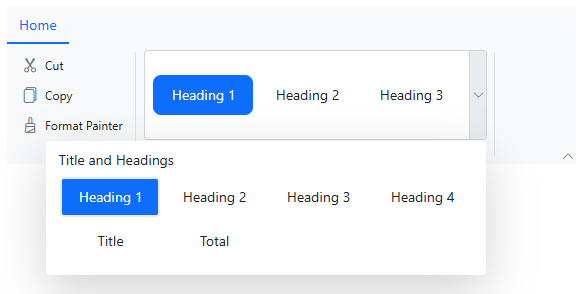
The Blazor Ribbon includes a gallery view that allows you to efficiently manage and display collections of items within a structured interface. The gallery supports grouping, scrolling, and adaptive layouts, ensuring a seamless user experience across different screen sizes and resolutions.

To render a gallery item, set the [Type](https://help.syncfusion.com/cr/blazor/Syncfusion.Blazor.Ribbon.RibbonItem.html#Syncfusion_Blazor_Ribbon_RibbonItem_Type)
 property of a Ribbon item to **RibbonItemType.Gallery** and customize it using the [RibbonGallerySettings](https://help.syncfusion.com/cr/blazor/Syncfusion.Blazor.Ribbon.RibbonGallerySettings.html)
 directive.

```
@using Syncfusion.Blazor.Ribbon;

<div style="width:30%">
    <SfRibbon>
        <RibbonTabs>
            <RibbonTab HeaderText="Home">
                <RibbonGroups>
                    <RibbonGroup HeaderText="Clipboard">
                        <RibbonCollections>
                            <RibbonCollection>
                                <RibbonItems>
                                    <RibbonItem Type=RibbonItemType.Button>
                                        <RibbonButtonSettings Content="Cut" IconCss="e-icons e-cut"></RibbonButtonSettings>
                                    </RibbonItem>
                                    <RibbonItem Type=RibbonItemType.Button>
                                        <RibbonButtonSettings Content="Copy" IconCss="e-icons e-copy"></RibbonButtonSettings>
                                    </RibbonItem>
                                    <RibbonItem Type=RibbonItemType.Button>
                                        <RibbonButtonSettings Content="Format Painter" IconCss="e-icons e-format-painter"></RibbonButtonSettings>
                                    </RibbonItem>
                                </RibbonItems>
                            </RibbonCollection>
                        </RibbonCollections>
                    </RibbonGroup>
                    <RibbonGroup HeaderText="Gallery">
                        <RibbonCollections>
                            <RibbonCollection>
                                <RibbonItems>
                                    <RibbonItem Type=RibbonItemType.Gallery>
                                        <RibbonGallerySettings Groups="galleryGroups"></RibbonGallerySettings>
                                    </RibbonItem>
                                </RibbonItems>
                            </RibbonCollection>
                        </RibbonCollections>
                    </RibbonGroup>
                </RibbonGroups>
            </RibbonTab>
        </RibbonTabs>
    </SfRibbon>
</div>

@code {
    List<GalleryGroup> galleryGroups = new List<GalleryGroup>
    {
        new GalleryGroup
        {
            Header = "Title and Headings",
            ItemWidth = "100",
            ItemHeight = "40",
            Items = new List<GalleryItem>
            {
                new GalleryItem { Content = "Heading 1" },
                new GalleryItem { Content = "Heading 2" },
                new GalleryItem { Content = "Heading 3" },
                new GalleryItem { Content = "Heading 4" },
                new GalleryItem { Content = "Title" },
                new GalleryItem { Content = "Total" }
            }
        },
    };
}
```
![Adaptive gallery view](https://www.syncfusion.com/blogs/wp-content/uploads/2025/04/Adaptive-gallery-view.png)

Adaptive gallery view

**Note:** For more details, refer to the [Ribbon Gallery documentation](https://blazor.syncfusion.com/documentation/ribbon/gallery)
.

## Traditional file menu

Provides a built-in file menu that enables users to access essential file-related actions, such as creating, opening, or exporting files. This menu offers a familiar and user-friendly interface for common tasks, making it easy for users to interact.

You can configure the file menu using the [RibbonFileMenuSettings](https://help.syncfusion.com/cr/blazor/Syncfusion.Blazor.Ribbon.RibbonFileMenuSettings.html)
 directive within the **SfRibbon** component. This ensures the file menu integrates smoothly with the rest of the ribbon, maintaining a consistent and user-friendly experience.

```
@using Syncfusion.Blazor.Ribbon;
@using Syncfusion.Blazor.Navigations;

<div style="width:30%">
    <SfRibbon>
        <RibbonFileMenuSettings Visible=true MenuItems="@fileMenuItems"></RibbonFileMenuSettings>
        <RibbonTabs>
            <RibbonTab HeaderText="Home">
                <RibbonGroups>
                    <RibbonGroup HeaderText="Clipboard">
                        <RibbonCollections>
                            <RibbonCollection>
                                <RibbonItems>
                                    <RibbonItem Type=RibbonItemType.Button>
                                        <RibbonButtonSettings Content="Cut" IconCss="e-icons e-cut" ></RibbonFileMenuSettings> 
                                    </RibbonItem>
                                    <RibbonItem Type=RibbonItemType.Button>
                                        <RibbonButtonSettings Content="Copy" IconCss="e-icons e-copy"></RibbonButtonSettings>
                                    </RibbonItem>
                                    <RibbonItem Type=RibbonItemType.Button>
                                        <RibbonButtonSettings Content="Format Painter" IconCss="e-icons e-format-painter"></RibbonButtonSettings>
                                    </RibbonItem>
                                </RibbonItems>
                            </RibbonCollection>
                        </RibbonCollections>
                    </RibbonGroup>
                </RibbonGroups>
            </RibbonTab>
        </RibbonTabs>
    </SfRibbon>
</div>

@code{
    List<MenuItem> fileMenuItems = new List<MenuItem>()
    {
        new MenuItem { Text = "New", IconCss = "e-icons e-file-new", Id = "new" },
        new MenuItem { Text = "Open", IconCss = "e-icons e-folder-open", Id = "open" },
        new MenuItem { Text = "Rename", IconCss = "e-icons e-rename", Id = "rename" },
        new MenuItem {
            Text = "Save as",
            IconCss = "e-icons e-save",
            Id = "save",
            Items = new List<MenuItem>() {
                new MenuItem { Text = "Microsoft Word (.docx)", IconCss = "sf-icon-word", Id = "word" },
                new MenuItem { Text = "Microsoft Word 97-2003(.doc)", IconCss = "sf-icon-word", Id = "word97" },
                new MenuItem { Text = "Download as PDF", IconCss = "e-icons e-export-pdf", Id = "pdf" }
            }
        }
    };
}
```

Refer to the following image.

![Traditional File Menu feature](https://www.syncfusion.com/blogs/wp-content/uploads/2025/07/Traditional-File-Menu-feature-1.png)

Traditional File Menu feature

**Note:** For more details, refer to the [File Menu documentation](https://blazor.syncfusion.com/documentation/ribbon/filemenu)
.

## Enhanced backstage view

The Ribbon supports a backstage view that offers users an extended interface, typically used for managing application-level settings, user profiles, or advanced options. This view provides a clean and organized space, improving navigation and separating core commands from supplementary tasks, thus enhancing the overall user experience.

You can configure the backstage view using the [RibbonBackstageMenuSettings](https://help.syncfusion.com/cr/blazor/Syncfusion.Blazor.Ribbon.RibbonBackstageMenuSettings.html)
 directive. The backstage menu options appear on the left panel, with the corresponding content displayed on the right.

```
@using Syncfusion.Blazor.Ribbon

<div style="width:50%">
    <SfRibbon>
        <RibbonBackstageMenuSettings Text="File" Visible="true">
             <BackstageMenuItems>
                 <BackstageMenuItem ID="home" Text="Home" IconCss="e-icons e-home">@GetBackstageContent("home")</BackstageMenuItem>
                 <BackstageMenuItem ID="new" Text="New" IconCss="e-icons e-file-new">@GetBackstageContent("new")</BackstageMenuItem>
                 <BackstageMenuItem ID="open" Text="Open" IconCss="e-icons e-folder-open">@GetBackstageContent("open")</BackstageMenuItem>
             </BackstageMenuItems>
         </RibbonBackstageMenuSettings>
         <RibbonTabs>
             <RibbonTab HeaderText="Home">
                <RibbonGroups>
                    <RibbonGroup HeaderText="Clipboard">
                        <RibbonCollections>
                            <RibbonCollection>
                                <RibbonItems>
                                    <RibbonItem Type=RibbonItemType.Button>
                                        <RibbonButtonSettings Content="Cut" IconCss="e-icons e-cut"></RibbonButtonSettings>
                                    </RibbonItem>
                                    <RibbonItem Type=RibbonItemType.Button>
                                        <RibbonButtonSettings Content="Copy" IconCss="e-icons e-copy"></RibbonButtonSettings>
                                    </RibbonItem>
                                </RibbonItems>
                            </RibbonCollection>
                        </RibbonCollections>
                    </RibbonGroup>
                </RibbonGroups>
            </RibbonTab>
        </RibbonTabs>
    </SfRibbon>
</div>

@code {
RenderFragment GetBackstageContent(string item) => item switch
{
    "home" => GetHomeContent(),
    "new" => GetNewContent(),
    "open" => GetOpenContent()
};

RenderFragment GetHomeContent() => @<div class="home-wrapper">
    <div class="new-wrapper">
        <div class="section-title">New</div>
        <div class="category_container">
            <div class="doc_category_image"></div>
            <span class="doc_category_text">New document</span>
        </div>
    </div>
    <div class="block-wrapper">
        <div class="section-title">Recent</div>
        @foreach (var doc in GetRecentDocuments())
        {
            @RenderWrapperContent(doc.icon, doc.name, doc.description)
        }
    </div>
</div>;

RenderFragment GetNewContent() => @<div class="new-wrapper">
    <div class="section-title">New</div>
    <div class="category_container">
       <div class="doc_category_image"></div>
       <span class="doc_category_text">New document</span>
    </div>
</div>;

RenderFragment GetOpenContent() => @<div class="block-wrapper">
    <div class="section-title">Recent</div>
    @foreach (var doc in GetRecentDocuments())
    {
        @RenderWrapperContent(doc.icon, doc.name, doc.description)
    }
</div>;

IEnumerable<(string icon, string name, string description)> GetRecentDocuments() => new List<(string, string, string)>
{
    ("e-notes", "Classic_layout.docx", "EJ2 >> Components >> Navigations >> Ribbon >> layouts"),
    ("e-notes", "Simplified_layout.docx", "EJ2 >> Components >> Navigations >> Ribbon >> layouts")
};

RenderFragment RenderWrapperContent(string icon, string name, string description) =>
    @<div class="section-content">
        <table>
            <tbody>
            <tr>
                <td><span class="doc_icon e-icons @icon"></span></td>
                <td>
                    <span style="display: block; font-size: 14px">@name</span>
                    <span style="font-size: 12px">@description</span>
                </td>
            </tr>
            </tbody>
        </table>
    </div>;
}

<style>
    .e-ribbon-backstage-content > div:first-child {
        width: 550px;
        padding: 25px;
        height: 510px;
    }
    .section-title {
        font-size: 22px;
    }
    .category_container {
        width: 150px;
        padding: 15px;
        text-align: center;
        cursor: pointer;
    }
    .doc_category_image {
        width: 80px;
        height: 100px;
        background-color: #fff;
        border: 1px solid rgb(125, 124, 124);
        text-align: center;
        overflow: hidden;
        margin: 0px auto 10px;
    }
    .doc_category_text {
        font-size: 16px;
    }
    .section-content {
        padding: 12px 0px;
        cursor: pointer;
    }
    .doc_icon {
        font-size: 16px;
        padding: 0px 10px;
    }
    /* Hover styles */
    .category_container:hover,
    .section-content:hover {
        background-color: #dfdfdf;
        border-radius: 5px;
        transition: all 0.3s;
    }
</style>
```

![Backstage View feature](https://www.syncfusion.com/blogs/wp-content/uploads/2025/07/Backstage-View-feature-1.png)

Backstage View feature

**Note:** For more details, refer to the [Ribbon Backstage documentation](https://blazor.syncfusion.com/documentation/ribbon/backstage)
.

## Help with tooltips

Tooltips enhance usability by providing helpful, descriptive information when users hover over items. These tooltips offer concise, context-sensitive guidance, helping users understand the functionality of each command without interrupting their workflow.

You can configure tooltips for specific items using the [TooltipSettings](https://help.syncfusion.com/cr/blazor/Syncfusion.Blazor.Ribbon.RibbonItem.html#Syncfusion_Blazor_Ribbon_RibbonItem_TooltipSettings)
 property.

```
@using Syncfusion.Blazor.Ribbon;
@using Syncfusion.Blazor.SplitButtons;

<div style="width:30%">
   <SfRibbon>
      <RibbonTabs>
         <RibbonTab HeaderText="Home">
            <RibbonGroups>
               <RibbonGroup HeaderText="Clipboard">
                  <RibbonCollections>
                     <RibbonCollection>
                        <RibbonItems>
                           <RibbonItem Type=RibbonItemType.SplitButton TooltipSettings="splitBtnTooltip">
                              <RibbonSplitButtonSettings Content="Paste" IconCss="e-icons e-paste" Items="@formatItems"></RibbonSplitButtonSettings>
                           </RibbonItem>
                        </RibbonItems>
                     </RibbonCollection>
                     <RibbonCollection>
                     <RibbonItems>
                        <RibbonItem Type=RibbonItemType.Button>
                           <RibbonButtonSettings Content="Cut" IconCss="e-icons e-cut"></RibbonButtonSettings>
                        </RibbonItem>
                        <RibbonItem Type=RibbonItemType.Button>
                           <RibbonButtonSettings Content="Copy" IconCss="e-icons e-copy"></RibbonButtonSettings>
                        </RibbonItem>
                     </RibbonItems>
                  </RibbonCollections>
               </RibbonGroup>
            </RibbonGroups>
         </RibbonTab>
      </RibbonTabs>
   </SfRibbon>
</div>

@code {
    RibbonTooltipSettings splitBtnTooltip = new()
    {
        Title = "Paste",
        Content = "Insert the clipboard content where the cursor is currently placed.",
        IconCss = "e-icons e-paste"
    };
    List<DropDownMenuItem> formatItems = new List<DropDownMenuItem>()
    {
        new DropDownMenuItem { Text = "Keep Source Format" },
        new DropDownMenuItem { Text = "Merge Format" },
        new DropDownMenuItem { Text = "Keep Text Only" }
    };
}
```

![Tooltips feature](https://www.syncfusion.com/blogs/wp-content/uploads/2025/07/Tooltips-feature-1.png)

Tooltips feature

**Note:** For more details, refer to the [Ribbon Tooltip documentation](https://blazor.syncfusion.com/documentation/ribbon/tooltip)
.

## References

For complete details, refer to the [demos](https://blazor.syncfusion.com/demos/ribbon/default-functionalities?theme=fluent2)
 and [documentation](https://blazor.syncfusion.com/documentation/ribbon/getting-started-webapp)
.

## Supported Platforms

The Ribbon component is also available on the following platforms.

| Platform | Live Demo | Documentation |
| --- | --- | --- |
| JavaScript | JavaScript Ribbon Demos | Getting Started with JavaScript Ribbon |
| Angular | Angular Ribbon Demos | Getting Started with Angular Ribbon |
| React | React Ribbon Demos | Getting Started with React Ribbon |
| Vue | Vue Ribbon Demos | Getting Started with Vue Ribbon |
| ASP.NET Core | ASP.NET Core Ribbon Demos | Getting Started with ASP.NET Core Ribbon |
| ASP.NET MVC | ASP.NET MVC Ribbon Demos | Getting Started with ASP.NET MVC Ribbon |


## FAQs

**Q1: How do I switch between Classic and Simplified layouts in the Ribbon?**  
Use the **ActiveLayout** property and set it to ** RibbonLayout.Classic** or ** RibbonLayout.Simplified** to toggle between layouts.

**Q2: Does the Ribbon support tooltips and file menus?**  
Yes, it includes built-in support for tooltips, file menus, and backstage views to enhance user experience.

## Conclusion

Thank you for reading! In this blog, we’ve explored the key features of the Blazor Ribbon component, a powerful addition to Syncfusion’s suite of Blazor tools. For more details, check the[Release Notes](https://help.syncfusion.com/common/essential-studio/release-notes/v28.1.33)
 and [What’s New](https://www.syncfusion.com/products/whatsnew)
 pages for our [2024 Volume 4](https://www.syncfusion.com/forums/195512/essential-studio-2024-volume-4-main-release-v28-1-33-is-available-for-download)
 release. We encourage you to try the Blazor Ribbon component and share your feedback in the comments.

For existing Syncfusion® customers, the newest version of Essential Studio® is available from the [license and downloads](https://www.syncfusion.com/account)
 page. If you are not a customer, try our 30-day [free trial](https://www.syncfusion.com/downloads)
 to check out these new features.

If you need assistance, feel free to reach out via our [support forum](https://www.syncfusion.com/forums)
, [support portal](https://support.syncfusion.com/)
, or [feedback portal](https://www.syncfusion.com/feedback/)
. As always, we are happy to assist you!

## Related Blogs


[A New Simplified Layout in WPF Ribbon Control](https://www.syncfusion.com/blogs/post/a-new-simplified-layout-in-wpf-ribbon-control)


[Design Office-Inspired Simplified Ribbon in WinForms](https://www.syncfusion.com/blogs/post/design-office-inspired-simplified-ribbon-in-winforms)


[Introducing Syncfusion Ribbon for WinUI](https://www.syncfusion.com/blogs/post/introducing-syncfusion-ribbon-for-winui)


[What’s New in Blazor 2025 Volume 2 – 99% Faster Performance + Revolutionary Spreadsheet Component](https://www.syncfusion.com/blogs/post/whats-new-blazor-2025-vol-2)
