---
title: "How to Choose the Best Blazor Dropdown Component for Your Web App"
published_at: "2025-12-02T17:49:09+00:00"
modified_at: "2026-01-21T12:04:33+00:00"
url: "https://www.syncfusion.com/blogs/post/blazor-dropdown-component-guide"
excerpt: "Learn how to select the right Blazor dropdown component, DropdownList, AutoComplete, ComboBox, MultiSelect, or DropdownTree, for optimal performance and user experience in modern web apps."
taxonomy_category:
- "ASP.NET Core"
- "Blazor"
- "Dropdown"
- "UI components"
- "Web Development"
taxonomy_post_tag:
- "Autocomplete"
- "Blazor"
- "ComboBox"
- "DropdownList"
- "multiselect"
---
# How to Choose the Best Blazor Dropdown Component for Your Web App
[Prince Oliver](https://www.syncfusion.com/blogs/author/prince-rajarathinam-oliver)
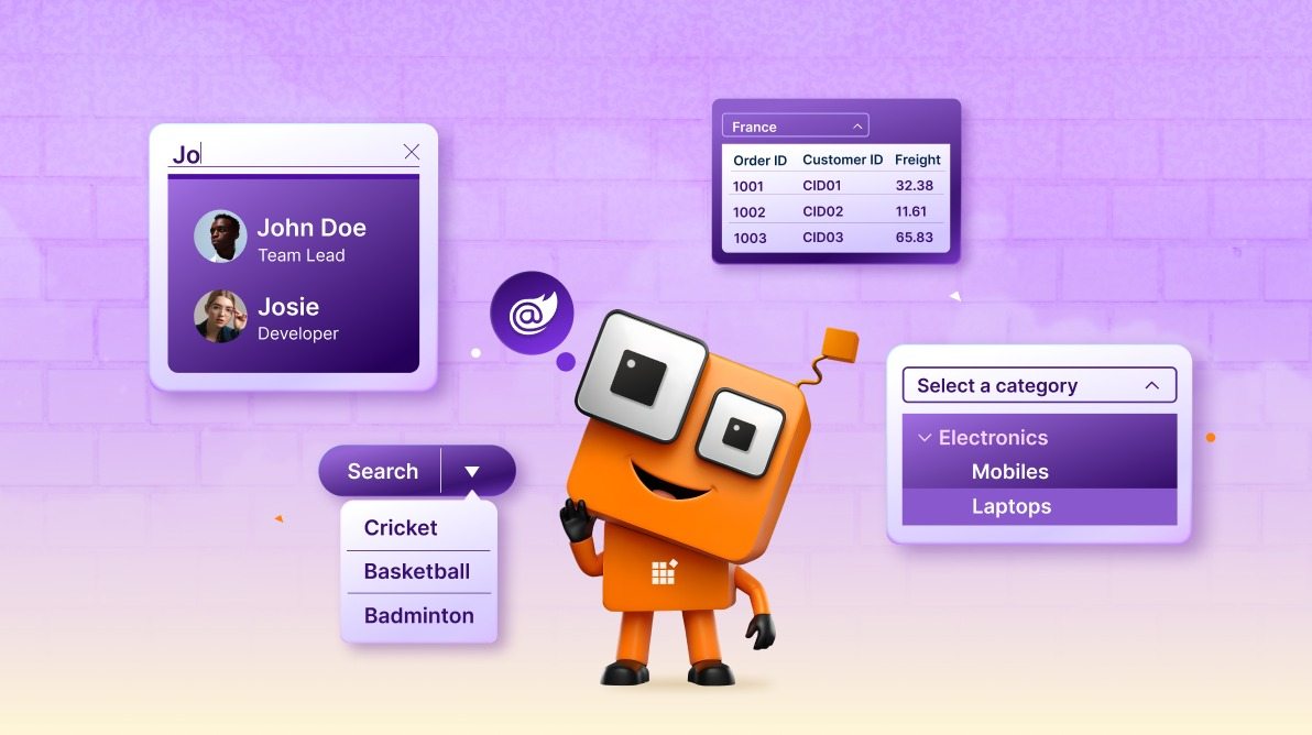
**TL;DR:** Choosing the right Blazor dropdown component can significantly impact your app’s performance and user experience. This guide quickly compares DropdownList, AutoComplete, ComboBox, MultiSelect, and DropdownTree to help you pick the perfect fit for building fast, clean, and intuitive modern web apps.
Choosing the right **Blazor dropdown** component is critical for delivering a seamless user experience. With multiple options available, each designed for a specific scenario, selecting the best fit can feel overwhelming.
Whether you’re building an e-commerce platform, an admin dashboard, or an enterprise application, understanding these components will help you make informed decisions. In this guide, we’ll break down the key dropdown types and explain when to use each one.
## The dropdown landscape: A quick overview
Syncfusion provides six main Blazor dropdown components, each with unique characteristics and use cases.
Here’s a quick snapshot:
- **DropdownList:** A classic, lightweight choice for simple selections.
- **AutoComplete:** Ideal for intelligent text suggestions and quick searches.
- **ComboBox:** A flexible hybrid that combines dropdown functionality with text input.
- **MultiSelect Dropdown:** Perfect when users need to select multiple options.
- **DropdownTree:** Designed for hierarchical or nested data structures.
- **MultiColumn ComboBox:** Best suited for presenting complex data in multiple columns.
Now that you have an overview, let’s dive deeper into each component. We’ll explore their features, real-world use cases, and tips to help you choose the perfect match for your application.
## 1. DropdownList: Your go-to component
The [DropdownList](https://www.syncfusion.com/blazor-components/blazor-dropdown-list)
is your bread-and-butter component for simple selection scenarios. Choose it when you need:
- A predefined list of options
- Single selection only
- Minimal footprint and maximum performance
- A compact UI that feels familiar to users
### Real-world use case
Imagine building a customer support ticket system where users select a ticket category from a fixed list, such as **Billing**, ** Technical Support**, ** Feature Request**, or ** Bug Report**.
```
@using Syncfusion.Blazor.DropDowns
@code {
public class TicketCategory
{
public string Id { get; set; }
public string Text { get; set; }
}
private List Categories = new List
{
new TicketCategory { Id = "1", Text = "Billing" },
new TicketCategory { Id = "2", Text = "Technical Support" },
new TicketCategory { Id = "3", Text = "Feature Request" },
new TicketCategory { Id = "4", Text = "Bug Report" }
};
private string SelectedCategory;
}
```
### Key features
When using the **DropdownList** component, you’ll benefit from several powerful features that enhance usability and performance:
- **Lightweight & fast**: Minimal DOM footprint
- **Keyboard navigation**: Full keyboard support
- **Virtual scrolling**: Handle thousands of items
- **Templates**: Customize item appearance
- **Filtering**: Quick item lookup
### Similarities & differences
| Feature | DropdownList | AutoComplete | ComboBox |
| --- | --- | --- | --- |
| Single selection | Supported | Supported | Supported |
| Type-ahead search | Not supported | Supported | Supported |
| Allow custom input | Not supported | Supported | Supported |
| Read-only list | Supported | Not supported | Not supported |
## 2. AutoComplete: Smart suggestions
The [AutoComplete](https://www.syncfusion.com/blazor-components/blazor-autocomplete)
component is perfect for scenarios where users need quick, intelligent suggestions as they type. It shines in situations that require:
- Searching through large datasets
- Providing intelligent suggestions as users type
- Improving UX with type-ahead functionality
- Reducing user effort in data entry
### Real-world use case
Imagine you’re building an employee directory. An AutoComplete component allows users to quickly find colleagues by typing their names, making the search process faster and more intuitive.
```
@using Syncfusion.Blazor.DropDowns
@code {
public class Employee
{
public int Id { get; set; }
public string Name { get; set; }
public string Department { get; set; }
}
private List Employees = new List
{
new Employee { Id = 1, Name = "Alice Johnson", Department = "Engineering" },
new Employee { Id = 2, Name = "Bob Smith", Department = "Marketing" },
new Employee { Id = 3, Name = "Carol White", Department = "Sales" },
new Employee { Id = 4, Name = "David Brown", Department = "Engineering" }
};
private string SelectedEmployee;
}
```
### Key features
The AutoComplete component offers several capabilities that enhance user experience:
- **Dynamic filtering**: Filter items as users type
- **Highlight matched text**: Visual feedback on matches
- **Case-insensitive search**: User-friendly search
- **Remote data binding**: Fetch data from APIs
- **Custom filtering**: Implement your own search logic
### Perfect for
AutoComplete is an excellent choice for:
- Customers search for CRM systems
- E-commerce product lookup
- Location search, like City/Country selection
- Finding relevant tags or categories
## 3. ComboBox: The flexible hybrid
The [ComboBox](https://www.syncfusion.com/blazor-components/blazor-combobox)
component combines the best of both worlds, offering the structure of a dropdown with the flexibility of text input. It’s ideal when:
- Select from predefined options
- Enter custom values
- Flexible input without losing structure
- Ideal when predefined lists aren’t exhaustive
### Real-world use case
For example, consider a shipping address form. Users can either select a recent address from a list or enter a new one, making the process both convenient and adaptable.
```
@using Syncfusion.Blazor.DropDowns
@code {
public class Address
{
public int Id { get; set; }
public string Value { get; set; }
}
private List RecentAddresses = new List
{
new Address { Id = 1, Value = "123 Main St, New York, NY 10001" },
new Address { Id = 2, Value = "456 Oak Ave, Los Angeles, CA 90001" },
new Address { Id = 3, Value = "789 Pine Rd, Chicago, IL 60601" }
};
private string SelectedAddress;
}
```
### Key features
The ComboBox offers several advantages:
- **Custom value entry**: Type your own values
- **Predefined list**: Suggest common options
- **Flexible input**: Best of dropdown + text input
- **Filtering & search**: Find items quickly
- **Validation**: Ensure valid data entry
### When to choose a ComboBox
You can opt for a ComboBox when:
- You want **structure,** but also ** flexibility**
- Users need to enter values that don’t exist in your list
- You’re building forms where “other” is a common option
- You want to guide users while allowing exceptions
## 4. MultiSelect dropdown: Multiple choices
The [MultiSelect Dropdown](https://www.syncfusion.com/blazor-components/blazor-multiselect-dropdown)
is essential when users need to select multiple options without cluttering the interface. This component is ideal for scenarios such as:
- Building filters, tags, or permission systems
- Compact UI without clutter
- Selected items should be clearly visible
### Real-world use case
For instance, in a content management system, you can allow users to select multiple tags for an article.
```
@using Syncfusion.Blazor.DropDowns
@code {
public class Tag
{
public int Id { get; set; }
public string Text { get; set; }
}
private List AvailableTags = new List
{
new Tag { Id = 1, Text = "Blazor" },
new Tag { Id = 2, Text = "WebDevelopment" },
new Tag { Id = 3, Text = "Tutorial" },
new Tag { Id = 4, Text = "Performance" },
new Tag { Id = 5, Text = "BestPractices" }
};
private string[] SelectedTags;
}
```
### Key features
Here’s what makes the MultiSelect Dropdown powerful and user-friendly:
- **Multiple selections**: Select as many as you need
- **Select all option**: Quick bulk selection
- **Tag display**: Show selected items as chips
- **Keyboard support**: Navigate with arrow keys
- **Remove selected items**: Easy deselection
- **Custom templates**: Style selected items
### Perfect for
This component shines in scenarios where flexibility and clarity are crucial:
- **Permission management** – Assign multiple roles
- **Filtering** – Multi-criteria search filters
- **Skills selection** – Job applications or profiles
- **Product bundles** – Select multiple products
- **Content tags** – Tagging system for articles
## 5. DropdownTree: Hierarchical and self-referential data
When your data is hierarchical or interconnected, the [DropdownTree](https://www.syncfusion.com/blazor-components/blazor-dropdowntree)
component is the ideal solution. It works best for:
- Hierarchical or nested data
- Self-referential data (interconnected data)
- Organization charts or category trees
- File system or folder navigation
### Real-World use case
For instance, in an HR management system, managers can select employees from a department hierarchy.
```
@using Syncfusion.Blazor.Navigations
@code {
public class Department
{
public string Id { get; set; }
public string Text { get; set; }
public string ParentId { get; set; }
public bool HasChild { get; set; }
}
private List HierarchicalData = new List
{
new Department { Id = "1", Text = "Engineering", ParentId = null, HasChild = true },
new Department { Id = "1-1", Text = "Frontend", ParentId = "1", HasChild = false },
new Department { Id = "1-2", Text = "Backend", ParentId = "1", HasChild = false },
new Department { Id = "2", Text = "Sales", ParentId = null, HasChild = true },
new Department { Id = "2-1", Text = "Enterprise Sales", ParentId = "2", HasChild = false },
new Department { Id = "2-2", Text = "Inside Sales", ParentId = "2", HasChild = false }
};
private string SelectedDepartment;
}
```
### Key features
Here’s why DropdownTree is perfect for hierarchical data handling:
- **Tree structure**: Show parent-child relationships
- **Expandable nodes**: Navigate nested data
- **Single selection**: Select specific items
- **Keyboard navigation**: Arrow keys for tree navigation
- **Checkbox selection**: Optional multi-select
- **Filtering**: Dynamic search and filter
- **Templates**: Customize node appearance with custom HTML
### When to choose DropdownTree
Use DropdownTree when your application needs to represent structured relationships:
- Your data has a natural hierarchy.
- Users need to understand relationships between items.
- You’re building organizational structures.
- File systems or category trees are involved.
## 6. MultiColumn ComboBox: Complex data
Finally, when a single text representation isn’t enough, the [MultiColumn ComboBox](https://www.syncfusion.com/blazor-components/blazor-multicolumn-combobox)
comes into play. It’s perfect for scenarios where:
- Multiple columns of information are needed
- Single text representation isn’t enough
- Users need context before selecting
### Real-world use case
For example, in an invoicing system, you can show product details such as name, SKU, price, and stock in columns.
```
@using Syncfusion.Blazor.MultiColumnComboBox
@code {
public class Product
{
public int Id { get; set; }
public string Name { get; set; }
public string SKU { get; set; }
public decimal Price { get; set; }
public int Stock { get; set; }
}
private List Products = new List
{
new Product { Id = 1, Name = "Wireless Mouse", SKU = "WM-001", Price = 29.99m, Stock = 150 },
new Product { Id = 2, Name = "USB-C Cable", SKU = "UC-002", Price = 12.99m, Stock = 500 },
new Product { Id = 3, Name = "Mechanical Keyboard", SKU = "MK-003", Price = 149.99m, Stock = 45 },
new Product { Id = 4, Name = "4K Monitor", SKU = "MON-004", Price = 399.99m, Stock = 20 }
};
private int SelectedProduct;
}
```
### Key features
Here’s why MultiColumn ComboBox is ideal for complex data scenarios:
- **Multiple columns:** Display rich, structured data
- **Formatted display:** Present relevant context clearly
- **Custom formatting:** Align numbers and format currency
- **Type-ahead search:** Search across multiple columns
### Perfect for
This component is best suited for situations where detailed context matters:
- **Product selection**: Show SKU, price, availability
- **Employee selection**: Display ID, department, email
- **Invoice items**: Product name, code, price, stock
- **Account selection**: Account number, balance, type
- **Any complex lookup**: Where more context helps decisions
## Comparison matrix: Choose your component
| Feature | DropdownList | AutoComplete | ComboBox | MultiSelect | DropdownTree | MultiColumn ComboBox |
| --- | --- | --- | --- | --- | --- | --- |
| Single selection | Supported | Supported | Supported | Not supported | Supported | Supported |
| Multiple selection | Not supported | Not supported | Not supported | Supported | Supported | Not supported |
| Custom input | Not supported | Supported | Supported | Not supported | Not supported | Not supported |
| Type-ahead search | Supported | Supported | Supported | Supported | Supported | Supported |
| Hierarchical data | Not supported | Not supported | Not supported | Not supported | Not supported | Supported |
| Multiple columns | Not supported | Not supported | Not supported | Not supported | Not supported | Supported |
| Virtual scrolling | Supported | Supported | Supported | Supported | Not supported | Not supported |
| Templates | Supported | Supported | Supported | Supported | Supported | Supported |
| Performance (Large data) | ⭐⭐⭐⭐⭐ | ⭐⭐⭐⭐ | ⭐⭐⭐⭐ | ⭐⭐⭐⭐ | ⭐⭐⭐⭐ | ⭐⭐⭐⭐ |
| Learning curve | Easy | Easy | Easy | Medium | Medium | Complex |
## Learning resources
To deepen your knowledge and explore these components further, consider the following resources:
- [Getting Started with Blazor DropDown List Component](https://blazor.syncfusion.com/documentation/dropdown-list/getting-started-with-web-app)
- [Interactive Blazor demos](https://blazor.syncfusion.com/demos/)
- [Blazor API reference](https://help.syncfusion.com/cr/blazor/Syncfusion.Blazor.html)
## Conclusion
Thank you for taking the time to explore these dropdown components. Choosing the right one doesn’t have to be complicated, and here’s a simple mental framework to guide you. If you’re working with a simple list, the [DropdownList](https://www.syncfusion.com/blazor-components/blazor-dropdown-list)
is your best choice. When search functionality is important, go for [AutoComplete](https://www.syncfusion.com/blazor-components/blazor-autocomplete)
. If flexibility matters most, [ComboBox](https://www.syncfusion.com/blazor-components/blazor-combobox)
is the way to go. For scenarios that require multiple selections, choose [MultiSelect Dropdown](https://www.syncfusion.com/blazor-components/blazor-multiselect-dropdown)
. When dealing with hierarchical data, [DropdownTree](https://www.syncfusion.com/blazor-components/blazor-dropdowntree)
is ideal. For complex data that requires multiple columns, the [MultiColumn ComboBox](https://www.syncfusion.com/blazor-components/blazor-multicolumn-combobox)
is the perfect solution.
Each component is crafted to solve specific problems, and [Syncfusion](https://www.syncfusion.com/)
gives you the tools to implement them seamlessly in your Blazor applications.
Ready to upgrade your Blazor application with the perfect dropdown components?
Get started today by exploring the interactive [demos](https://blazor.syncfusion.com/demos/)
, reviewing the comprehensive [documentation](https://blazor.syncfusion.com/documentation/dropdown-list/getting-started-with-web-app)
, checking the detailed [API reference](https://help.syncfusion.com/cr/blazor/Syncfusion.Blazor.html)
, and trying your hand at building a component using Blazor. Once you’re done, share your experience with us!
The **dropdown** feature is also available in other Syncfusion components such as [React](https://www.syncfusion.com/react-components)
, [Angular](https://www.syncfusion.com/angular-components)
, [JavaScript](https://www.syncfusion.com/javascript-ui-controls)
, [Vue](https://www.syncfusion.com/vue-components)
, [ASP.NET Core](https://www.syncfusion.com/aspnet-core-ui-controls)
, and [ASP.NET MVC](https://www.syncfusion.com/aspnet-mvc-ui-controls)
.
If you’re a Syncfusion user, you can download the setup from the [license and downloads](https://www.syncfusion.com/account/downloads)
page. Otherwise, you can download a free [30-day trial](https://www.syncfusion.com/downloads/)
.
You can also contact us through our [support forum](https://www.syncfusion.com/forums)
, [support portal](https://support.syncfusion.com/)
, or [feedback portal](https://www.syncfusion.com/feedback)
for queries. We are always happy to assist you!
## Related Blogs
[How to Add Video Preview to the Blazor File Upload Component](https://www.syncfusion.com/blogs/post/blazor-file-upload-with-video-preview)
[Syncfusion Announces Day-1 Support for .NET 10 in Blazor Components](https://www.syncfusion.com/blogs/post/dot-net-10-support-syncfusion-blazor)
[Build a High-Performance Financial Dashboard in Blazor with Syncfusion Components](https://www.syncfusion.com/blogs/post/financial-dashboard-in-blazor)
[What’s New in Blazor 2025 Volume 2 – 99% Faster Performance + Revolutionary Spreadsheet Component](https://www.syncfusion.com/blogs/post/whats-new-blazor-2025-vol-2)