---
title: "Why Your .NET MAUI Layout Breaks Across Devices and How to Fix It"
published_at: "2026-02-12T15:17:28+00:00"
modified_at: "2026-02-20T07:54:59+00:00"
url: "https://www.syncfusion.com/blogs/post/best-practices-for-responsive-maui-app"
excerpt: "Struggling to keep your .NET MAUI UI consistent? Use adaptive layouts and smart spacing to build responsive, scalable apps that look polished on every device."
taxonomy_category:
- ".NET MAUI"
- "Cross-Platform Development"
- "Desktop"
- "Mobile Development"
- "Responsive Design"
taxonomy_post_tag:
- ".NET MAUI"
- "Adaptive Layouts"
- "desktop"
- "development"
- "MAUI"
- "Mobile"
- "responsive design"
---
# Why Your .NET MAUI Layout Breaks Across Devices and How to Fix It
[Anandh Ganesan](https://www.syncfusion.com/blogs/author/anandh-ganesan)

**TL;DR:** Ever wonder why a .NET MAUI screen looks great on one device but breaks on another? Let layouts, not fixed sizes, do the work. With clean hierarchy, consistent spacing, and adaptive responsive‑design patterns, you write code once and make your .NET MAUI UI fit every screen. Want user‑friendly tips and performance best practices? Read the blog.
Struggling with .NET MAUI layouts that look perfect on your phone but break on tablets, desktops, or when rotated? You’re not alone. Responsive design in .NET MAUI isn’t automatic; it depends on how you structure layouts, manage spacing, and avoid fixed sizing.
Everything looks right until the device rotates or resizes. Buttons float, text stretches, and spacing falls apart. In .NET MAUI, this happens daily.
The secret is to understand that responsive design in .NET MAUI isn’t a feature; it’s a mindset.
This guide builds on that mindset, providing practical examples of layouts in action. You’ll see not just how certain rules matter, but also how simple patterns can ensure your UI scales from phones to desktops.
## The one big idea that fixes 80% of responsive problems
The core lesson for .NET MAUI responsive design is surprisingly simple:
**“Avoid fixed widths, fixed heights, and absolute positioning****. Let layouts do the work.”**
.NET MAUI layouts are built to stretch, shrink, wrap, and reflow intelligently. When you fight them with hardcoded widths, heights, or absolute coordinates, you lose responsiveness and spend hours debugging something the layout engine could have solved naturally.
Fixed sizes can make sense, but they should feel like rare exceptions, not defaults.
## Three non-negotiable layout rules
Every well-behaved .NET MAUI screen follows these rules, whether the developer realizes it or not.
### 1. One root element per page
Every `ContentPage` must have a single root layout container, usually a `VerticalStackLayout` or **Grid**.
XML
```
```
This establishes a predictable measurement flow. Without a layout root, responsiveness becomes unstable.
### 2. Think in Nested Structure, Not Flat Placement
A responsive MAUI screen is a tree. Structure should flow like this:
- **Grid →** defines macro structure.
- **Stack layouts****→** group related elements.
- **Borders** / ** ContentViews****→** encapsulate reusable regions.
When alignment feels complicated, the issue is almost always hierarchy, not properties.
Avoid stacking everything inside one giant layout. Structure intentionally..
### 3. Avoid hardcoded sizes
If you find yourself setting `WidthRequest`, `HeightRequest`, or **pixel-based** ** positions** everywhere, pause. Ask yourself: Am I solving a layout problem or forcing one? Prefer star-sized (*****) Grid columns, Auto rows, and layout-driven sizing over manual pixel constraints.
## Your .NET MAUI layout toolbox and when to reach for each
The .NET MAUI framework offers several layout tools. The key isn’t just memorizing their names but understanding their intended uses and ideal scenarios. Each tool is designed to solve specific UI challenges, making selection and application intentional.
### 1. VerticalStackLayout and HorizontalStackLayout: Your everyday workhorses
Responsive UI improves dramatically when the correct container is chosen. [VerticalStackLayout](https://learn.microsoft.com/en-us/dotnet/maui/user-interface/layouts/verticalstacklayout?view=net-maui-10.0)
and [HorizontalStackLayout](https://learn.microsoft.com/en-us/dotnet/maui/user-interface/layouts/horizontalstacklayout?view=net-maui-10.0)
should be your default choice for most screens. They render elements in a clean, predictable flow and support responsive spacing naturally. Use them for:
- Forms
- Settings screens
- Profile pages
- Simple top‑to‑bottom content flows
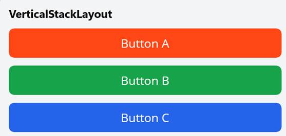
VerticalStackLayout in .NET MAUI
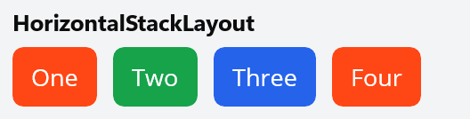
HorizontalStackLayout in .NET MAUI
They are lightweight, easy to read, and suitable for **80% of everyday UI needs**. Prefer these over the older `StackLayout` from **`Xamarin.Forms`** migrations.
Let’s see an example of a clean vertical screen.
XML
```
```
The output will be as shown below.
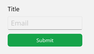
Simple screen with VerticalStackLayout
### 2. FlexLayout: When content needs to breathe
Use [FlexLayout](https://learn.microsoft.com/en-us/dotnet/maui/user-interface/layouts/flexlayout?view=net-maui-10.0)
when elements must wrap, redistribute, or expand naturally based on available space. It shines in scenarios where widths are unpredictable, and spacing must adapt fluidly.
Great for:
- Buttons and actions
- Chips / Tags
- Filter pills
- Quick actions
- Compact cards
Let’s see an example of wrapping actions and chips.
XML
```
...
```
See the output below.
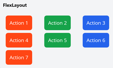
Wrapping with FlexLayout
On smaller phones, items wrap gracefully; on larger displays, they spread out comfortably, no extra layout logic required.
### 3. Grid: The backbone of real apps
When screens become more structured, especially when building multi‑section layouts, [Grid](https://learn.microsoft.com/en-us/dotnet/maui/user-interface/layouts/grid?view=net-maui-10.0)
becomes the foundation. Think of it as the structural scaffolding of a page.
We can use Grid when we need:
- Master‑detail interfaces
- Split panels (filters + data)
- Structured forms
- Multi‑column layouts
- Content that must scale from mobile to desktop.
Grid gives precise control over:
- Rows
- Columns
- Alignment inside cells
- Nested stacks for local grouping
Now, let’s look at an example of a structured, scalable layout.
XML
```
```
The output is shown below.
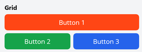
Structural Layouts with Grid
This pattern scales beautifully from phone screens to large desktop layouts while keeping content organized and readable.
### 4. ScrollView: Powerful, but strict
[ScrollView](https://learn.microsoft.com/en-us/dotnet/maui/user-interface/controls/scrollview?view=net-maui-10.0)
solves overflow issues, but it must be used with caution. Misuse often causes gesture conflicts, broken layouts, and poor performance.
Follow these rules strictly:
- One **ScrollView** per page
- Never nest **ScrollViews**
- Never put a **CollectionView** inside a ** ScrollView**
If you need long static content and a list, let the list scroll independently. Breaking these rules leads to layout bugs and conflicting gestures.
**Example**: A safe ScrollView layout.
XML
```
…
```
ScrollView layout
## Alignment and spacing: Where responsiveness really lives
Spacing is the unsung hero of clean interfaces. The fanciest layout still feels amateur if spacing is inconsistent, like furniture shoved into a room. Most layout problems are about how we treat space, not the container we choose.
### Alignment
Think of alignment as your screen’s quiet organizer. Use **HorizontalOptions** and **VerticalOptions** with **Start, Center, End,** or** Fill**, like arranging photos on a mantel.
- The default is `VerticalOptions="Start"`, which lets content flow naturally from the top, keeping things readable and predictable while allowing elements to expand when needed.
- Choose **Center** or** End** only when we want the eye to rest there on purpose, for emphasis or a deliberate visual beat.
### The big three of spacing
- **Padding**: Space inside a container. Use it for page-level breathing room and consistent outer gutters. 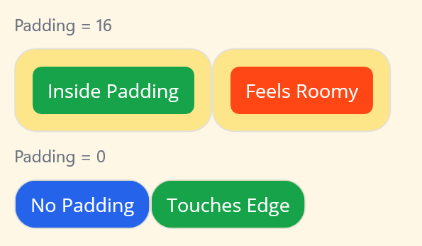
- **Spacing**: Space between children inside a layout. Use it to enforce consistent gaps between items.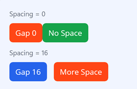
- **Margin**: Space outside a view. Reserve for intentional exceptions (single-item offsets), not routine spacing.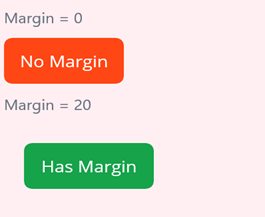
### Production rule of thumb
- **Use padding for pages:** Provide uniform internal margins at the container level rather than sprinkling offsets on children.
- **Use spacing for lists/grids:** Centralize inter-item gaps in the layout’s ** Spacing** property for consistency.
- **Avoid random margins:** Inconsistent UIs almost always come from random margins scattered everywhere. So, use margin sparingly.
Next time, when you refactor a screen, scan for random margins first. Centralize gutters with padding and spacing, and intentionally pick the vertical alignment; the layouts will feel calmer and more purposeful.
## Real-world notes with Syncfusion .NET MAUI controls
Syncfusion® [.NET MAUI controls](https://www.syncfusion.com/maui-controls)
fit naturally into the above design patterns:
- **DataGrid and ListView:** Place the controls inside the Grid cells and let the grid define available space. Avoid hardcoded sizes; options like column fill modes help the control adapt naturally.
- **Cards and grouped content:** Use **SfCardView** to create clean, scalable card layouts that respond well to different screen sizes.
- **Supporting UI around controls:** Keep filters, headers, and toolbars layout‑driven, so the main Syncfusion control remains focused on data presentation.
When paired with material light theming, the result feels modern and cohesive across form factors.
## Final reality check before you ship
Before you ship a screen, ask:
✔ Did I avoid unnecessary fixed sizes?
✔ Is spacing handled at the layout level?
✔ Does it look right, rotated and resized?
✔ Would Grid simplify anything here?
If yes, you’re building responsive MAUI, the way it’s meant to be built.
## Frequently Asked Questions
What is the fastest way to validate my layout across devices?Resize the app window on desktop, test multiple emulators and physical devices, and flip orientations. Use adaptive templates or conditional XAML/VisualStateManager to verify column spans, wrapping, and breakpoints.
Why do buttons float or have weird gaps on wider screens?It is usually caused by random margins or missing alignment. Use container padding for gutters and the layout’s spacing for inter-item gaps. Align controls with **HorizontalOptions/VerticalOptions**, and let star (*) columns or max-width containers control distribution.
My screen looked perfect on my phone, but breaks on a tablet. What did I do wrong?You probably used fixed widths or absolute positions. Prefer layout-driven sizing, star columns, and nested layouts (Grid + stacks), so controls reflow rather than stay fixed. Add adaptive states or max-width constraints for large screens instead of hard-coding sizes.
Will these layout rules still work if I’m migrating from Xamarin.Forms?Yes. The principles are the same. Migrate to **VerticalStackLayout/HorizontalStackLayout,** update bindings, and replace deprecated patterns with MAUI-specific APIs and controls.
What about performance on low-end devices when using many layouts?Flatten the visual tree where possible and replace deep nesting with a well-structured Grid. Reuse ContentViews, enable virtualization for large lists (e.g., CollectionView), and avoid unnecessary effects or animations.
## Designing responsively: Now and beyond
Thanks for reading! Responsive .NET MAUI design isn’t about mastering every layout. It’s about trusting them. Let your layout stretch instead of forcing fixed sizes, let content wrap naturally, and use hierarchy to guide structure rather than relying on pixel-perfect adjustments. When you build this way, your UI doesn’t just adapt to different devices; it feels truly at home on all of them.
And if you want to push your app even further, Syncfusion [.NET MAUI controls](https://help.syncfusion.com/maui/introduction/overview)
make responsive UI development faster, cleaner, and far more powerful. Their **datagrids, charts, cards, inputs,** and ** layout-friendly** components integrate seamlessly with these best practices, helping you ship polished, professional interfaces with less effort.
For existing Syncfusion customers, the newest version of Essential Studio is available from the [license and downloads](https://www.syncfusion.com/account/downloads)
page. If you are not a customer, try our [30-day free trial](https://www.syncfusion.com/downloads/)
to check out these new features.
For queries, you can contact us through our [support forum](https://www.syncfusion.com/forums)
, [support portal](https://support.syncfusion.com/)
, or [feedback portal](https://www.syncfusion.com/feedback)
. As always, we are happy to assist you!
## Related Blogs
[Visualizing Supply Chain Metrics in .NET MAUI with Charts and Gauges](https://www.syncfusion.com/blogs/post/build-supply-chain-dashboard-in-maui)
[Loading Dynamic Data into a .NET MAUI ComboBox with JSON and REST APIs](https://www.syncfusion.com/blogs/post/maui-combobox-json-rest-api)
[Building a Gated Multi-Step Wizard in .NET MAUI with Tab View](https://www.syncfusion.com/blogs/post/multi-step-wizard-dotnet-maui-tab-view)
[Automate Task Planning with an AI-Powered Kanban Board in .NET MAUI](https://www.syncfusion.com/blogs/post/ai-powered-kanban-dotnet-maui)