---
title: "Introducing the New Angular Mention Component"
published_at: "2022-11-08T11:00:03+00:00"
modified_at: "2026-02-10T06:29:35+00:00"
url: "https://www.syncfusion.com/blogs/post/angular-mention-component"
excerpt: "We are happy to introduce the new Angular Mention component in our 2022 Volume 3 release. It provides one of the most anticipated features for all our editor components. Let’s explore the Angular Mention component, its UI design, and its..."
taxonomy_category:
- "Angular"
- "Syncfusion"
- "UI"
- "Web"
- "What's new"
taxonomy_post_tag:
- "Angular"
- "dropdown"
- "UI"
- "Web Development"
---
# Introducing the New Angular Mention Component
[Saravanan G](https://www.syncfusion.com/blogs/author/saravanang)
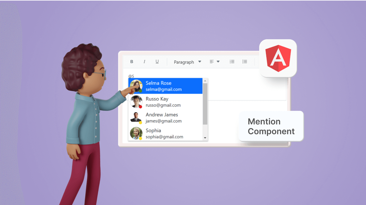
We are happy to introduce the new [Angular Mention](https://www.syncfusion.com/angular-components/angular-mention)
component in our [2022 Volume 3](https://www.syncfusion.com/forums/177858/essential-studio-2022-volume-3-main-release-v20-3-0-47-is-available-for-download)
release. It provides one of the most anticipated features for all our editor components.
Let’s explore the Angular Mention component, its UI design, and its features with code examples.
## Overview
The new Angular Mention component provides @mention and #hashtag functionality for any editor control. It lets users tag or select a user or group name from a suggestion list. It has several out-of-the-box features such as data binding, grouping, UI customization, accessibility, and more.
## Key features
The following are the key features of the Angular Mention component:
- [Data binding](#data-binding) .
- [Mention character customization](#mention-character-customization) .
- [Highlighting for matched text](#highlighting-for-matched-text) .
- [Icons paired with suggestion list items](#icons-paired-with-suggestion-list-items) .
- [Categorizable suggestion lists](#categorizable-suggestion-lists) .
- [Sortable suggestion lists](#sortable-suggestion-lists) .
- [UI customization with templates](#ui-customization-with-templates) .
- [Web accessibility and keyboard support](#web-accessibility-and-keyboard-support) .
### Data binding
The Angular Mention component supports different types of data sources, such as arrays of primitive data, JSON data collections, and remote data sources using adapters such as OData, OData V4, URLs, JSON, and web APIs.
The following code example shows how to bind a string of array data.
**[app.component.ts]**
```
import { Component } from ‘@angular/core’;
@Component({
selector: ‘app-root’,
// Specifies the template string for the Mention component.
Template: ``
})
export class AppComponent {
constructor() {
}
// Defines the array of data.
Public userData: string[] = [‘Selma Rose’, ‘Russo Kay’, ‘Camden Kate’, ‘Garth’, ‘Margaret’, ‘Robert’, ‘Albert’, ‘Michael’];
// Sets target editor or editable element.
Public commentTarget: string = ‘#commentBox’;
}
```
### Customize mention character
You can easily customize the mentioned character using the [mentionChar](https://ej2.syncfusion.com/angular/documentation/api/mention/#mentionchar)
property. Then, you can show or hide the mentioned character while tagging or selecting items by using the [showMentionChar](https://ej2.syncfusion.com/angular/documentation/api/mention/#showmentionchar)
property. You can also use multiple mention characters that correspond to different suggestion lists within a single editor.
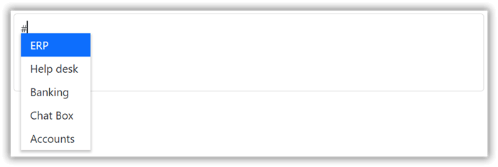
Customizing the Mention Character in the Angular Mention Component
**Note:** For more details, refer to our [multiple suggestion list example for the Angular Mention component.](https://ej2.syncfusion.com/angular/demos/#/bootstrap5/mention/multiple-list)
### Highlight the matched text
The Angular Mention component has the option to configure different visual appearances for the matching text of each suggestion through the [highlight](https://ej2.syncfusion.com/angular/documentation/api/mention/#highlight)
property.
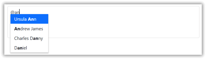
Highlighting the Matched Text in the Angular Mention Component
### Suggestion list items with icons
The Angular Mention component comes with built-in icon support for visual representations of the suggestion items. To enable this feature, configure the CSS class name through the data source and map the [fields.iconCss](https://ej2.syncfusion.com/angular/documentation/api/mention/fieldSettingsModel/#iconcss)
property for each item.
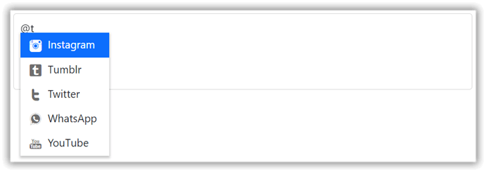
Angular Mention Component Showing the Suggestion List Items with Icons
### Categorize the suggestions list items
You can organize suggestions into groups based on different categories. The category for each list item can be mapped through the [groupBy](https://ej2.syncfusion.com/angular/documentation/api/mention/fieldSettingsModel/#groupby)
field in the data source.
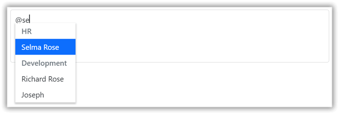
Categorizing the Suggestion List Items in the Angular Mention Component
### Sorting the suggestions list items
The Angular Mention component has built-in support to display the suggestion list items in ascending or descending order using the [sortOrder](https://ej2.syncfusion.com/angular/documentation/api/mention#sortorder)
property.
### UI customization with templates
To create custom user experiences, use the template option in the Angular Mention component. You can customize the suggestion list items, selection display text, no-record display, and data loading spinner using the template support.
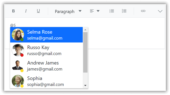
Customizing the Angular Mention Component UI with Templates
**Note:** For more details, refer to the [example for the Angular Mention component template](https://ej2.syncfusion.com/angular/demos/#/bootstrap5/mention/template)
.
### Web accessibility and keyboard support
The Angular Mention component supports keyboard interaction and web accessibility standards based on the [WAI-ARIA](https://www.w3.org/TR/wai-aria-practices/)
specifications, roles, and states. The supported keyboard shortcuts are as follows:
- **Down arrow**: After the pop-up list opens, press the Down arrow key to move to the next list item. If it is the last item, then the selection will focus on the first item in the list.
- **Up arrow**: After the pop-up list opens, press the Up arrow key to move to the previous list item. If it is the first item, then the selection will focus on the last item in the list.
- **Home/Page up:** Moves to the first item in the list after the pop-up list opens.
- **End/Page down**: Moves to the last item in the list after the pop-up list opens.
- **Esc**: Closes the pop-up list if it is in the open state.
- **Enter**: Selects the focused item, and when the pop-up list is in an open state it closes.
- **Tab**: Focuses on the next TabIndex element on the page when the pop-up list is closed. Otherwise, inserts the selected pop-up list item and close the pop-up list.
## **How to use it**
You can include the Mention component in the rich text editor, text area, text box, or other editable components. It has a huge set of resources for developers, including source code on [GitHub,](https://github.com/syncfusion/ej2-angular-ui-components/tree/master/components/dropdowns/src/mention)
[live demos](https://ej2.syncfusion.com/angular/demos/#/bootstrap5/mention/default)
, and thoroughly explained customization features in its [documentation](https://ej2.syncfusion.com/angular/documentation/mention/getting-started/)
.
## **Supported platforms**
The Mention component is also available on the following platforms.
| Platform | Live demos | Documentation |
| --- | --- | --- |
| React | React Mention demos | Getting started with React Mention |
| Vue | Vue Mention demos | Getting started with Vue Mention |
| JavaScript | JavaScript Mention demos | Getting started with JavaScript Mention |
| ASP.NET Core | ASP.NET Core Mention demos | Getting started with ASP.NET Core Mention |
| ASP.NET MVC | ASP.NET MVC Mention demos | Getting started with ASP.NET MVC Mention |
## Conclusion
Thanks for reading! In this blog, we have seen the features of the new [Angular Mention](https://www.syncfusion.com/angular-components/angular-mention)
component that rolled out in our [2022 Volume 3](https://www.syncfusion.com/forums/177858/essential-studio-2022-volume-3-main-release-v20-3-0-47-is-available-for-download)
release. These features are also listed on our [Release Notes](https://help.syncfusion.com/common/essential-studio/release-notes/v20.3.0.47)
and the [What’s New](https://www.syncfusion.com/products/whatsnew)
pages. Try out the component and share your feedback as comments on this blog.
You can also reach us through our [support forums](https://www.syncfusion.com/forums)
, [support portal](https://support.syncfusion.com/)
, or [feedback portal](https://www.syncfusion.com/feedback/)
. We are always happy to assist you!
## **Related blogs**
- [Top 7 Features of Angular 14](https://www.syncfusion.com/blogs/post/top-7-features-of-angular-14.aspx)
- [What’s New in 2022 Volume 3: Essential JS 2](https://www.syncfusion.com/blogs/post/whats-new-in-2022-volume-3-essential-js-2.aspx)
- [Syncfusion Essential Studio®2022 Volume 3 Is Here!](https://www.syncfusion.com/blogs/post/syncfusion-essential-studio-2022-volume-3-is-here.aspx)
- [Introducing Skeleton Loading Indicator in Syncfusion Essential JS 2 DataGrid](https://www.syncfusion.com/blogs/post/skeleton-loading-indicator-in-essential-js-2-datagrid.aspx)