Trend analysis is used to predict future outcomes based on recorded data. Charts play a vital role in analyzing trends over time. Their graphical representations make complex facts easier to understand quickly. However, you must choose the appropriate chart type to convey your data story accurately and effectively.
In this blog, we explore various Syncfusion Angular Charts to find the best chart types to identify trends in your time-series data.
Line chart
A line graph reveals trends over time and can display a wide range of data. We can use a line chart when plotting a continuous data set. It is the most common chart type used to show trends with large amounts of data.
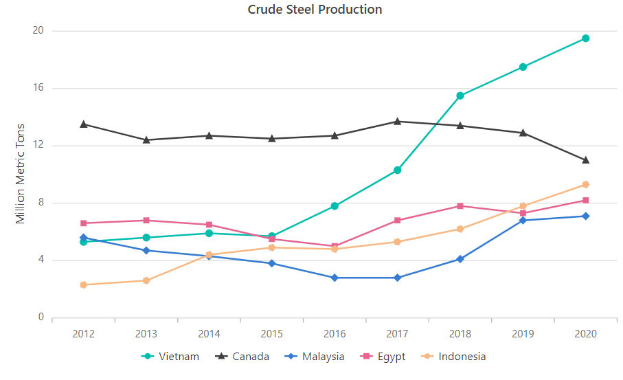
In the following example, I use line series to show the trend of crude steel production for different countries. In this case, the x-axis shows the time value, and the y-axis shows the amount of crude steel produced. In the first year, most of the production was less than 8 million metric tons, but over time production trended higher, with most countries producing above 8 million metric tons annually.
Refer to the following code example.
app.component.html
<ejs-chart id='chartcontainer' [title]='title' >
    <e-series-collection>
      <e-series [dataSource]='data' type='Line' xName='Period' yName='Viet_Growth' name='Vietnam' width=2 opacity=1> </e-series>
      <e-series [dataSource]='data' type='Line' xName='Period' yName='Can_Growth' name='Canada' width=2 opacity=1> </e-series>
      <e-series [dataSource]='data' type='Line' xName='Period' yName='Mal_Growth' name='Malaysia' width=2 opacity=1> </e-series>
      <e-series [dataSource]='data' type='Line' xName='Period' yName='Egy_Growth' name='Egypt' width=2 opacity=1> </e-series>
      <e-series [dataSource]='data' type='Line' xName='Period' yName='Ind_Growth' name='Indonesia' width=2 opacity=1> </e-series>
    </e-series-collection>
</ejs-chart>
app.component.ts
export class AppComponent {
    public data: Object[] = [
        { Period : 2012, Can_Growth : 13.5, Viet_Growth : 5.3, Mal_Growth : 5.6, Egy_Growth : 6.6, Ind_Growth : 2.3 },
        { Period : 2013, Can_Growth : 12.4, Viet_Growth : 5.6, Mal_Growth : 4.7, Egy_Growth : 6.8, Ind_Growth : 2.6 },
        { Period : 2014, Can_Growth : 12.7, Viet_Growth : 5.9, Mal_Growth : 4.3, Egy_Growth : 6.5, Ind_Growth : 4.4 },
        { Period : 2015, Can_Growth : 12.5, Viet_Growth : 5.7, Mal_Growth : 3.8, Egy_Growth : 5.5, Ind_Growth : 4.9 },
        { Period : 2016, Can_Growth : 12.7, Viet_Growth : 7.8, Mal_Growth : 2.8, Egy_Growth : 5.0, Ind_Growth : 4.8 },
        { Period : 2017, Can_Growth : 13.7, Viet_Growth : 10.3, Mal_Growth : 2.8, Egy_Growth : 6.8, Ind_Growth : 5.3 },
        { Period : 2018, Can_Growth : 13.4, Viet_Growth : 15.5, Mal_Growth : 4.1, Egy_Growth : 7.8, Ind_Growth : 6.2  },
        { Period : 2019, Can_Growth : 12.9, Viet_Growth : 17.5, Mal_Growth : 6.8, Egy_Growth : 7.3, Ind_Growth : 7.8 },
        { Period : 2020, Can_Growth : 11.0, Viet_Growth : 19.5, Mal_Growth : 7.1, Egy_Growth : 8.2, Ind_Growth : 9.3 }
    ];
    public title: string = 'Crude Steel Production';
}
Line chart resources
Column chart
Column charts plot data in several vertical bars that are useful for showing trends over time. Each bar’s length reflects the variable’s value. Column charts are helpful when the data set is small.
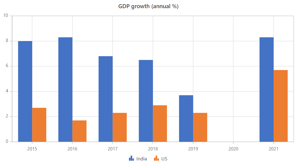
In this example, the column chart depicts two countries’ GDP annual growth rates from 2015 to 2021. US GDP trended downward until a massive increase in 2021, and India’s GDP contracted and expanded slightly over the years until a surge in 2021 similar to the US’s.
Refer to the following code example.
app.component.html
<ejs-chart [title]='title'>
    <e-series-collection>
        <e-series [dataSource]='data' type='Column' xName='Period' yName='Ind_Growth' name='India'> </e-series>
        <e-series [dataSource]='data' type='Column' xName='Period' yName='US_Growth' name='US'> </e-series>
    </e-series-collection>
</ejs-chart>
app.component.ts
export class AppComponent {
    public data: Object[] = [
        { Period : 2015, Ind_Growth : 8, US_Growth : 2.7, },
        { Period : 2016, Ind_Growth : 8.3, US_Growth : 1.7, },
        { Period : 2017, Ind_Growth : 6.8, US_Growth : 2.3, },
        { Period : 2018, Ind_Growth : 6.5, US_Growth : 2.9,  },
        { Period : 2019, Ind_Growth : 3.7, US_Growth : 2.3, },
        { Period : 2021, Ind_Growth : 8.3, US_Growth : 5.7, }
    ];

    public title: string = 'GDP growth (annual %)';
}
Column chart resources
Bubble chart
Data with three dimensions can be represented using bubble charts. Three inputs are required: an x-value, a y-value, and the bubble’s size value. These charts can be used when you need to give users more information along with the data trend.
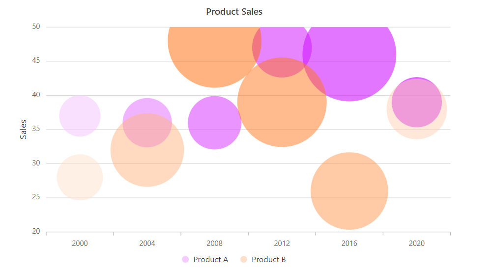
In this illustration, the number of sales of two products from 2000 to 2020 is plotted together with the revenue those sales generated. In 2012, Product A outsold Product B, but Product B generated much more revenue, as indicated by its bubble size.
Refer to the following code example.
app.component.html
<ejs-chart [title]='title'>
    <e-series-collection>
        <e-series [dataSource]='data' pointColorMapping="color" type='Bubble' size="TotalRevenue" xName='Period' yName='Sale' name='Product A'> </e-series>
        <e-series [dataSource]='data2' pointColorMapping="color" type='Bubble' size="TotalRevenue" xName='Period' yName='Sale' name='Product B'> </e-series>
    </e-series-collection>
</ejs-chart>
app.component.ts
export class AppComponent {
    public data: Object[] = [
        { Period : 2000, TotalRevenue: 23, color: '#f5ccff', Sale : 37, },
        { Period : 2004, TotalRevenue: 101, color: '#e580ff', Sale : 36, },
        { Period : 2008, TotalRevenue: 142, color: '#db4dff', Sale : 36, },
        { Period : 2012, TotalRevenue: 204, color: '#d633ff', Sale : 47,  },
        { Period : 2016, TotalRevenue: 541, color: '#d11aff', Sale : 46, },
        { Period : 2020, TotalRevenue: 110, color: '#cc00ff', Sale : 39, }
    ];
    public data2: Object[] = [
        { Period : 2000, TotalRevenue: 13, color: '#ffe0cc', Sale : 28, },
        { Period : 2004, TotalRevenue: 63, color: '#ffb380', Sale : 32, },
        { Period : 2008, TotalRevenue: 100, color: '#ff6600', Sale : 48, },
        { Period : 2012, TotalRevenue: 92, color: '#ff751a', Sale : 39,  },
        { Period : 2016, TotalRevenue: 70, color: '#ff944d', Sale : 26, },
        { Period : 2020, TotalRevenue: 39, color: '#ffd1b3', Sale : 38, }
    ];

    public title: string = 'Product Sales';
}
Bubble chart resources
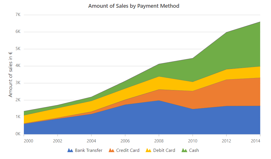
Stacked area chart
A stacked area chart assists you in detecting and comparing trends across various factors. A single chart can show how several series’ values have changed over time. You can use a stacked area chart when you want to track not only a total value, but also how that total value is broken down by contributors to it.
In the following example, I’ve illustrated the amount of revenue generated by various payment methods over the year. Each payment type—cash, credit card, debit card, and bank transfer—is plotted on top of one another to compose the total.
Refer to the following code example.
App.component.html
<ejs-chart >
    <e-series-collection>
        <e-series [dataSource]=’data’ type=’StackingArea’ xName=’Period’ yName=’OrganicSales’ name=’Bank Transfer’ [border]=’border’> </e-series>
        <e-series [dataSource]=’data’ type=’StackingArea’ xName=’Period’ yName=’FairTradeSales’ name=’Credit Card’ [border]=’border’> </e-series>
        <e-series [dataSource]=’data’ type=’StackingArea’ xName=’Period’ yName=’VegAlternativesSales’ name=’Debit Card’ [border]=’border’> </e-series>
        <e-series [dataSource]=’data’ type=’StackingArea’ xName=’Period’ yName=’OtherSales’ name=’Cash’ [border]=’border’> </e-series>
    </e-series-collection>
</ejs-chart>
app.component.ts
export class AppComponent {public chartArea: Object = {
    border: {
        width: 0
    }
};
public width: string = ‘75%’;
public data: Object[] = [
    { Period : new Date(2000, 1, 1), OrganicSales : 0.61, FairTradeSales : 0.03, VegAlternativesSales : 0.48, OtherSales : 0.23 },
    { Period : new Date(2002, 1, 1), OrganicSales : 0.91, FairTradeSales : 0.06, VegAlternativesSales : 0.57, OtherSales : 0.17 },
    { Period : new Date(2004, 1, 1), OrganicSales : 1.19, FairTradeSales : 0.14, VegAlternativesSales : 0.63, OtherSales : 0.23 },
    { Period : new Date(2006, 1, 1), OrganicSales : 1.74, FairTradeSales : 0.29, VegAlternativesSales : 0.66, OtherSales : 0.43 },
    { Period : new Date(2008, 1, 1), OrganicSales : 1.99, FairTradeSales : 0.64, VegAlternativesSales : 0.77, OtherSales : 0.72 },
    { Period : new Date(2010, 1, 1), OrganicSales : 1.48, FairTradeSales : 1.06, VegAlternativesSales : 0.54, OtherSales : 1.38 },
    { Period : new Date(2012, 1, 1), OrganicSales : 1.66, FairTradeSales : 1.55, VegAlternativesSales : 0.61, OtherSales : 2.16 },
    { Period : new Date(2014, 1, 1), OrganicSales : 1.67, FairTradeSales : 1.65, VegAlternativesSales : 0.67, OtherSales : 2.61 }
];

public title: string = ‘Amount of Sales by Payment Method’;
}
Stacked area chart resources

Conclusion
In this blog, we’ve discussed four different Angular charts that are perfect for showing trends over time. Try out Syncfusion Angular Charts and let us know what you think in the comments section below. If you’re not an Angular developer, please check out our Charts component for other platforms, including:
Browse our documentation to learn more about our other Angular widgets.
You can also contact us through our support forums, support portal, or feedback portal. We are always happy to assist you!