---
title: "Advantages of Using Syncfusion WinUI Controls over Framework Controls: Part 2"
published_at: "2022-12-08T11:55:38+00:00"
modified_at: "2026-01-09T08:55:01+00:00"
url: "https://www.syncfusion.com/blogs/post/advantages-of-using-syncfusion-winui-controls-over-framework-controls-part-2"
excerpt: "This is the continuation of the Advantages of Using Syncfusion WinUI Controls over Framework Controls: Part 1 blog. In this blog, we will look at the features and differences of Syncfusion’s Calendar, Calendar Date Picker, Date Picker, and Time Picker..."
taxonomy_category:
- "Desktop"
- "Syncfusion"
- "UI"
- "WinUI"
taxonomy_post_tag:
- "desktop"
- "Syncfusion"
- "UI"
- "WinUI"
---
# Advantages of Using Syncfusion WinUI Controls over Framework Controls: Part 2
[Jeyasri Murugan](https://www.syncfusion.com/blogs/author/jeyasrim)
This is the continuation of the [Advantages of Using Syncfusion WinUI Controls over Framework Controls: Part 1](https://www.syncfusion.com/blogs/post/advantages-of-using-syncfusion-winui-controls-over-framework-controls-part-1.aspx)
blog. In this blog, we will look at the features and differences of Syncfusion’s [Calendar](https://www.syncfusion.com/winui-controls/calendar)
, [Calendar Date Picker](https://www.syncfusion.com/winui-controls/calendar-date-picker)
, [Date Picker](https://www.syncfusion.com/winui-controls/date-picker)
, and [Time Picker](https://www.syncfusion.com/winui-controls/time-picker)
controls over the WinUI framework’s native [CalendarView](https://docs.microsoft.com/en-us/uwp/api/windows.ui.xaml.controls.calendarview?view=winrt-22621)
, [CalendarDatePicker](https://docs.microsoft.com/en-us/uwp/api/windows.ui.xaml.controls.calendardatepicker?view=winrt-22621)
, [DatePicker](https://docs.microsoft.com/en-us/uwp/api/windows.ui.xaml.controls.datepicker?view=winrt-22621)
, and [TimePicker](https://docs.microsoft.com/en-us/uwp/api/windows.ui.xaml.controls.timepicker?view=winrt-22621)
control.
## Calendar
The Calendar control is used to view dates and makes it simple for users to choose a single date, multiple dates, or a range of dates. Let’s see the differences between Syncfusion’s [Calendar](https://www.syncfusion.com/winui-controls/calendar)
and the WinUI framework’s native [CalendarView](https://docs.microsoft.com/en-us/uwp/api/windows.ui.xaml.controls.calendarview?view=winrt-22621)
controls.
### Built-in calendar views
Syncfusion’s WinUI Calendar provides month, year, decade, and century views to quickly navigate to the desired date, but the WinUI framework CalendarView only has month, year, and decade views.
Refer to the following code example to display the century view.
```
xmlns:calendar="using:Syncfusion.UI.Xaml.Calendar"
```
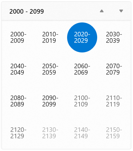
Century View in Calendar
### Selection mode
Syncfusion’s Calendar supports [single](https://help.syncfusion.com/winui/calendar/selection#single-selection)
, [multiple](https://help.syncfusion.com/winui/calendar/selection#multiple-selection)
, and [date range](https://help.syncfusion.com/winui/calendar/selection#select-a-date-range)
selection modes whereas the WinUI native **CalenderView** only supports single and multiple selection modes.
In addition, Syncfusion’s Calendar has support to change the [selection highlight mode](https://help.syncfusion.com/winui/calendar/selection#highlight-today-and-selected-date)
and [selection shape](https://help.syncfusion.com/winui/calendar/selection#change-shape-of-today-and-selected-date)
, but the WinUI framework does not support these customizations.
Refer to the following code example of a date range selection.
```
xmlns:calendar="using:Syncfusion.UI.Xaml.Calendar"
```
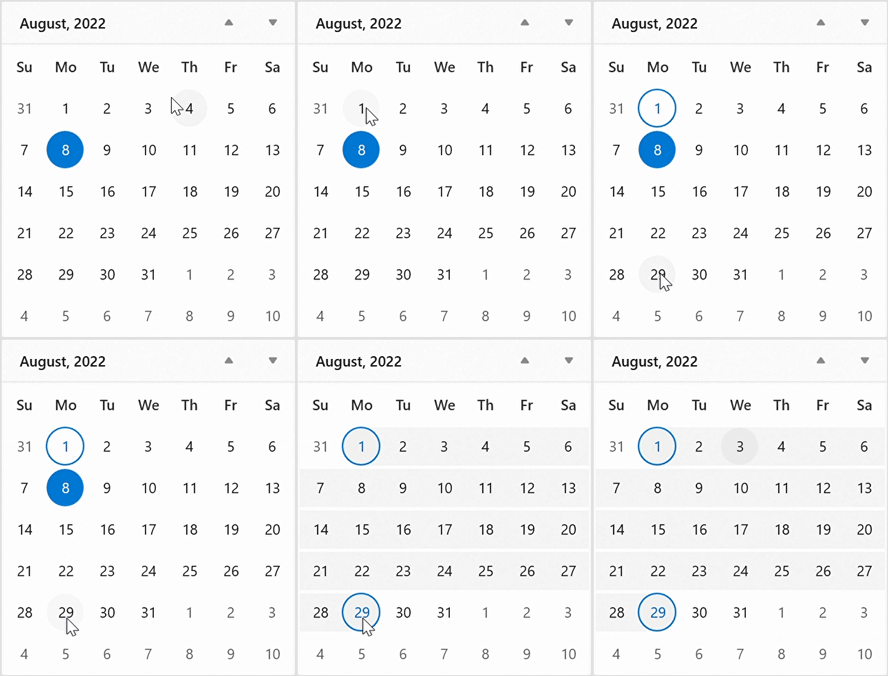
Date Range Selection in Calendar
### Navigation
Syncfusion’s WinUI Calendar supports restricting [view navigation](https://help.syncfusion.com/winui/calendar/getting-started#navigation-between-views)
by using the [MinDisplayMode](https://help.syncfusion.com/cr/winui/Syncfusion.UI.Xaml.Calendar.SfCalendar.html?tabs=tabid-1#Syncfusion_UI_Xaml_Calendar_SfCalendar_MinDisplayMode)
and [MaxDisplayMode](https://help.syncfusion.com/cr/winui/Syncfusion.UI.Xaml.Calendar.SfCalendar.html?tabs=tabid-1#Syncfusion_UI_Xaml_Calendar_SfCalendar_MaxDisplayMode)
properties, and it also supports changing the [navigation direction](https://help.syncfusion.com/winui/calendar/navigation#scrolling-within-a-view)
to be either horizontal or vertical. On the other hand, the WinUI framework CalendarView does not have these view navigation restriction and direction features.
Refer to the following code example of view navigation restriction.
```
xmlns:calendar="using:Syncfusion.UI.Xaml.Calendar"
```
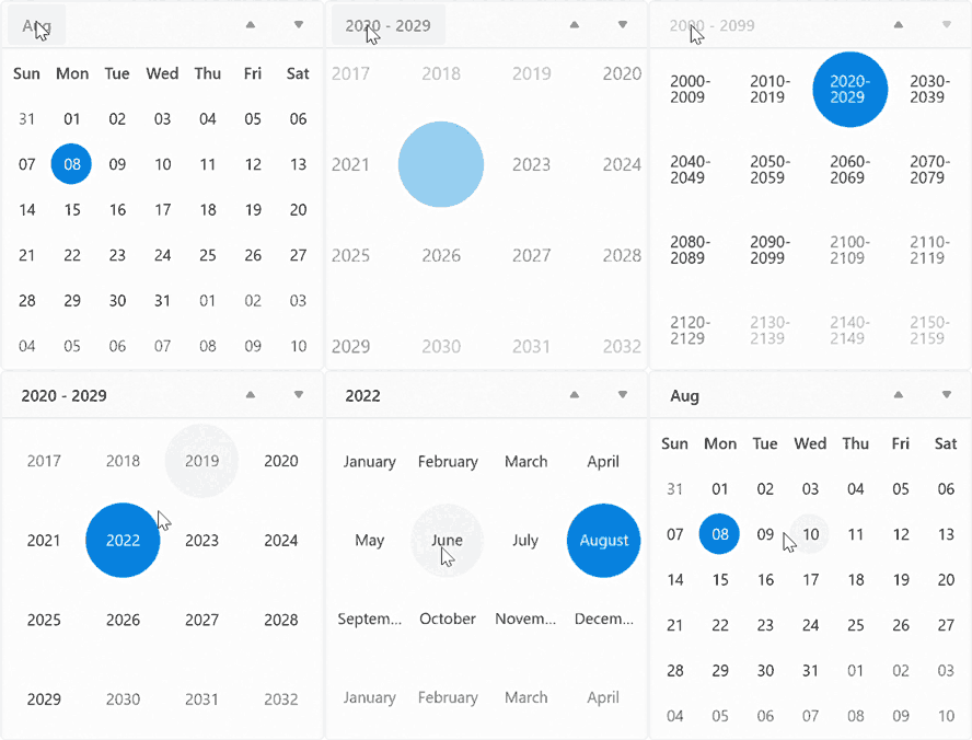
Minimum and Maximum Display Dates in Calendar
### Calendar date formats
Syncfusion’s Calendar supports setting different [date formats](https://help.syncfusion.com/winui/calendar/localization-and-formatting#change-date-display-format)
, such as abbreviated or full names for a day, month, or week, as well as for the header of a month or year. The WinUI framework’s Calendar supports only a **DayOfWeekFormat** property to customize dates.
Refer to the following code example of date formatting.
```
xmlns:calendar="using:Syncfusion.UI.Xaml.Calendar"
```
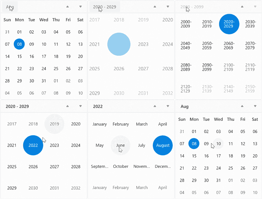
Date Format Customization in Calendar
### Show week number
Syncfusion’s Calendar supports displaying [week numbers](https://help.syncfusion.com/winui/calendar/week-numbers)
in the month view and customizing the week number [rule](https://help.syncfusion.com/winui/calendar/week-numbers#week-rule)
and [format](https://help.syncfusion.com/winui/calendar/week-numbers#format-week-numbers)
. The WinUI framework does not have week number rule format customization support.
Refer to the following code example to show week numbers in the month view.
```
xmlns:calendar="using:Syncfusion.UI.Xaml.Calendar"
```
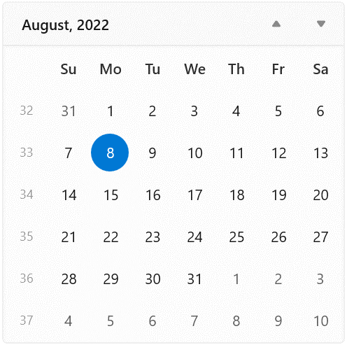
Week Number Rule Format Customization in Calendar
## Calendar Date Picker
The Syncfusion [Calendar Date Picker](https://www.syncfusion.com/winui-controls/calendar-date-picker)
allows users to pick a date from a calendar display. Let’s see the differences between Syncfusion’s and the [WinUI framework’s](https://learn.microsoft.com/en-us/uwp/api/windows.ui.xaml.controls.calendardatepicker?view=winrt-22621)
controls.
### Built-in calendar views
Syncfusion’s WinUI Calendar Date Picker provides month, year, decade, and century views to quickly navigate to the desired date, but the WinUI native control only has month, year, and decade views.
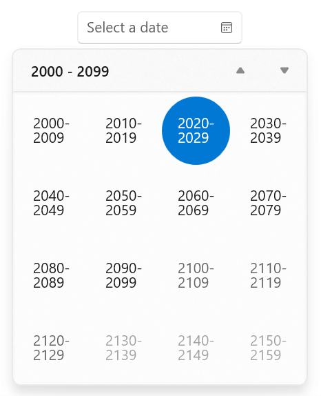
Century View in Calendar Date Range Picker
Refer to the following code example to display the century view.
```
xmlns:calendar="using:Syncfusion.UI.Xaml.Calendar"
```
### Selection highlight mode
Syncfusion’s Calendar Date Picker supports changing the selection [highlight mode](https://help.syncfusion.com/winui/calendar-date-picker/date-selection-and-restriction#highlight-today-and-selected-dates)
and [shape](https://help.syncfusion.com/winui/calendar-date-picker/date-selection-and-restriction#change-shape-of-today-and-selected-date)
, but the WinUI framework does not.
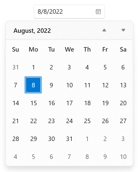
Selection Highlight Mode in Calendar Date Range Picker
Refer to the following code example to customize the selection highlight mode.
```
xmlns:calendar="using:Syncfusion.UI.Xaml.Calendar"
```
### Restrict date selection
Syncfusion’s WinUI Calendar Date Picker supports restricting date selection by adding [blackout dates](https://help.syncfusion.com/winui/calendar-date-picker/date-selection-and-restriction#block-dates-using-blackoutdates)
for the month view, but the WinUI framework does not have this support.
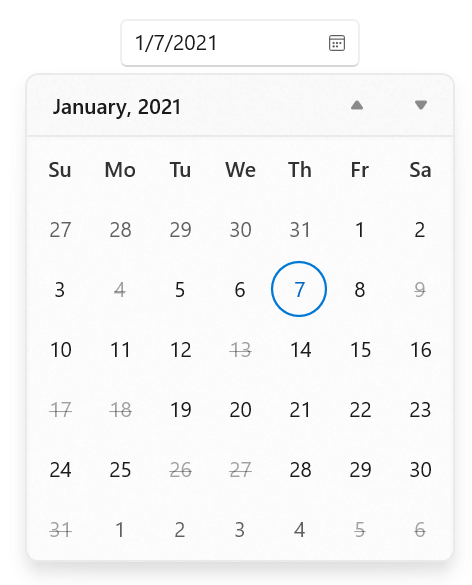
Restricted Date Selection in Syncfusion Calendar Date Range Picker
### Navigation
Syncfusion’s Calendar Date Picker supports restricting [view navigation](https://help.syncfusion.com/winui/calendar-date-picker/navigation#navigate-between-views)
by using the [MinDisplayMode](https://help.syncfusion.com/cr/winui/Syncfusion.UI.Xaml.Calendar.SfCalendarDatePicker.html?tabs=tabid-1#Syncfusion_UI_Xaml_Calendar_SfCalendarDatePicker_MinDisplayMode)
and [MaxDisplayMode](https://help.syncfusion.com/cr/winui/Syncfusion.UI.Xaml.Calendar.SfCalendarDatePicker.html?tabs=tabid-1#Syncfusion_UI_Xaml_Calendar_SfCalendarDatePicker_MaxDisplayMode)
properties, but the WinUI framework control does not have this support.
Refer to the following code example to restrict the view navigation.
```
xmlns:calendar="using:Syncfusion.UI.Xaml.Calendar"
```
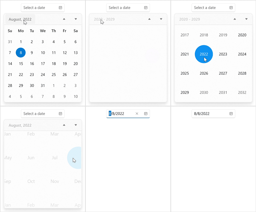
Restricted View Navigation
### Show week number
Syncfusion’s Calendar Date Picker supports displaying [week numbers](https://help.syncfusion.com/winui/calendar-date-picker/week-numbers)
in the month view and changing the week number [rule](https://help.syncfusion.com/winui/calendar-date-picker/week-numbers#week-rule)
with [format](https://help.syncfusion.com/winui/calendar-date-picker/week-numbers#format-week-numbers)
customization, but the WinUI framework does not support similar customization.
Refer to the following code example to show the week number in the month view.
```
xmlns:calendar="using:Syncfusion.UI.Xaml.Calendar"
```
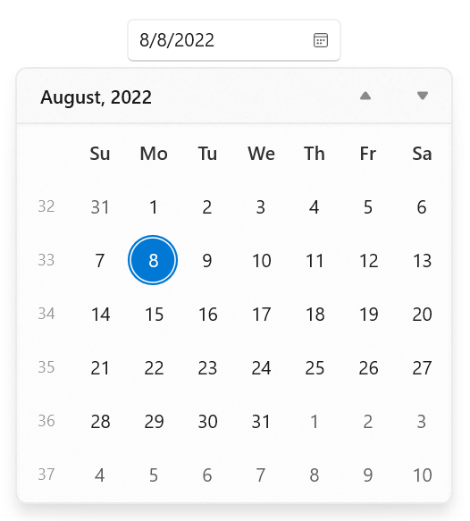
Show Week Number in Calendar Date Picker
### Number of weeks in view
Syncfusion’s Calendar Date Picker supports changing the [number of weeks](https://help.syncfusion.com/winui/calendar-date-picker/localization-and-formatting#number-of-weeks-in-a-view)
displayed in the month view, but the WinUI framework does not have this support.
Refer to the following code example to change the number of weeks in the month view.
```
Xmlns:calendar=”using:Syncfusion.UI.Xaml.Calendar”
```
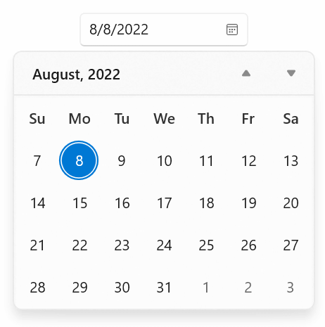
Calendar Date Picker with Custom Number of Weeks
### Calendar date formats
Syncfusion’s Calendar Date Picker supports setting different date [formats](https://help.syncfusion.com/winui/calendar-date-picker/localization-and-formatting#change-calendar-display-format)
, such as abbreviated or full names for a day, month, or week, and header names for a month and year. The WinUI framework’s Calendar supports only a **DayOfWeekFormat** property to customize dates.
Refer to the following code example of date formatting.
```
xmlns:calendar="using:Syncfusion.UI.Xaml.Calendar"
```
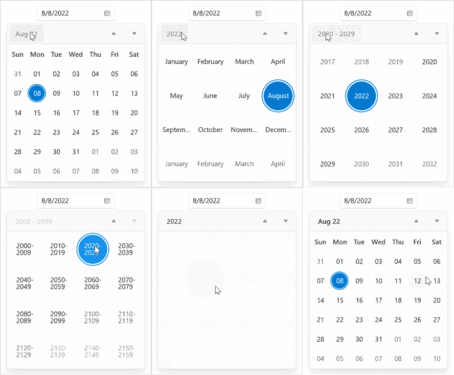
Calendar Date Format Customization in Calendar Date Picker
### Customize the editor view
Syncfusion’s Calendar Date Picker supports showing or hiding a [clear button](https://help.syncfusion.com/winui/calendar-date-picker/calendar-ui-customization#hide-clear-button-in-textbox)
in the editor view and also supports customizing the[dropdown alignment](https://help.syncfusion.com/winui/calendar-date-picker/calendar-ui-customization#change-drop-down-alignment)
and [height](https://help.syncfusion.com/winui/calendar-date-picker/calendar-ui-customization#change-drop-down-size)
.
Refer to the following code example to change the dropdown height.
```
xmlns:calendar="using:Syncfusion.UI.Xaml.Calendar"
```
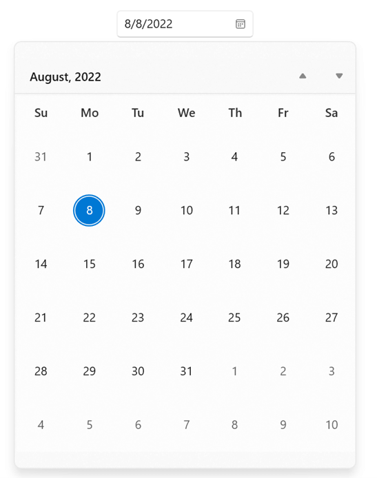
Customize Editor View in Calendar Date Picker
## Date Picker
The date picker allows the user to pick the date from the spinner. Let’s see the differences between Syncfusion’s [Date Picker](https://www.syncfusion.com/winui-controls/date-picker)
and the WinUI framework’s native [DatePicker](https://docs.microsoft.com/en-us/uwp/api/windows.ui.xaml.controls.datepicker?view=winrt-22621)
controls.
### Edit mode
Syncfusion’s Date Picker supports [mask](https://help.syncfusion.com/winui/date-picker/localization-and-formatting#edit-date-using-mask-mode)
and normal edit modes, but the WinUI framework does not have mask edit mode support.
Refer to the following code example to enable the mask edit mode.
```
xmlns:editors="using:Syncfusion.UI.Xaml.Editors"
```

Mask Edit Mode in Date Picker
### Restrict date selection
Syncfusion’s Date Picker supports restricting the date selection by adding [blackout dates](https://help.syncfusion.com/winui/date-picker/date-restriction#disable-dates-using-blackoutdates)
, but the WinUI native control does not support this.
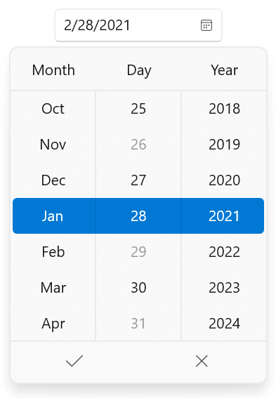
Blackout Dates in Date Picker
Refer to the following code example to add blackout dates.
```
xmlns:editors="using:Syncfusion.UI.Xaml.Editors"
```
```
public class ViewModel
{
public DateTimeOffsetCollection BlockedDates { get; set; }
public ViewModel()
{
BlockedDates = new DateTimeOffsetCollection();
BlockedDates.Add(new DateTimeOffset(new DateTime(2018, 1, 28)));
BlockedDates.Add(new DateTimeOffset(new DateTime(2021, 1, 26)));
BlockedDates.Add(new DateTimeOffset(new DateTime(2021, 1, 29)));
BlockedDates.Add(new DateTimeOffset(new DateTime(2021, 1, 31)));
BlockedDates.Add(new DateTimeOffset(new DateTime(2023, 1, 28)));
BlockedDates.Add(new DateTimeOffset(new DateTime(2024, 1, 28)));
}
}
```
### Navigation
Syncfusion’s Date Picker supports [minimum and maximum date range](https://help.syncfusion.com/winui/date-picker/date-restriction#limit-the-available-dates)
restrictions, but the native WinUI control does not have this support.
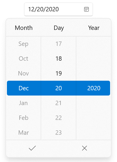
Restricted Navigation in Date Picker
### Change the number of dates to be shown
Syncfusion’s Date Picker supports customizing the [number of dates](https://help.syncfusion.com/winui/date-picker/dropdown-customization#change-the-number-of-dates-to-be-shown-in-the-dropdown)
to be displayed in the spinner, but the WinUI framework does not have this support.
Refer to the following code example to change the number of dates displayed.
```
xmlns:editors="using:Syncfusion.UI.Xaml.Editors"
```
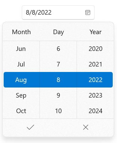
Change the Number of Dates Displayed in the Date Picker
### Dropdown customization
Syncfusion’s Date Picker supports showing or hiding the [dropdown button](https://help.syncfusion.com/winui/date-picker/dropdown-customization#hide-dropdown-button)
in the editor view and also supports customizing the drop-down [alignment](https://help.syncfusion.com/winui/date-picker/dropdown-customization#change-dropdown-alignment)
and [height](https://help.syncfusion.com/winui/date-picker/dropdown-customization#change-dropdown-height)
. But the WinUI framework’s date picker doesn’t have this support.
Refer to the following code example to change the dropdown height.
```
xmlns:editors="using:Syncfusion.UI.Xaml.Editors"
```
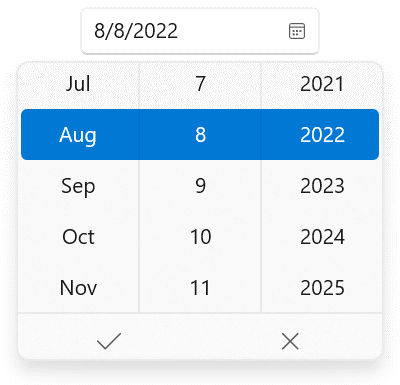
Customized Dropdown in Date Picker
## Time Picker
The Time Picker allows users to pick a time from a spinner. Let’s see the differences between Syncfusion’s [Time Picker](https://www.syncfusion.com/winui-controls/time-picker)
and the WinUI framework’s [TimePicker](https://docs.microsoft.com/en-us/uwp/api/windows.ui.xaml.controls.timepicker?view=winrt-22621)
control.
### Edit mode
Syncfusion’s Time Picker supports [mask](https://help.syncfusion.com/winui/time-picker/localization-and-formatting#edit-time-using-mask-mode)
and normal edit modes, but the WinUI framework does not have mask edit support.
Refer to the following code example to enable the mask edit mode.
```
xmlns:editors="using:Syncfusion.UI.Xaml.Editors"
```

Mask Edit Mode in Time Picker
### Restrict time selection
Syncfusion’s Time Picker supports restricting the time selection by adding [blackout times](https://help.syncfusion.com/winui/time-picker/time-restriction#disable-times-using-blackouttimes)
, but the WinUI framework does not have this support.
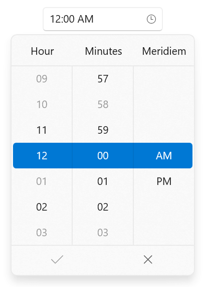
Restricted Time Selection in Time Picker
Refer to the following code example to add blackout times.
```
```
```
public class ViewModel
{
public DateTimeOffset? SelectedTime { get; set; }
public DateTimeOffsetCollection BlackoutTimes { get; set; }
public ViewModel()
{
SelectedTime = DateTimeOffset.Now.Date;
BlackoutTimes = new DateTimeOffsetCollection();
BlackoutTimes.Add(new DateTimeOffset(DateTimeOffset.Now.Year, DateTimeOffset.Now.Month, DateTimeOffset.Now.Day, 0, 3, 0, DateTimeOffset.Now.Offset));
BlackoutTimes.Add(new DateTimeOffset(DateTimeOffset.Now.Year, DateTimeOffset.Now.Month, DateTimeOffset.Now.Day, 0, 58, 0, DateTimeOffset.Now.Offset));
BlackoutTimes.Add(new DateTimeOffset(DateTimeOffset.Now.Year, DateTimeOffset.Now.Month, DateTimeOffset.Now.Day, 1, 0, 0, DateTimeOffset.Now.Offset));
BlackoutTimes.Add(new DateTimeOffset(DateTimeOffset.Now.Year, DateTimeOffset.Now.Month, DateTimeOffset.Now.Day, 3, 0, 0, DateTimeOffset.Now.Offset));
BlackoutTimes.Add(new DateTimeOffset(DateTimeOffset.Now.Year, DateTimeOffset.Now.Month, DateTimeOffset.Now.Day, 9, 0, 0, DateTimeOffset.Now.Offset));
BlackoutTimes.Add(new DateTimeOffset(DateTimeOffset.Now.Year, DateTimeOffset.Now.Month, DateTimeOffset.Now.Day, 10, 0, 0, DateTimeOffset.Now.Offset));
}
}
```
### Navigation
Syncfusion’s Time Picker supports [minimum and maximum time range](https://help.syncfusion.com/winui/time-picker/time-restriction#limit-the-available-times)
restrictions, but the native WinUI control does not have this support.
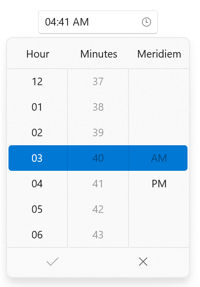
Minimum and Maximum Time Range in Time Picker
### Change the number of time cells shown in the dropdown
Syncfusion’s Time Picker supports displaying a specific [number of time cells](https://help.syncfusion.com/winui/time-picker/dropdown-customization#change-the-number-of-time-cells-to-be-shown-in-the-dropdown)
in the spinner, but the WinUI framework control does not support this.
Refer to the following code example to change the number of time cells displayed.
```
xmlns:editors="using:Syncfusion.UI.Xaml.Editors"
```
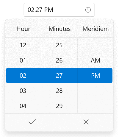
Change the Number of Time Cells in the Time Picker
### Dropdown customization
Syncfusion’s Time Picker supports showing and hiding the [dropdown button](https://help.syncfusion.com/winui/time-picker/dropdown-customization#hide-dropdown-button)
in the editor view and also supports customizing the dropdown [alignment](https://help.syncfusion.com/winui/time-picker/dropdown-customization#change-dropdown-alignment)
and [height](https://help.syncfusion.com/winui/time-picker/dropdown-customization#change-dropdown-height)
. The WinUI framework’s time picker doesn’t have this support.
Refer to the following code example to change the dropdown height.
```
xmlns:editors="using:Syncfusion.UI.Xaml.Editors"
```
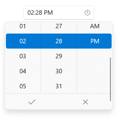
Dropdown Customization in Time Picker
## Conclusion
Thanks for reading! We saw the differences between Syncfusion’s WinUI Calendar, Calendar Date Picker, Date Picker, and Time Picker controls and their WinUI framework counterparts. To see more of our WinUI controls’ features, you can download and check out [our demo app in the Windows Store](https://www.microsoft.com/en-us/p/syncfusion-winui-controls-gallery/9n0fp16ddc06)
.
For current Syncfusion customers, the newest version of Essential Studio®is available from the [license and downloads page](https://www.syncfusion.com/account/downloads)
. If you are not yet a customer, you can try our 30-day [free trial](https://www.syncfusion.com/downloads)
to check out these new features.
If you have questions, contact us through our [support forums](https://www.syncfusion.com/forums)
, [feedback portal](https://www.syncfusion.com/feedback)
, or [support portal](https://support.syncfusion.com)
. We are always happy to assist you!
## Related blogs
If you liked this blog, we think you’ll enjoy the following articles as well:
- [Design a Car Dashboard Like a Pro Using the WinUI Radial Gauge](https://www.syncfusion.com/blogs/post/design-a-car-dashboard-like-a-pro-using-the-winui-radial-gauge.aspx)
- [Design an Airfare Calendar to Display the Lowest Fares Using the WinUI Scheduler](https://www.syncfusion.com/blogs/post/design-an-airfare-calendar-to-display-the-lowest-fares-using-the-winui-scheduler.aspx)
- [Introducing the New WinUI Shadow Control](https://www.syncfusion.com/blogs/post/introducing-the-new-winui-shadow-control.aspx)