This post is part of our ongoing How-to series about using the Syncfusion Dashboard Platform. In this entry, we will demonstrate how to connect to a data source and transform that data for creating a dashboard. To watch a full video on this topic, visit our YouTube page.
In a new, empty Dashboard Designer interface, click either the Add (+) button at the bottom of the Data Sources pane, or click the Add button in the Start with configuring a data source pop-up. These two buttons are highlighted in the following figure.
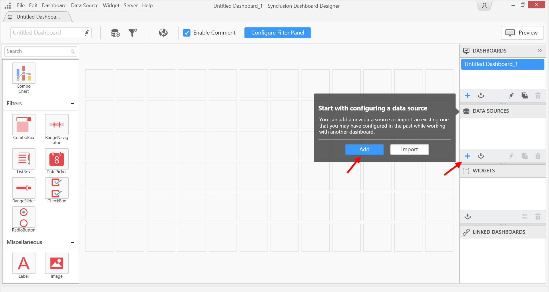
Blank Dashboard Designer interface
In the New Connection dialog that appears, let’s select a connection type from the Connection type drop-down. The available types range from Excel worksheets to on-premise and cloud databases. For a complete list of the available connection types, visit our documentation. For this example, we will select Microsoft SQL Server, which we already have installed on our machine. We then provide our Server name, our Authentication type, and the Database. Finally, we click the Connect button to initiate the connection.
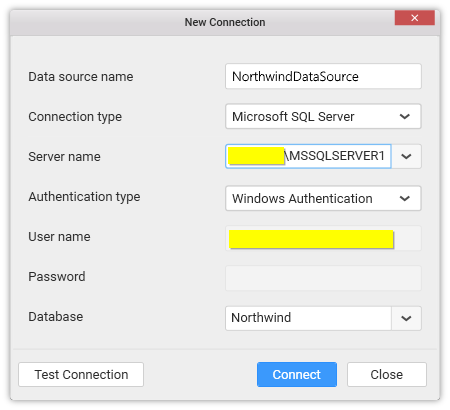
Filling in connection details
We are now in the data design view.
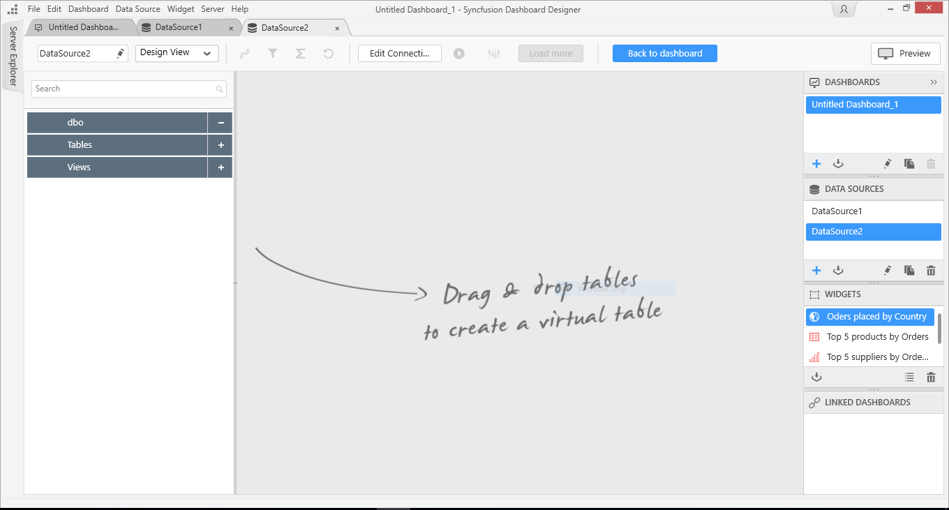
Dashboard Designer data design view
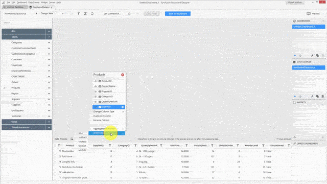
The left pane contains a tree that shows the available database schema, such as tables, views, and stored procedures. We’ll expand the Tables item to view all the tables in our database, and drag and drop the Products table onto the design surface.
Adding a table to the design surface
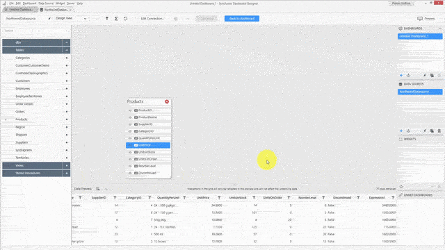
With the Products table added, we can see the list of available fields in the design surface, and preview the records in the Data Preview pane at the bottom.
We are free to rename, hide, and include fields as needed. With columns, we can change their type, duplicate them, or rename them. If our underlying data doesn’t contain all the record fields, we can create our own calculated fields by defining a formula on an existing field using standard functions or operators. These functions are available depending on the field type.
Now, let’s transform this data. First, we’ll create a calculated field by multiplying the unit price by a factor of 100. To do this, we click the Settings icon to the right of the UnitPrice field in the design surface, point to Arithmetic Functions, and select Multiply.
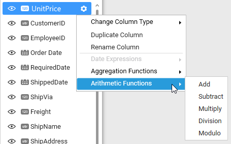
Creating a calculated field
In the window that appears, we type 100 into the Value text box and then click Apply.
Specifying our multiply value
We will now see our new calculated column in the Data Preview pane at the bottom of the screen.
The calculated column in the Data Preview
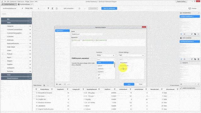
This is a simple transformation. For a more involved one, we’ll use the built-in Expression Editor, which we open by clicking the sigma icon button at the top of the Dashboard Designer.
Opening the Expression Editor
The Functions area provides a list of all the available functions, filterable by type. Selecting a function will show us the function’s syntax and a description to the left. To the right is a list of the fields in our data source, also filterable by type.
Viewing functions and fields in the Expression Designer
Let’s create an expression to calculate the total amount, which is calculated by multiplying the unit price by the total number of units in stock and units on order. First, we’ll click the Add button in the bottom left corner of the Expression Designer. Type TotalAmount in the Name text box. In the Expression text box, we’ll enter [UnitPrice] * ([UnitsInSotck] + [UnitsOnOrder]). Rather than typing these entire field names manually, we can select them from the IntelliSense-like suggestions provided by the Expression text box, or double-click items in the Functions and Fields lists. Finally, click Save.
We should see our new expression added to the list on the left side of the window. In the Data Preview pane, we should also see our newly added expression as a new column.
Adding a new expression
Let’s look at another aspect of transforming our data: creating data filters.
We can create data filters by using the Filters tool, which is opened by clicking the filter icon next to the Expression Editor icon in the toolbar.
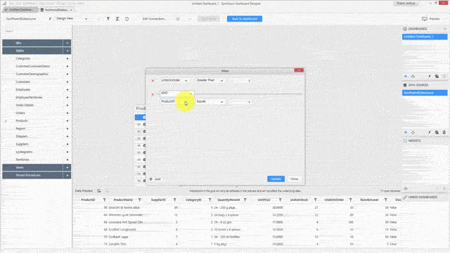
In the Filters window, click the Add button. The available filter criteria will differ depending on the field type. For our new filter, we’re going to filter the data in the UnitsOnOrder field to show values greater than 0. Select the UnitsOnOrder field in the leftmost drop-down. For the middle drop-down, select Greater Than, and leave the spin box blank.
Creating our first filter
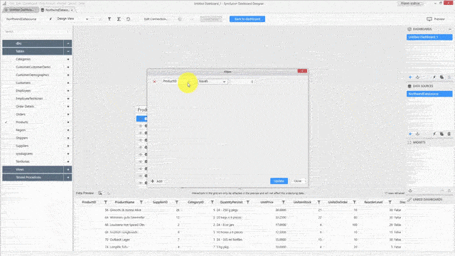
We can combine multiple filters in the Dashboard Designer, so let’s do it by filtering specific product names from our data. First, click Add. In the new filter line that appears, make sure the first drop-down is set to AND, the next one is set to ProductName, and the next one is set to Inclusion. For the final drop-down, let’s clear the selection for a few of the names listed, and then click Apply.
Adding a second filter
Note: Since ProductName is a string field, we have the option to use the TOP ‘N’ feature, which allows us to filter on the top n number of records. The Top ‘N’ feature is available for text and date-time column types.
After the Data Preview pane reloads, our new data filter will be applied.
Now let’s check out adding multiple tables to our data source.
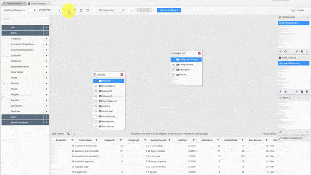
First, drag and drop the Categories table into the data design view from the Tables list. The table is joined automatically using the unit column or unique key present in the table. In this case, the tables are joined via the CategoryID column.
Next, let’s add another table; this time, Orders. Since the Orders tables doesn’t contain a unique column, the Join Editor opens automatically, where we can choose the columns and merge the tables based on conditions we specify.
We can also access the Join Editor through the toolbar, next to the Expression Designer and Filters icons. Here, we can view the details related to the tables we’re joining, the columns, and their relationship. We can also specify the join clause, which is inner join by default, and the merging condition.
Editing table join details
The data design view also offers a query view where we can see the operations we performed in the database. This view also allows us to design our data by dropping in our custom queries here, instead of using the design view.
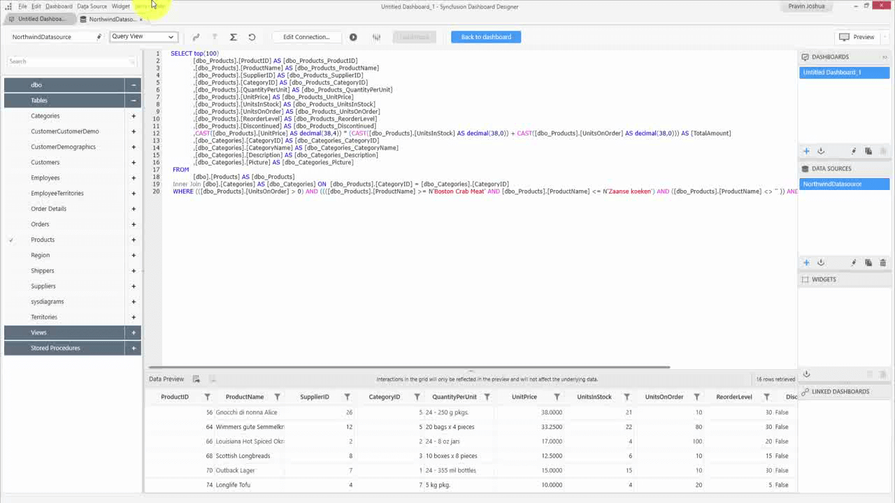
Dashboard Designer query view
That’s it! Those are the basics of connecting to data and transforming it for use in a dashboard. From here, we can save our data source for later use by right-clicking our data source in the Data Sources pane, selecting Export from the context menu, and saving it as an SYDS file. We can also publish our data source for use in the Dashboard Server.
For more in-depth walkthroughs of working with the Dashboard Platform and all the features it has to offer, see our documentation, and if you aren’t a user of Syncfusion’s Dashboard Platform yet, why not give it a shot with a free, 30-day trial? Happy dashboarding!
For more information about Dashboard Platform features, see our documentation. If you have yet to use the Syncfusion Dashboard Platform, try it out with a free, 30-day trial.
If you liked this post, we think you’ll love these free e-books:
BI Solutions Using SSAS Tabular Model Succinctly
MongoDB 3 Succinctly
Hadoop Succinctly
Power BI Succinctly
R Programming Succinctly