---
title: "2D vs. 3D Scatter Charts: Which Suits Your Data Visualization Needs?"
published_at: "2025-06-04T16:53:03+00:00"
modified_at: "2025-07-29T06:47:42+00:00"
url: "https://www.syncfusion.com/blogs/post/2d-vs-3d-scatter-charts"
excerpt: "Wondering whether to use a 2D or 3D scatter chart for energy data? This guide shows how to choose the right chart to visualize energy trends clearly and efficiently using WPF Charts."
taxonomy_category:
- "Chart"
- "Chart of the week"
- "Data Visualization"
- "Scatter Charts"
- "WPF"
taxonomy_post_tag:
- "2D Charts"
- "3D"
- "analyze data"
- "Charts"
- "Data Visualization"
- "Scatter Charts"
- "WPF"
- "WPF Controls"
---
[Chart of the week](https://www.syncfusion.com/blogs/category/chart-of-the-week)
# 2D vs. 3D Scatter Charts: Which Suits Your Data Visualization Needs?
[Priyadharshini Periyasamy](https://www.syncfusion.com/blogs/author/priyadharshini-periyasamy)

**TL;DR:** Dive into the world of energy data visualization with our guide on 2D vs. 3D Scatter Charts. Discover their benefits, practical applications, and how to implement them using Syncfusion WPF controls, complete with code examples. Perfect for choosing the right chart for your project.
Welcome to the **Chart of the Week** blog series!
**Choosing the right chart type can make or break your energy data analysis.**
When dealing with complex metrics like electricity consumption, temperature, and cost, visual clarity becomes essential. In this post, we break down the key differences between [Syncfusion® WPF 2D and 3D Scatter Charts](https://www.syncfusion.com/wpf-controls/charts/wpf-scatter-chart)
, helping you choose the best one for your energy data insights.
This guide helps you visualize your data with precision, whether you’re tracking grid performance or analyzing renewable energy trends.
## Understanding 2D Scatter Charts
A [2D Scatter Chart](https://help.syncfusion.com/cr/wpf/Syncfusion.UI.Xaml.Charts.ScatterSeries.html#properties)
is a simple yet powerful tool for visualizing relationships between two numerical variables. It plots data points along the X and Y axes, making it easy to identify patterns, correlations, and clusters within the dataset.
### When should you use a 2D Scatter Chart?
The 2D Scatter Chart is ideal for datasets involving only two numerical variables. It offers a clear, concise view of the data, making it easy to identify trends, correlations, and outliers. Common use cases include:
- Analyzing the correlation between height and weight, temperature and energy consumption, or marketing spend and revenue.
- Presenting data in a straightforward format that doesn’t require user interaction to explore depth.
- Displaying data in dashboards, reports, or presentations where readability and simplicity are essential.
### Benefits of 2D Scatter Charts for energy data
- **Simplicity and readability:** The lack of a third dimension eliminates visual clutter, making patterns and relationships easier to interpret.
- **Efficient comparison:** Enables quick comparison of multiple datasets using distinct markers and colors.
- **Performance-friendly:** Lightweight rendering ensures smooth performance, even when visualizing large volumes.
## Understanding 3D Scatter Charts
[3D Scatter Charts](https://help.syncfusion.com/cr/wpf/Syncfusion.UI.Xaml.Charts.ScatterSeries3D.html#properties)
introduce a Z-axis, enabling the visualization of three numerical variables simultaneously. This format is especially useful for analyzing complex energy datasets that require a third dimension to uncover deeper insights.
### When should you use a 3D Scatter Chart?
A 3D Scatter Chart is ideal for datasets where three variables are interrelated. Common use cases include:
- **Scientific analysis**, such as exploring relationships between pressure, temperature, and volume in physics.
- **Financial modeling**, including visualizing risk, return, and investment amount simultaneously.
- **Customer segmentation**, based on dimensions like age, income, and spending behavior.
- **Interactive dashboards,** where users can rotate, zoom, and explore data in 3D, are ideal when users are comfortable with navigating visualizations.
### Benefits of 3D Scatter Charts for energy data
- **Additional dimension:** Enables visualization of a third variable in the same chart, eliminating the need for multiple charts.
- **Holistic perspective:** Offers a comprehensive view of interactions between three variables in complex datasets.
- **Interactive exploration:** Users can rotate and zoom to explore patterns from various angles, enhancing analytical depth.
Let’s explore the steps in analyzing energy consumption trends using [WPF 2D and 3D Scatter Charts.](https://www.syncfusion.com/wpf-controls/charts)
## Step 1: Collecting data
To begin, gather relevant metrics for energy analysis. In this example, we’ll use a sample dataset that includes the following:
- **Energy consumption (kWh)**.
- **Monthly electricity cost ($)**.
- **Average temperature (°C).**
This data will allow us to visualize relationships among these variables and uncover potential trends in energy usage.
| Energy Consumption (kWh) | Monthly cost ($) | Temperature (°C) |
| --- | --- | --- |
| 120 | 200 | 150 |
| 900 | 800 | 950 |
| 150 | 250 | 180 |
| 850 | 750 | 900 |
| 200… | 300… | 220… |
## Step 2: Preparing data for the chart
To accurately visualize energy data in 2D and 3D Scatter Charts, first define a structured data model. This model will represent key variables such as **energy consumption (kWh)**,** monthly electricity cost ($)**, and** temperature (°C)**, three critical factors that influence energy usage patterns.
By establishing this model, we lay a solid foundation for creating 2D and 3D Scatter Charts, enabling clear, consistent, and insightful data representation.
The following C# class defines a model for storing energy-related data.
```
public class Model
{
public double EnergyConsumption { get; set; }
public double MonthlyCost { get; set; }
public double Temperature { get; set; }
}
```
Next, create a data collection using the **EnergyViewModel** class, which includes a property of ** EnergyData** to store the energy metrics as shown in the code example below.
```
public class EnergyViewModel
{
public ObservableCollection EnergyData { get; set; }
public EnergyViewModel()
{
EnergyData = new ObservableCollection()
{
new Model { EnergyConsumption = 120, MonthlyCost = 200, Temperature = 150 },
new Model { EnergyConsumption = 900, MonthlyCost = 800, Temperature = 950 },
new Model { EnergyConsumption = 150, MonthlyCost = 250, Temperature = 180 },
new Model { EnergyConsumption = 850, MonthlyCost = 750, Temperature = 900 },
new Model { EnergyConsumption = 200, MonthlyCost = 300, Temperature = 220 },
new Model { EnergyConsumption = 800, MonthlyCost = 700, Temperature = 850 },
new Model { EnergyConsumption = 250, MonthlyCost = 400, Temperature = 260 },
. . .
. . .
};
}
}
```
## Step 3: Create a 2D Scatter Chart
Configure the Syncfusion® WPF Chart control by following the steps outlined in the [documentation.](https://help.syncfusion.com/wpf/charts/getting-started)
```
```
### Binding data to the WPF 2D Scatter Chart
Bind the collected energy data to the [2D Scatter Chart](https://help.syncfusion.com/wpf/charts/seriestypes/bubbleandscatter#scatter-chart)
to visualize the relationship between energy consumption and monthly electricity costs, as shown in the code example below.
```
```
### Customizing the WPF 2D Scatter Chart’s appearance
To enhance the readability and visual appeal of the 2D Scatter Chart, customize the [chart title](https://help.syncfusion.com/wpf/charts/header)
, [tooltip](https://help.syncfusion.com/cr/wpf/Syncfusion.UI.Xaml.Charts.ChartSeriesBase.html#Syncfusion_UI_Xaml_Charts_ChartSeriesBase_TooltipTemplate)
, and [series appearance](https://help.syncfusion.com/cr/wpf/Syncfusion.UI.Xaml.Charts.ChartSeriesBase.html#Syncfusion_UI_Xaml_Charts_ChartSeriesBase_Interior)
. These customizations help make the data more engaging and easier to interpret.
#### Customizing the chart title
Adding a title makes it easier for users to quickly understand the data being presented. Refer to the following code example to customize the chart title for the [2D Scatter Chart](https://www.syncfusion.com/wpf-controls/charts/2d-chart)
.
```
```
#### Adding tooltips for data points
To enhance user interactivity, we can enable [TooltipTemplate](https://help.syncfusion.com/cr/wpf/Syncfusion.UI.Xaml.Charts.ChartSeriesBase.html#Syncfusion_UI_Xaml_Charts_ChartSeriesBase_TooltipTemplate)
, which display data values when hovering over points in the chart. For more details, refer to the [documentation](https://help.syncfusion.com/wpf/charts/interactive-features/tooltip#customizing-the-appearance)
.
```
```
#### Customizing the series appearance
Customize the 2D Scatter Chart’s appearance using the [Interior](https://help.syncfusion.com/cr/wpf/Syncfusion.UI.Xaml.Charts.ChartSeriesBase.html#Syncfusion_UI_Xaml_Charts_ChartSeriesBase_Interior)
property to enhance point visibility with distinct colors.
After executing the previous code examples, the output will appear as shown in the following image.
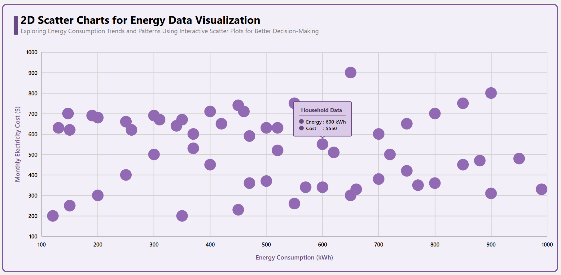
2D Scatter Chart for energy data visualization
## Step 4: Create a 3D Scatter Chart
Configure the Syncfusion® WPF 3D Scatter Chart control by following the steps outlined in the [documentation](https://help.syncfusion.com/wpf/sfchart3d/gettingstarted)
.
```
```
### Binding data to the WPF 3D Scatter Chart
Bind the collected energy data to the [3D Scatter Chart](https://help.syncfusion.com/wpf/sfchart3d/3dseries#scatter-chart)
to visualize the relationship between energy consumption, monthly electricity cost, and average temperature, as shown in the code example below.
```
```
### Customizing the WPF 3D Scatter Chart’s appearance
To improve the readability and visual appeal of the 3D Scatter Chart, enhance the [chart title](https://help.syncfusion.com/wpf/sfchart3d/gettingstarted#add-title)
, [tooltip](https://help.syncfusion.com/cr/wpf/Syncfusion.UI.Xaml.Charts.ChartSeriesBase.html#Syncfusion_UI_Xaml_Charts_ChartSeriesBase_TooltipTemplate)
, [wall color](https://help.syncfusion.com/cr/wpf/Syncfusion.UI.Xaml.Charts.SfChart3D.html#properties)
, [series appearance](https://help.syncfusion.com/cr/wpf/Syncfusion.UI.Xaml.Charts.ChartSeriesBase.html#Syncfusion_UI_Xaml_Charts_ChartSeriesBase_Interior)
, customize [rotation](https://help.syncfusion.com/wpf/sfchart3d/interactivefeatures#dynamic-rotation)
, [tilt](https://help.syncfusion.com/cr/wpf/Syncfusion.UI.Xaml.Charts.SfChart3D.html#Syncfusion_UI_Xaml_Charts_SfChart3D_Tilt)
, and [perspective angle](https://help.syncfusion.com/wpf/sfchart3d/interactivefeatures#segment-selection)
. These adjustments make the data more engaging and easier to interpret.
### Customizing the chart title
Adding a title makes it easier for users to understand the data being presented. Refer to the following code example to customize the chart title for the [3D Scatter Chart](https://www.syncfusion.com/wpf-controls/charts/wpf-3d-scatter-chart)
.
```
```
### Adding tooltips for data points
To enhance user interactivity, we can enable the [TooltipTemplate](https://help.syncfusion.com/cr/wpf/Syncfusion.UI.Xaml.Charts.ChartSeriesBase.html#Syncfusion_UI_Xaml_Charts_ChartSeriesBase_TooltipTemplate)
, which displays data values when the user hovers over points on the chart.
```
```
### Customizing the wall color
The wall brush enhances the 3D effect by defining the background color or gradient of the chart walls.
- [BackWallBrush](https://help.syncfusion.com/cr/wpf/Syncfusion.UI.Xaml.Charts.SfChart3D.html#Syncfusion_UI_Xaml_Charts_SfChart3D_BackWallBrush) : Defines the background wall appearance, enhancing the depth of the 3D Chart.
- [LeftWallBrush](https://help.syncfusion.com/cr/wpf/Syncfusion.UI.Xaml.Charts.SfChart3D.html#Syncfusion_UI_Xaml_Charts_SfChart3D_LeftWallBrush) : Customizes the left-side wall to maintain a consistent and visually appealing design.
- [RightWallBrush](https://help.syncfusion.com/cr/wpf/Syncfusion.UI.Xaml.Charts.SfChart3D.html#Syncfusion_UI_Xaml_Charts_SfChart3D_RightWallBrush) : Sets the right wall’s appearance to complement the overall 3D Chart aesthetics.
- [BottomWallBrush](https://help.syncfusion.com/cr/wpf/Syncfusion.UI.Xaml.Charts.SfChart3D.html#Syncfusion_UI_Xaml_Charts_SfChart3D_BottomWallBrush) : Styles the base of the chart, providing a distinct foundation for better visualization.
- [TopWallBrush](https://help.syncfusion.com/cr/wpf/Syncfusion.UI.Xaml.Charts.SfChart3D.html#Syncfusion_UI_Xaml_Charts_SfChart3D_TopWallBrush) : Modifies the top wall to create a balanced and refined 3D Chart presentation.
```
```
### Customizing the series appearance
Customize the 3D Scatter Chart by adjusting [ScatterHeight](https://help.syncfusion.com/cr/wpf/Syncfusion.UI.Xaml.Charts.ScatterSeries3D.html#Syncfusion_UI_Xaml_Charts_ScatterSeries3D_ScatterHeight)
and [ScatterWidth](https://help.syncfusion.com/cr/wpf/Syncfusion.UI.Xaml.Charts.ScatterSeries3D.html#Syncfusion_UI_Xaml_Charts_ScatterSeries3D_ScatterWidth)
to enhance visibility. Additionally, use the [Interior](https://help.syncfusion.com/cr/wpf/Syncfusion.UI.Xaml.Charts.ChartSeriesBase.html#Syncfusion_UI_Xaml_Charts_ChartSeriesBase_Interior)
property to modify the point color for better distinction.
```
```
### Incorporate the interactive features and customize rotation, tilt, and perspective
To enhance the visual appeal and readability of the WPF 3D Scatter Chart, you can adjust its**rotation**, ** tilt**, and ** perspective angle**. These properties improve viewing angles and data exploration, making the chart more interactive.
-
-
- [Rotation](https://help.syncfusion.com/cr/wpf/Syncfusion.UI.Xaml.Charts.SfChart3D.html#Syncfusion_UI_Xaml_Charts_SfChart3D_Rotation) : Adjusts the horizontal angle of the chart.
- [Tilt](https://help.syncfusion.com/cr/wpf/Syncfusion.UI.Xaml.Charts.SfChart3D.html#Syncfusion_UI_Xaml_Charts_SfChart3D_Tilt) : Controls the vertical perspective of the chart.
- [EnableRotation](https://help.syncfusion.com/cr/wpf/Syncfusion.UI.Xaml.Charts.SfChart3D.html#Syncfusion_UI_Xaml_Charts_SfChart3D_EnableRotation) : Allows users to interactively rotate the chart.
- [PerspectiveAngle](https://help.syncfusion.com/cr/wpf/Syncfusion.UI.Xaml.Charts.SfChart3D.html#Syncfusion_UI_Xaml_Charts_SfChart3D_PerspectiveAngle) : Defines the depth perspective for a 3D effect.
These customizations improve the user experience by offering better data visibility from different angles. Refer to the following code example to customize these settings.
```
```
After executing the previous code examples, the output will appear as shown in the following image.

3D Scatter Charts for energy data visualization
## Choosing the right chart for your needs
When deciding between 2D and 3D Scatter Charts for energy data, consider the following factors:
- **Data complexity:** A 2D Scatter Chart is ideal if your dataset involves only two key variables. However, if a third variable is crucial, a 3D Scatter Chart is more appropriate.
- **Ease of interpretation:** 2D Charts are easier for a broad audience to interpret, while 3D Charts require interactive tools for in-depth exploration.
- **Visualization tools available:** Some data visualization platforms offer intuitive 3D Chart interactions, making them easier to navigate.
## Performance considerations
While 3D Scatter Charts offer deeper insights, they have increased computational costs. Here are some factors to consider.
- **Rendering performance**: 2D Charts generally perform better, especially when dealing with large datasets, as they require fewer resources to display.
- **Responsiveness**: 2D Charts in WPF are highly responsive and render efficiently across a wide range of systems. In contrast, 3D Charts may require performance optimizations, particularly on machines with limited graphics capabilities.
- **Optimization tips**:
- Apply **data thinning** techniques for large datasets.
- Enable **hardware acceleration** for better 3D rendering performance.
- Use **lazy loading** when working with extensive data points.
## GitHub reference
For more details, refer to the [GitHub demo](https://github.com/SyncfusionExamples/2D-vs-3D-Scatter-Charts-in-Energy-Data-Clarity-or-Complexity)
.
## Conclusion
When clarity and simplicity are key, [2D Scatter Charts](https://www.syncfusion.com/wpf-controls/charts/2d-chart)
provide a lightweight, performance-friendly way to uncover patterns in energy data. For multi-variable exploration, [3D Scatter Charts](https://www.syncfusion.com/wpf-controls/charts/3d-chart)
offer depth and interactivity, which is ideal for advanced analytics.
With the [Syncfusion® WPF Charts](https://www.syncfusion.com/wpf-controls/charts)
control, you can easily implement both and create powerful, interactive dashboards for energy insights. To start visualizing smarter, choose the chart that fits your data best.
We encourage you to follow the steps outlined in this blog. Stay tuned for next week’s **Chart of the Week**!
If you are an existing customer, you can download the new version of Essential Studio® on the [license and downloads](https://www.syncfusion.com/account)
page. If you are not a Syncfusion® customer, try our 30-day [free trial](https://www.syncfusion.com/downloads)
to check out our incredible features.
If you require assistance, please don’t hesitate to contact us via our [support forum](https://www.syncfusion.com/forums)
, [support portal](https://support.syncfusion.com/)
, or [feedback portal](https://www.syncfusion.com/feedback/wpf)
. We are always eager to help you!
## Related Blogs
[Heikin-Ashi vs. Candlestick Charts: Which Is Better for Market Trend Analysis in WPF?](https://www.syncfusion.com/blogs/post/wpf-heikin-ashi-vs-candlestick-charts)
[Visualize JSON Data Quickly Using WPF Charts](https://www.syncfusion.com/blogs/post/visualize-json-data-wpf-charts)
[Chart of the Week: Visualize the Transfer Spending and Earning among the Football League Clubs Using WPF Scatter Chart](https://www.syncfusion.com/blogs/post/visualize-transfer-spending-earning-wpf-scatter-chart)
[Visualize Global Temperature Anomalies with a Dynamic WPF HeatMap Chart](https://www.syncfusion.com/blogs/post/wpf-heatmap-visualize-temp-anomalies)