---
title: "Chart of the Week: Visualizing Top 25 Largest Countries Using .NET MAUI Column Chart"
published_at: "2024-08-07T13:03:34+00:00"
modified_at: "2026-01-09T07:40:16+00:00"
url: "https://www.syncfusion.com/blogs/post/25-large-countries-maui-column-chart"
excerpt: "This blog explains how to visualize the top 25 largest countries in the world using the Syncfusion .NET MAUI Column Chart control. "
taxonomy_category:
- ".NET MAUI"
- "Chart"
- "Chart of the week"
- "Data Visualization"
- "Desktop"
- "Syncfusion"
- "UI"
taxonomy_post_tag:
- ".NET MAUI"
- "Chart"
- "Cross-Platform"
- "desktop"
- "MAUI"
- "Mobile"
---
[Chart of the week](https://www.syncfusion.com/blogs/category/chart-of-the-week)
# Chart of the Week: Visualizing Top 25 Largest Countries Using .NET MAUI Column Chart
[Sowndharya Selladurai](https://www.syncfusion.com/blogs/author/sowndharya-selladurai)
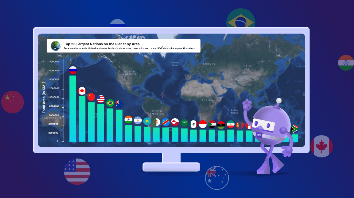
**TL;DR:** Visualize the top 25 largest countries of the world using the Syncfusion .NET MAUI Column Chart. This blog covers steps like gathering data, preparing data models, configuring the chart, customizing data labels and tooltips, applying gradient effects, and customizing the chart title and axes for better readability and visual appeal.
Welcome to our **Chart of the Week** blog series!
Today, we’ll visualize the top 25 largest countries by area using the Syncfusion [.NET MAUI Column Chart](https://www.syncfusion.com/maui-controls/maui-cartesian-charts/chart-types/maui-column-chart)
.
The **.NET MAUI Column Chart** offers powerful customization options to enhance your data visualization experience. We’ll guide you through various techniques to make our chart visually appealing and informative. Specifically, we will cover:
- Adding background images to the chart.
- Customizing data labels and tooltips for more precise insights.
- Applying gradient backgrounds to chart segments for a polished look.
Each of these customization will help you create a more dynamic and visually appealing chart.
Refer to the following image.[https://www.syncfusion.com/blogs/wp-content/uploads/2024/08/Visualizing-the-top-25-largest-counties-in-the-world-using-Syncfusion-.NET-MAUI-Column-Chart.png](https://www.syncfusion.com/blogs/wp-content/uploads/2024/08/Visualizing-the-top-25-largest-counties-in-the-world-using-Syncfusion-.NET-MAUI-Column-Chart.png)
Let’s see the steps involved in creating this chart!
## Step 1: Gather data
First, gather data on the top 25 world’s largest countries by area from [worldometer](https://www.worldometers.info)
site. Next, organize this information into an Excel spreadsheet, listing each country and its corresponding area, then save the file in CSV format.
## Step 2: Preparing data for the chart
Create a **Model** class that includes properties for storing information about a country’s name and its total area.
```
public class Model
{
public string CountryName { get; set; }
public double TotalArea { get; set; }
public Model(string countryName, double totalArea)
{
CountryName = countryName;
TotalArea = totalArea;
}
}
```
In the **ViewModel**, read the CSV file contents using the ** StreamReader** method and store the data in an ** ObservableCollection.** Use a ** foreach** loop to iterate through each item, then add each item to the ** AreaDetails** property.
Refer to the following code example.
```
public ViewModel()
{
AreaDetails = new List();
ReadCSVFile();
}
private void ReadCSVFile()
{
Assembly executingAssembly = typeof(App).GetTypeInfo().Assembly;
Stream inputStream = executingAssembly.GetManifestResourceStream("SampleDemo.Resources.WorldLandDetails.csv");
string line;
ObservableCollection lines = new ObservableCollection();
if (inputStream != null)
{
using StreamReader reader = new StreamReader(inputStream);
while ((line = reader.ReadLine()) != null)
{
lines.Add(line);
}
lines.RemoveAt(0);
foreach (var items in lines)
{
string[] data = items.Split(',');
string countryName = data[0];
double totalArea = Convert.ToDouble(data[1]);
AreaDetails.Add(new Model(countryName, totalArea));
}
}
}
```
## Step 3: Configure the .NET MAUI Column Chart and add background images
Now, configure the Syncfusion .NET MAUI Cartesian Charts control using this [documentation](https://help.syncfusion.com/maui/cartesian-charts/getting-started)
. Then, create an instance of [ColumnSeries](https://help.syncfusion.com/maui/cartesian-charts/column)
, and bind the **CountryName** and ** TotalArea** properties to the [XBindingPath](https://help.syncfusion.com/cr/maui/Syncfusion.Maui.Charts.ChartSeries.html#Syncfusion_Maui_Charts_ChartSeries_XBindingPath)
and [YBindingPath](https://help.syncfusion.com/cr/maui/Syncfusion.Maui.Charts.XYDataSeries.html#Syncfusion_Maui_Charts_XYDataSeries_YBindingPath)
properties, respectively. Additionally, set the [ItemsSource](https://help.syncfusion.com/cr/maui/Syncfusion.Maui.Charts.ChartSeries.html#Syncfusion_Maui_Charts_ChartSeries_ItemsSource)
property to the **AreaDetails** collection.
```
```
The [CartesianChart](https://help.syncfusion.com/cr/maui/Syncfusion.Maui.Charts.SfCartesianChart.html)
supports setting any kind of view as the chart background. We can achieve this in two ways:
- [PlotAreaBackgroundView](https://help.syncfusion.com/cr/maui/Syncfusion.Maui.Charts.ChartBase.html#Syncfusion_Maui_Charts_ChartBase_PlotAreaBackgroundView)
- Grid panel overlap
Here, we’ll use the **grid panel overlap** option to set the background image to the whole screen. Refer to the following code example.
```
```
## Step 4: Adding and customizing data labels
[Data labels](https://help.syncfusion.com/maui/cartesian-charts/datalabels)
help us display information for each data point within a chart. To enable data labels on a chart, set the [ShowDataLabels](https://help.syncfusion.com/cr/maui/Syncfusion.Maui.Charts.ChartSeries.html#Syncfusion_Maui_Charts_ChartSeries_ShowDataLabels)
property to **True**. We can also customize the appearance of these labels using the [LabelTemplate](https://help.syncfusion.com/cr/maui/Syncfusion.Maui.Charts.ChartSeries.html#Syncfusion_Maui_Charts_ChartSeries_LabelTemplate)
property.
Then, we’ll create an image source as a data template and bind the **CountryFlags** property using the data label’s binding context of the name ** Item**. Next, we’ll assign this custom data template to the ** LabelTemplate** property. Using the [LabelPlacement](https://help.syncfusion.com/cr/maui/Syncfusion.Maui.Charts.ChartDataLabelSettings.html#Syncfusion_Maui_Charts_ChartDataLabelSettings_LabelPlacement)
property, we can position the data label outside the segment, which is available in the [CartesianDataLabelSettings](https://help.syncfusion.com/cr/maui/Syncfusion.Maui.Charts.CartesianDataLabelSettings.html?tabs=tabid-1%2Ctabid-3%2Ctabid-5)
class.
Refer to the following code example.
```
```
## Step 5: Adding and customizing tooltips
With the help of [tooltips](https://help.syncfusion.com/maui/cartesian-charts/tooltip)
, we can include additional context or details when users hover or interact with chart elements. To enable tooltips, set the [EnableTooltip](https://help.syncfusion.com/cr/maui/Syncfusion.Maui.Charts.ChartSeries.html#Syncfusion_Maui_Charts_ChartSeries_EnableTooltip)
property to **True**. We can also customize the appearance of tooltips using the [TooltipTemplate](https://help.syncfusion.com/cr/maui/Syncfusion.Maui.Charts.ChartSeries.html#Syncfusion_Maui_Charts_ChartSeries_TooltipTemplate)
property.
In this section, we’ll create a custom tooltip template and bind the country name and total area values using the tooltip’s binding context of the name **Item**. Finally, we’ll apply this custom template by setting it to the ** TooltipTemplate** property.
```
….
```
## Step 6: Applying the gradient effect to the chart
Let’s enhance the visual appeal of the column series in the chart by applying a **gradient** effect. This can be achieved using the [Fill](https://help.syncfusion.com/cr/maui/Syncfusion.Maui.Charts.ChartSeries.html#Syncfusion_Maui_Charts_ChartSeries_Fill)
property in conjunction with the [LinearGradientBrush](https://learn.microsoft.com/en-us/dotnet/api/microsoft.maui.controls.lineargradientbrush?view=net-maui-8.0)
class. The **StartPoint** and ** EndPoint** properties define the direction of the gradient. Here, the gradient runs vertically from top to bottom. The [GradientStop](https://learn.microsoft.com/en-us/dotnet/api/microsoft.maui.controls.gradientstop?view=net-maui-8.0)
elements specify the colors for different data points to replicate the gradient effect.
Refer to the following code example.
```
```
## Step 7: Customizing the chart title
In this step, we’ll focus on customizing chart titles for better readability.
- **Apply a border and background color:** Use the [Border](https://learn.microsoft.com/en-us/dotnet/maui/user-interface/controls/border?view=net-maui-8.0) element to add a border around the chart title. This improves readability by visually separating the title from the rest of the chart.
- **Add title and description:** Inside the border, use a [Grid](https://learn.microsoft.com/en-us/dotnet/maui/user-interface/layouts/grid?view=net-maui-8.0) layout to arrange an icon, chart title, and description.
Refer to the following code example.
```
```
## Step 8: Customizing the axes
To enhance the appearance and functionality of the primary and secondary axes, we can use the following properties:
- [ShowMajorGridLines:](https://help.syncfusion.com/cr/maui/Syncfusion.Maui.Charts.ChartAxis.html#Syncfusion_Maui_Charts_ChartAxis_ShowMajorGridLines) Controls the visibility of grid lines.
- [PlotOffsetStart:](https://help.syncfusion.com/cr/maui/Syncfusion.Maui.Charts.ChartAxis.html#Syncfusion_Maui_Charts_ChartAxis_PlotOffsetStart) Adds padding to the axis at the start position.
- [PlotOffsetEnd:](https://help.syncfusion.com/cr/maui/Syncfusion.Maui.Charts.ChartAxis.html#Syncfusion_Maui_Charts_ChartAxis_PlotOffsetEnd) Adds padding to the axis at the end position.
- [AutoScrollingDelta:](https://help.syncfusion.com/cr/maui/Syncfusion.Maui.Charts.ChartAxis.html#Syncfusion_Maui_Charts_ChartAxis_AutoScrollingDelta) Sets the number of data points that are always visible in the chart.
- [AutoScrollingMode:](https://help.syncfusion.com/cr/maui/Syncfusion.Maui.Charts.ChartAxis.html#Syncfusion_Maui_Charts_ChartAxis_AutoScrollingMode) Determines whether the axis should scroll from the start or end position.
- [ChartAxisTitle](https://help.syncfusion.com/cr/maui/Syncfusion.Maui.Charts.ChartAxisTitle.html) : Customizes the text of the axis title.
- [ChartLineStyle:](https://help.syncfusion.com/cr/maui/Syncfusion.Maui.Charts.ChartLineStyle.html) Customizes the style of the axis line.
- [ChartAxisTickStyle:](https://help.syncfusion.com/cr/maui/Syncfusion.Maui.Charts.ChartAxisTickStyle.html) Customizes the style of the axis ticks.
- [ChartAxisLabelStyle:](https://help.syncfusion.com/cr/maui/Syncfusion.Maui.Charts.ChartAxisLabelStyle.html?tabs=tabid-1) Customizes the style of the axis labels.
Refer to the following code example.
```
….
```
After executing these code examples, we will get the output that resembles the following image.
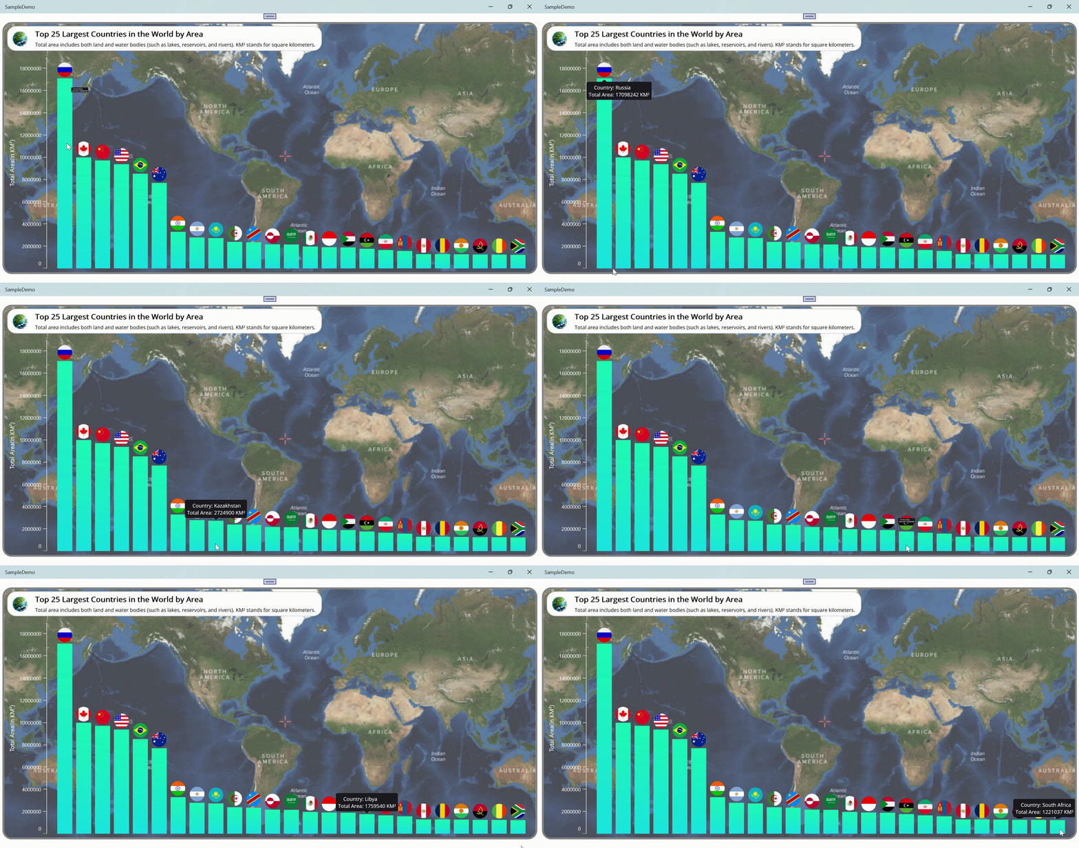
Visualizing the top 25 largest counties in the world using Syncfusion .NET MAUI Column Chart
## GitHub reference
For more details, refer to [visualizing the top 25 largest countries in the world using the .NET MAUI Column Chart GitHub demo](https://github.com/SyncfusionExamples/Top-25-Largest-Nations-on-the-Planet-by-Land-Area)
.
## Conclusion
Thanks for reading! In this blog, we’ve explored how to visualize the top 25 largest countries in the world by area using the Syncfusion [.NET MAUI Column Chart](https://www.syncfusion.com/maui-controls/maui-cartesian-charts/chart-types/maui-column-chart)
. Please follow the guidelines outlined in this blog and share your thoughts in the comments below.
The existing customers can download the latest version of Essential Studio® from the [License and Downloads](https://www.syncfusion.com/account)
page. If you are new, try our 30-day [free trial](https://www.syncfusion.com/downloads)
to explore our incredible features.
You can also contact us through our [support forums](https://www.syncfusion.com/forums)
, [support portal](https://support.syncfusion.com/)
, or [feedback portal](https://www.syncfusion.com/feedback)
. We are always happy to assist you!
## Related blogs
- [Comparing Generative AI Usage with .NET MAUI Multi-Category Bar Charts](https://www.syncfusion.com/blogs/post/maui-multi-bar-charts-generative-ai)
- [Easily Bind DataTable and Perform CRUD Actions with .NET MAUI DataGrid](https://www.syncfusion.com/blogs/post/bind-datatable-crud-maui-datagrid)
- [Easily Synchronize Outlook Calendar Events in .NET MAUI Scheduler](https://www.syncfusion.com/blogs/post/sync-outlook-calendar-maui-scheduler)
- [Design a Timer App using .NET MAUI Radial Gauge and Timer Picker](https://www.syncfusion.com/blogs/post/timer-app-maui-radialgauge-timepicker)