WPF Charts - A Fast, Beautiful and Interactive Live Charts
- Visualize and analyze data with an ever-expanding collection of 55+ Charts and graphs ranging from line to financial charts.
- Interact with and explore charts with features such as zoom and pan, selection, tooltip, trackball, data labels, and markers.
- Use vertical charts, technical indicators, and different scales, including a log axis.
.NET 10 support now available
Trusted by the world’s leading companies

Overview
The WPF Charts control is optimized to visualize a large amount of data in an elegant way. Its rich feature set includes functionalities like data binding, multiple axes, legends, animations, data labels, annotations, trackballs, tooltips, gradients, technical indicators, and zooming.
Why choose Syncfusion WPF Charts?
55+ chart types
The WPF Chart control uses different types of graphs to display information in a meaningful way.
Chart animation
Make WPF graphs look more appealing with smooth transitions of data.
Performance
Fine-tuned Charts for rendering more than 100k data in less than a second.
Exporting and printing
The WPF live charts can be printed and exported to image formats like JPEG or JPG, JPG-XR, GIF, PNG, BMP, and TIFF.
Localization
Any static text in the Syncfusion Charts control can be localized to any supported language.
XML serialization
Convert the series and data point properties to XML format with serialization concepts. Accomplish the reverse process with de-serialization support.
UI automation
The Charts in WPF is compatible with Coded UI and UFT (formerly QTP) automation tools.
AI-Assisted Development
Build interactive data visualization experiences faster with the AI Coding Assistant and Syncfusion Agent Skills. Generate chart layouts, configure series and axes, and create analytical dashboards with minimal manual effort.
Blazing-fast performance
The WPF Charts control contains several data storage and rendering optimizations to achieve the best possible performance when plotting large volumes of data as well as handling high-frequency, real-time updates.

Load time
In less than a second, more than 100k data points can be rendered.

Real-time updates
WPF Charts can seamlessly handle quick updates while maintaining excellent refresh rates.

Smooth zooming
WPF Charts with rich UI provide a smooth and responsive zooming experience on both touch and mouse-enabled interfaces.
2D chart types
The WPF Charts control contains 45+ popular 2D chart types. Each chart type is easily configurable with the built-in support for creating stunning visual effects.


3D chart types
WPF Charts provide 10+ 3D chart types. Control how a chart is displayed with 3D type, angle, depth, and zoom.
Fast chart types
WPF Charts contain a special chart type called fast chart that renders a large number of data points quickly.

Data labels and markers
Data points can easily be annotated with labels to improve the readability of data in WPF Charts. Readability can be further enhanced by adding markers or customizable symbols.

Labels customization
Data points can easily be annotated with labels to help improve the readability of data.

Data point markers
Mark the data points with the available built-in shapes.

Smart data labels
Pie and doughnut data labels are smartly arranged to avoid intersection when there are large amounts of data.
Chart axis
The WPF Charts control supports four types of axes: numerical, categorical, date-time, and logarithmic. The appearance of all chart axis elements can be customized with built-in properties.


User interactions
The end-user experience is greatly enhanced by a set of user-interaction features: crosshair, data editing, zooming tool bar, zooming, panning, trackball, selection, and tooltip.
Legends
Legends in WPF custom charts provide additional information helpful in identifying individual series in a chart. They can be docked to the left, right, top, or bottom positions around the chart area.

Templating
Apply a data template to a legend item. This helps show more information about a series or data point in a legend.

Positioning
Position the legend anywhere in the chart area to best fit the page.

Legend layout
Display the legend items in multiple rows when several series are loaded in a single chart. Add a desired pane for arranging the legends.
Annotations
Annotations display metadata about a chart or series at a specific point of interest in the plotting area.

Shapes
All the basic annotation elements like lines, text, and arrows are available.

Editable text
Text can be edited interactively.

Drag and resize
Annotations can be resized and dragged across the plot area.
Trendlines
Render linear, exponential, logarithmic, power, and polynomial trendlines.

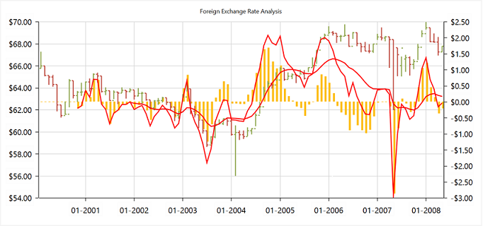
Technical indicators
The WPF Charts control features built-in support for RSI, momentum, Bollinger bands, accumulation distribution, EMA, SMA, stochastic, ATR, MACD, and TMA indicators.
Palette
The WPF Charts control provides more than 10 built-in palettes. Custom palettes can also be created as needed.
Purple chrome palette
Metro chrome palette

Blue chrome palette

WPF Charts Code Example
Easily get started with the WPF Charts using a few simple lines of XAML, VB.NET, and C# code example as demonstrated below. Also explore our WPF Charts Example that shows you how to render and configure the XAML charts.
<Window x:Class="Sample_WPF.MainWindow"
        xmlns="http://schemas.microsoft.com/winfx/2006/xaml/presentation"
        xmlns:x="http://schemas.microsoft.com/winfx/2006/xaml"
        xmlns:d="http://schemas.microsoft.com/expression/blend/2008"
        xmlns:mc="http://schemas.openxmlformats.org/markup-compatibility/2006"
        xmlns:local="clr-namespace:Sample_WPF"
        xmlns:syncfusion="clr-namespace:Syncfusion.UI.Xaml.Charts;assembly=Syncfusion.SfChart.WPF"
        mc:Ignorable="d"
        Title="MainWindow" Height="350" Width="525">

    <!--Setting DataContext for SfChart-->
    <Window.DataContext>
        <local:ViewModel/>
    </Window.DataContext>

    <Grid>

        <syncfusion:SfChart Header="Chart" Height="300" Width="500">
            <!--Initialize the horizontal axis for SfChart-->
            <syncfusion:SfChart.PrimaryAxis>
                <syncfusion:CategoryAxis Header="Name" FontSize="14"/>
            </syncfusion:SfChart.PrimaryAxis>

            <!--Initialize the vertical axis for SfChart-->
            <syncfusion:SfChart.SecondaryAxis>
                <syncfusion:NumericalAxis Header="Height(in cm)" FontSize="14"/>
            </syncfusion:SfChart.SecondaryAxis>

            <!--Adding Legend to the SfChart-->
            <syncfusion:SfChart.Legend>
                <syncfusion:ChartLegend/>
            </syncfusion:SfChart.Legend>

            <!--Initialize the series for SfChart-->
            <syncfusion:ColumnSeries Label="Heights" ItemsSource="{Binding Data}" XBindingPath="Name" YBindingPath="Height" ShowTooltip="True" >
                <syncfusion:ColumnSeries.AdornmentsInfo>
                    <syncfusion:ChartAdornmentInfo ShowLabel="True" >
                    </syncfusion:ChartAdornmentInfo>
                </syncfusion:ColumnSeries.AdornmentsInfo>
            </syncfusion:ColumnSeries>
        </syncfusion:SfChart>

    </Grid>
</Window>
Imports Syncfusion.UI.Xaml.Charts
Partial Public Class MainWindow
Inherits Window
Public Sub New()
InitializeComponent()
Dim chart As New SfChart()
chart.Header = "Chart"
chart.Height = 300
chart.Width = 500
'Adding horizontal axis to the chart
Dim primaryAxis As New CategoryAxis()
primaryAxis.Header = "Name"
primaryAxis.FontSize = 14
chart.PrimaryAxis = primaryAxis
'Adding vertical axis to the chart
Dim secondaryAxis As New NumericalAxis()
secondaryAxis.Header = "Height(in cm)"
secondaryAxis.FontSize = 14
chart.SecondaryAxis = secondaryAxis
'Adding Legends for the chart
Dim legend As New ChartLegend()
chart.Legend = legend
'Initializing column series
Dim series As New ColumnSeries()
series.ItemsSource = New ViewModel().Data
series.XBindingPath = "Name"
series.YBindingPath = "Height"
series.Label = "Heights"
series.ShowTooltip = True
'Setting adornment to the chart series
series.AdornmentsInfo = New ChartAdornmentInfo() With {.ShowLabel = True}
'Adding Series to the Chart Series Collection
chart.Series.Add(series)
Me.Content = chart
End Sub
End Classusing Syncfusion.UI.Xaml.Charts;
namespace ChartDemo
{
public sealed partial class MainWindow : Window
{
public MainWindow()
{
InitializeComponent();
SfChart chart = new SfChart() { Header = "Chart", Height = 300, Width = 500 };
//Adding horizontal axis to the chart
CategoryAxis primaryAxis = new CategoryAxis();
primaryAxis.Header = "Name";
primaryAxis.FontSize = 14;
chart.PrimaryAxis = primaryAxis;
//Adding vertical axis to the chart
NumericalAxis secondaryAxis = new NumericalAxis();
secondaryAxis.Header = "Height(in cm)";
secondaryAxis.FontSize = 14;
chart.SecondaryAxis = secondaryAxis;
//Adding Legends for the chart
ChartLegend legend = new ChartLegend();
chart.Legend = legend;
//Initializing column series
ColumnSeries series = new ColumnSeries();
series.ItemsSource = (new ViewModel()).Data;
series.XBindingPath = "Name";
series.YBindingPath = "Height";
series.ShowTooltip = true;
series.Label = "Heights";
//Setting adornment to the chart series
series.AdornmentsInfo = new ChartAdornmentInfo() { ShowLabel = true };
//Adding Series to the Chart Series Collection
chart.Series.Add(series);
this.Content = chart;
}
}
}Not sure how to create your first WPF Charts? Our documentation can help.
I’d love to watch it now I’d love to read it now155+ WPF CONTROLS
ALL CONTROLS
SMART COMPONENTS
DATA VISUALIZATION
MODERN THEMES
LAYOUT
NAVIGATION
INPUT CONTROLS
BUTTON
BUSINESS INTELLIGENCE
DATA SCIENCE
MISCELLANEOUS
LISTS & DROPDOWNS
NOTIFICATION
FILE VIEWERS & EDITORS
CONVERSATIONAL UI
Build Document Workflows in WPF
Integrate a powerful PDF Viewer, rich DOCX Editor, and full‑featured Spreadsheet Editor into your WPF applications, alongside robust document processing libraries, to create smooth document experiences. Empower users to work with documents interactively while developers automate processing behind the scenes.
Frequently Asked Questions
Why should you choose Syncfusion WPF Charts?
The Syncfusion WPF Charts supports the following features:
Support for 55+ chart types and elegant animation.
Blazing-fast load time and rich UI interaction.
- One of the best WPF Charts in the market that offers feature-rich UI to interact with the software.
- Simple configuration and APIs.
Support to validate the data on errors
- Use vertical charts, technical indicators, and different scales, including a log axis.
- Touch-friendly and responsive.
Support for different modes of data virtualization such as paging, incremental loading.
Extensive demos and documentation to learn quickly and get started with WPF Charts.
Can I download and utilize the Syncfusion WPF Charts for free?
No, this is a commercial product and requires a paid license. However, a free community license is also available for companies and individuals whose organizations have less than $1 million USD in annual gross revenue, 5 or fewer developers, and 10 or fewer total employees.
How do I get started with Syncfusion WPF Charts?
A good place to start would be our comprehensive getting started documentation.
Our Customers Love Us
Having an excellent set of tools and a great support team, Syncfusion® reduces customers’ development time.Here are some of their experiences.

Everything works perfect, examples are great and support team tries to do their best to help
Support and amount of tutorials. They help a lot to understand the basics, of what syncfusion can suggest. I use data grids, charts. It has a good design too. It’s very good.

Arnoldas A,

Junior Node.JS Developer
Best Mobile Chart Solution for Flutter - most professional and responsive engineering and support
Syncfusion Team is World Class! - We discovered a problem implementing the Syncfusion Charts, Submitted a support ticket - immediate response & help. The Engineers confirmed the problem - and immediately started creating a new version that fixed the problem, they kept in contact with me - in a few days, the new version was ready and it works flawlessly. If you are looking for a team that will support you and work with your DEV team rapidly and responsively - then Syncfusion is for you. Best charting solution for mobile (we are using the Flutter plug-ins) - works great on the latest IOS & Android Builds - very customizable - great training and support - We highly recommend Syncfusion for the products & equally the customer & dev support. Very pleasant to work with as well ;-)

Don M,
Owner/Developer
See Real Success Stories
Developers around the world trust Syncfusion’s Essential Studio to simplify complex projects and speed up delivery. With a vast library of UI controls, powerful SDKs, and reliable support, Essential Studio helps teams build enterprise-ready applications with confidence.
Read Our Customer StoriesIndustry
Software development
75% Cost reduction
50% Faster development
Industry
Utilities (oil and gas)
450+ hours saved
Streamlined processes and hours of development effort saved.
Advanced, flexible features
Empowered users through robust and versatile functionality.
Industry
Software and technology
1000+ of hours saved
Accelerated development with enterprise-ready UI components.
Efficient file management
Streamlined workflows with document libraries without building them from scratch.
Industry
Software and technology
2 Years of delay avoided
Two years of delays prevented with proactive planning.
On-time delivery
Projects delivered on schedule using trusted controls.
Industry
IT services and IT consulting
Improved performance
Large datasets handled with easy customization and quick debugging.
Highly customizable
Plug-and-play controls with quick template integration.
Industry
Professional services
Instant access
Quick availability of features and resources.
Reduced dependencies
Fewer dependencies for faster development.
Rated by users across the globe
Syncfusion WPF Resources
Learning
 Documentation
 Documentation


Awards
Greatness—it’s one thing to say you have it, but it means more when others recognize it. Syncfusion® is proud to hold the following industry awards.