WinForms Chart - A Fast, Beautiful, and Interactive Graph Control
- Take advantage of high performance and a rich gallery of chart types that range from line to financial charts.
- Easily customize the Chart control through the built-in chart wizard at design time and also at runtime.
- Export to PDF, Excel, DOC, and XML formats, and also load a chart from an XML file.
.NET 10 support now available
Trusted by the world’s leading companies

Overview
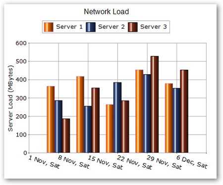
The WinForms Chart control is a high-performance charting component that is easy to use and visually stunning. It includes 30+ chart types, ranging from simple column charts to specialized financial charts. The charts are highly customizable and have a powerful data model to make data binding simple.
Chart wizard
The Windows Forms Chart control has a powerful wizard that helps to design a chart visually.
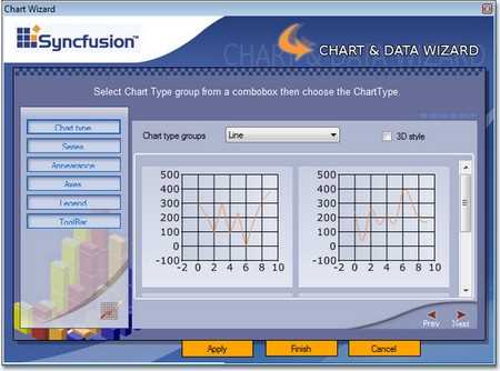

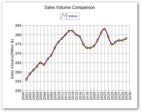
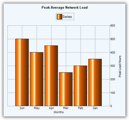
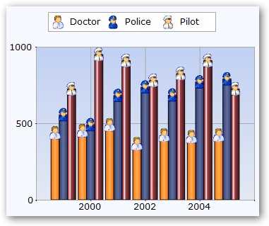
Chart real time data
The Chart control can efficiently handle real-time data as illustrated in the following screenshots. Updates are optimized to be smooth and flicker-free.
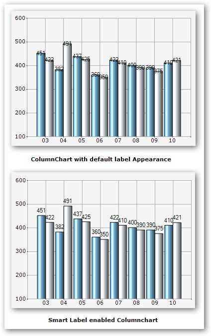
Smart labels
Smart labels are just one of the built-in optimization techniques that ensure data point labels do not overlap when rendered next to data points.

Template support
Save time by persisting the appearance of a chart created at design time or runtime as a template. Apply the saved style to a new chart by loading the template.
Unlimited data points
Users can add an unlimited number of data points to a chart series. Chart is optimized to handle such large sets of data.
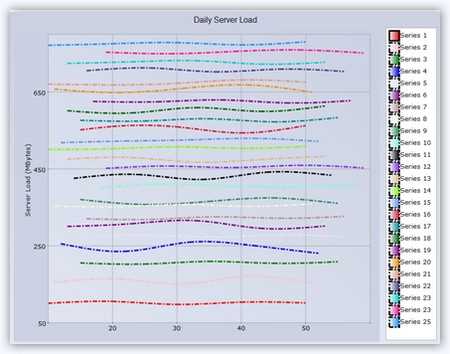
Unlimited data series
Users can add an unlimited number of data series to a chart. The control is optimized to handle such large sets of data.
Zooming and scrolling
Enable the built-in zooming and scrolling features of a chart to provide users with great chart flexibility. Users can simply click and drag any chart area to select and zoom. Once any part of the chart area is zoomed in, scroll bars will automatically appear to let the user view areas beyond the currently displayed chart area. A zoom-out button lets users revert back to the default mode.

Panning support for zoomed chart
WinForms Graph supports panning a chart when it is zoomed. You can navigate to parts of the chart outside of the viewing area by simply clicking and dragging.
Chart localization support
Localize all the visible strings in a chart to any supported language.
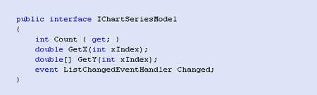
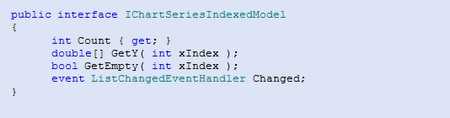
Custom data model
Chart provides a very easy way to implement a custom data model by using a simple data model interface. Use this approach to encapsulate your data retrieval code within a scalable scope. Such custom data models perform better than manually populated chart series when dealing with large amounts of data. The following screenshots illustrate indexed and non-indexed model interfaces.
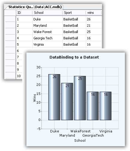
Data binding to a data set
Chart makes it easy to bind data set instances containing data point values to a chart series. Simply use the built-in ChartDataBindModel class to set up this binding as follows.
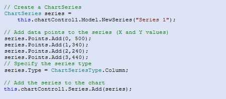
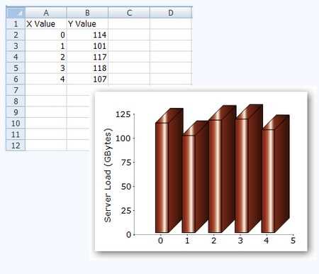
Default data population
The simplest and most straightforward approach is to populate a chart series with data points as shown.
Axis label binding
Bind axis labels to pie, funnel, and pyramid charts. This feature displays data-bound labels in charts.
LINQ support
Bind to LINQ query results. Use LINQ to create varied, concise, and optimal views of your data. Bind to LINQ query results and view your data using many different chart types. Binding a LINQ query result to a chart and the resultant display are illustrated here.

Excel importing and exporting
The WinForms Graph control can be used with the Syncfusion Excel Library to import data from Excel documents into a chart. Simpler Excel data can, of course, be loaded using the Microsoft Jet OLEDB data provider.
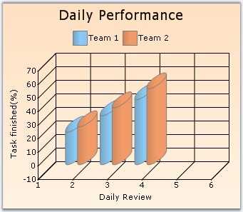
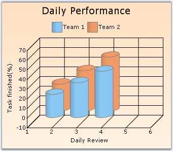
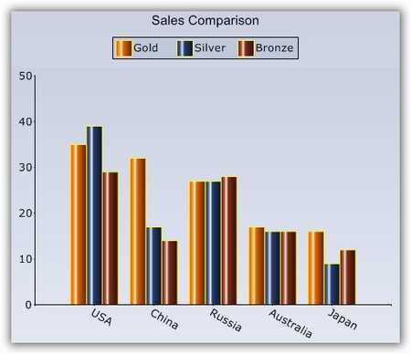
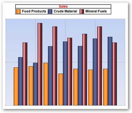
Chart types
The Windows Forms Chart control includes a comprehensive set of more than 30 chart types for all your business needs. Each one is highly and easily configurable with built-in support for creating stunning visual effects.
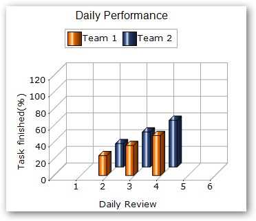
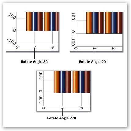
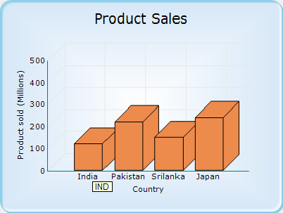
3D Mode
The Windows Forms Chart control supports 3D modes for all chart types except polar and radar charts. * The depth of the z-axis is customizable through the depth property. * The real mode option specifies if the chart is displayed in a 3D plane. * Users can also use the rotation or tilt properties to rotate the control programmatically.

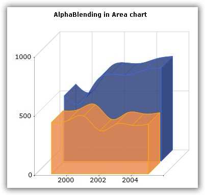
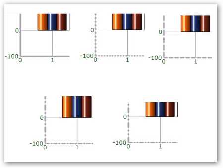
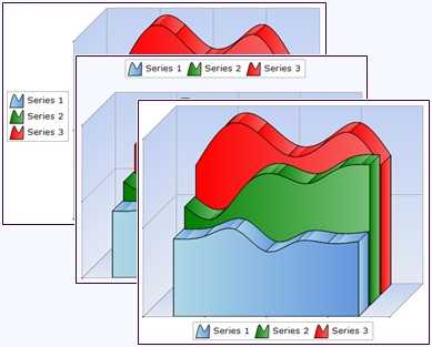
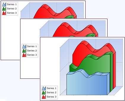
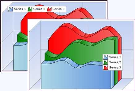
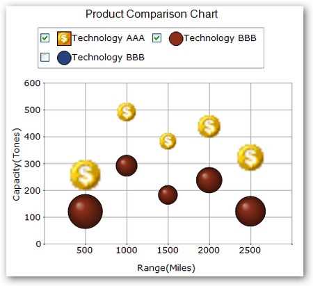
Alpha blending
Add alpha blending to a chart series to help interpret data that may be hidden behind a series. It can also give a new effect to 2D and 3D charts. Alpha blending is ideal for making one series visible through another, as in the accompanying figure.
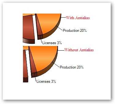
Anti-aliasing
Render a chart in different ways using the SmoothingMode property. The default option is anti-alias.
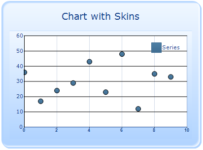
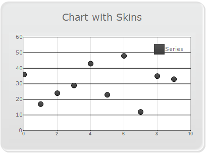
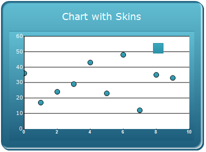
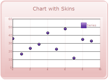
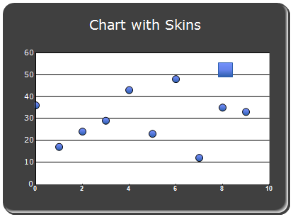
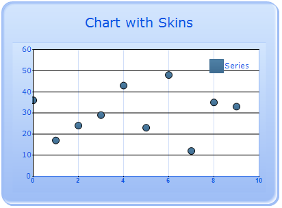
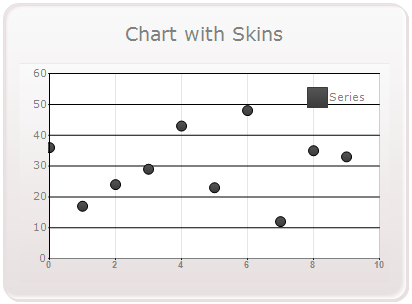
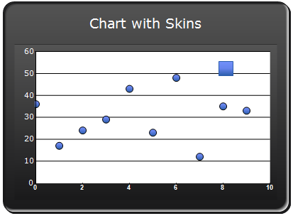
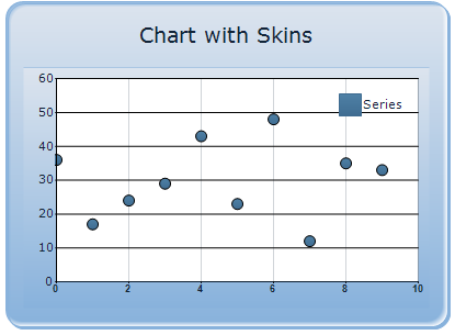
Built-in skins
The Chart for Windows Forms contains 14 types of built-in skins that allow you to easily customize chart appearances. The skins property allows you to apply predefined skins to the control, giving you plenty of customization options.
WinForms Chart with Office 2007 blue skin

WinForms Chart with Office 2007 black skin
WinForms Chart with Office 2007 silver skin
WinForms Chart with vista skin
WinForms Chart with almond skin
Blend skin for WinForms Chart
WinForms Chart with blueberry skin
WinForms Chart with marble skin
Midnight skin for WinForms Chart
Monochrome skin for WinForms Chart
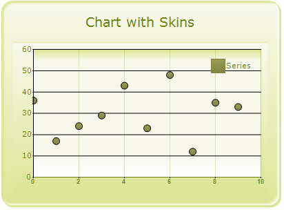
Olive skin for WinForms Chart
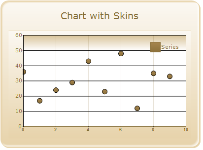
Sandune skin for WinForms Chart

Turquoise skin for WinForms Chart

VS2010 skin for WinForms Chart
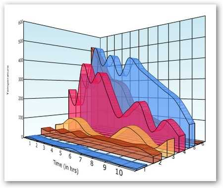
Chart area and series shadow effect
Apply shadow effects to the chart area and chart series as illustrated.


Chart background
Easily customize the layout and background of the Chart control.
Chart border
The WinForms Chart supports 13 different built-in border styles. The interior style and the size of the chart border can also be customized.
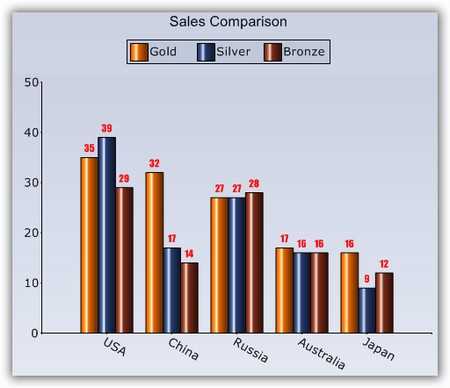
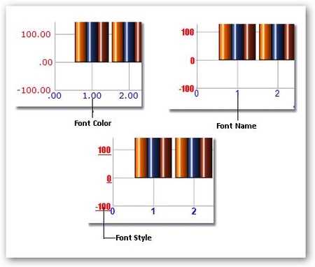
Chart font
Customize the font for all text rendered in a chart.
Chart interior
Render professional-looking charts with gradient colors in the chart interior and other chart areas.
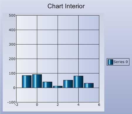
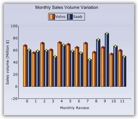
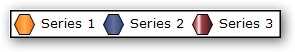
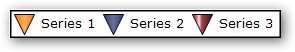
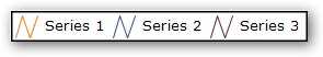
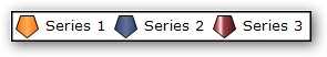
Chart symbols
Symbols can be associated with each chart series to highlight data points. You can also specify custom images instead of the built-in symbols.
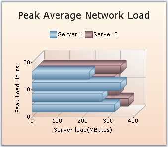
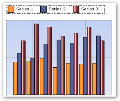
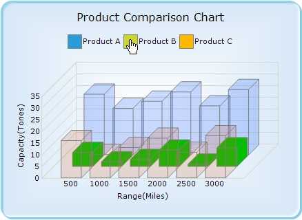
Clustered mode
The Chart control supports a clustered view in 3D mode. This effect shows z-axis data extended in the third dimension while clusters are displayed in the foreground.

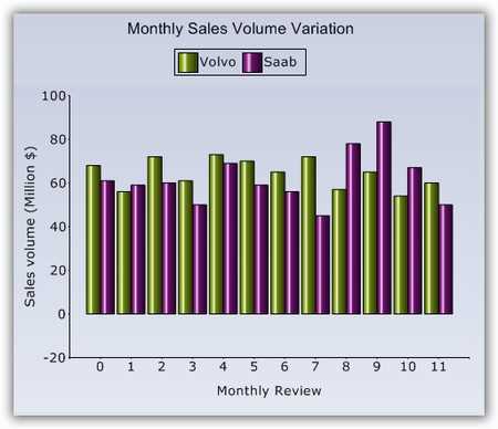
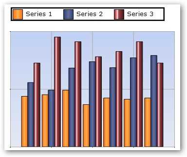
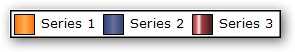
Color palette
The Chart comes with a set of color palettes that are automatically applied to a chart’s data points if no custom colors are specified for the series. These built-in palettes offer a rich set of colors to render professional-looking charts.

Custom palettes
Define and add custom color palettes.
Localization
Render data points from right to left to adhere to certain local standards. All built-in strings can also be easily localized using localization binaries.
Series border
Improve the appearance of a chart series by customizing the border color, style, and width of the data points.
Spacing effect
Spacing allows you to customize the space between series columns to give data more clarity. Increased spacing between columns will in turn reduce the width of a column. Support is also provided to control the spacing among series in 3D mode. Series spacing is set as a percentage value of the z-axis depth of a column.

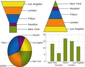
Multiple pies
Display multiple pie charts in one chart area for easier presentation and analysis of chart data.
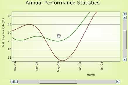
Automatic range scaling
The Chart control has an automatic range-scaling engine that computes the best possible range for a given set of values. * Automatic range calculations are also configurable. * Automatic ranges are also calculated for date values. The range intervals are calculated to be in increments of easily understandable date segments, such as weeks, months, or years.

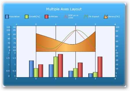
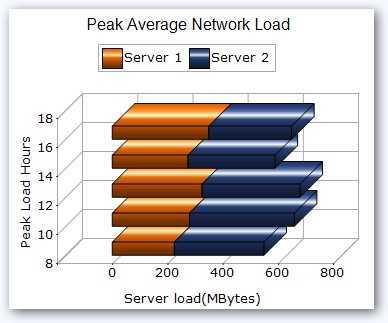
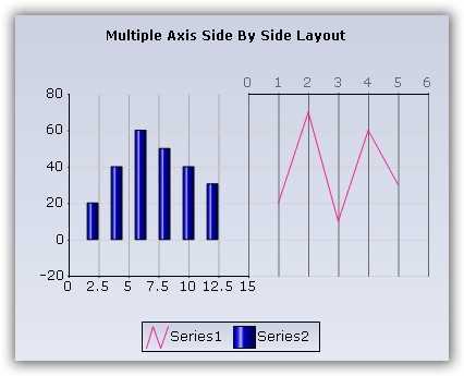
Multiple axes layouts
The WinForms Charts control supports a combination of both stacking and side-by-side chart axes layouts when multiple axes are used. Multiple axes allow for greater control and flexibility when dealing with large amounts of data. The multiple axes layout feature is illustrated in the accompanying image.
Axis label font
You can customize the appearance of axis labels by specifying their size, color, and font.
Axis label orientation
Axis labels can also be rotated to any angle. This is convenient when axis labels are long enough to interfere with other labels. In fact, the Chart control is smart enough to automatically rotate axis labels to avoid overlap.
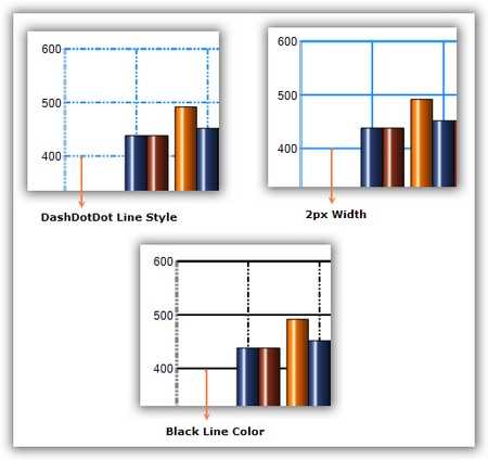
Axis lines
Customize the x-axis and y-axis line appearance to fit your needs. You can configure the style, width, and color of these lines.
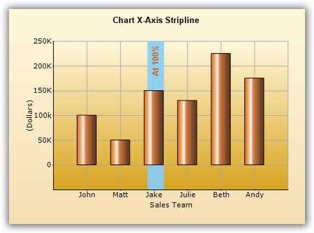
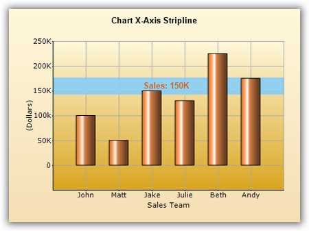
Axis strip lines
Strip lines are bands that can be drawn horizontally or vertically in a chart’s background to highlight certain regions. They can also be repeated to mark weekends, for example.
Axis ticks
Chart axes support major and minor tick marks. The appearance of a tick’s color, height, and width can be customized.
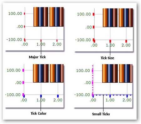
Chart axis labels
Customize the appearance of chart axis labels. You can include custom labels, which can be edited at runtime. Group chart axis labels as desired, and define the grouping label text, color, font, and other related information. Set individual label positions to be to the left or right of the axis, or to the top or bottom.


Custom axis origin
Specify a custom origin in a chart. The origin can be any specific value in the axis range, or it can also be a specific data point’s value.


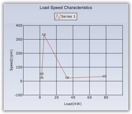
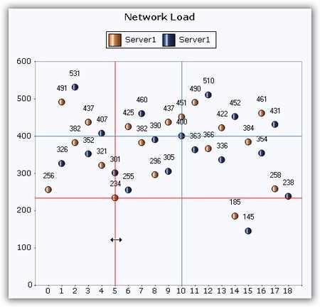
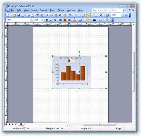
Custom axis range
Specify a custom range for the axes if the default calculated range is not good enough. You can specify the range as well as the intervals of an axis. The accompanying screenshot shows a custom x-axis range with a minimum value of 0, a maximum value of 6, and an interval of 1. The custom y-axis range has a minimum value of -100, a maximum value of 600, and an interval of 100.
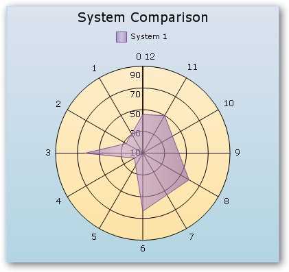
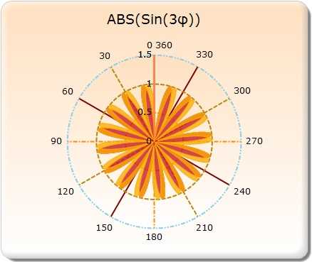
Custom polar axis range
A polar chart is a circular graph in which data is displayed in terms of values and angles. The Chart control lets you specify any custom range instead of the default 0–360 degree range values for the axes of a polar chart. You can set the range and intervals for an axis. The accompanying image illustrates a polar chart with a customized axis with a minimum value of 0, a maximum value of 12, and an interval of 1.
Gridlines
Display horizontal and vertical gridlines in the chart area to help clarify series values. Also customize gridline appearances, as shown in the accompanying figure. All dash styles (dash, dot, dash dot, dash dot dot, solid, custom) are available for gridlines. It is also possible to show and hide gridlines.
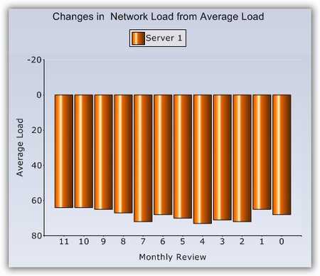
Inverted axis
Reverse any chart axis range and plot data for such an axis in the opposite direction, as shown in the following screenshot.
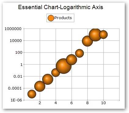
Logarithmic axis
The WinForms Charts control supports logarithmic axes. The data type of any series plotted on the chart can be set to logarithmic. Both axes of a chart can be customized to display logarithmic values. You can also specify custom logarithmic axis ranges. Logarithmic axes are usually used to show data with large ranges.
Opposed axis
The WinForms Chart control supports the opposed position of chart axes. The axis of a chart can be positioned opposite to that of the default axis position. This is useful in creating RTL charts.

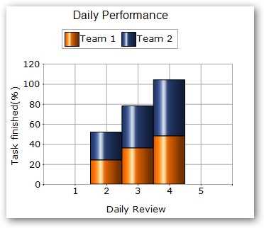
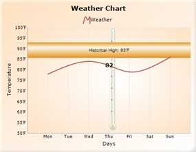
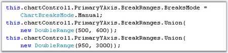
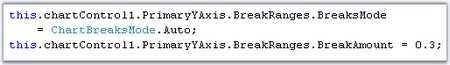
Scale breaks
Scale breaks help in accommodating outlying data in a chart while also clearly displaying normal values. Scale breaks can be applied automatically or manually.


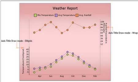
Secondary axis
The WinForms Chart control supports multiple axes. You can add a secondary axis and position it next to or below the primary axis. Display ellipses at the end of a title when the title text exceeds the axes bounds. This feature can be implemented in both the primary and secondary axes.


Custom polar axis
Customize of solid circle lines in polar and radar charts. The Pens property of the primary x-axis and y-axis is used to set the style of the solid circles.
Axis label tooltips
You can add tooltips to the chart axis labels.
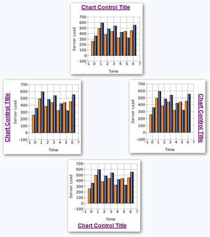
Multiple chart titles
Add multiple chart titles to a chart, each at their own custom position.
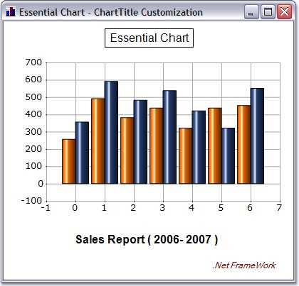
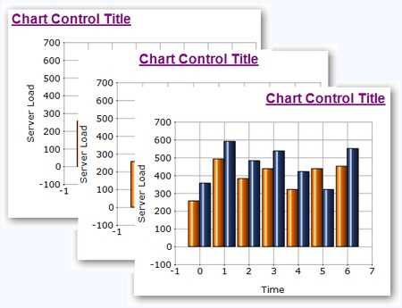
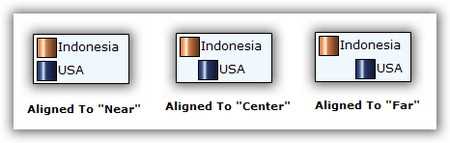
Chart title alignment
Align the title of a chart near, center, or far, relative to the side it is rendered on.
Chart title position
Position the chart title at any of the four sides of a chart.
Legend background image
The Chart control supports custom background images in a chart’s legend.
Legend border with different styles
Customize the border styles of the legend.

Legend dock and alignment
Dock a chart legend anywhere within the chart area. The legend can also be aligned near, center, or far in the docked side. Set the chart legend to float so that the user can drag the legend around during runtime.
Legend item alignment
Align the item text in the chart legend near, center, or far within the item bounds.
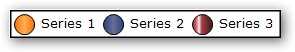
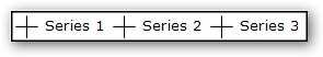
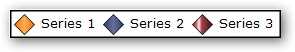
Legend representation types
Set the legend representation type.
Legend shadow effect
Render legend text with a shadow effect.
Legend title font and color
A chart’s legend can have a custom title with a custom font style, size, and color.
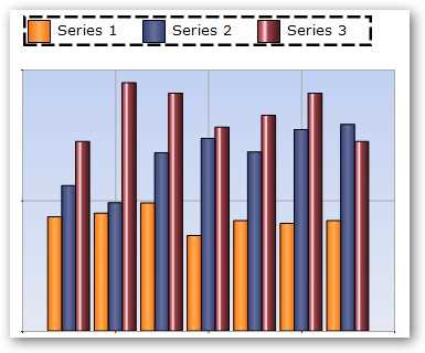
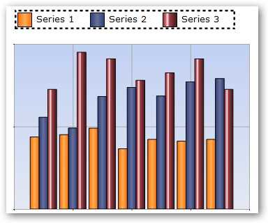
Legend visibility checkboxes
The checkbox feature in the legend lets your users show or hide a series during runtime.
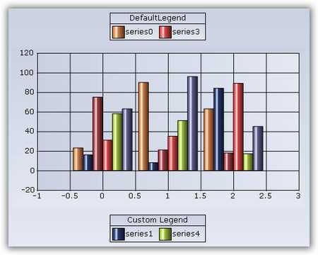
Multiple chart legends
Display multiple chart legends with custom legend items that can be associated with any chart series.
Title font size and color
Customize a chart title with custom fonts, colors, and sizes.
Auto highlight
Automatically highlight chart data points on mouse-over. Customize the highlight color for such elements.
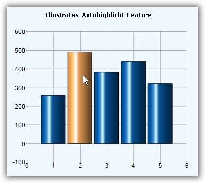
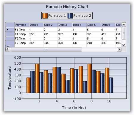
Chart host control
Host any Windows Forms control within the Chart control using the docking manager available for the chart. By using the docking manager, any Windows Forms control can be docked to any region inside the Chart control.
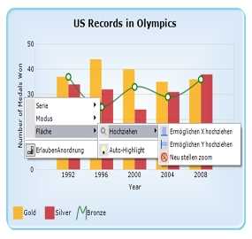
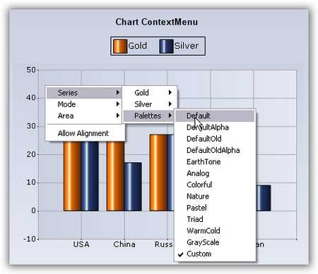
Context menu
Implement built-in context menus in the Chart control.
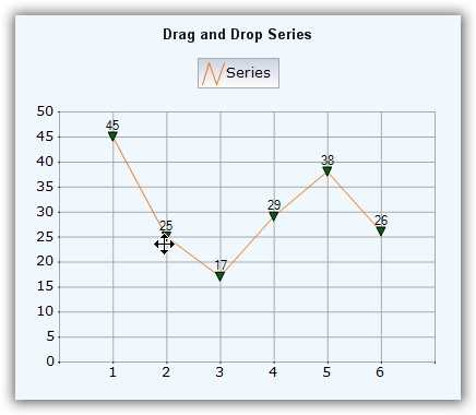
Drag-and-drop series points
Using the mouse events fired by a chart, you can track the drag-and-drop of a chart point to a new location.
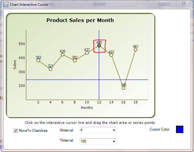
Interactive cursor
Position cursors at a specific data point in a series and point out the x- and y-values via a horizontal and vertical line passing through the data point and intersecting the x-axis and y-axis. Drag interactive cursor lines to position them at specific data points.
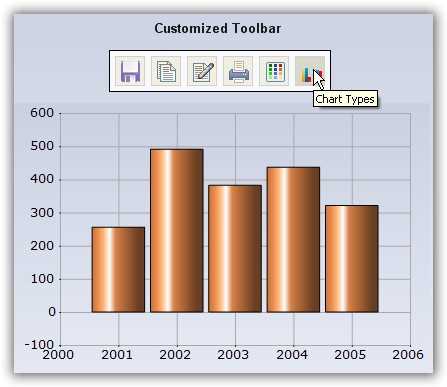
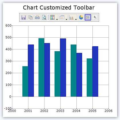
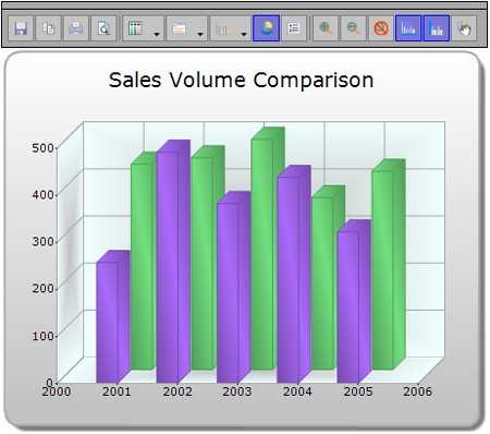
Toolbar
A built-in toolbar is available for the Chart control.
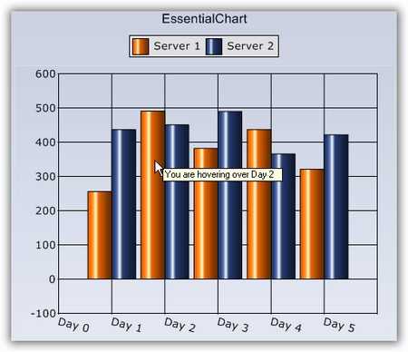
Tooltip
Display tooltips when hovering the mouse pointer over a chart area, data points, and other regions. Customization options are also available for tooltip text.
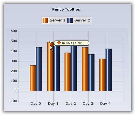
Fancy tooltips
The Chart control also includes a “fancy tooltip” feature. This tooltip looks like a balloon and includes information regarding the series name and x- and y-points.
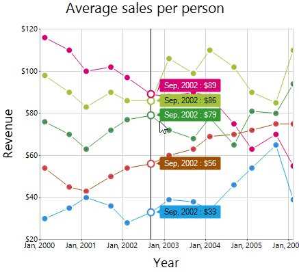
Trackball
Use a trackball to view the closest data point to a mouse or touch contact point. A line with markers and tooltips will appear at the location of the data point. Information about the data point can be displayed using the trackball tooltip.
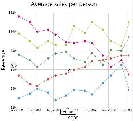
Crosshair
Use a crosshair to view the axis coordinates at the mouse location or touch contact point. Display information about the coordinate in a tooltip near the axis.
Series highlight
Highlight a specific series of the chart over which the mouse hovers. The series can also be highlighted by hovering the pointer over the legend of the series.
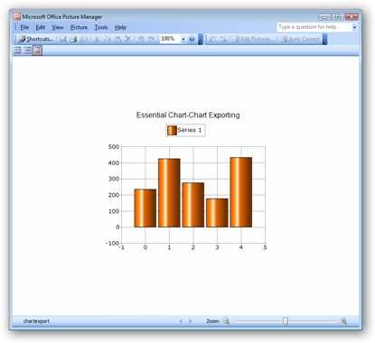
Export as an image
The Chart control provides APIs to export a chart as an image file with support for all popular image formats: .bmp, .jpg, .gif, .tiff, .wmf, .emf, .svg, and .eps.
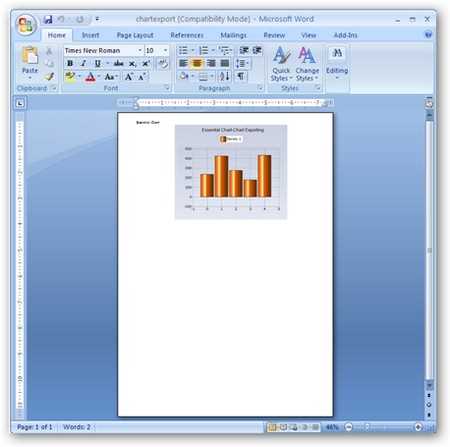
Export to Word Library
Using Word Library, dynamically create a Word document that contains an image of the chart.
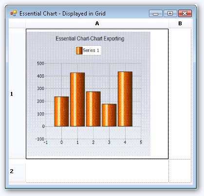
Export to grid
Add an image of a chart to a grid cell dynamically.
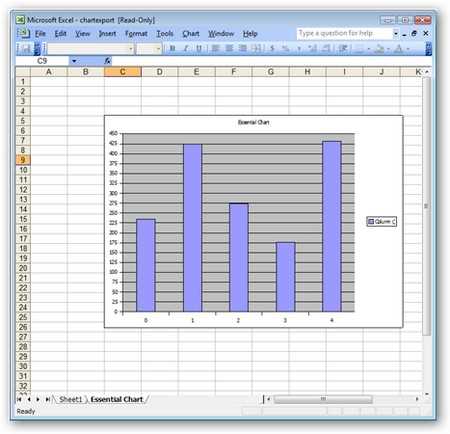
Export to Excel
Using Syncfusion’s Excel Library, export chart data points to an Excel worksheet and create an Excel chart to render that data.
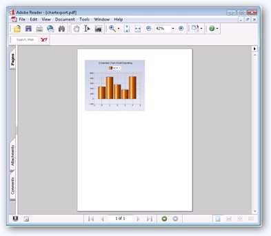
Export to PDF
Using Syncfusion’s PDF Library, you can dynamically create a PDF document containing a snapshot of the chart.
Export to SVG
Export and save a chart as a scalable vector graphics (SVG) file. SVG defines graphics in XML format, which is very useful in viewing a zoomed-in or zoomed-out chart without losing the quality due to the zoom level.
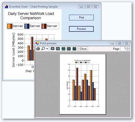
Print support
Print a chart in color, grayscale, or automatic mode.
XML serialization
Save the series and point properties into XML format and load them into a new Chart control.
WinForms Chart Code Example
Easily get started with the WinForms Chart using a few simple lines of C# code example as demonstrated below. Also explore our WinForms Chart Example that shows you how to render and configure the Charts in WinForms.
using Syncfusion.Windows.Forms.Chart;
namespace WinFormsApp1
{
    public partial class Form1 : Form
    {
        public Form1()
        {
            InitializeComponent();
            ChartControl chartControl1 = new ChartControl();
            chartControl1.PrimaryXAxis.DrawGrid = false;
            BindingList<SalesData> dataSource = new BindingList<SalesData>();
            dataSource.Add(new SalesData("2004", 30));
            dataSource.Add(new SalesData("2005", 40));
            dataSource.Add(new SalesData("2006", 50));
            dataSource.Add(new SalesData("2007", 65));
            dataSource.Add(new SalesData("2008", 75));
            CategoryAxisDataBindModel dataSeriesModel = new CategoryAxisDataBindModel(dataSource);
            dataSeriesModel.CategoryName = "Year";
            dataSeriesModel.YNames = new string[] { "Sales" };
            ChartSeries chartSeries = new ChartSeries("Sales");
            chartSeries.CategoryModel = dataSeriesModel;
            chartSeries.Style.DisplayText = true;
            chartSeries.Style.TextOrientation = ChartTextOrientation.Up;
            chartControl1.Legend.Visible = true;
            chartControl1.LegendAlignment = ChartAlignment.Center;
            chartControl1.Legend.Position = ChartDock.Top;
            chartControl1.LegendsPlacement = ChartPlacement.Outside;
            chartControl1.Series.Add(chartSeries);
            chartControl1.ShowToolTips = true;
            this.Controls.Add(chartControl1);
        }
    }
}
public class SalesData
{
public string Year { get; set; }
public double Sales { get; set; }
public SalesData(string year, double sales)
{
this.Year = year;
this.Sales = sales;
}
}Not sure how to create your first WinForms Chart? Our documentation can help.
I’d love to read it now130+ WINDOWS FORMS CONTROLS
ALL CONTROLS
CONVERSATIONAL UI
DATA VISUALIZATION
INPUT CONTROLS
NAVIGATION
DIALOGS & NOTIFICATION
LAYOUT
LISTS & DROPDOWN
CALENDAR
MISCELLANEOUS
FILE VIEWERS & EDITORS
BUTTONS
DATA SCIENCE
Build Document Workflows in WinForms
Integrate a powerful PDF Viewer and a full‑featured Spreadsheet Editor into your WinForms applications, alongside robust document processing libraries, to create smooth document experiences. Empower users to work with documents interactively while developers automate processing behind the scenes.
Frequently Asked Questions
Why should I choose Syncfusion WinForms Chart?
The Syncfusion WinForms Charts provides the following features:
A comprehensive set of more than 30 chart types that are easily configurable with built-in support.
3D mode for all chart types except polar and radar charts.
Customize the chart control using ChartWizard at design time and run time.
- One of the best WinForms Chart in the market that offers feature-rich UI to interact with the software.
- Handle real-time data efficiently and update the chart in a smooth and flicker-free manner.
- Touch-friendly for interacting with charts.
- Simple configuration and API.
- Built-in support for exporting the chart control into various formats.
- Save or load a Chart control to an XML file.
Extensive demos and documentation to learn quickly and get started with WinForms Charts.
Where can I find the Syncfusion WinForms Chart demo?
You can find our WinForms Chart demo on
GitHub location.
Can I download and utilize the Syncfusion WinForms Chart for free?
No, this is a commercial product and requires a paid license. However, a free community license is also available for companies and individuals whose organizations have less than $1 million USD in annual gross revenue, 5 or fewer developers, and 10 or fewer total employees.
How do I get started with Syncfusion WinForms Chart?
A good place to start would be our comprehensive getting started documentation.
Our Customers Love Us
Having an excellent set of tools and a great support team, Syncfusion® reduces customers’ development time.Here are some of their experiences.

Everything works perfect, examples are great and support team tries to do their best to help
Support and amount of tutorials. They help a lot to understand the basics, of what syncfusion can suggest. I use data grids, charts. It has a good design too. It’s very good.

Arnoldas A,

Junior Node.JS Developer
Best Mobile Chart Solution for Flutter - most professional and responsive engineering and support
Syncfusion Team is World Class! - We discovered a problem implementing the Syncfusion Charts, Submitted a support ticket - immediate response & help. The Engineers confirmed the problem - and immediately started creating a new version that fixed the problem, they kept in contact with me - in a few days, the new version was ready and it works flawlessly. If you are looking for a team that will support you and work with your DEV team rapidly and responsively - then Syncfusion is for you. Best charting solution for mobile (we are using the Flutter plug-ins) - works great on the latest IOS & Android Builds - very customizable - great training and support - We highly recommend Syncfusion for the products & equally the customer & dev support. Very pleasant to work with as well ;-)

Don M,
Owner/Developer
See Real Success Stories
Developers around the world trust Syncfusion’s Essential Studio to simplify complex projects and speed up delivery. With a vast library of UI controls, powerful SDKs, and reliable support, Essential Studio helps teams build enterprise-ready applications with confidence.
Read Our Customer StoriesIndustry
Software development
75% Cost reduction
50% Faster development
Industry
Utilities (oil and gas)
450+ hours saved
Streamlined processes and hours of development effort saved.
Advanced, flexible features
Empowered users through robust and versatile functionality.
Industry
Software and technology
1000+ of hours saved
Accelerated development with enterprise-ready UI components.
Efficient file management
Streamlined workflows with document libraries without building them from scratch.
Industry
Software and technology
2 Years of delay avoided
Two years of delays prevented with proactive planning.
On-time delivery
Projects delivered on schedule using trusted controls.
Industry
IT services and IT consulting
Improved performance
Large datasets handled with easy customization and quick debugging.
Highly customizable
Plug-and-play controls with quick template integration.
Industry
Professional services
Instant access
Quick availability of features and resources.
Reduced dependencies
Fewer dependencies for faster development.
Rated by users across the globe
Syncfusion Windows Forms Resources
Learning
 Documentation
 Documentation


Awards
Greatness—it’s one thing to say you have it, but it means more when others recognize it. Syncfusion® is proud to hold the following industry awards.