ASP.NET Web Forms Charts & Graphs : Beautiful and Interactive Charts
- Visualize and analyze data with ever-expanding 30+ charts and graphs ranging from line to financial charts.
- Interact and explore charts with features such as zoom and pan, selection, tooltip, trackball, and data label and markers.
- Experience seamless interaction and responsiveness with smooth animation.
Trusted by the world’s leading companies

Overview
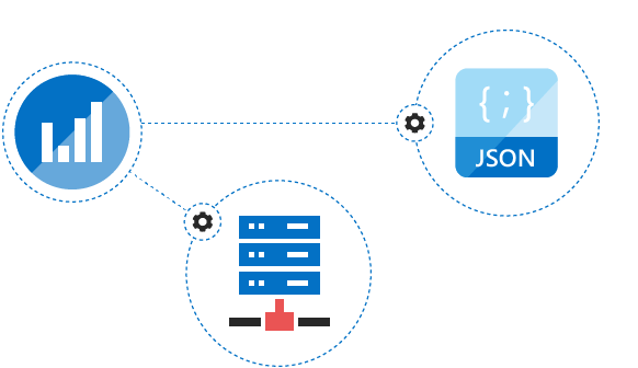
The ASP.NET Chart control can plot over 30 chart types ranging from line charts to specialized financial charts. Its rich feature set includes functionalities like data binding, multiple axes, trackball, drill-down operations, and zooming.
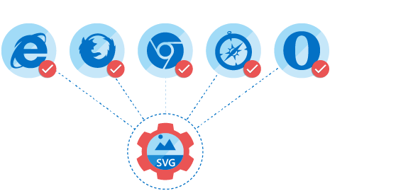
Browser Compatibility
All modern browsers and devices are supported. The chart is rendered as SVG in all the modern browsers and automatically rendered as VML on Internet Explorer 8 and below.

High Performance
Includes several data rendering optimizations to achieve the best possible performance when plotting large volumes of data as well as handling high frequency real-time data.
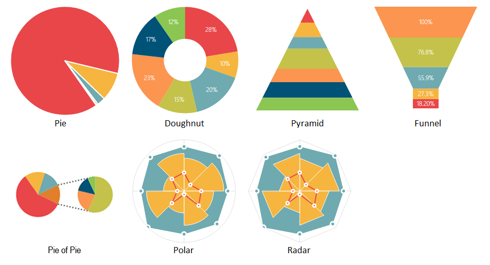
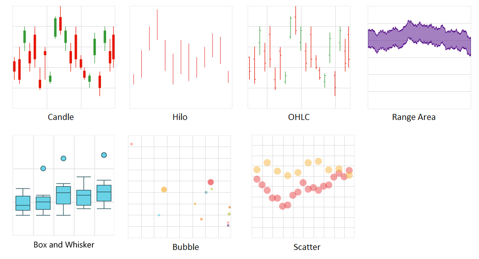
Chart Types
The chart control includes functionality for plotting more than 30 chart types. Each chart type is easily configurable with built-in support for creating stunning visual effects.
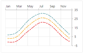
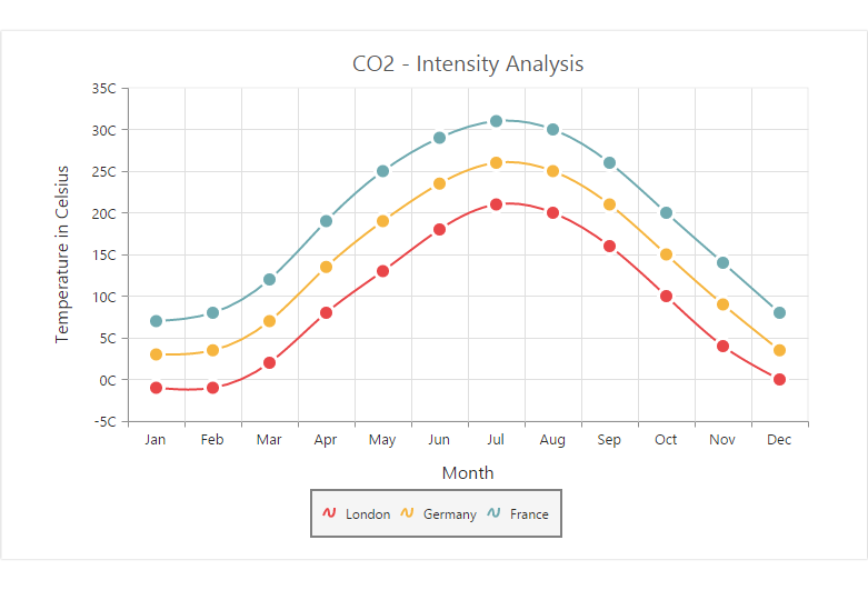
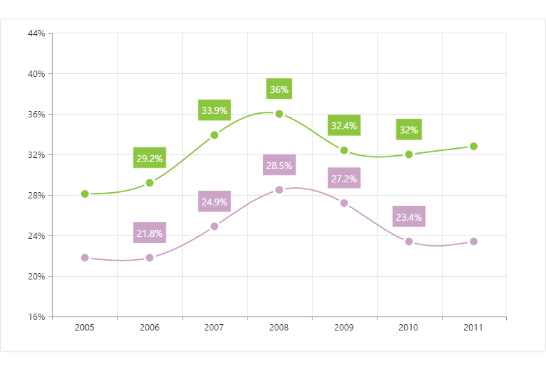
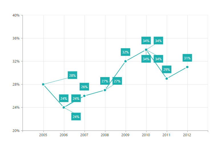
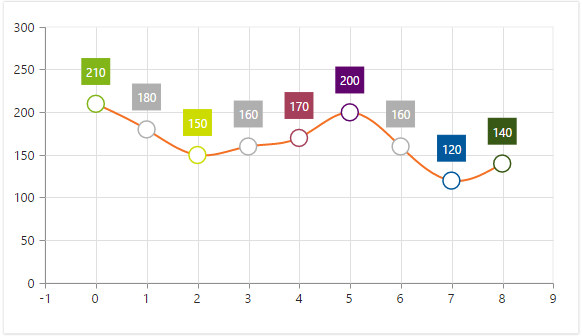
- Line and area type charts for representing time-dependent data, showing trends in data at equal intervals.
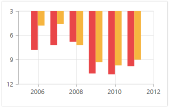
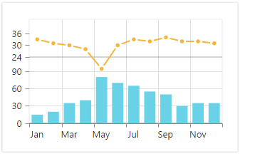
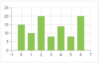
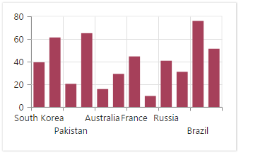
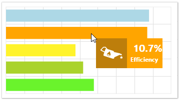
- Column and bar type charts for comparing the frequency, count, total, or average of data in different categories. They are ideal for showing variations in the value of an item over time.
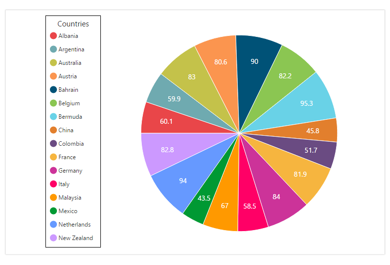
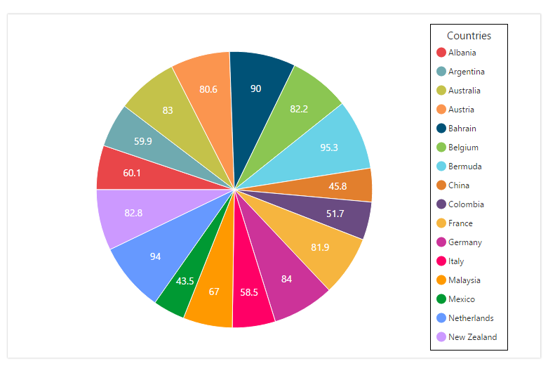
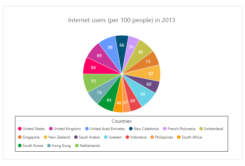
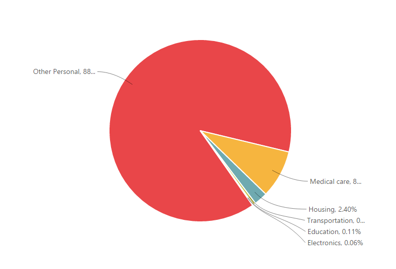
- Pie and pyramid type charts to represent data in proportions.
- Polar and radar charts to perform visual comparisons among several quantitative or qualitative aspects of a situation.
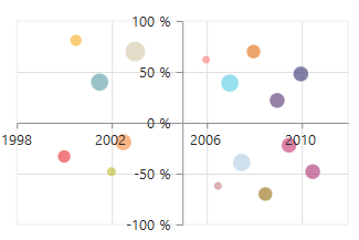
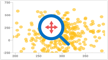
- Bubble and scatter charts to plot financial or scientific data.
- Waterfall chart for representing the cumulative effect of sequential positive or negative values.
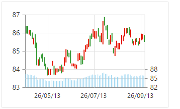
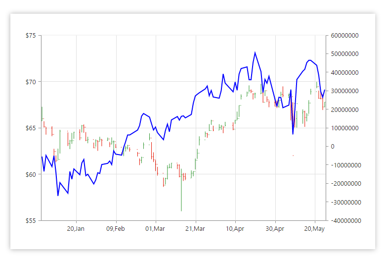
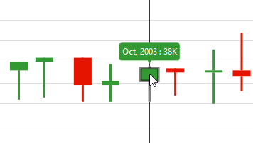
- Candle and HiLo type charts for stock analysis.
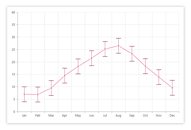
- Range column and range area series to represent high and low values at a point.
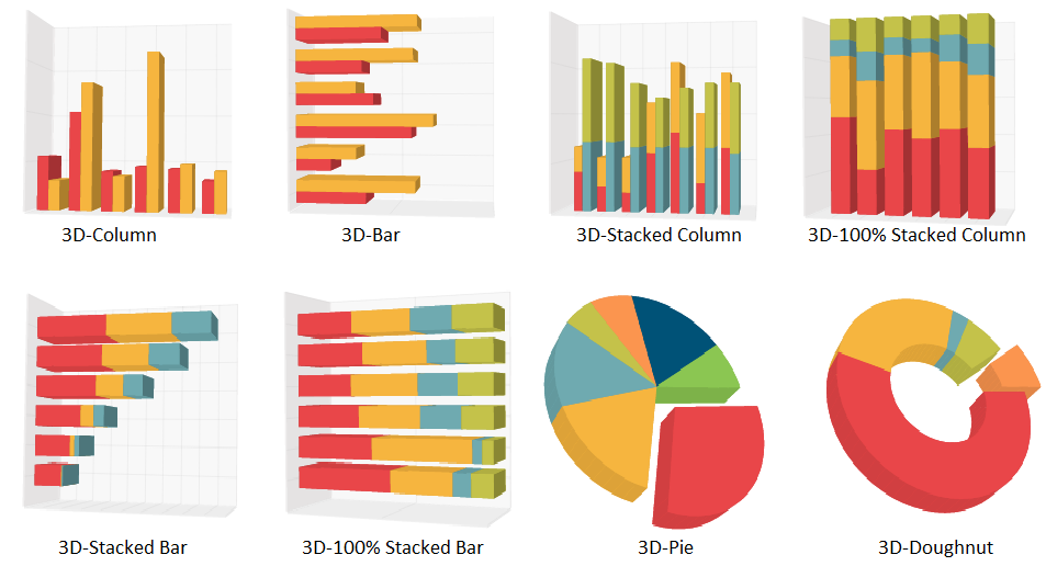
- 3-D charts for pie, doughnut, column, and bar type series.


Customizable Chart Axis
The chart control supports five different types of axes, namely Numerical, Categorical, DateTime, DateTimeCategory, and Logarithmic.
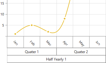
Multiple Panes
Add multiple panes to a chart.
Smart Range
The best possible axis ranges and intervals are calculated automatically based on the given values. The ranges can also be further customized using range padding.
Opposed Axis
The chart control supports opposed axes being rendered on sides opposite to the default position.
Axis Labels
The chart control provides many customization options for the axis labels, including positioning, placement, label format, and rotation. It also has options for avoiding labels overlapping.
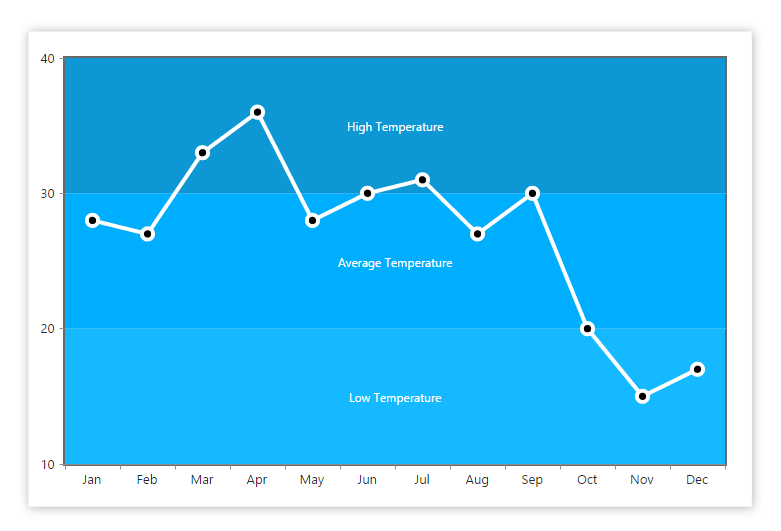
Strip Lines
Chart areas can be customized with the help of strip lines. This is useful for visually representing the different regions within a chart range.
Technical Indicators
Built-in support for RSI, Momentum, Bollinger band, accumulation distribution, EMA, SMA, stochastic, ATR, MACD, and TMA indicators.
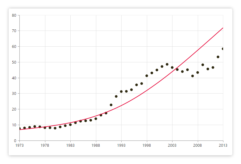
Trendlines
Render linear, exponential, logarithmic, power, polynomial, and moving average trendlines.
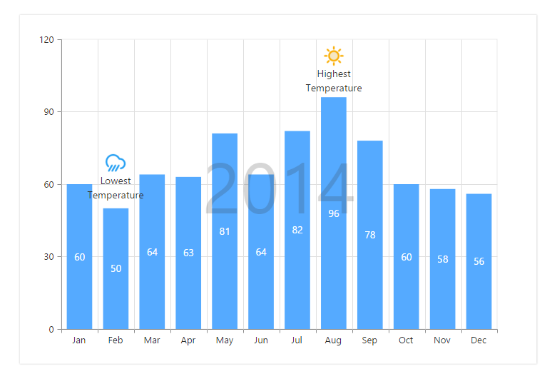
Annotations
Display metadata about the chart or series at specific points of interest in the plotting area.
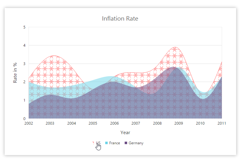
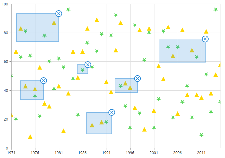
Highlight and Selection
Highlight and select a series or data point with patterns or colors. Data in multiple ranges can also be selected.
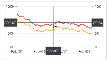
User Interaction
The end user experience is greatly enhanced by a set of included user interaction features, such as
zooming and panning
,
crosshair
,
trackball
,
drill-down
,
events
, and
tooltips.
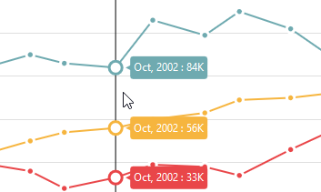
Types of trackball available in chart - Float Trackball
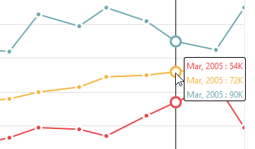
Types of trackball available in chart - Group Trackball
Types of trackball available in chart - Financial Trackball
Trackball
The trackball is used to track a data point closer to the current mouse position or touch contact point.
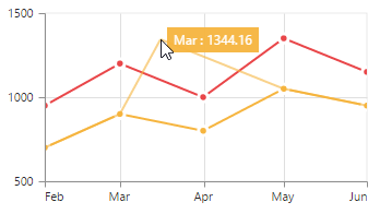
Tooltip
Displays a pop-up with information when the cursor is hovered over a data point.
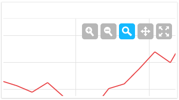
Zooming Toolbar
Contains buttons for zooming in and out, reset, pan, and more.
Data Editing
Data points can be edited by dragging them with mouse and touch interactions.
Legend
Legends provide additional information that is helpful in identifying individual series in a chart.
Placement
Legends can be placed at the left, right, top, or bottom of the chart area or they can be docked anywhere within the chart area.

Customization
Legend icon, title, and alignment can also be customized as required.
Data Labels and Markers
Data points can be easily annotated with labels to indicate their measure and dimension to help improve the readability of data. Data points can also be enhanced by adding markers or customizable symbols.
Smart Labels
Data labels are automatically arranged to avoid intersection when there are large amounts of data.
Empty Points
Empty point values are elegantly handled with several customizable options.


Appearance
There are several built-in themes available, including Dark, Light, and Gradient.

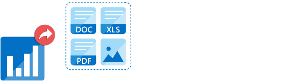
Export
Charts can be exported to a Word document, PDF document, Excel file, and image formats such as SVG, PNG, and JPEG on client and server side.

The rendered chart control can be printed directly from the browser. One or more number of charts in a web page can be printed together.
75+ ASP.NET UI CONTROLS
ALL CONTROLS
GRIDS
DATA VISUALIZATION
DATA SCIENCE
EDITORS
NAVIGATION
NOTIFICATION
BUSINESS INTELLIGENCE
Our Customers Love Us
Having an excellent set of tools and a great support team, Syncfusion® reduces customers’ development time.Here are some of their experiences.

We chose Essential Studio based on the breadth and quality of the components and the excellent support.
I would highly recommend using Essential Studio and have found that the Syncfusion support team is one of the fastest I have worked with.
Rated by users across the globe
Syncfusion ASP.NET Resources
Learning
 Documentation
 Documentation


Awards
Greatness—it’s one thing to say you have it, but it means more when others recognize it. Syncfusion® is proud to hold the following industry awards.

