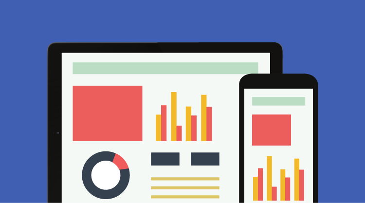
In this fast-running world, Internet-enabled smartphones and tablets are good companions for helping people keep in touch. Businesses have also benefited from this connectedness, such as real-time monitoring of business progress through a dashboard, but it’s often restricted by access to laptops or desktops which may not always be available. The Syncfusion Dashboard Mobile app overcomes this limitation and lets Syncfusion Dashboard Platform users monitor their dashboards on their smartphones and tablets on both Android and iOS.
The Syncfusion Dashboard Mobile app showcases several dashboards for the public in a simple, portable, and user-friendly mobile environment. This blog walks through the uses and interactions possible with dashboards using the mobile app from a tablet or smartphone.
In order to see a collection of dashboards through the mobile app, all the dashboards first need to be designed using our Dashboard Designer and then published in the Dashboard Server. Users cannot directly design a dashboard using the mobile app. A quick guide to designing and publishing dashboards is available here.
Once the dashboards are published in the Dashboard Server, users can download the mobile app either from Google Play or the App Store based on their devices’ operating systems. Search for Syncfusion Dashboard Mobile and select Install. Once the installation is complete, open the app and enter the valid Dashboard Server URL, followed by the user credentials. Based on the credentials and native administrator settings in the Dashboard Server, the dashboard collection will be filtered for the appropriate logged-in user.
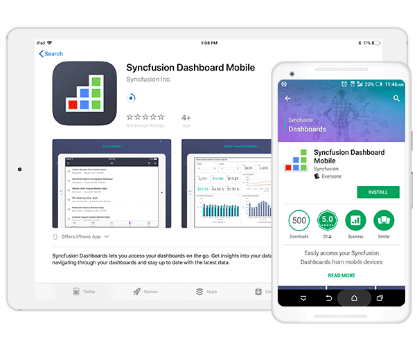
Figure 1: Syncfusion Dashboard Mobile app: Download, install, and login
After logging in, the user’s favorite dashboards are listed on the screen. At the bottom are options to navigate to recent, categorized, public, and all-dashboards views. Users can filter and sort those dashboards based on owner name, modified date, and category to quickly visualize and select a dashboard from the entire collection. To quickly navigate to a desired dashboard, a search option is also available.
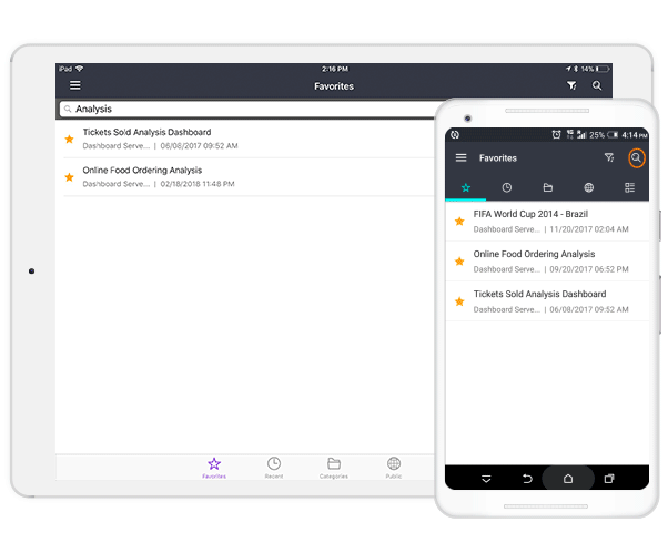
Figure 2: Search option with sorting and filtering
Moving on, let’s see how to interact with dashboards and create views for them. For this scenario, the Worldwide Car Sales dashboard is used as an example. In this dashboard, information like total car sales, sales by country, sales by car type, and the top five manufacturers are all displayed. To create a view that shows a Q2 2015 Sales Report, select the correct date range in the range navigator. On selection, dashboard data will be filtered and simultaneously a Filter Overview option will be shown at the top of the screen. Choose this option and a new screen holding the complete filter information—Date set to 4/1/2015 – 6/30/2015—will be shown. In the top-right corner, a Save option will be shown which allows users to save the view with a custom name. At any time, the user can re-open the same dashboard and choose this view from the Views section to see the filtered dashboard.
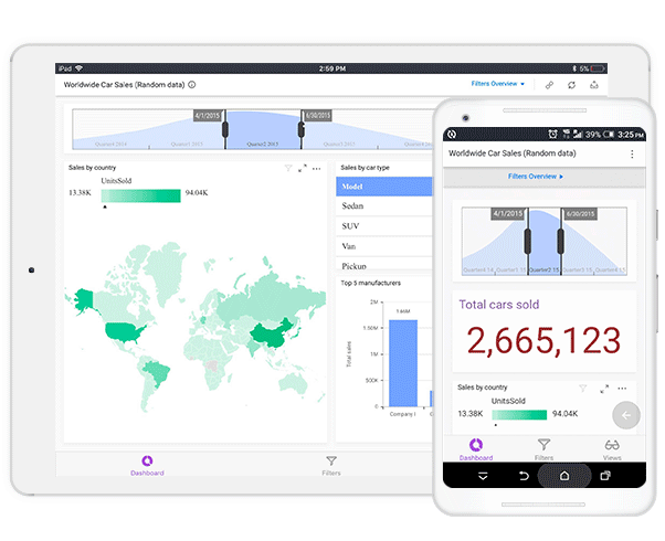
Figure 3: Q2 2015 sales report view
The dedicated filter panel that holds filters for dashboards can be viewed by navigating to the Filters section at the bottom of the screen. In the Worldwide Car Sales dashboard, filter options like Manufacturer and Continent are placed separately in the dedicated filter panel. You can navigate to this section and select Company A from Manufacturer and North America from Continent, resulting in a filtered dashboard showing Company A car sales in North America. On applying the filter, the Filter Overview option appears in the dashboard section at top of the screen to save this filter as a separate view.
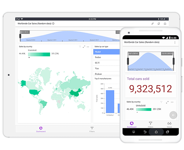
Figure 4: Dedicated filter panel: Company A car sales in North America
Apart from these, other common interactive features include:
- View information or summary details about the dashboard and its purpose.
- Export the dashboard to image, PDF, Excel, and CSV file formats.
- Update the dashboard periodically.
- Get dashboard URL with the current view data along with the filters.

Figure 5: Other dashboard interactions
Similar to dashboards, widgets published to the Dashboard Server can also be viewed in the mobile app.
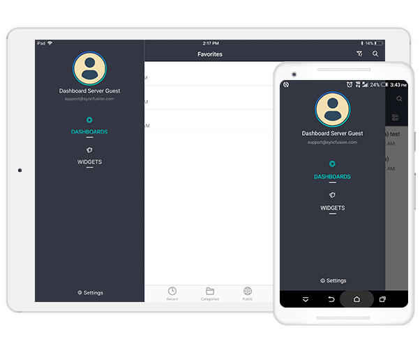
Figure 6: Visualizing dashboard widgets
Error logging, yet another advanced option, is also provided in the mobile app, which logs all the error information, right from the start of the application. It can be shared with Syncfusion support for error diagnosis and clearing.
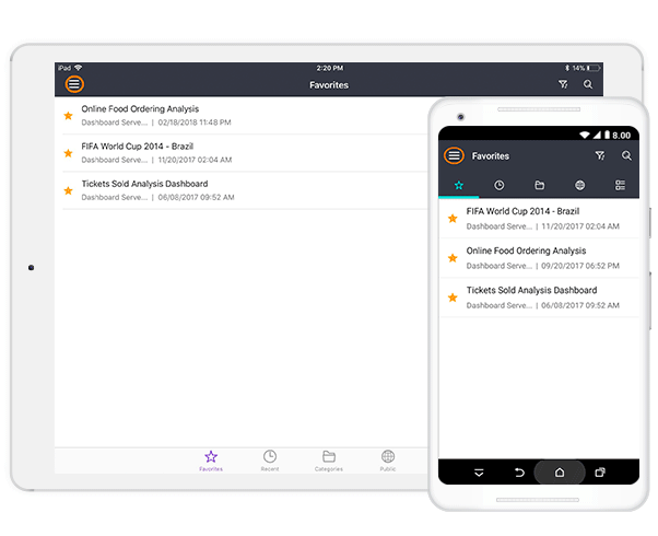
Figure 7: Error logging
As we have demonstrated, the Syncfusion Dashboard Mobile app makes the monitoring process much easier. If you’re already a Dashboard Platform user, you can try everything shown here yourself with your own dashboards and data. If you’re not a Syncfusion Dashboard Platform user, you can try it by downloading a free, 30-day trial and consulting the supporting resources available online. Happy dashboarding!
References
https://help.syncfusion.com/dashboard-platform/quick-start
https://help.syncfusion.com/dashboard-platform/dashboard-designer/overview
https://help.syncfusion.com/dashboard-platform/dashboard-server/overview
https://help.syncfusion.com/dashboard-platform/dashboard-mobile/introduction
If you liked this post, we think you’ll love these free e-books:
BI Solutions Using SSAS Tabular Model Succinctly
MongoDB 3 Succinctly
Hadoop Succinctly
Power BI Succinctly
R Programming Succinctly


Comments (1)
The article provides me with a lot of useful information, which I believe is very important for everyone; I hope that more people become aware of your post. This is a very useful post, and I admire the author. I hope you succeed in your next post, and I will continue to follow your posts. Very good topic, similar texts are available, but I’m not sure if they’re as good as your work.
click here
Comments are closed.