In this post, we will walk you through design interfaces and the options available in the Syncfusion Dashboard Designer for creating attractive dashboards. To watch the full video on this topic, visit our YouTube page.
The Dashboard Designer mainly contains three design views or surfaces:
- Dashboard designer view
- Data design view
- Widget design view
Dashboard Designer view
The first one is the actual dashboard designer view. This is the landing page when you open the dashboard designer application:
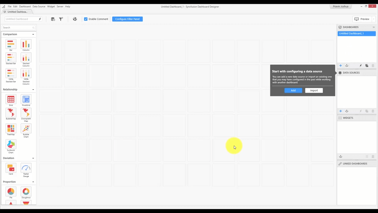
Dashboard designer view
You have the design canvas in the middle, the toolbox at the left side, and various item containers on the right side. Basically, this is the region where you’ll be designing the dashboard.
The design canvas has a grid where you can drag widgets from the toolbox. By default, the design canvas has a snap-to-grid approach, which helps in laying out and aligning the widgets easily. You can resize the widgets and move them around in the empty region. You can also use your keyboard arrow keys to do the same.
The toolbox has widgets such as charts, grids, filter elements, and many more under different categories. You can also include your own custom widgets using the widget menu. In the menu, choose the Manage Custom Widgets option and include your custom widget by clicking Add Widget.
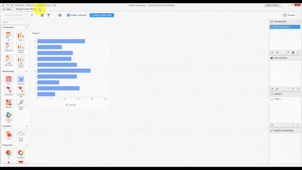
Including a custom widget
For more details regarding custom widgets, check out our video Introduction to Custom Widgets. The accompanying blog will be forthcoming.
On the right side of the design canvas, we have an array of containers that show various items such as dashboards, data sources, widgets, and linked dashboards that are used in the current instance. Each container has its own options, such as adding a new element, importing one from the server, duplicating one, and many more. Further, each item in the containers comes with a context menu that provides a few additional options, such as publishing and resetting the properties.
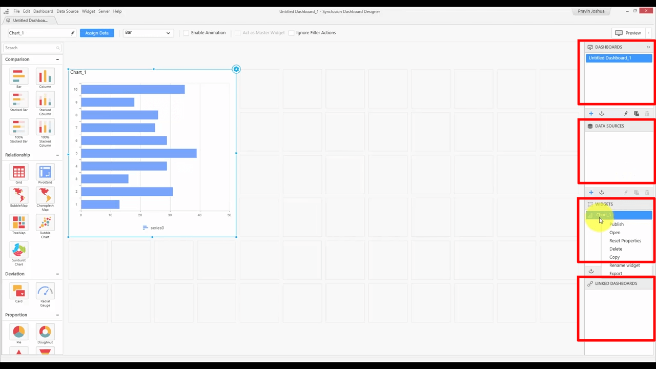
Dashboards, Data Sources, Widgets, and Linked Dashboards containers
And finally, the dashboard designer view contains a toolbar with buttons for adding data sources, managing filter actions, and more.
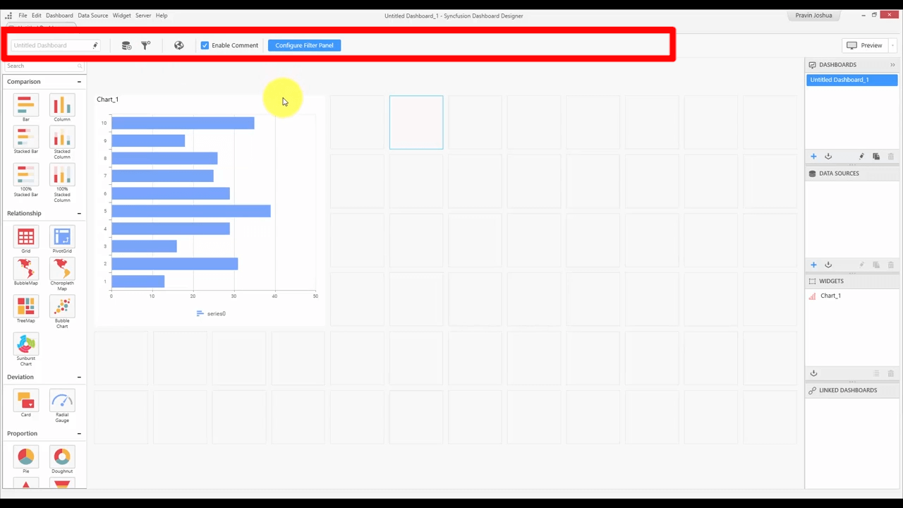
Dashboard designer view toolbar
These buttons are contextual, so whenever an item is selected, these buttons will change. In the previous image, the dashboard is selected, so the options related to the dashboard are shown. If a widget is selected, then the quick options for the widget are shown in the toolbar.
Data design view
The second design surface is the data design view. You see this when you add a data source, connect to a server, and choose your data. You can also open the data design view at any time from the data source container. You can double-click an item in it, or use the edit icon at the bottom of the container to open the data design view.
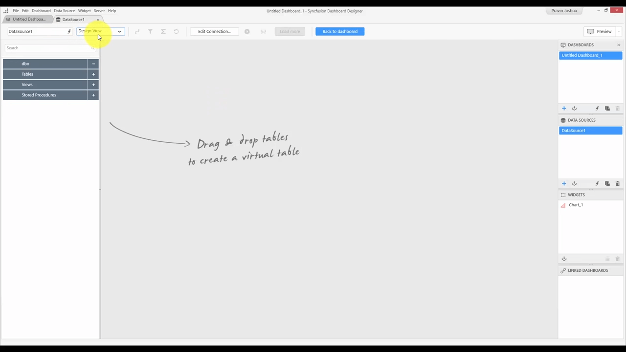
Data design view
The middle is the region where you will be designing your data source and transforming it to later visualize the data in the dashboard. In the toolbar, we have the design view (as in the previous image), as well as a query view. In the design view, you can simply drag the tables, modify the fields, and do other operations interactively. In the query view, you can drop your custom query and start preparing the data source.
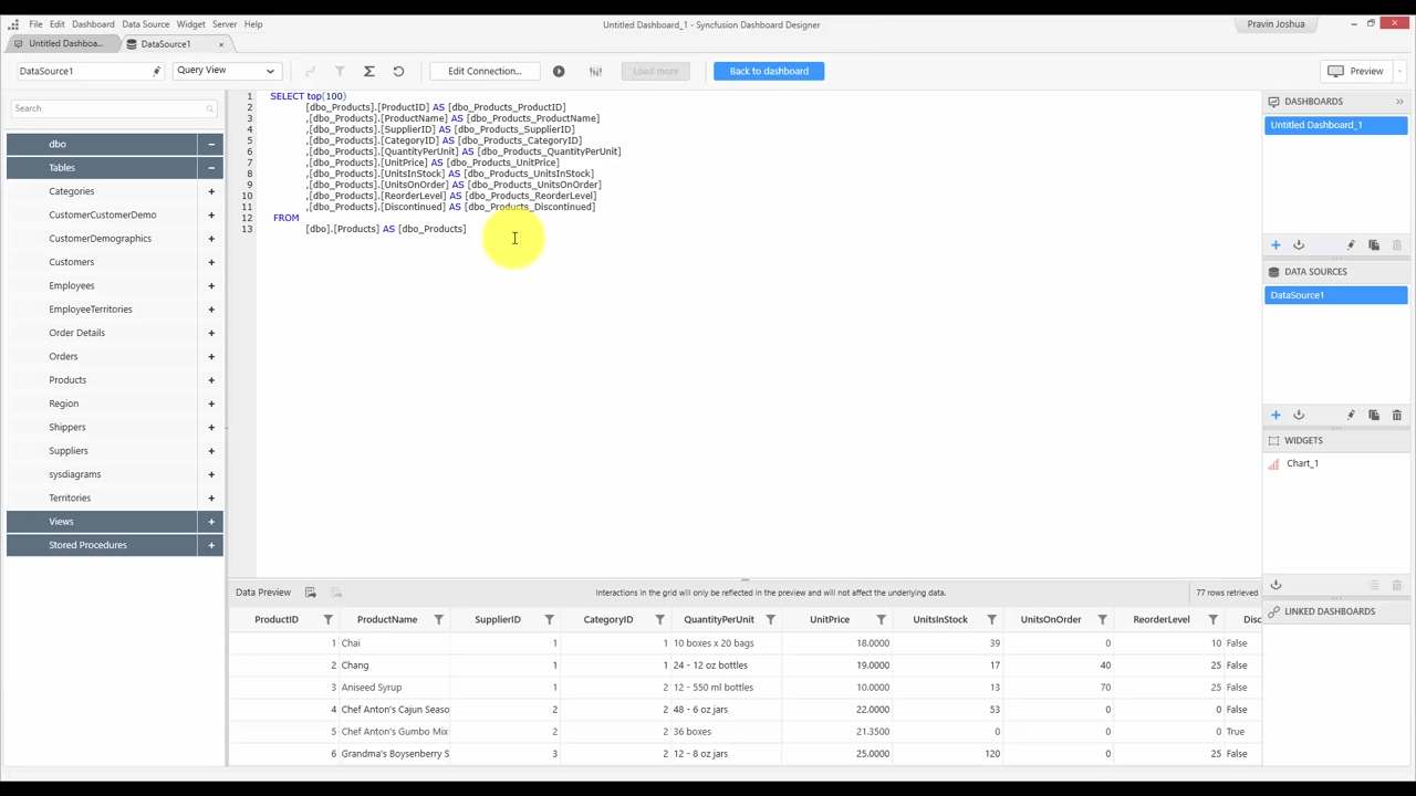
Query view

Design view with the export records buttons highlighted
The design view contains a list on the left that shows the database schema, and a data preview grid at the bottom. So whenever you make changes to your data source, such as adding a table or a custom field, all those changes will be shown in the data preview. You can also export your records using the export buttons that are available in the grid.
There’s also a toolbar that provides access to various other elements such as the expression editor, design editor, and so forth.
Widget design view
The third and final design surface is the widget design view. To see this, we need to go to the dashboard tab. You can open the widget design view by clicking the Settings icon at the top right corner of a widget, or you can click the Assign Data button available in the toolbar.
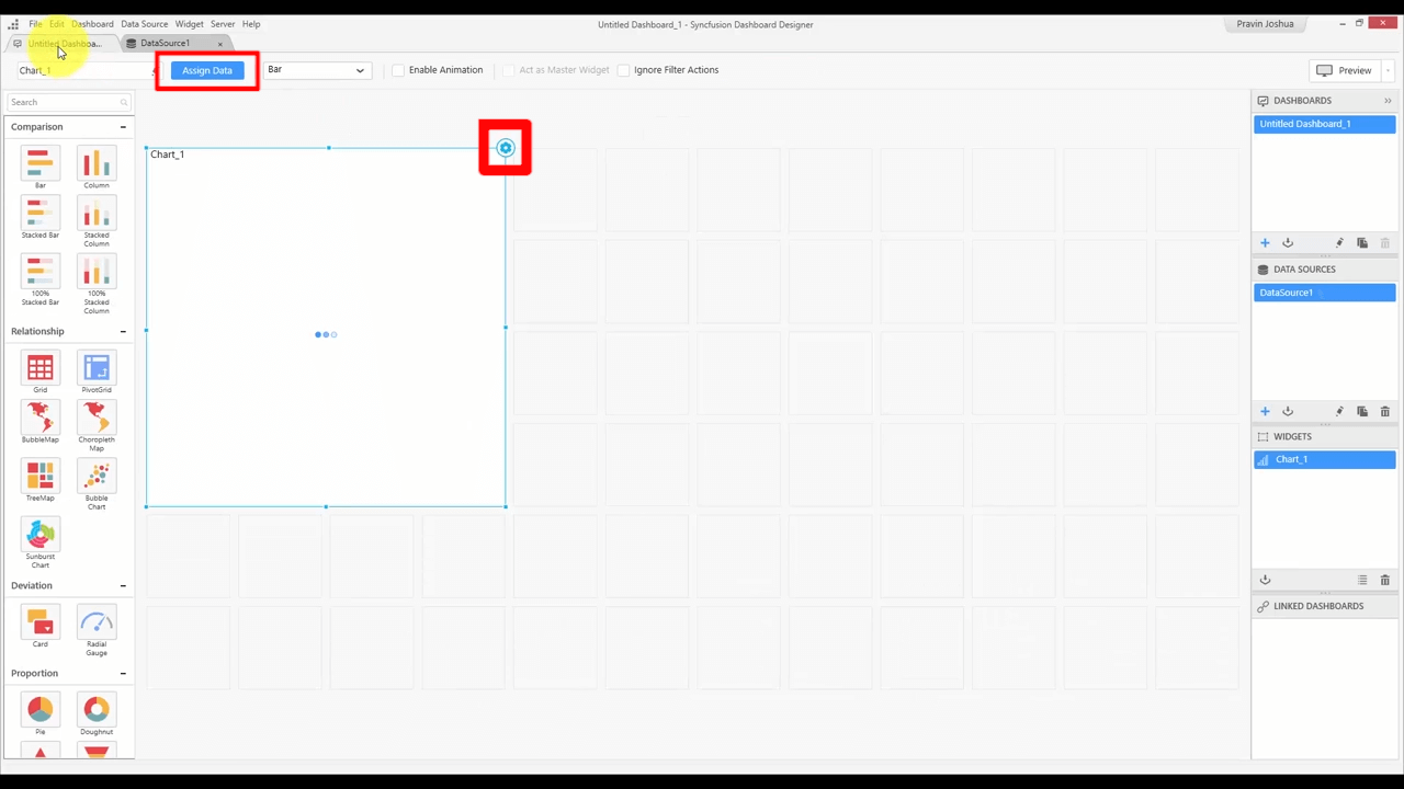
Widget design view with Assign Data and Settings items highlighted
On the left side, we have the widget preview. The widget preview shows how the widget will actually be rendered in the dashboard viewer. So whenever you make some changes to the widget configuration, the widget preview will automatically refresh to show the changes. The widget design view mainly contains two parts: the data design part, and the properties part. You can switch between them using the tabs on the top right.
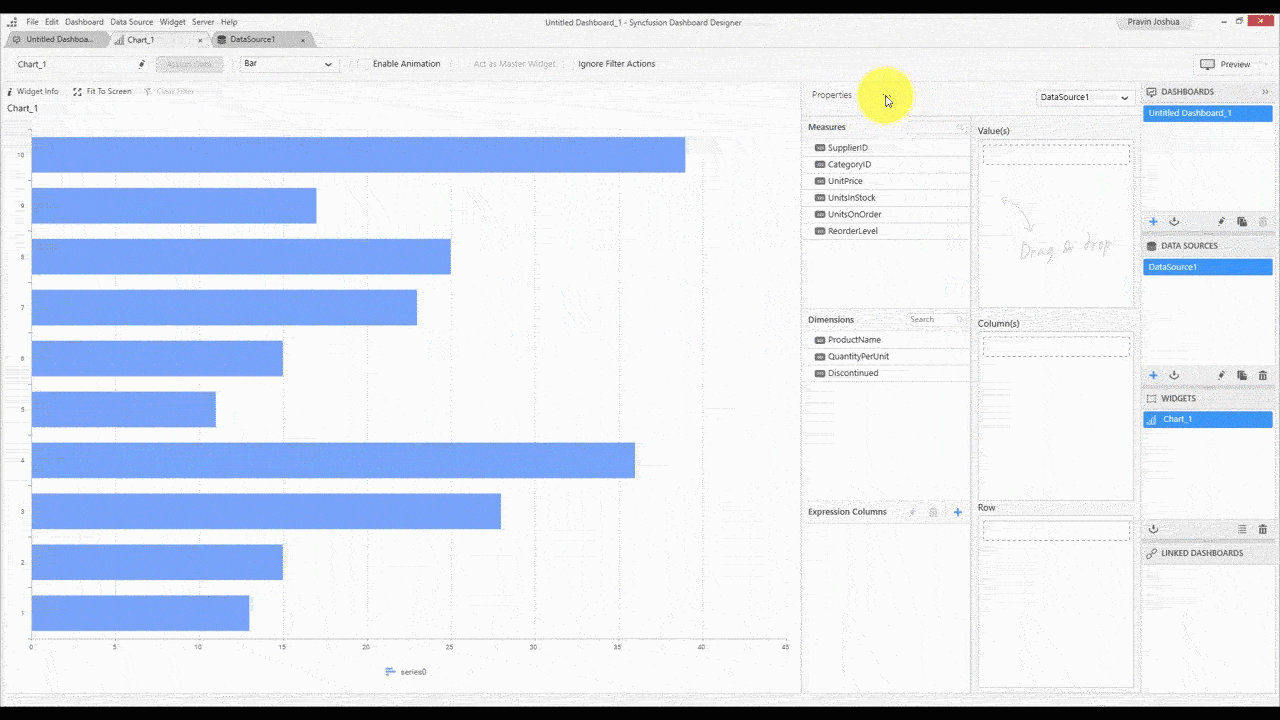
Switching between data design and properties tabs
Data design
The data design part is where you’ll be binding data to the widget. The left side has the list of measures, dimensions, and calculated fields that are available in the data source. The right side has different sections that are specific to the widget. You can bind data to the widget by simply dragging the fields into these sections. For example, we can drag the ProductName dimension to the Column box and the UnitPrice to the Value box.
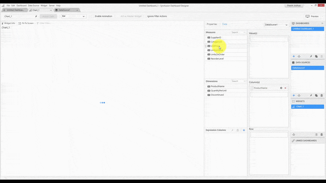
Binding data to a widget
If you’re working with more than one data source, you can choose your data source from the combo box just above the Value section. You can also see the different aggregation types that are available with the Settings buttons for each field, as well as change the format of your data.
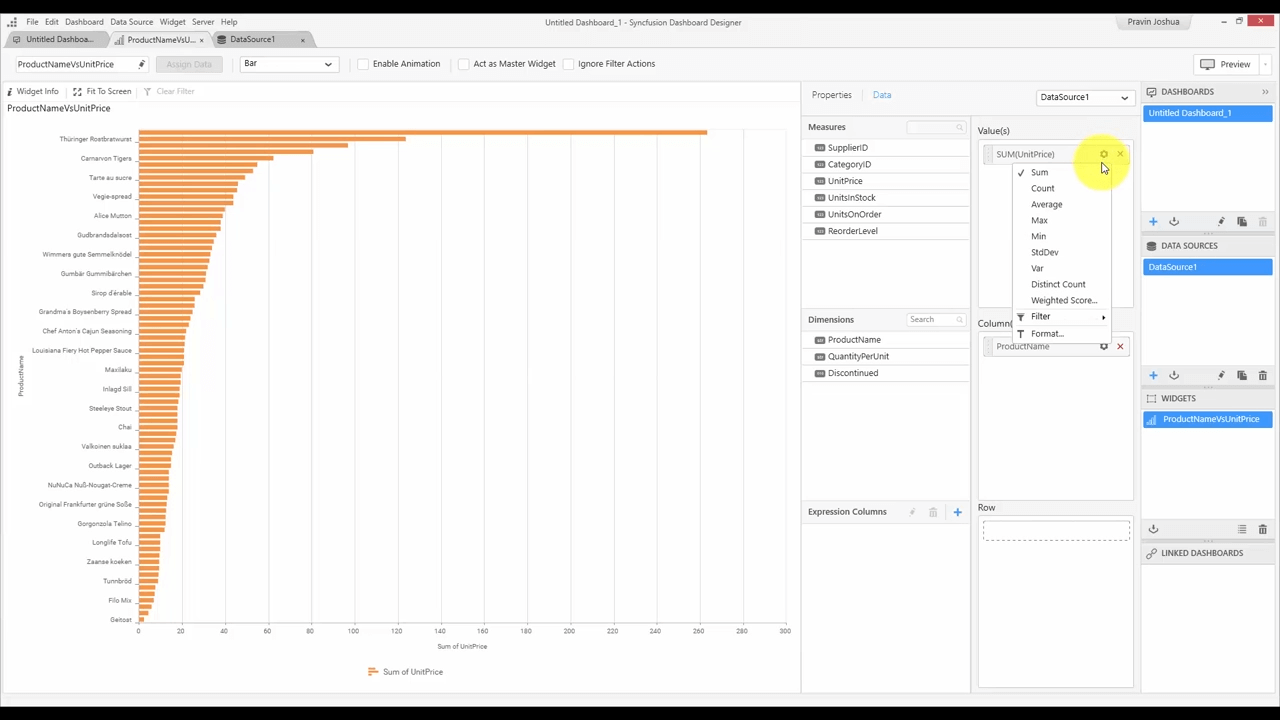
Viewing aggregation types
For this example, we’ll change the format to currency. You can see in the following GIF the dollar symbol being added. You can choose your currency culture and the number of decimal places.
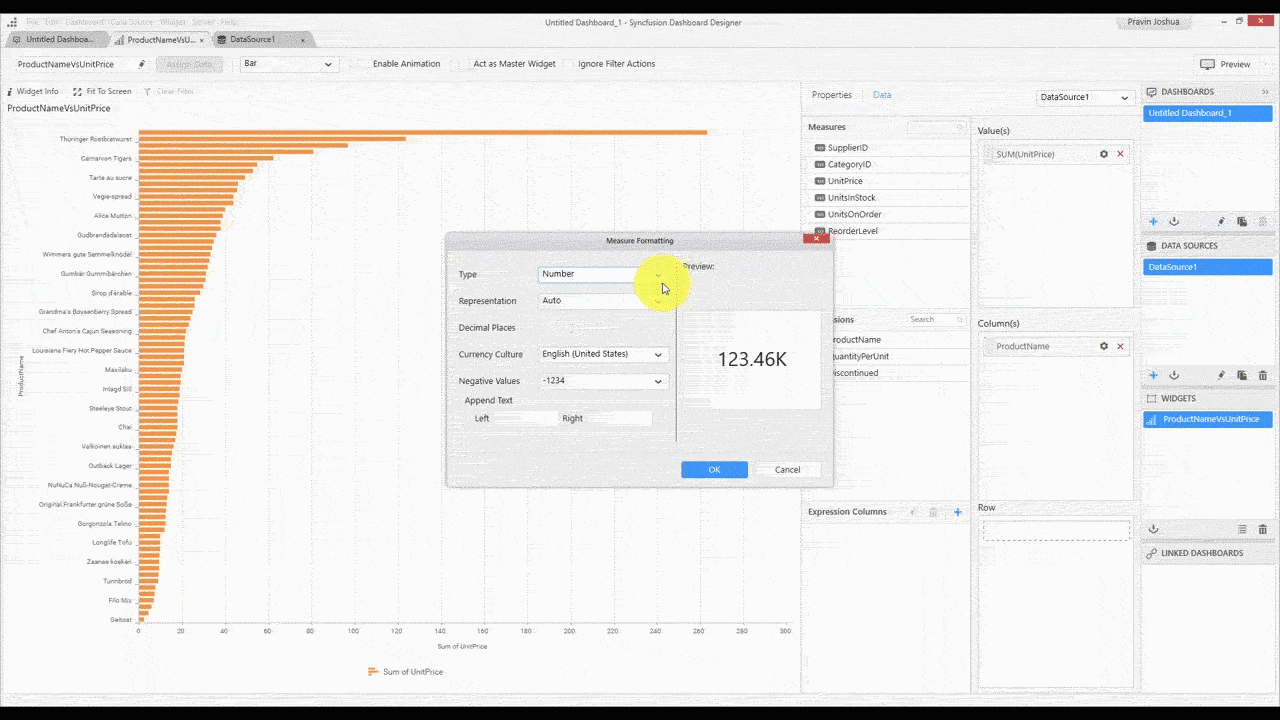
Choosing the currency format
These settings, of course, vary depending on the field type. For a date-time field, for example, you can choose aggregations such as month, year, month of a year, quarter, and many more.
Property
The property section has various settings such as basic, filter, and a few others related to the selected widget. Every time you make a change, it will be reflected in the widget preview.
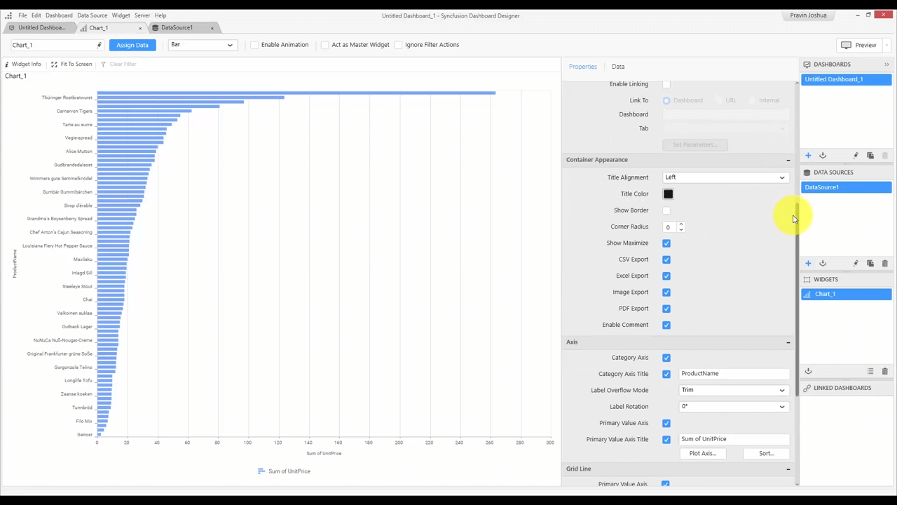
Changing widget properties
At any point, you can preview and check how your dashboard looks in the dashboard viewer by clicking the Preview button at the top right of the dashboard screen. You can also press F8.
And finally, after designing your dashboard, you can publish it to the Dashboard Server. The Dashboard Designer has a user management system in which you can log into your dashboard server and publish or import items directly from it. You can add multiple accounts and switch accounts whenever you need.
To publish, you can select the Publish and then Dashboard options in the Server menu, or use the Ctrl+Shift+P shortcut.
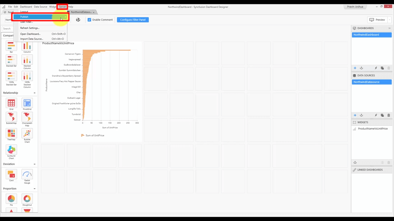
Publish dashboard option
It’ll ask you to save the dashboard and then display the Publish Dashboard pop-up.
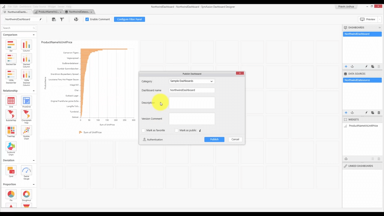
Publish Dashboard window
Here, you’ll choose a category, give the dashboard a name, and add a description. Finally, click Publish. You’ll see a pop-up telling you the dashboard has been successfully published and giving you the option to view it rendered in a browser.
This was a general overview of the Dashboard Designer interface based on this video from our Dashboard Team. If you’d like to request walk-throughs of specific parts of using our products, let us know in the comments below.
If you liked this post, we think you’ll love these free e-books:
BI Solutions Using SSAS Tabular Model Succinctly
MongoDB 3 Succinctly
Hadoop Succinctly
Power BI Succinctly
R Programming Succinctly